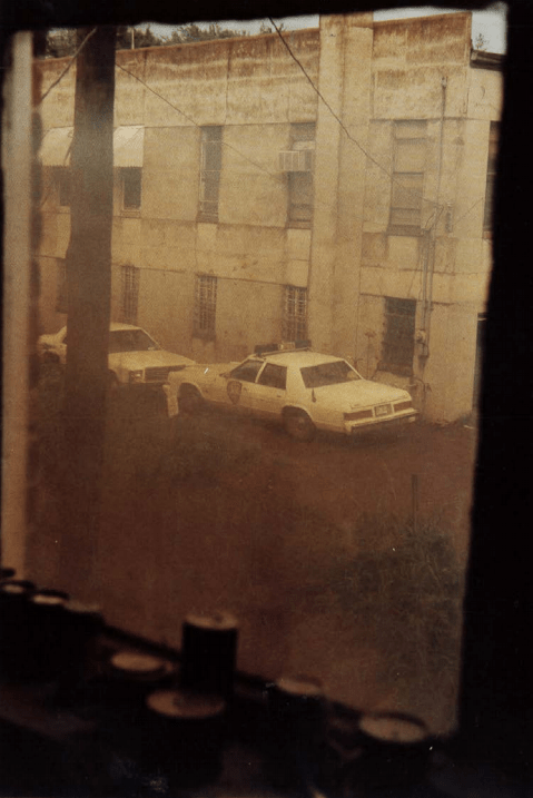
WILLIAM EGGLESTON UNTITLED (MISSISSIPI) 1984

In this image, I get a sense of danger and safety at the same time. As the viewer, I feel danger from the police car outside, the surroundings and atmosphere don’t seem the friendliest. We know this from the bordered up and dirty windows to the lack of life and low living conditions. It makes you question the emptiness of the area.
However, as the image was taken from the inside of the building, looking out at the danger. It makes me feel safer, that I’m inside away from the police and outside. William Eggleston is making us feel that we are at a safe distance waiting/watching for something to happen at any time.
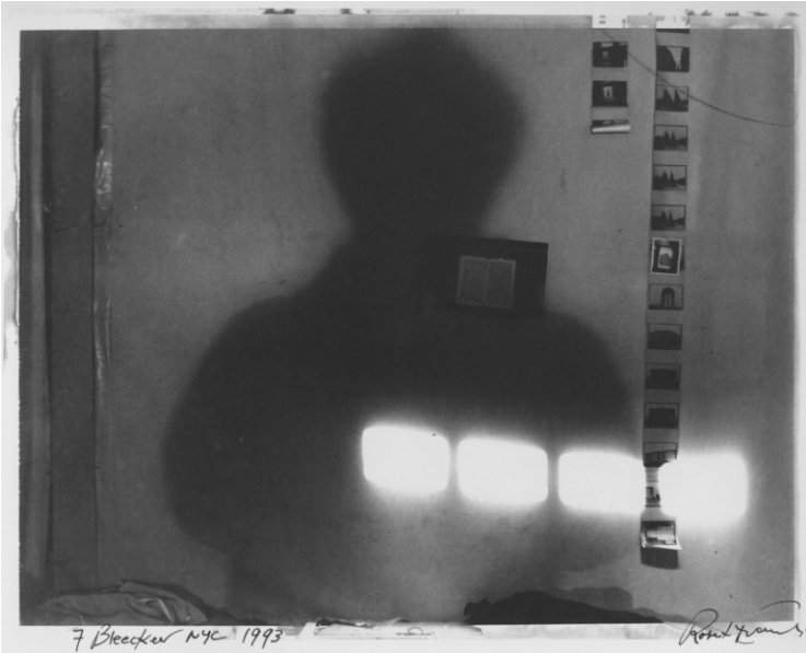
ROBERT FRANK, FROM STORYLINES, 2005

Robert Frank has brought a different viewpoint, by bringing the outside in, with the film negatives. The shadow of the person creates a sense of mystery, making the viewer’s eye look closer at the individual film images. To work out who this person is? What’s there lifestyle? Why are they doing this?
The contrast between the shadows and bright light enhances the shapes created, to draw the viewer eye to the film. Especially as the subject is in an empty room, it makes these shadows, bright lights and film stand out even more.
It is an exciting way of bringing the outside in, by taking a photograph of photographs and keeping the atmosphere mysterious.
BOUNDARIES BETWEEN THE INSIDE & OUTSIDE
The boundaries between the inside and the outside can produce different views within a photograph. A line of division between the inside and outside, or an intermix of each other. By intermixing makes the image blend more, rather than feeling like a wall between the boundaries. Below I have two images exploring these ideas, I’ve mentioned above.
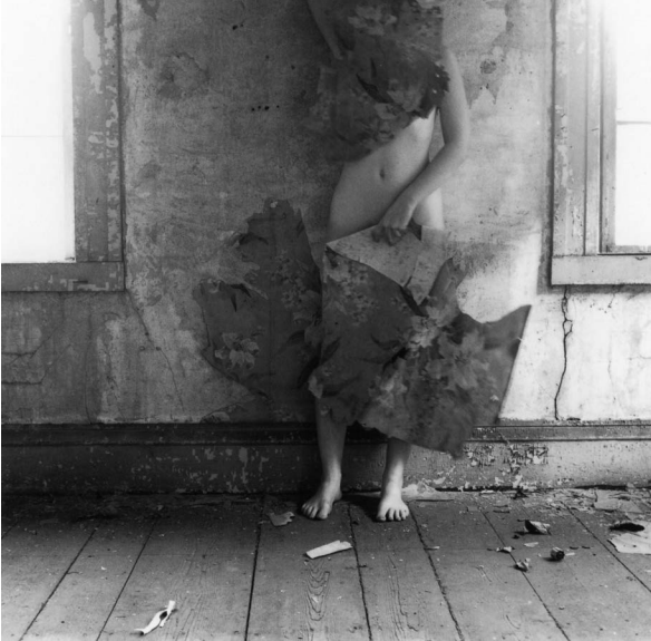
FRANCESCA WOODMAN, THE OPTICAL UNCONSCIOUS, 1993

Francesca Woodman has used the person body from an outside environment to camouflage themselves to the inside surrounding. They’re making themselves apart of the inside. Almost like they have taken over the inside now, that they own it.
The place isn’t homely, and it makes the viewer feel alienated, as the inside doesn’t have any carpet, furniture, or wallpaper. The person is bringing the outside material in (wallpaper) and blending in with the inside. This is a different way of bringing together the inside, and outside, it also feels quite mysterious, the way Woodman has framed the image. Woodman has chosen not to frame the face, which makes the body blend into the inside better. The way Woodman has framed the windows is interesting. It draws you away from thinking about the outside and directs your viewpoint straight to the body.
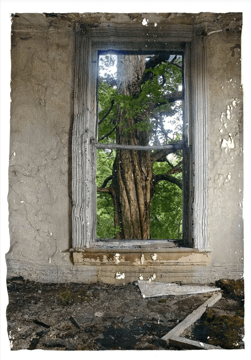
KEV FILMORE, INSIDE OUTSIDE, 2011

Kev Filmore has framed the inside and outside together. This juxtaposition shows the dead, uninhabited, muted, rotted, ugly, dangerous inside and frames it with a beautiful, alive, colourful, fresh tree outside surrounding. Placing together two opposites works, this shows development over time, the inside has disintegrated, but on the outside is a flourishing, lively environment.
The way Filmore has framed the image, making the window central is smart because this leads the viewer eye towards the window. The colour palette also helps with this, as the inside is a muted colour and the outside is colourful.
The image is different from Woodman’s image above, rather than camouflaging or blending the inside and out, Filmore has used the window as a wall of division. Dividing itself from the ugly to beautiful, or the rotted to growing.