In this unit, we have to produce our photography website, to do so, I am looking at other photographer websites and seeing all the design, layout and structure details together. Below are examples of people I look at, with concepts in mind I am going to put on my website.
KANNETHA BROWN
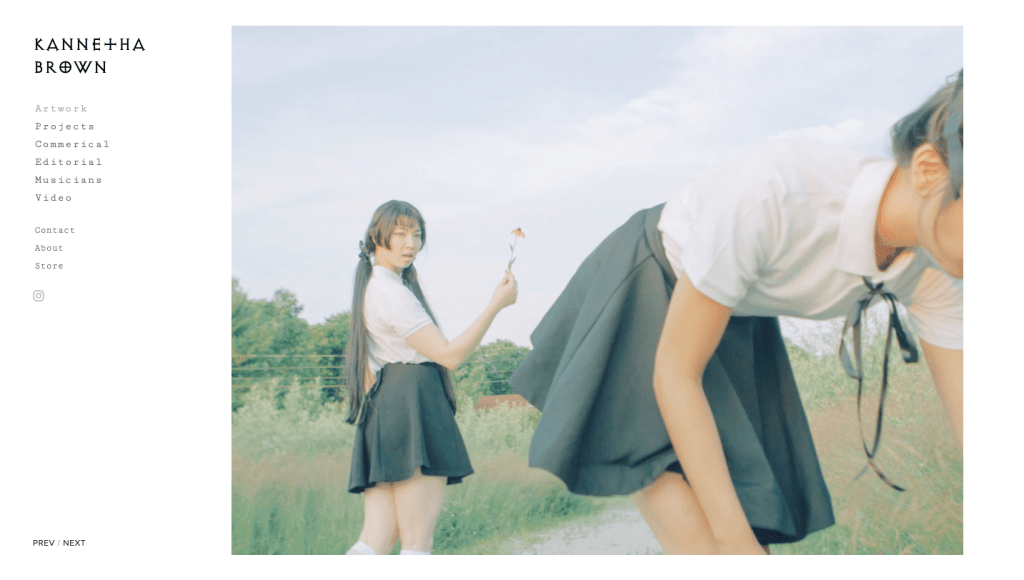
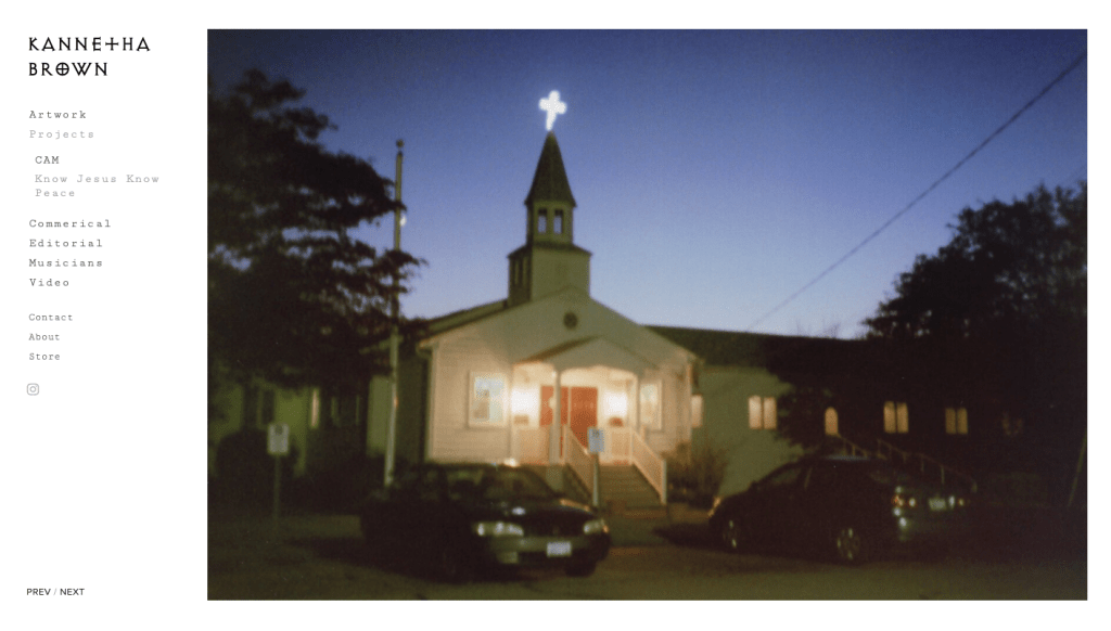
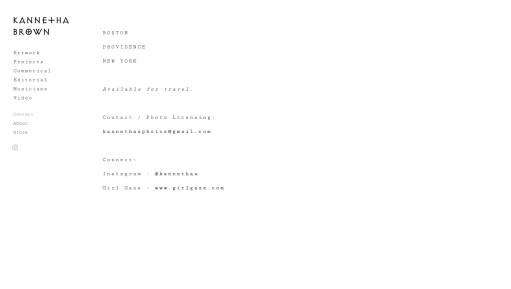
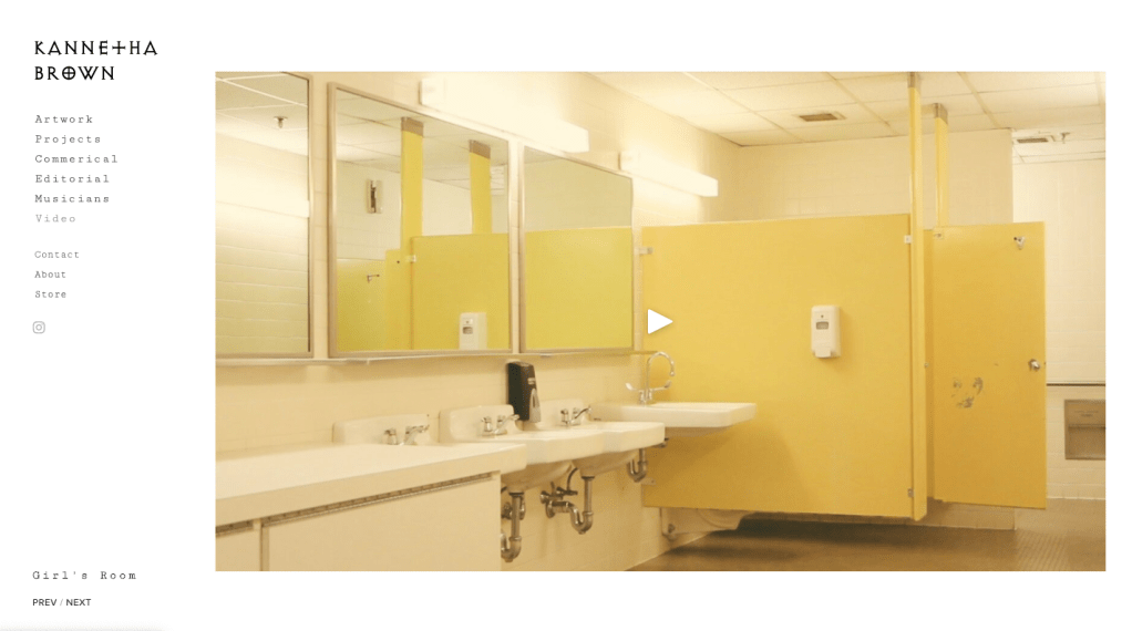
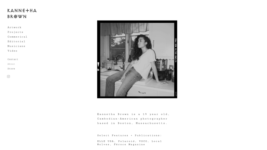
I follow Kannetha Brown on Instagram and loved the simplistic of her pages. The use of different, but minimal fonts makes it unique. But the layout makes her work stand out. Her page about me is also short and straightforward, which I like because as looking through lots of websites I see that some people write lots of small amounts. This may be down to age and lack of experience, but I feel that the audience is there to view your work, and perhaps don’t want a lengthy paragraph about the individual. On the other hand, if you have great partnership/clients or awards, I like the way Brown has display it, in a list format. Overall I love her website, with the choices of keeping everything simple.
HARIS NUKEM
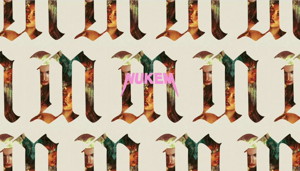
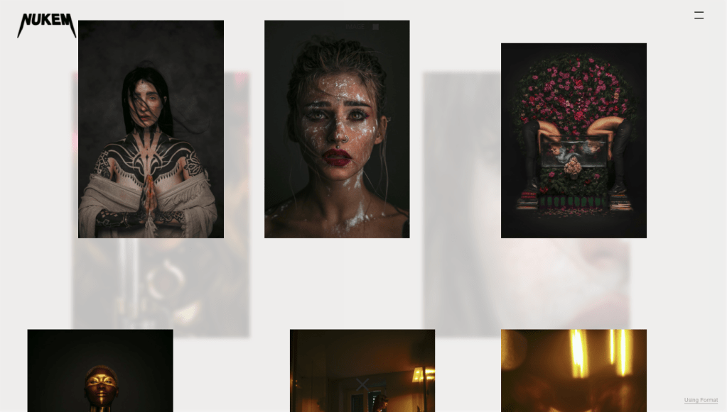
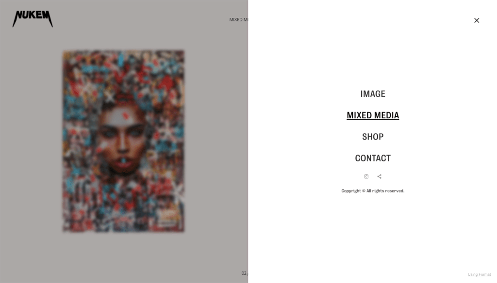

On the other hand, Haris Nukem website is the complete opposite to simple. First, as you open the site, you’re greeted with an intro page, which leads you into the main website, and then instead of scrolling down to looking the images, you scroll horizontally. Each photo is placed together with muted colour boxes, which somehow really works if you didn’t want to view it this way; there’s also an option to see it in a grid format.
SYNO KEY/SOBERIKA LEEWAY
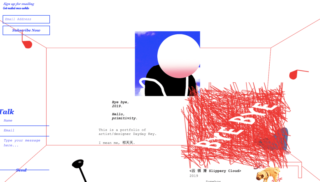
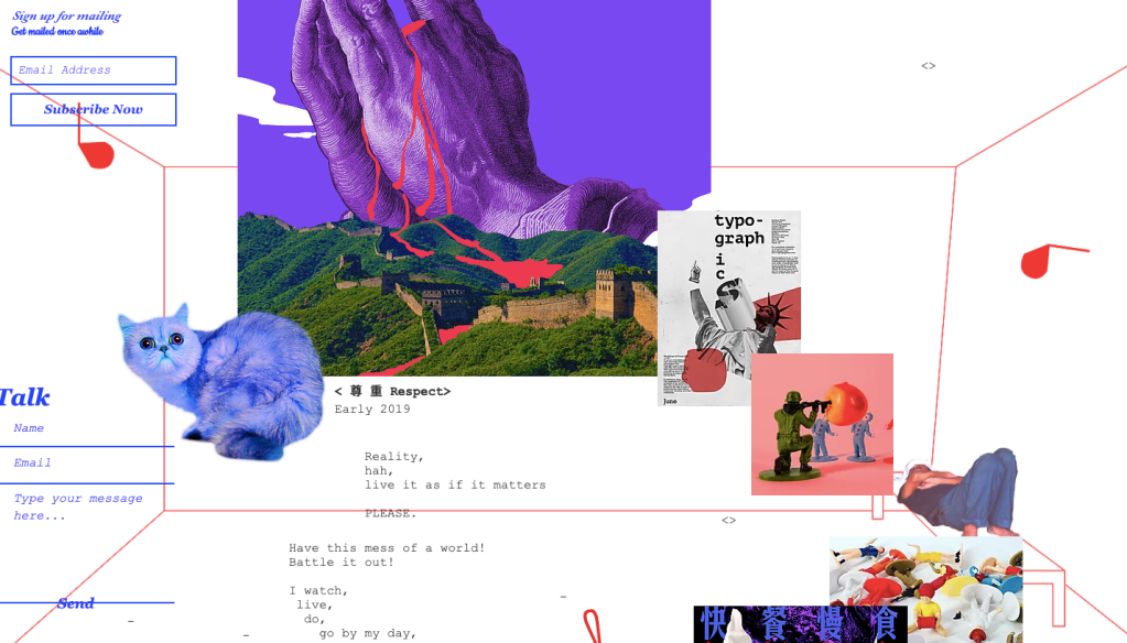
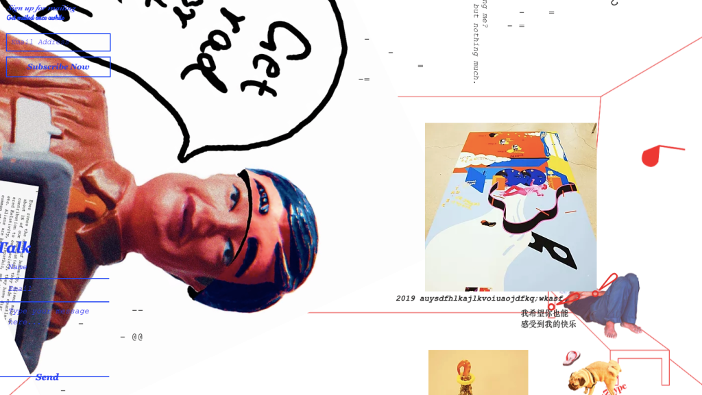
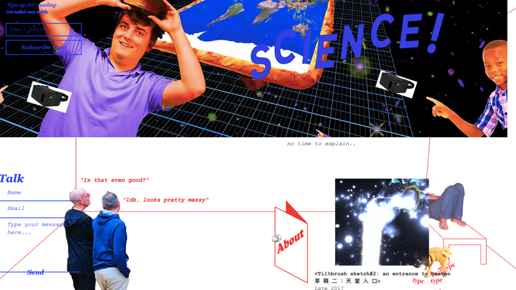
Even though this website isn’t directly photography, i appreciated the time and effort that went into building this site. It is so unique, as you scroll through you see a bit of work merge with little details about Soberika Leeway. I have never seen a website like this before, but it works.
https://www.invertgallery.com/
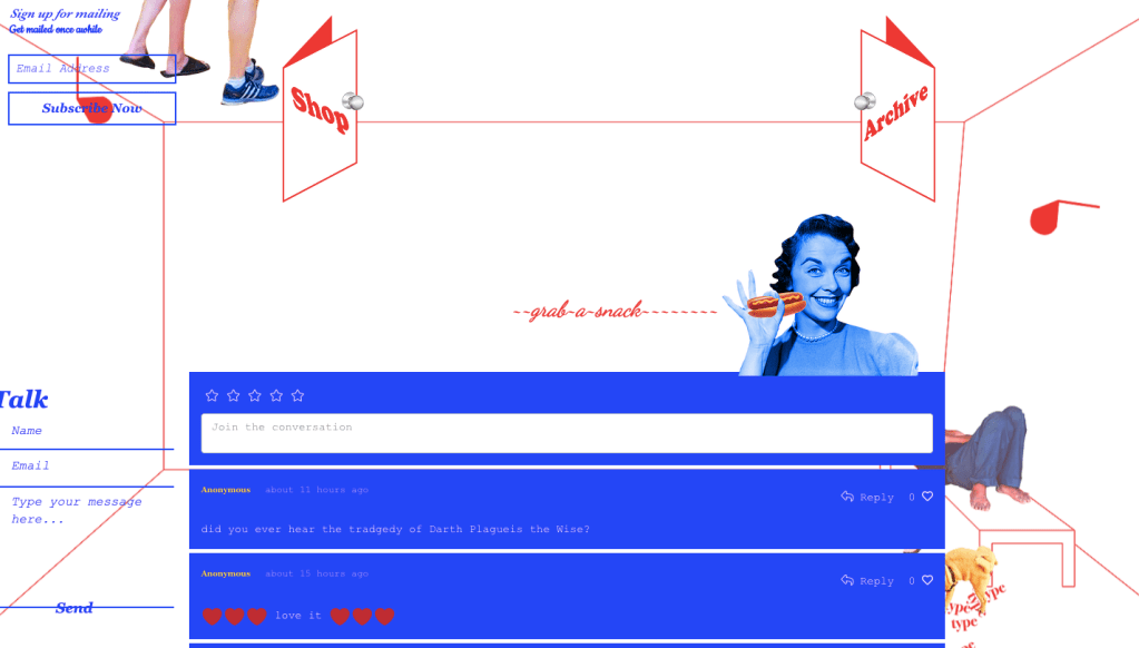
STYLISTS IN CRIME
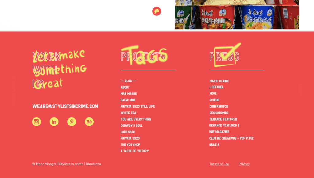
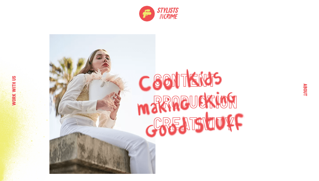
Stylists in crime is a company that has much photography within it. The layout of this site is excellent and again, full of surprises. As you hover over parts of texts, and overlay of something else pops up. Making the website feel more creative but relax. All the small details from the logo, to the spray paint effect, really brings this website together.
https://www.stylistsincrime.com/
TIZIANO DEMURO
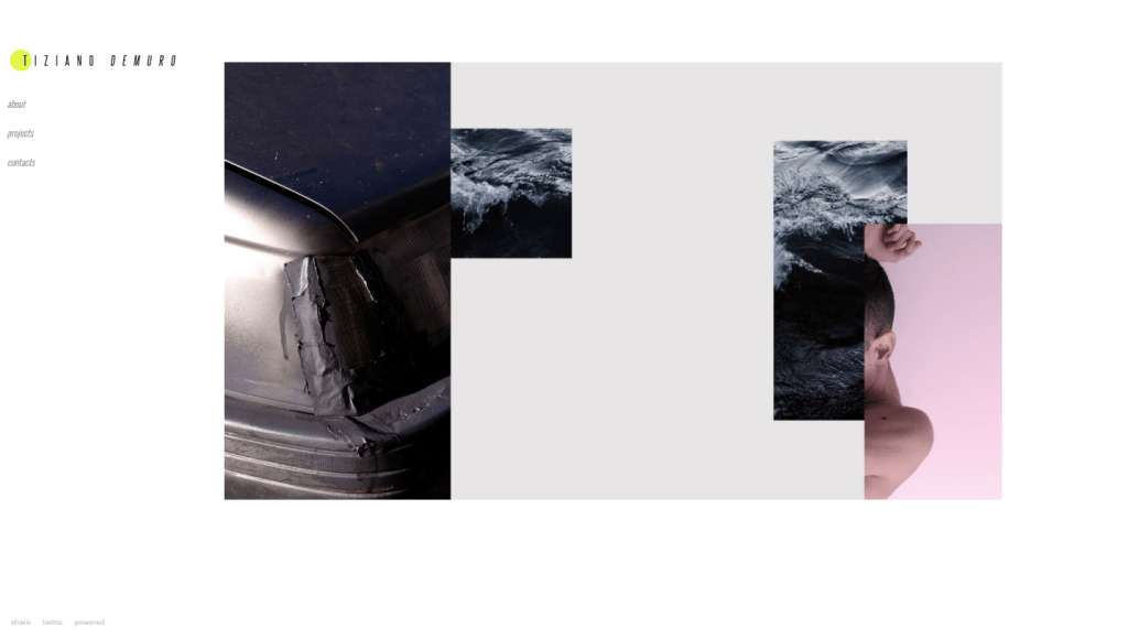
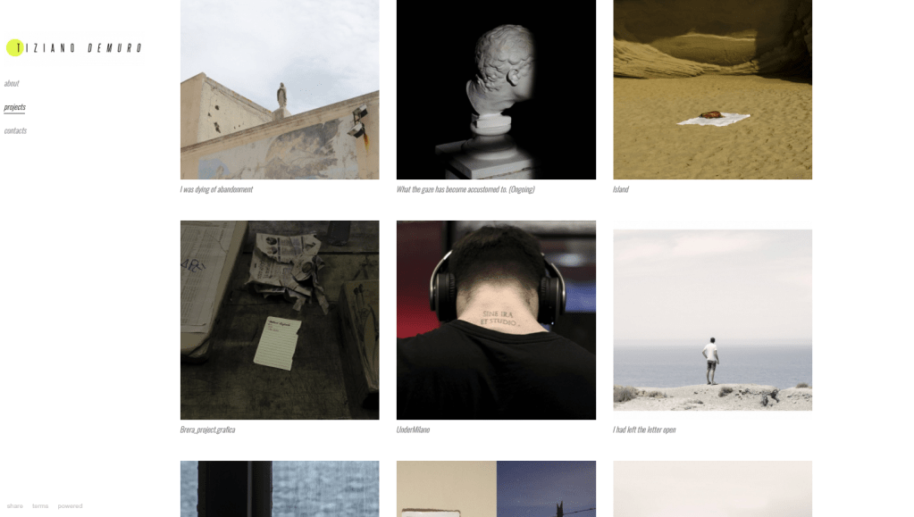
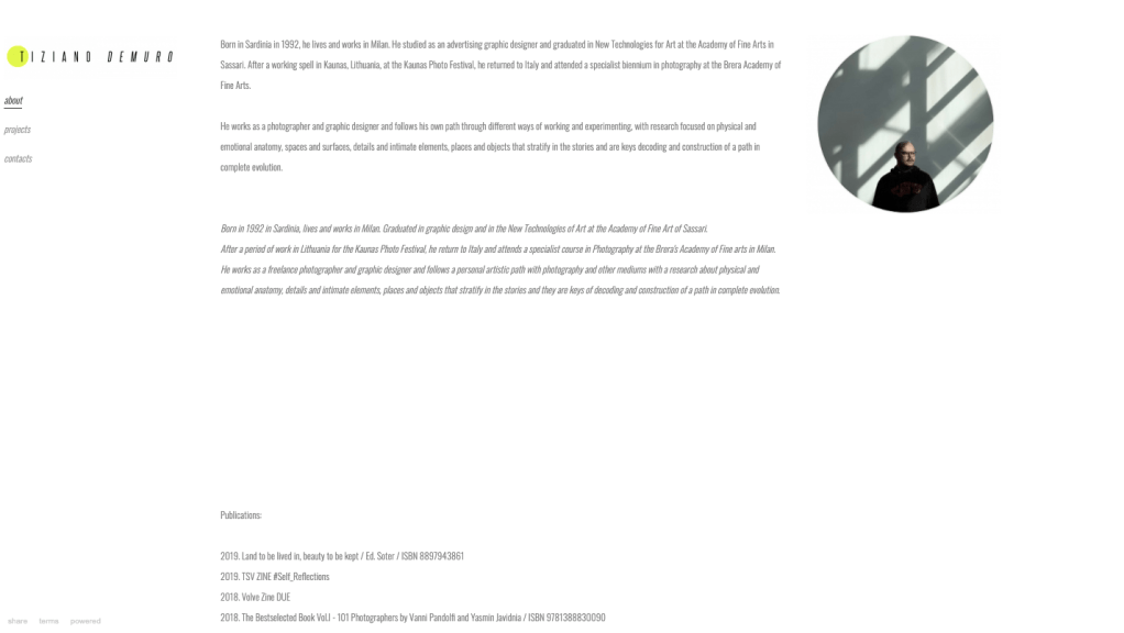
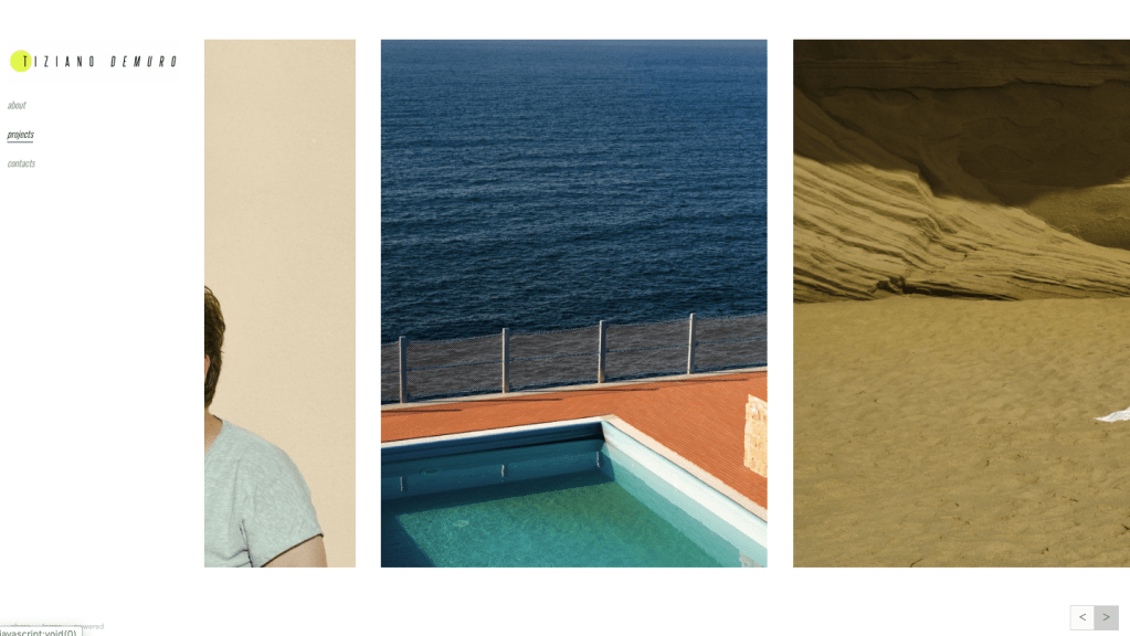
I also follow Italian photographer Tiziano Demuro, and I think his website makes his work stand out clearly than other sites. The layout of each page is clean, simple, and modern. Like Haris Nukem, from above, each one of his projects you scroll to the left to right. Using this method makes the images of the projects feel like a series. When creating my site, I am going to try this. On Demuro homepage, he has a digital mix-media collage of images, that do not make sense with each other. However, the placement makes it feel unique.
