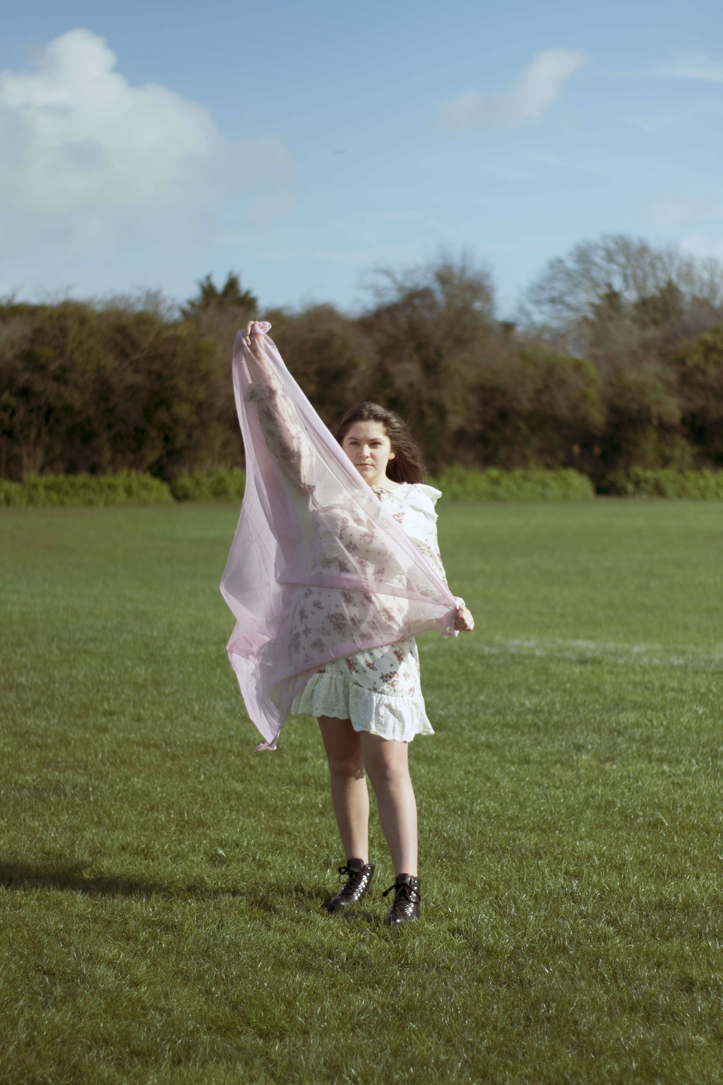
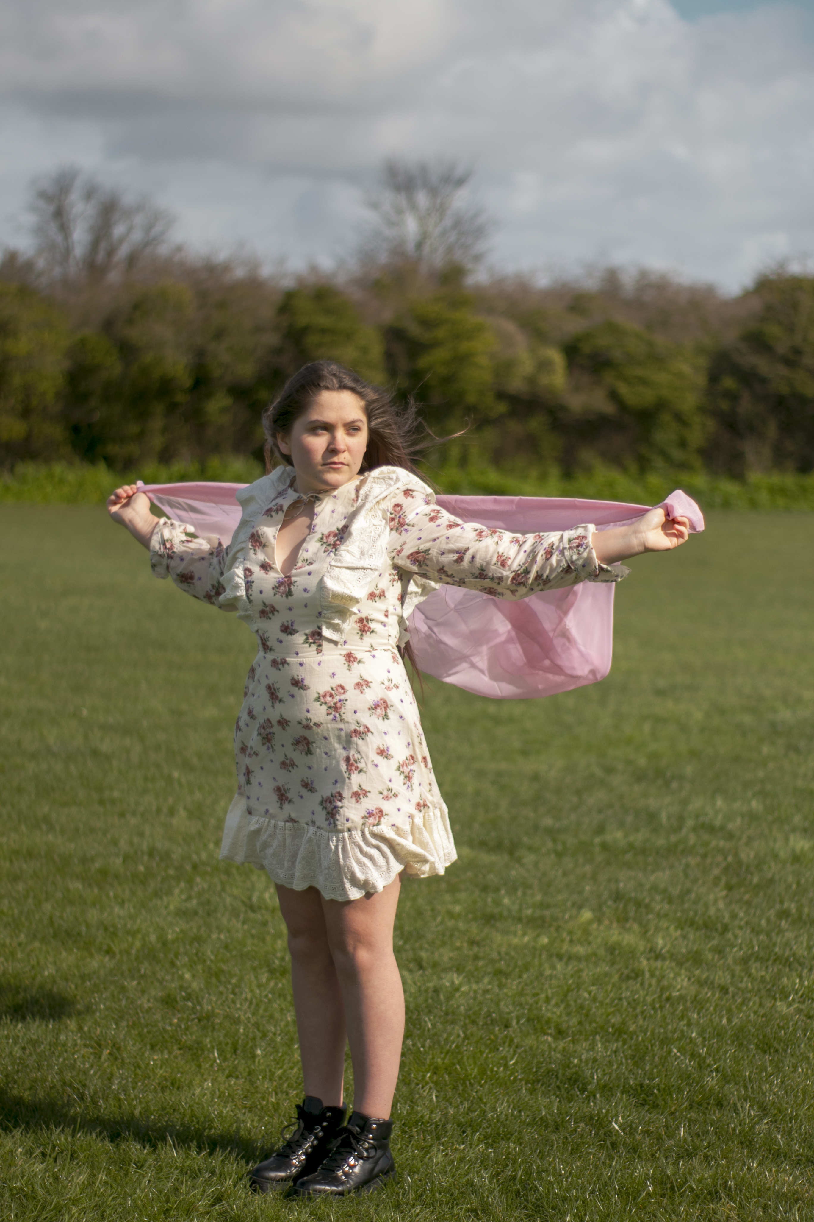
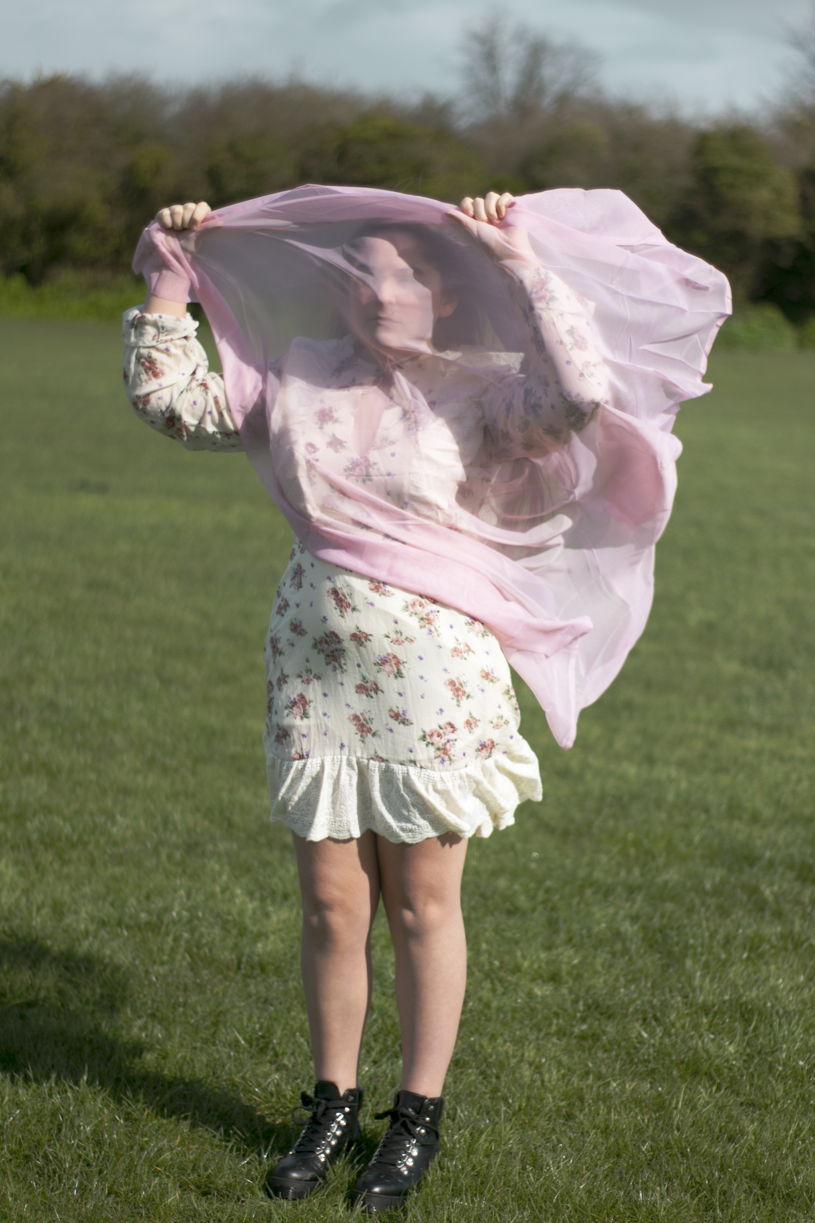
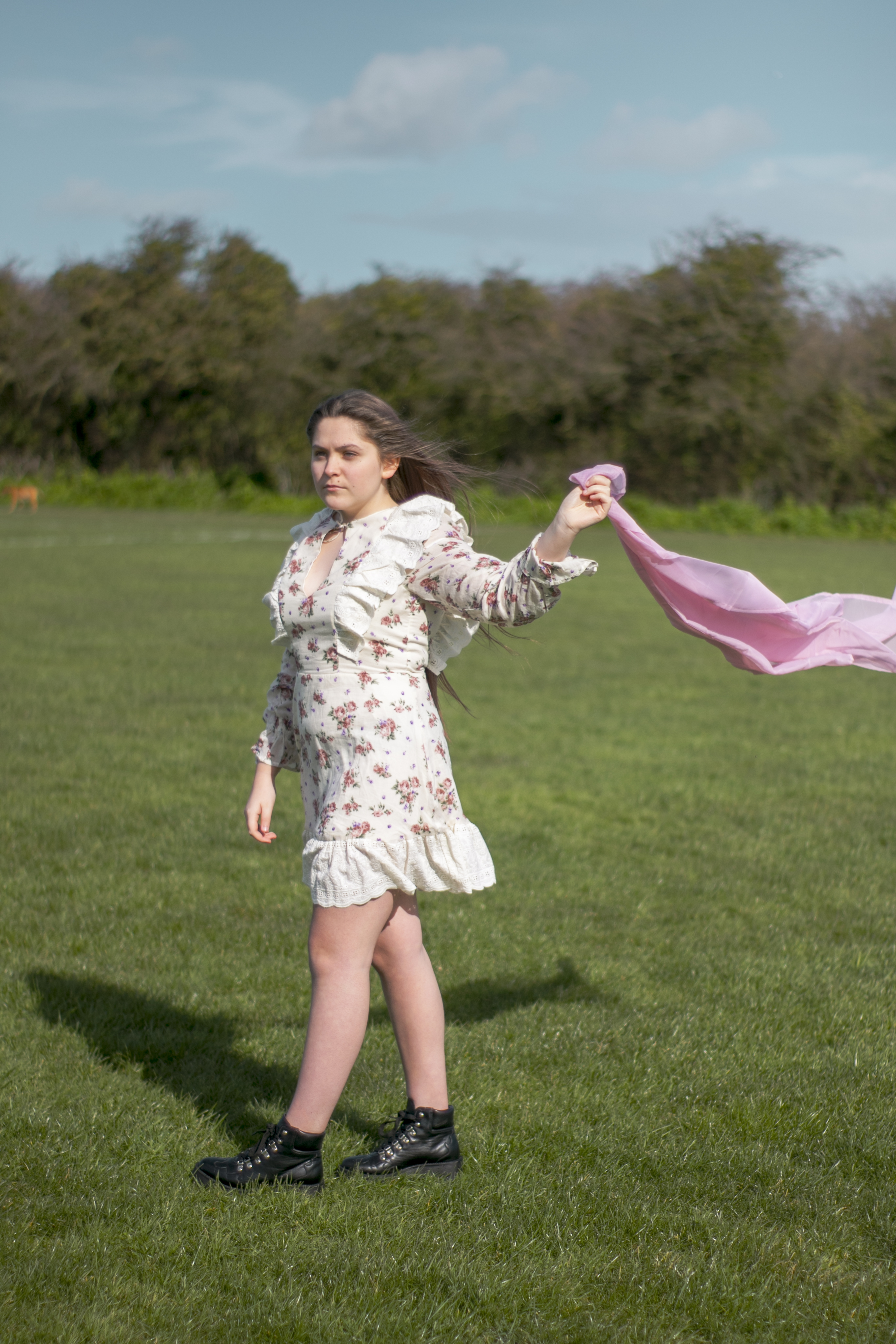
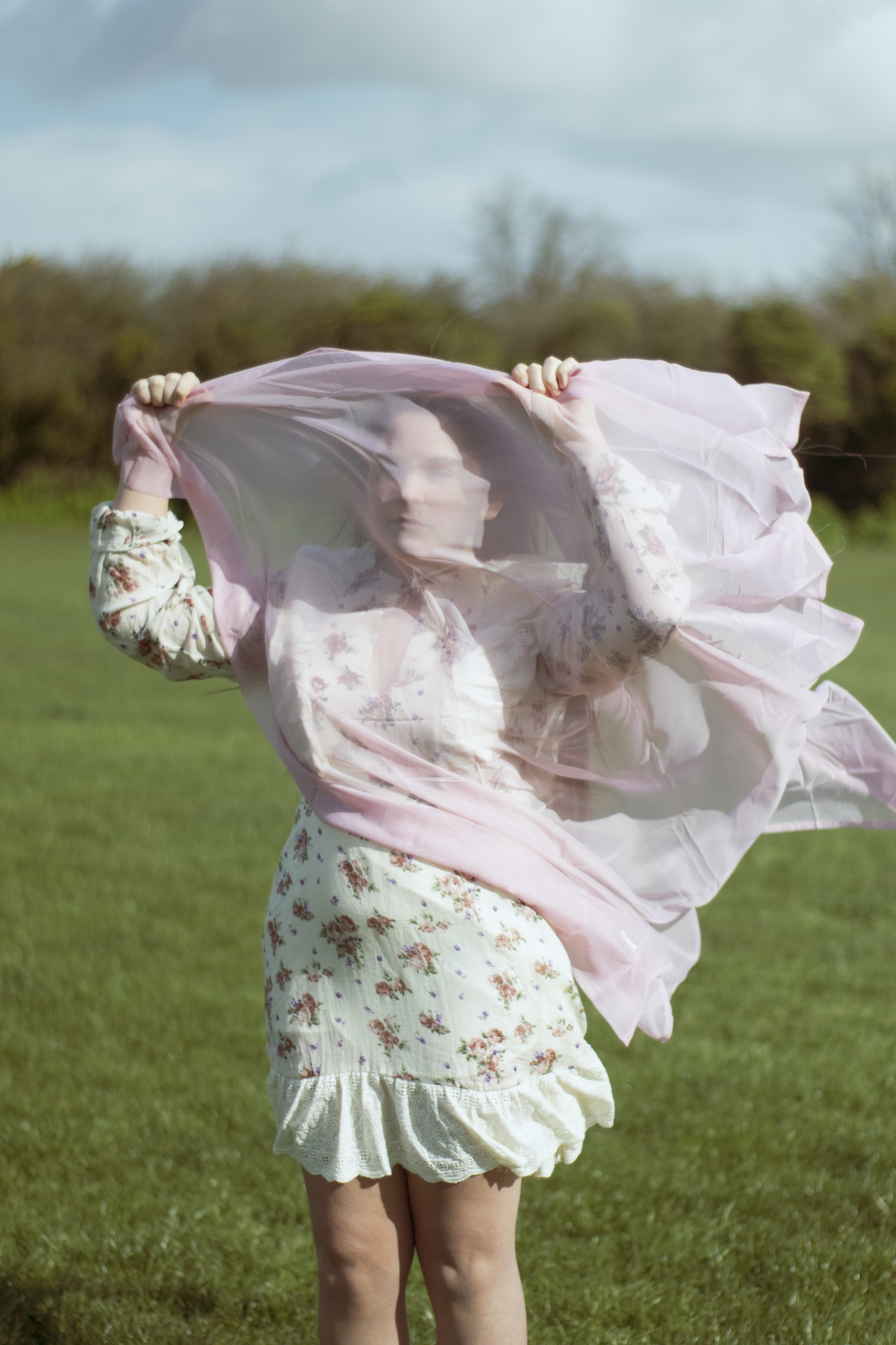
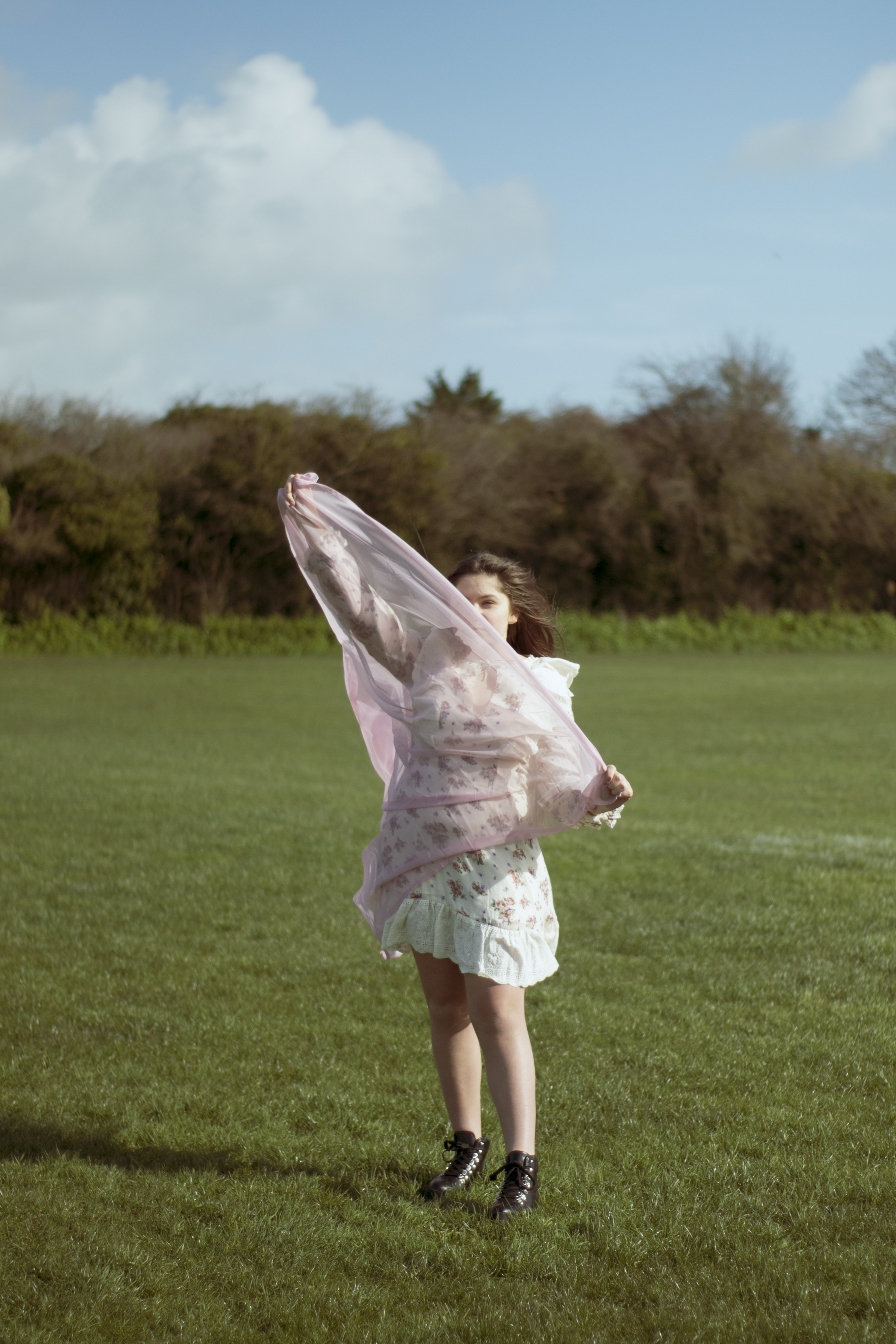
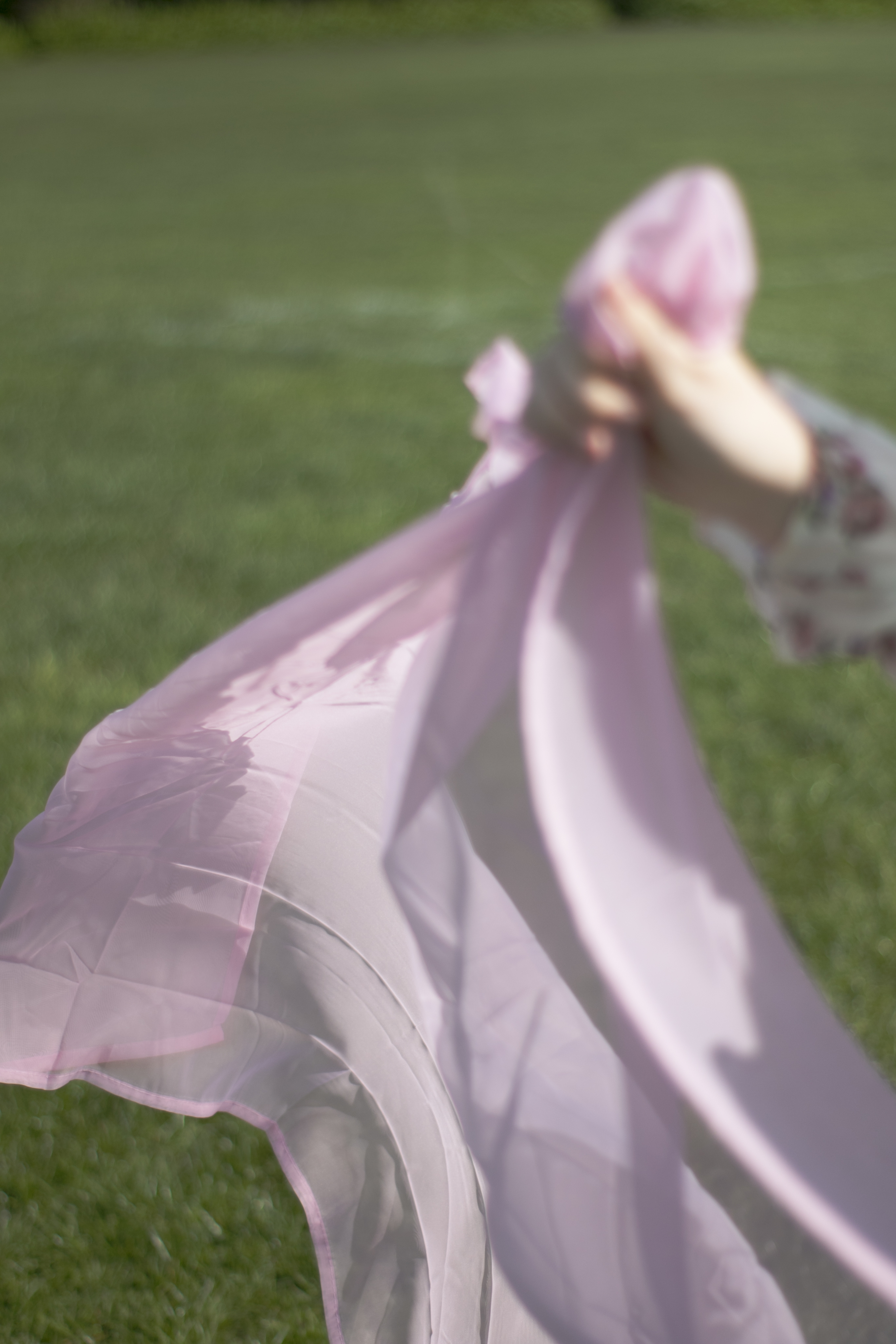
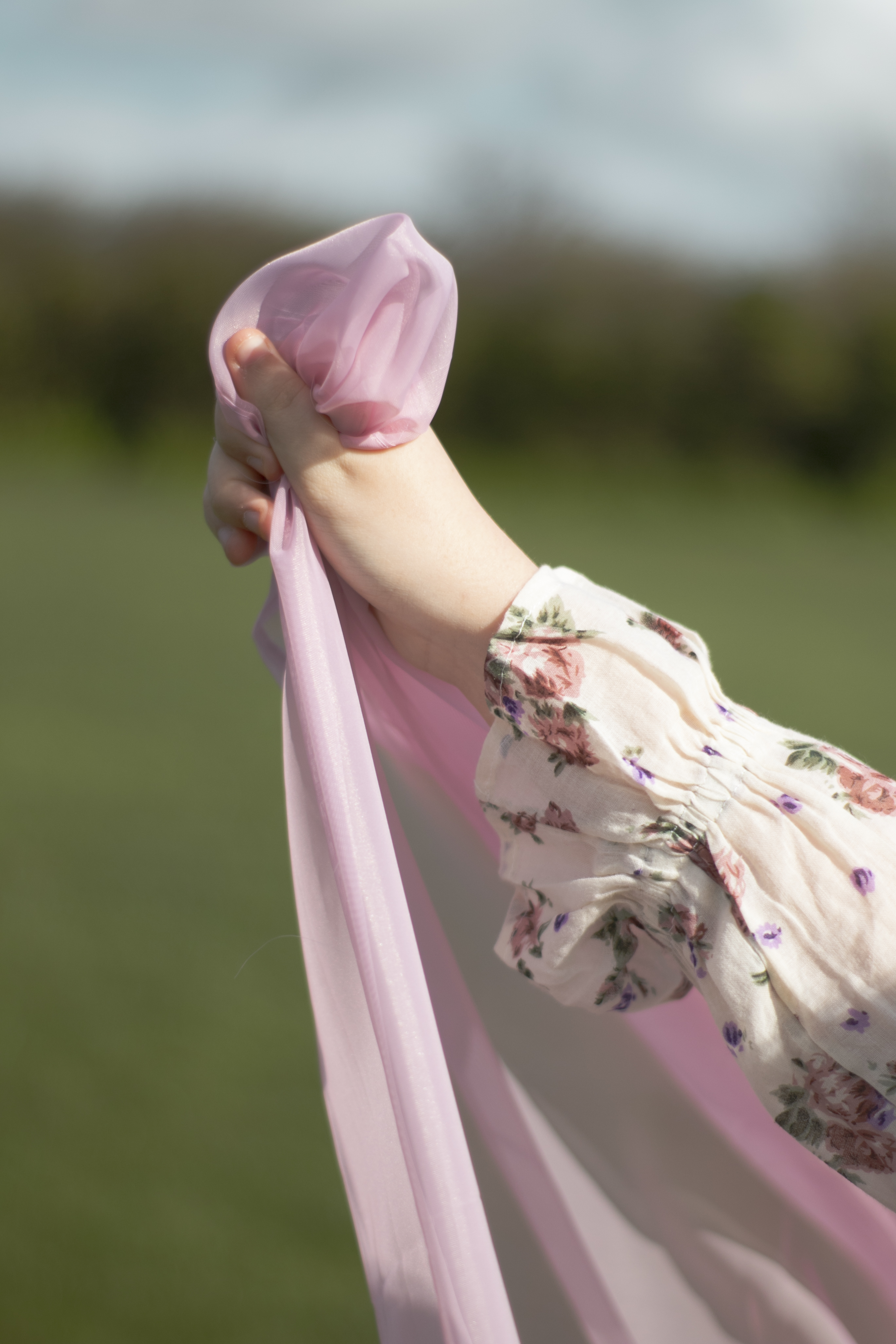
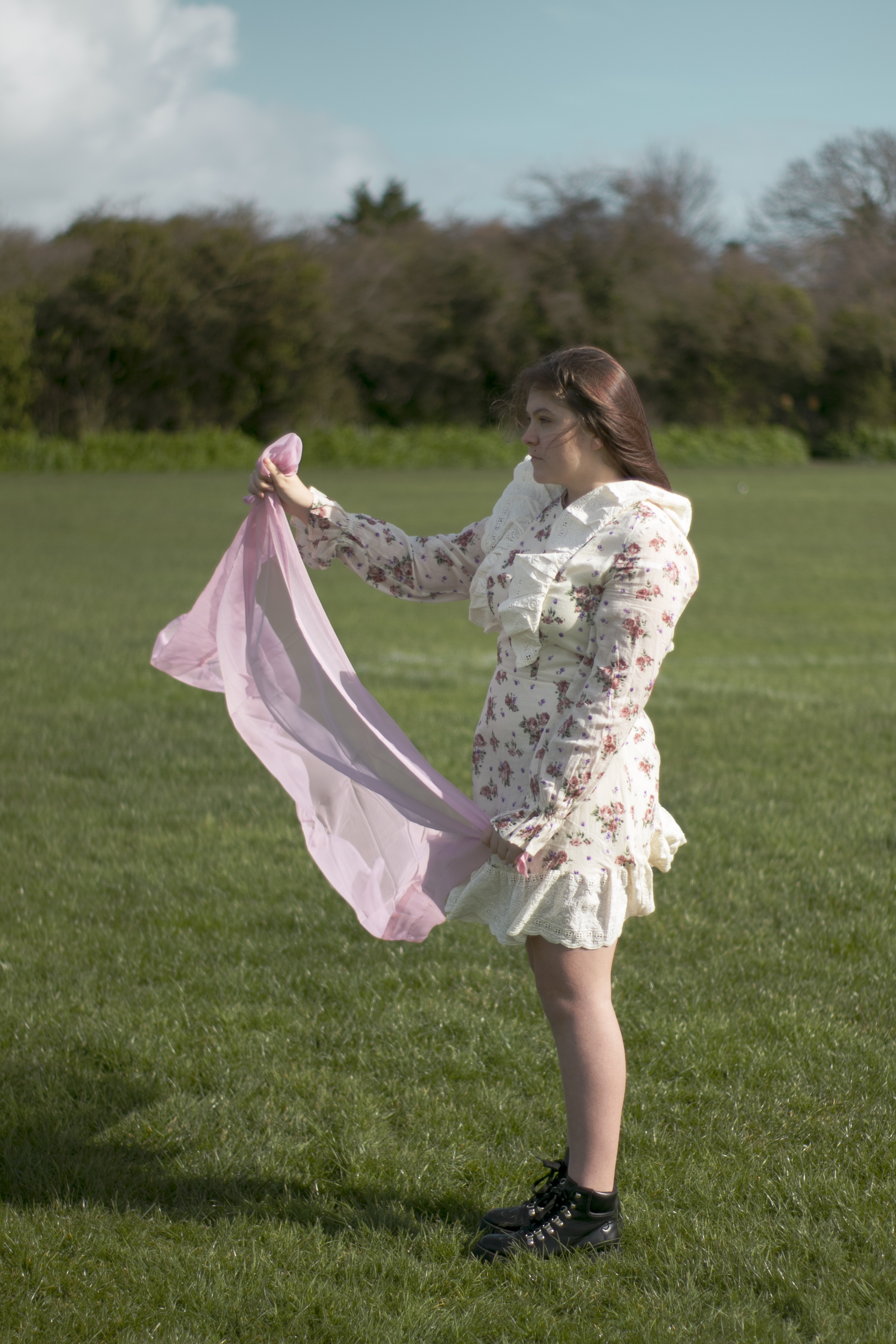
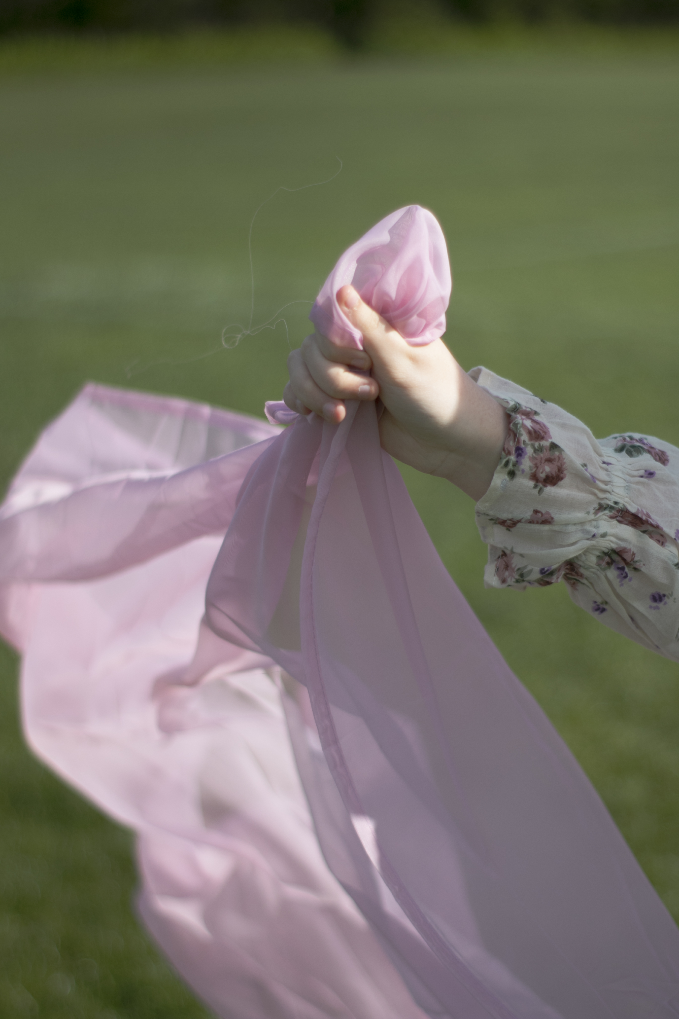
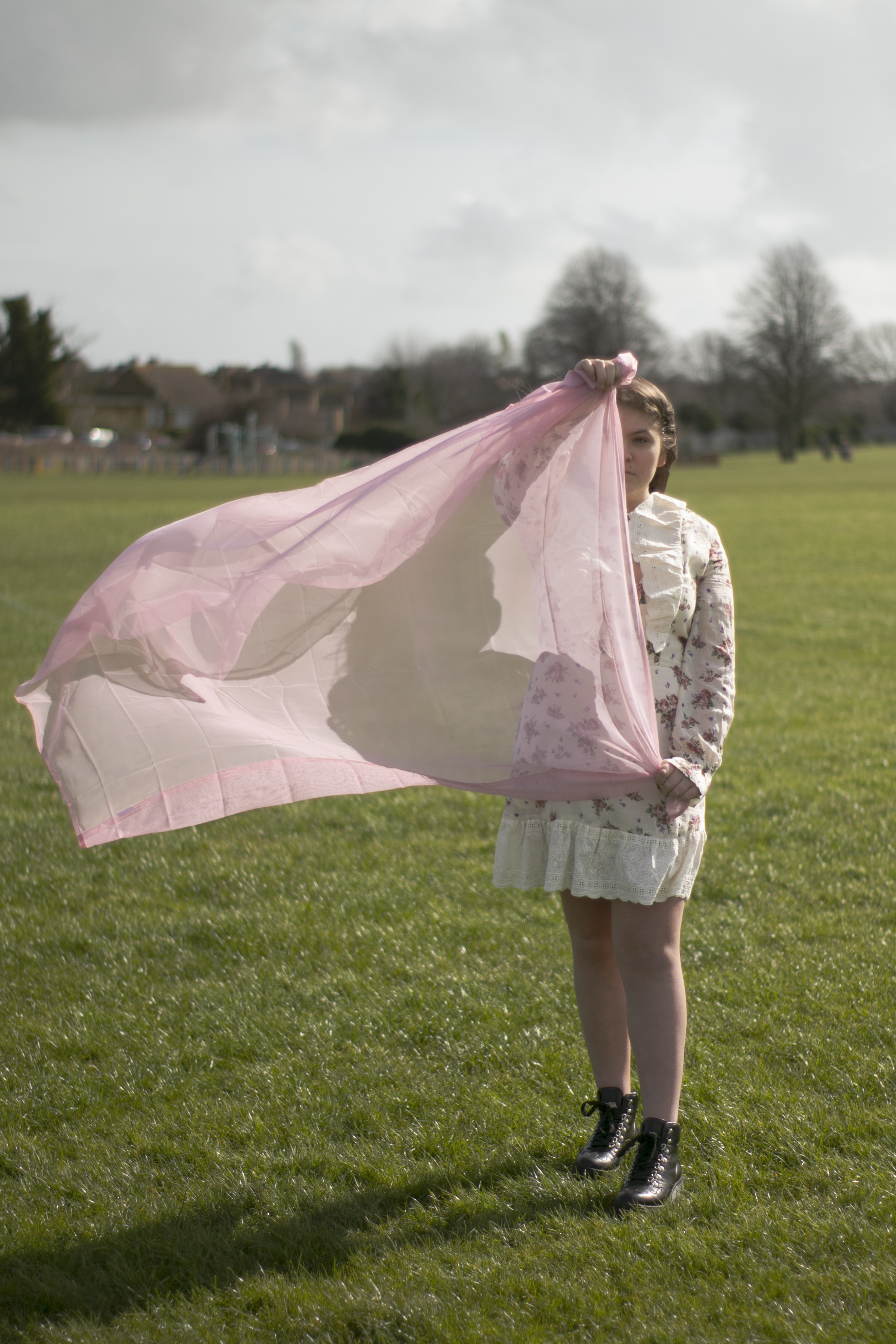
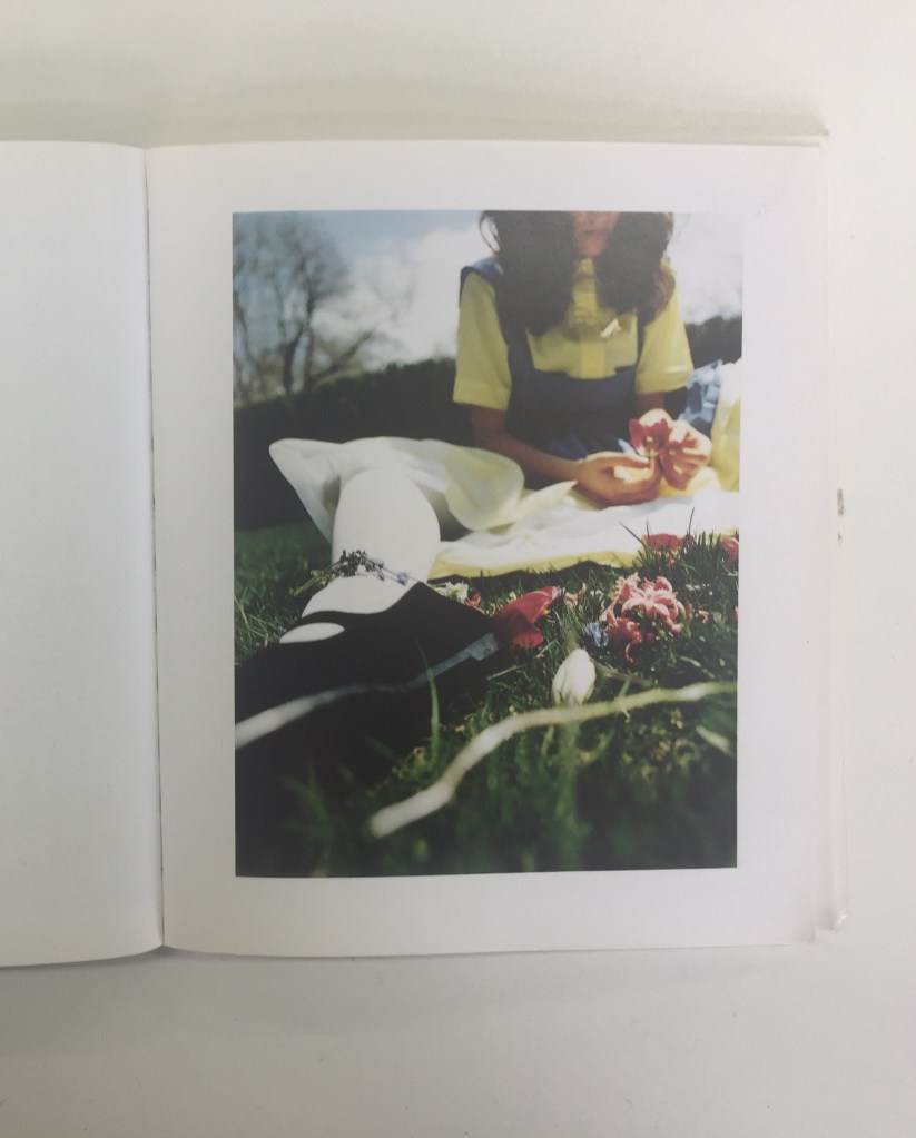
For shoot 3, I wanted to do something a bit different. I’m not sure if it will work at all, but I feel it will be abstract. However, it will fit in with the theme. I’m planning to used different fabric and getting the model to pose/use the materials in various ways to disguise/hide.
LOCATION
Initially, I wanted to go to the beach; however, as I took some with my other model in shoot 2, I thought it would look too the same. So I decided to go to a location where it is windy and open. This is going to be in a field, there a couple of local areas around, but I think the one I have chosen will be the best option.
EQUIPMENT
Canon 70D body
50mm lens
18-55mm lens
Polaroid camera/film
Model (Ruby)
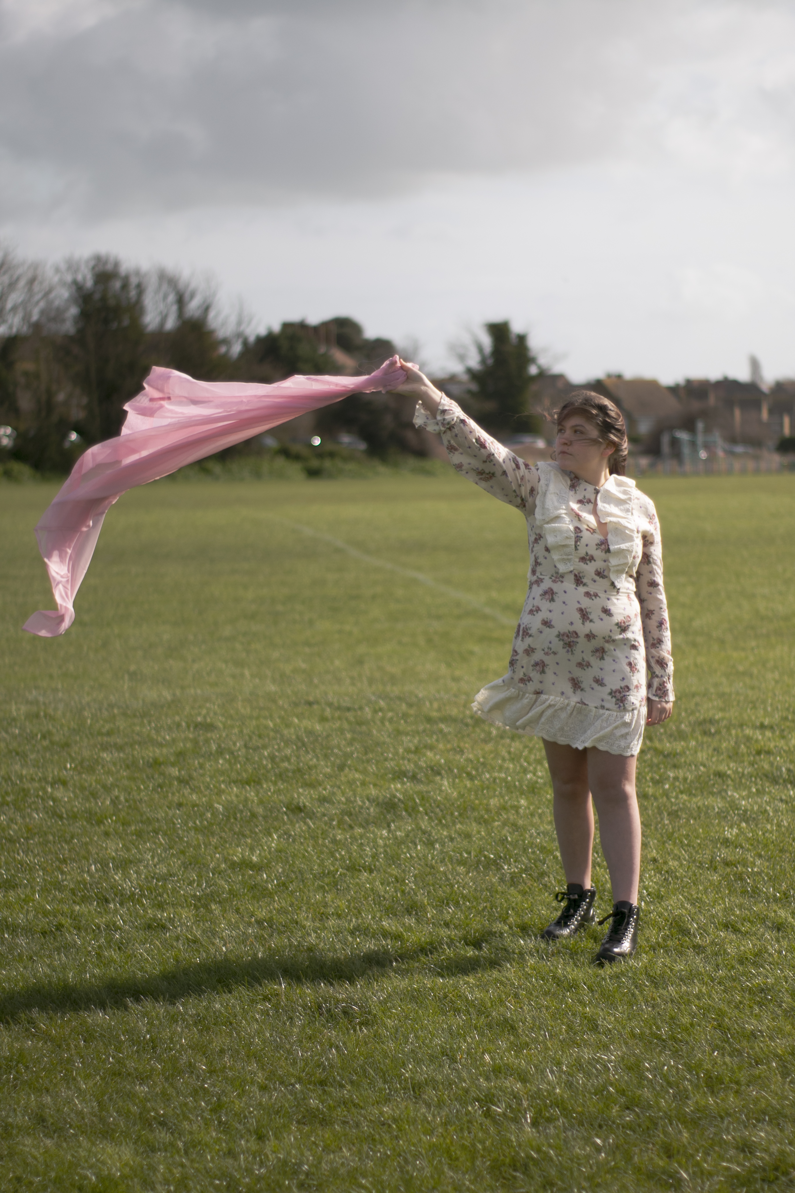
Frilled Dress
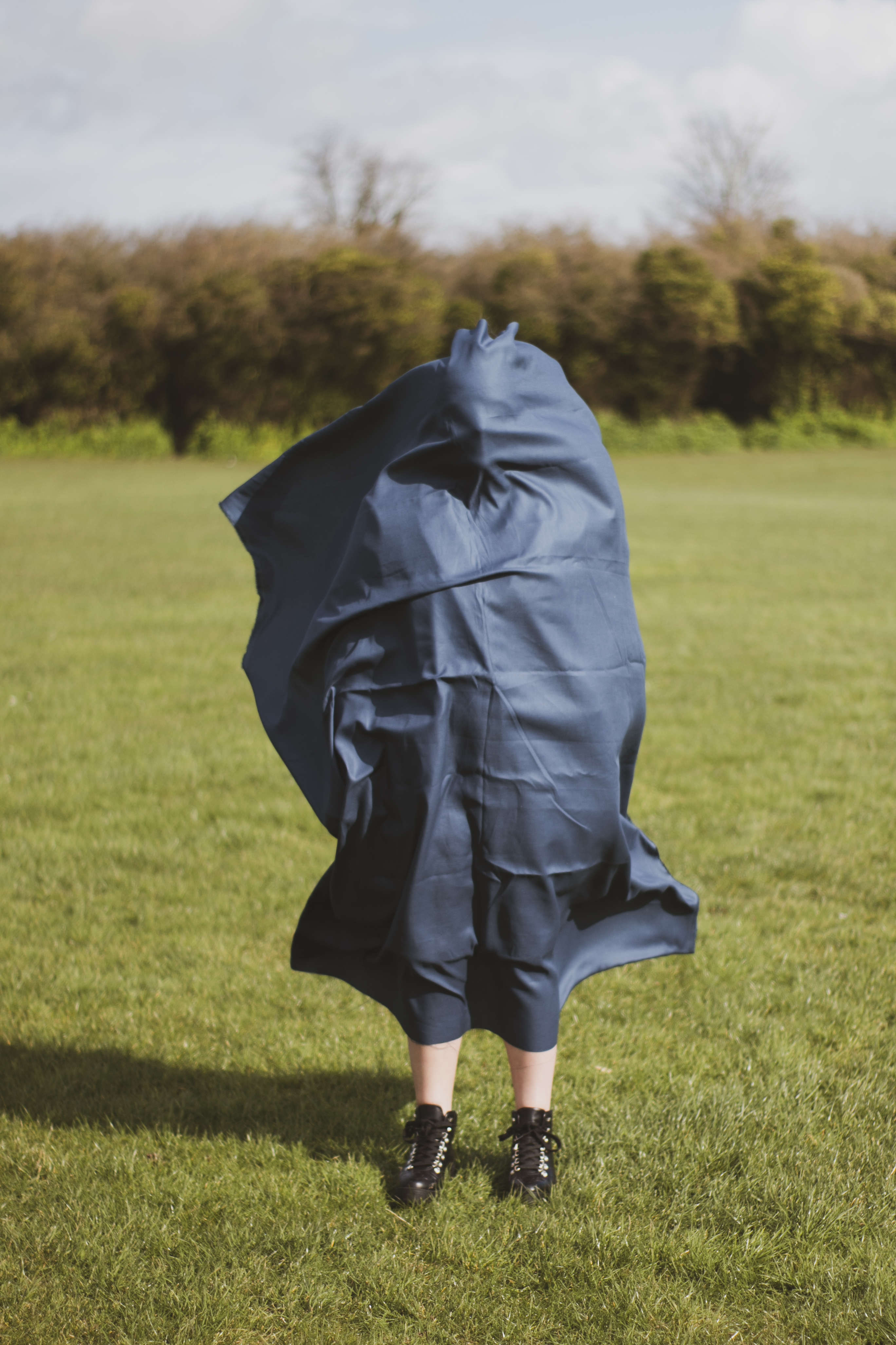
Material (Pink sheer & Navy blue)
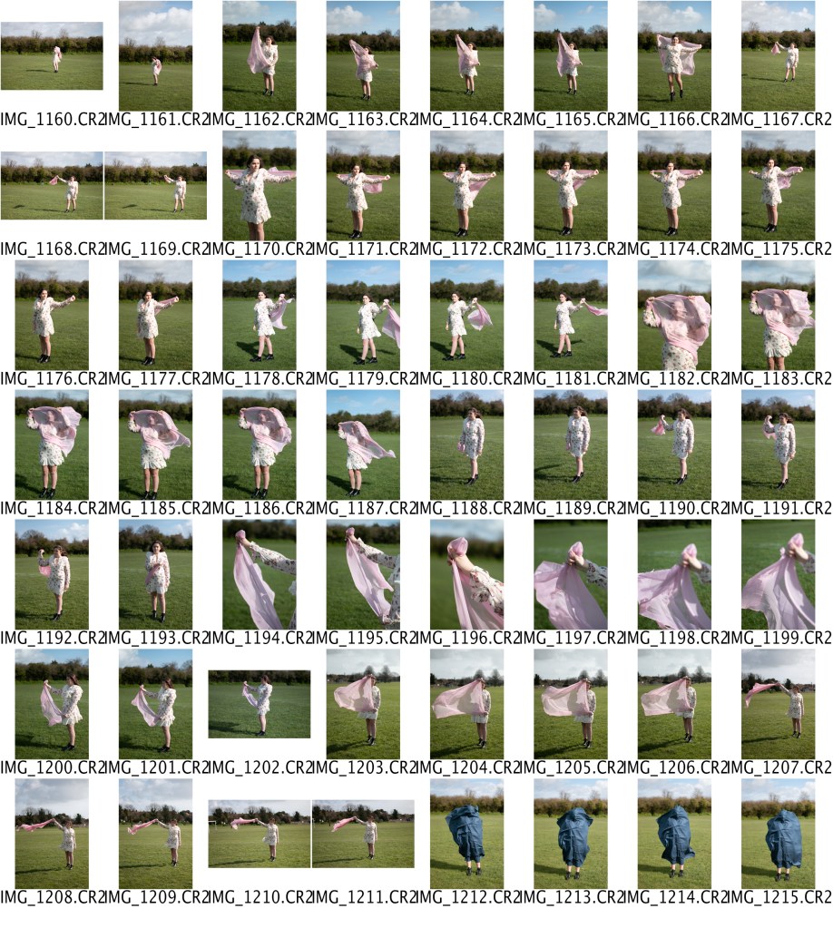
CONTACT SHEET
RESULTS
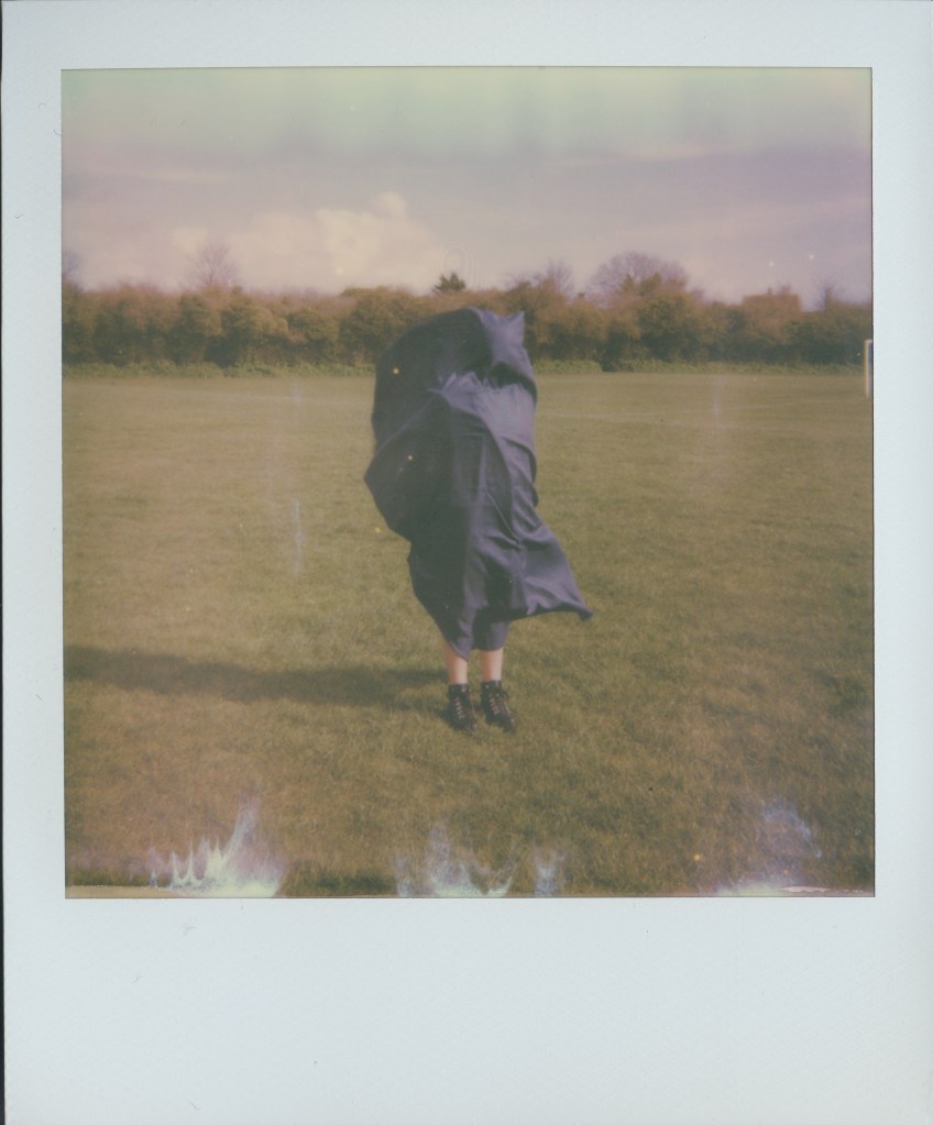
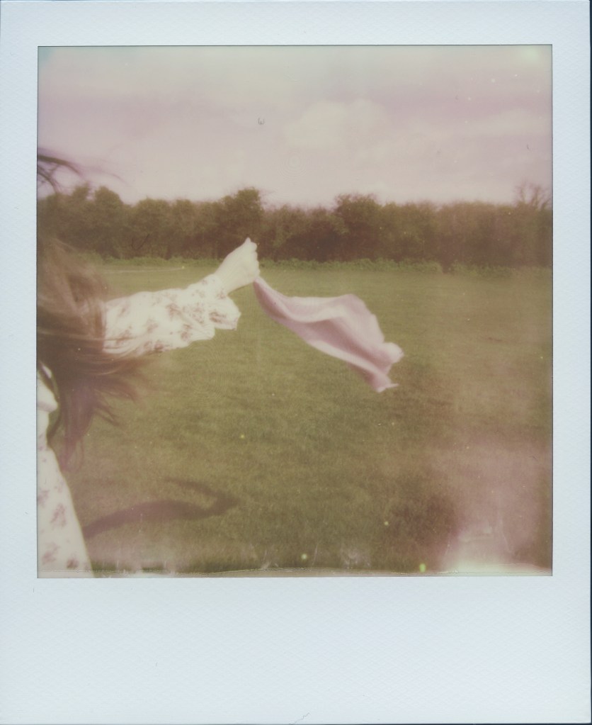
RESULTS OF POLAROIDS
The shoot was a lot harder than I thought; the wind went in different directions, which made the timing/angles of the material hard to take. The weather was constantly changing, which made the condition harder, as well. When positioning the model and the fabric to how I wanted it, the wind moved it straight away, so I had to be quick enough and have communications between the model and me. The blue fabric happen by accident, I let go of it and few into her face, almost like the scene in movies when the newspaper lands in someones face. So I place it in position, and this is how it turned out.
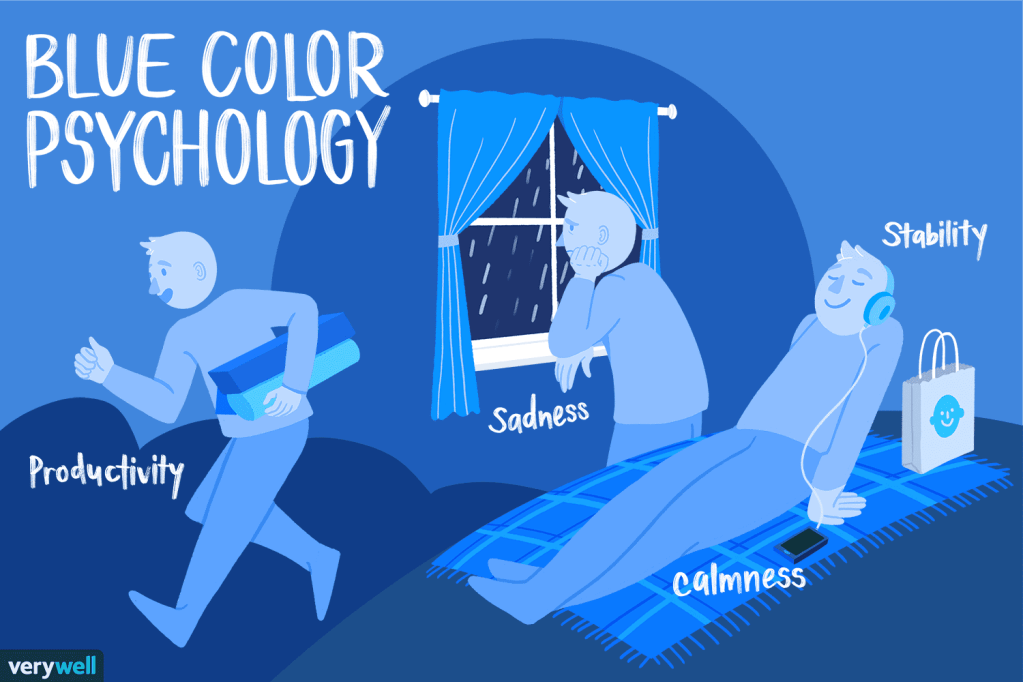
WHY I PICKED THE BLUE FABRIC
The colour blue can represent loneliness, sadness, etc. Thats why I wanted to incorporate the colour mood into my work, for the viewer to interpret, thats why I chose the blue fabric!
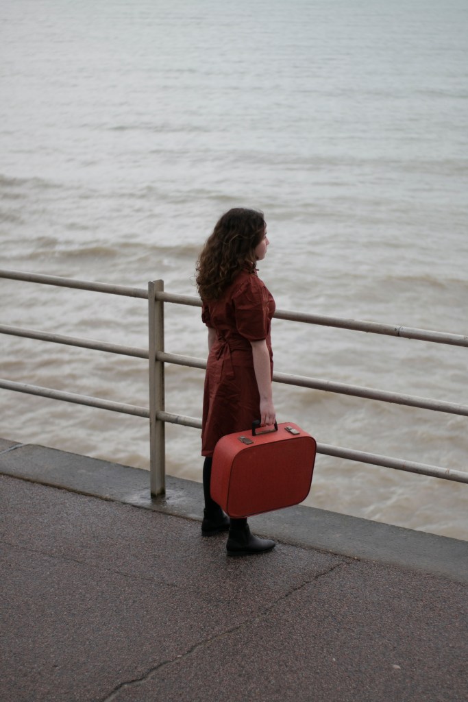
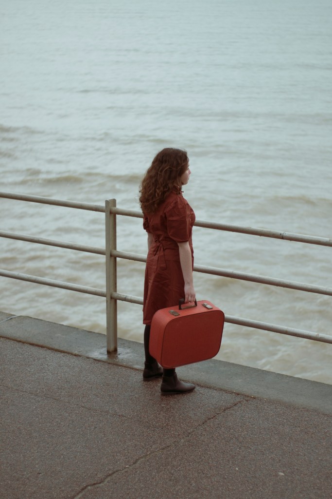
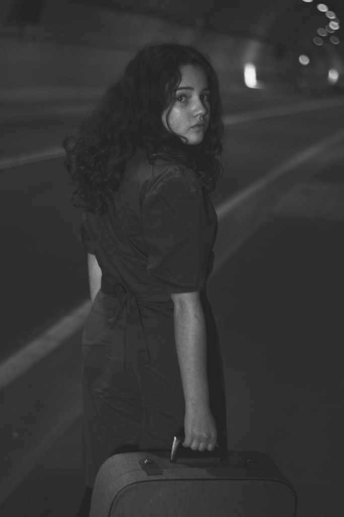
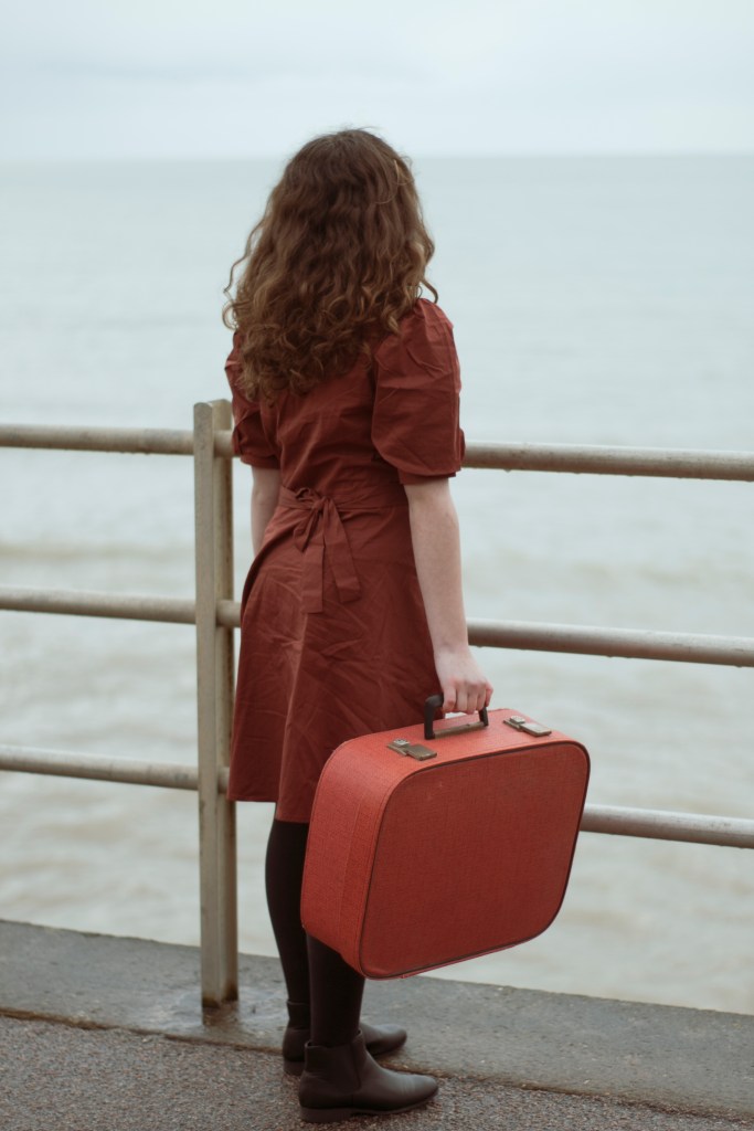
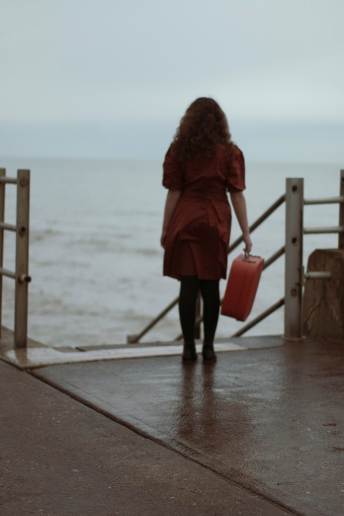
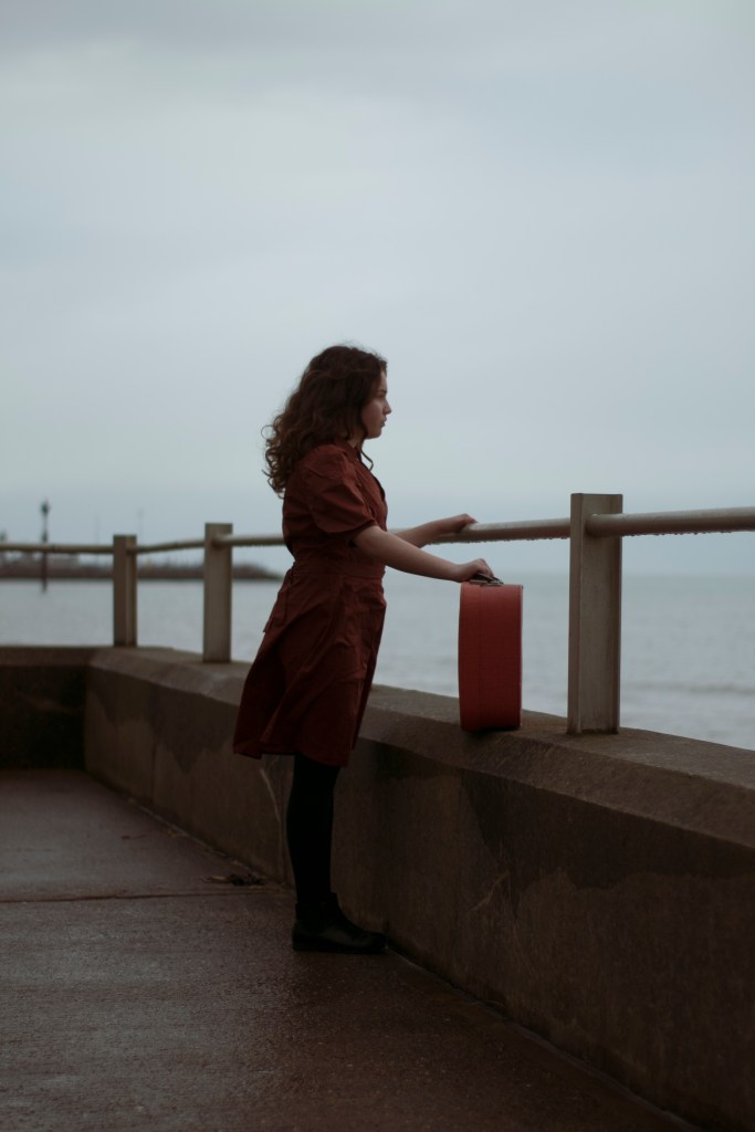
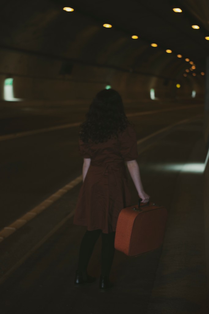
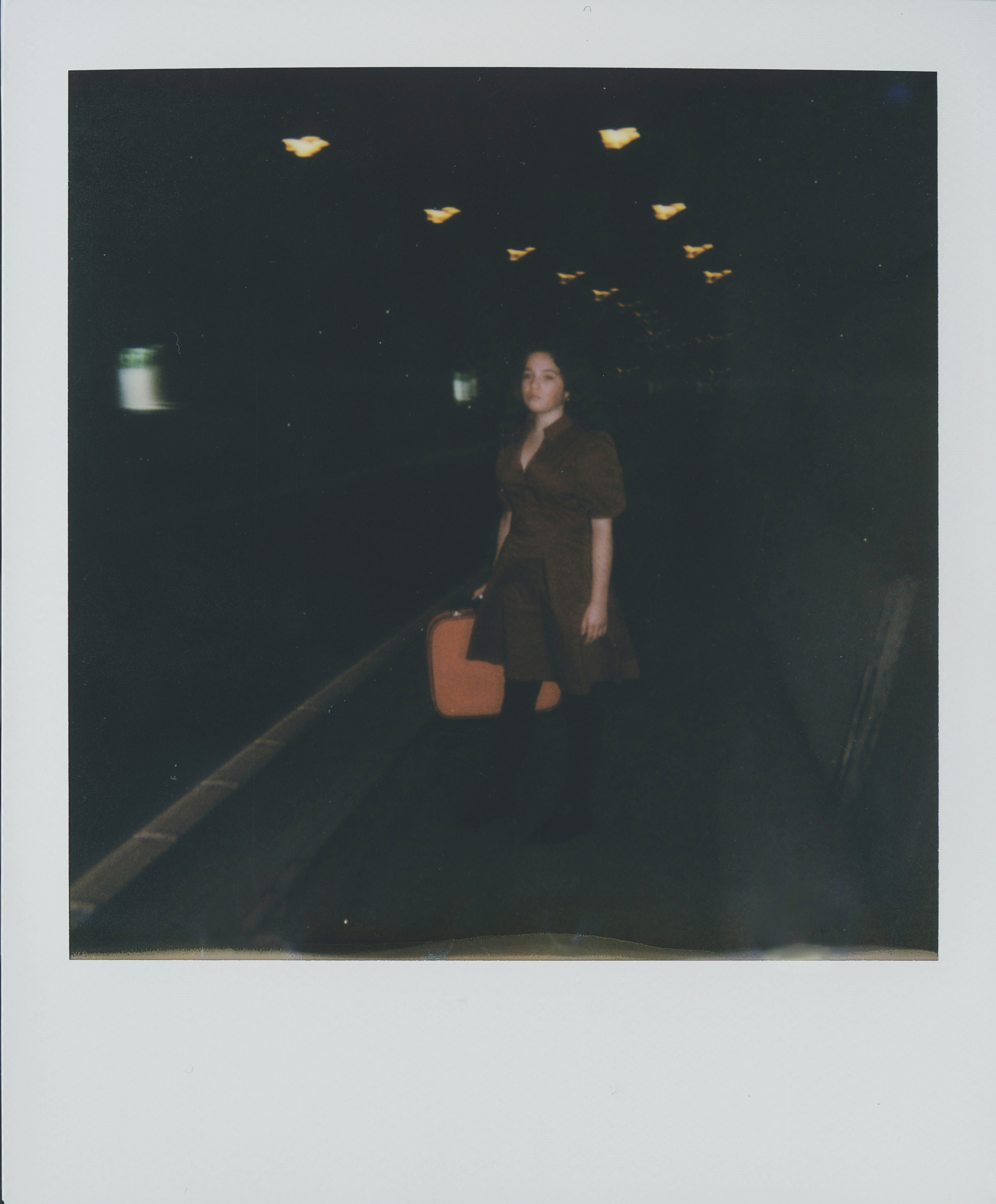
In shoot 2, i’m using my second female model on a location, with props. The idea for one image is for the model look likes she is lost/escaping. Hence the suitcase, in a isolated/empty area.
LOCATION
The location of shoot 2 is going to be around the Ramsgate port tunnel and sands. If safe, shooting inside the tunnel, as well as the beach/sea area.
EQUIPMENT
Canon 70D Body
50mm lens
18-55mm lens
Polaroid camera/film
Vintage suitcase
Black shoes
Red/orange dress
Model – (Leia)
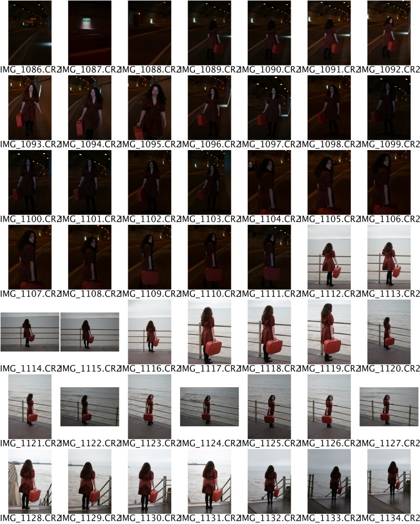
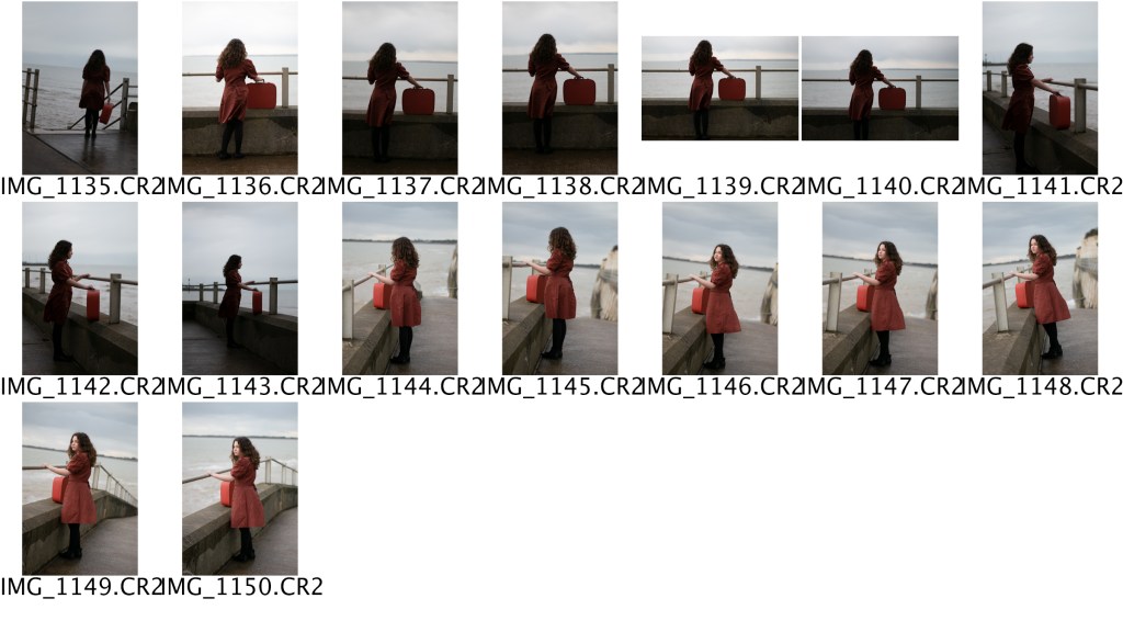
CONTACT SHEET
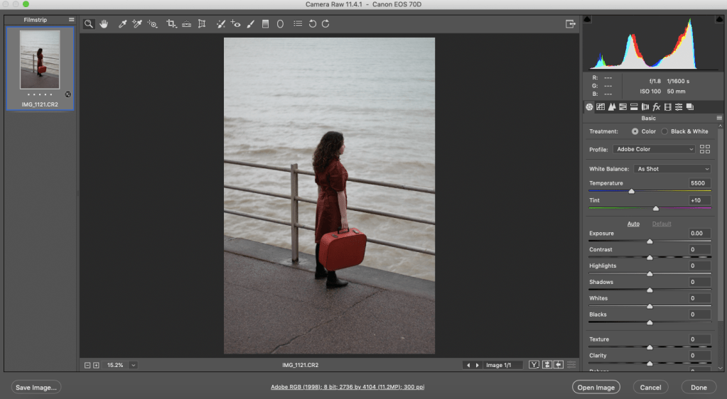
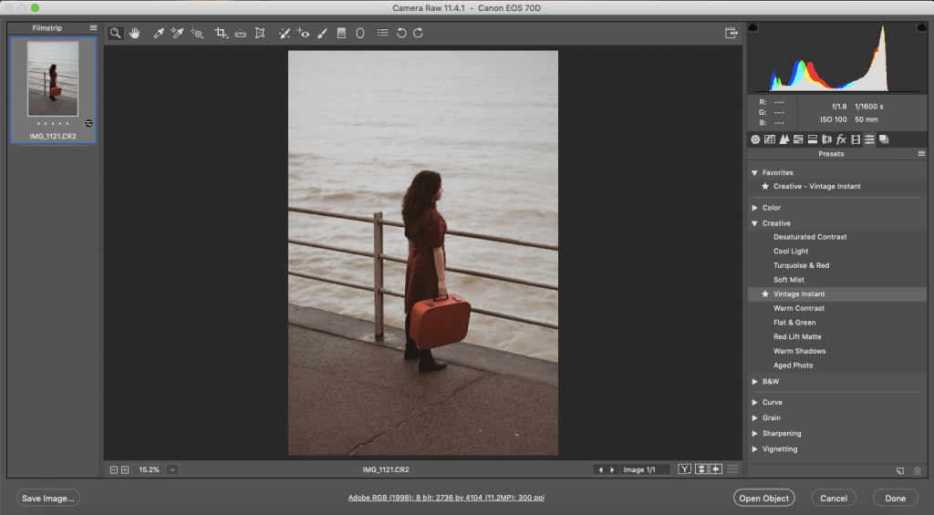
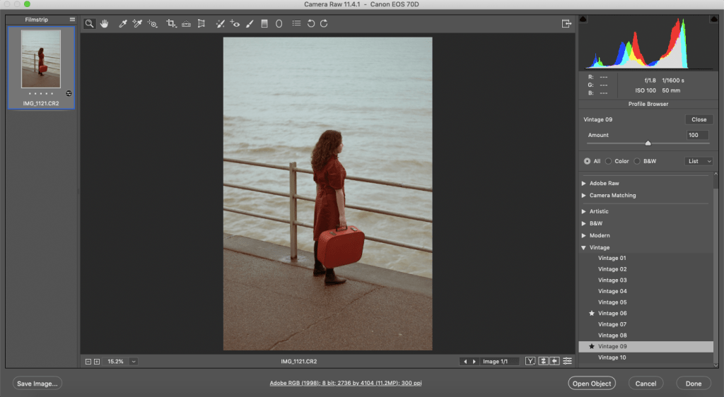
SCREENSHOTS
OPENED UP THE RAW FILE IN PHOTOSHOP
WENT TO THE ADOBE PRESETS, CHOSE A VINTAGE INSTANT PRESET
CHOSE VINTAGE 09 AND TONE IT DONE
AFTER
RESULTS
RESULTS OF POLAROID
This shoot had a lot of change of plans; however, it worked out for the better in the end. The model, outfit and accessories were ready and prepared. But the weather was not on my side. Neither was the location, I originally wanted to go to. Anyhow, I made do with what I had and went to a couple other places and ideas. And I think it worked out a lot better than I intended.
The tunnel images were hard to get. I used my 50mm lens, so I could get a lower aperture, but still, because of the darkness, I had to turn up my ISO. I couldn’t turn it up too high because of the noise, so my shutter speed was low. That’s why the tunnel images are slightly blurred and not sharp. On the other hand, I feel that it adds to the realness of the scene, almost like the subject walk past you in real life.
With the sea images, I experimented with different angles and heights, trying to make the most of each shot. Again I feel that the outfit, model, suitcase, and location all came together nicely, and will go well with the other previous images.
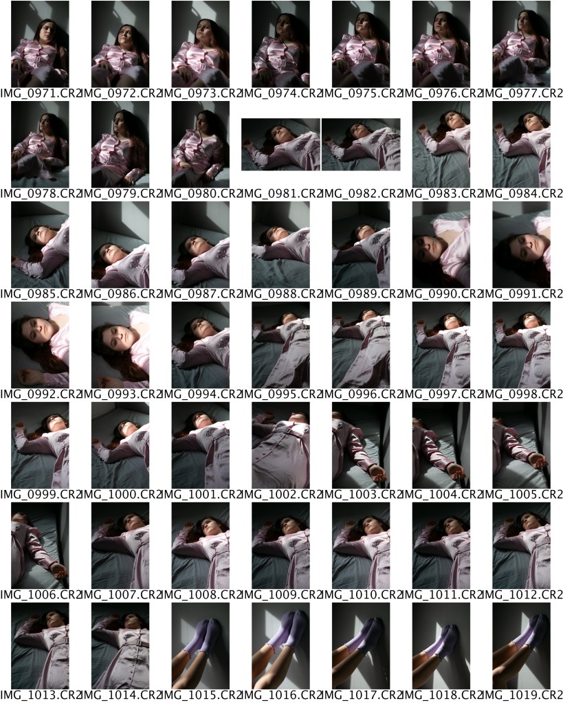
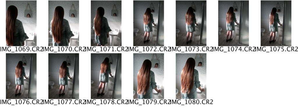
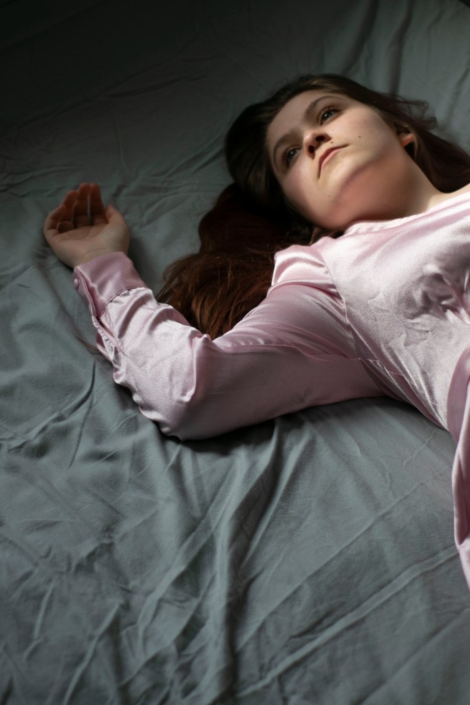
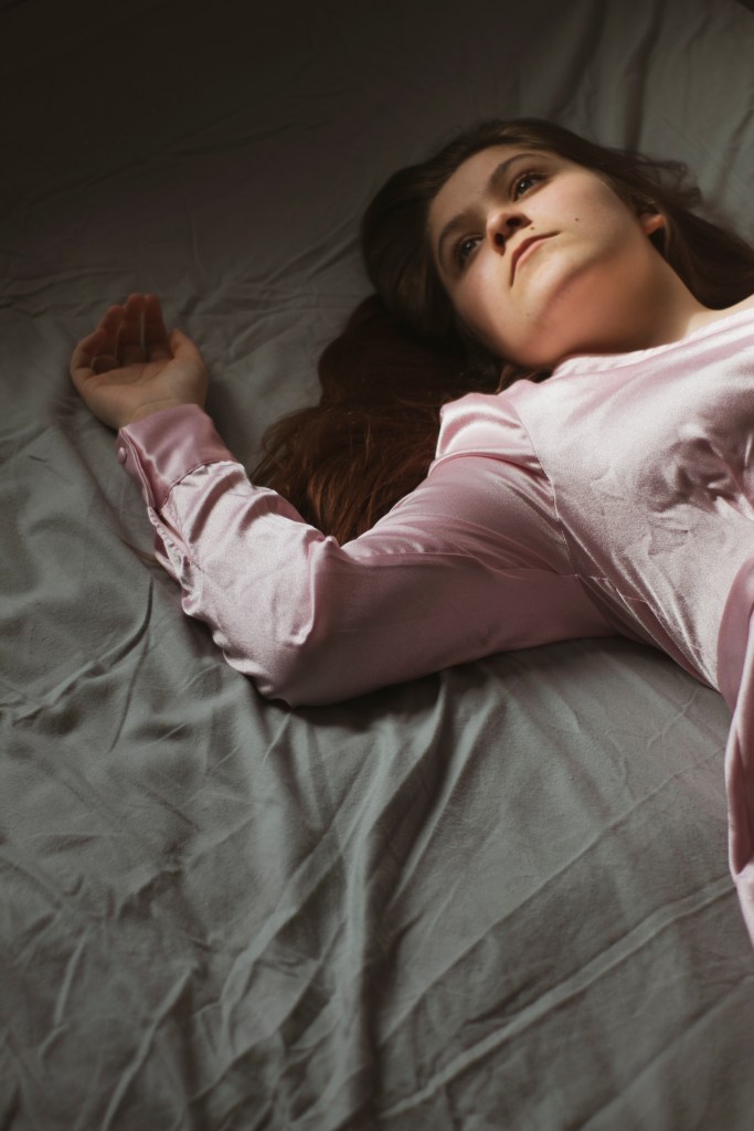
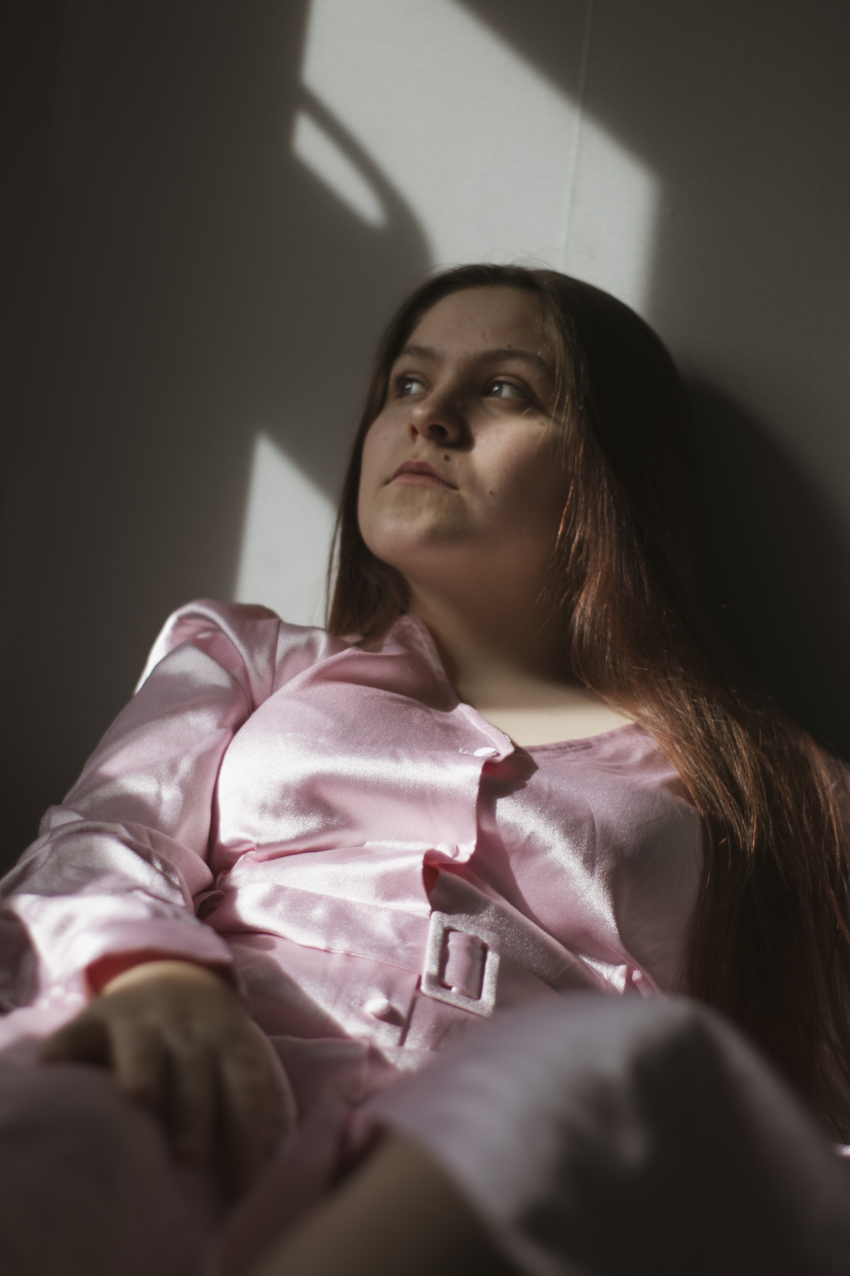
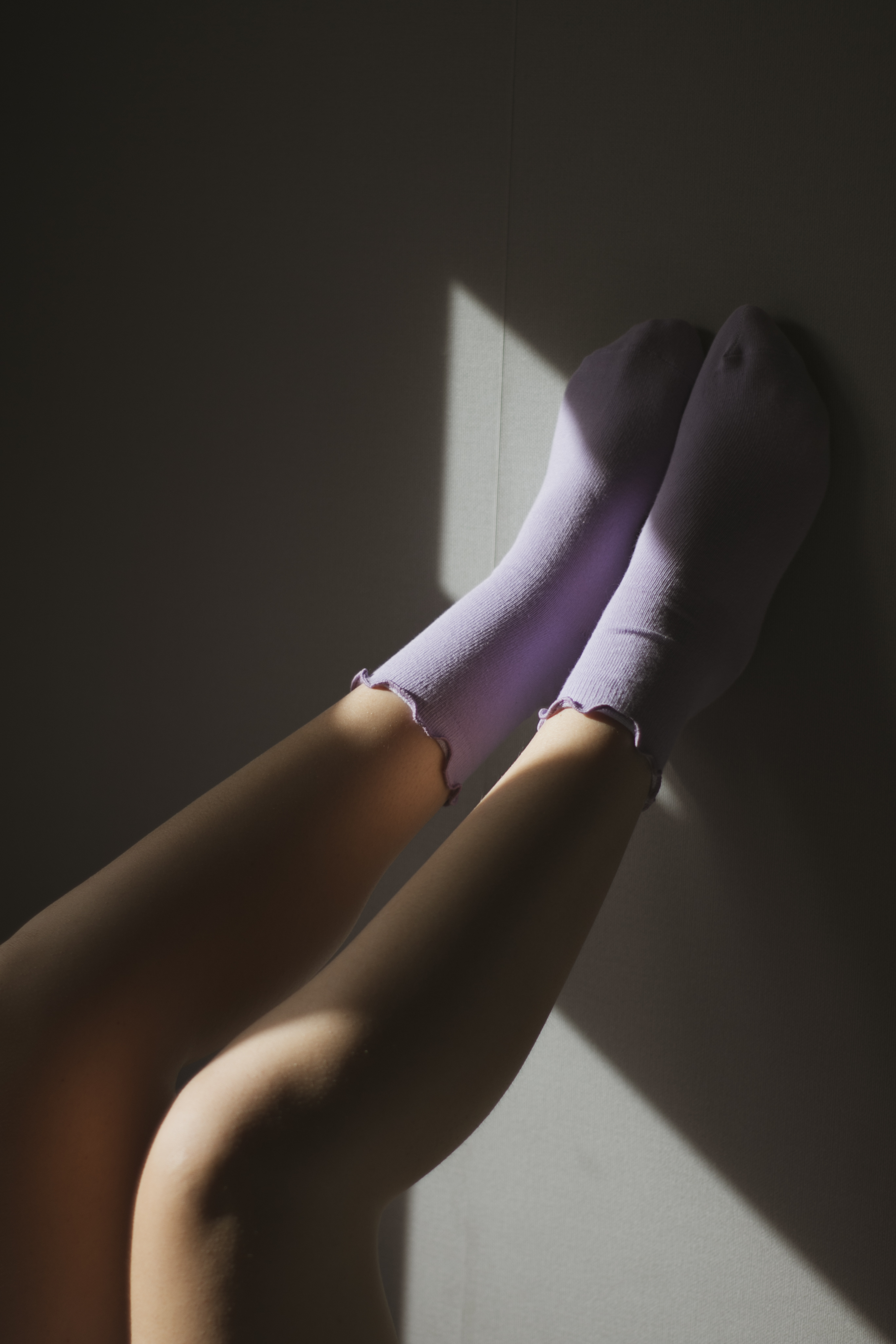
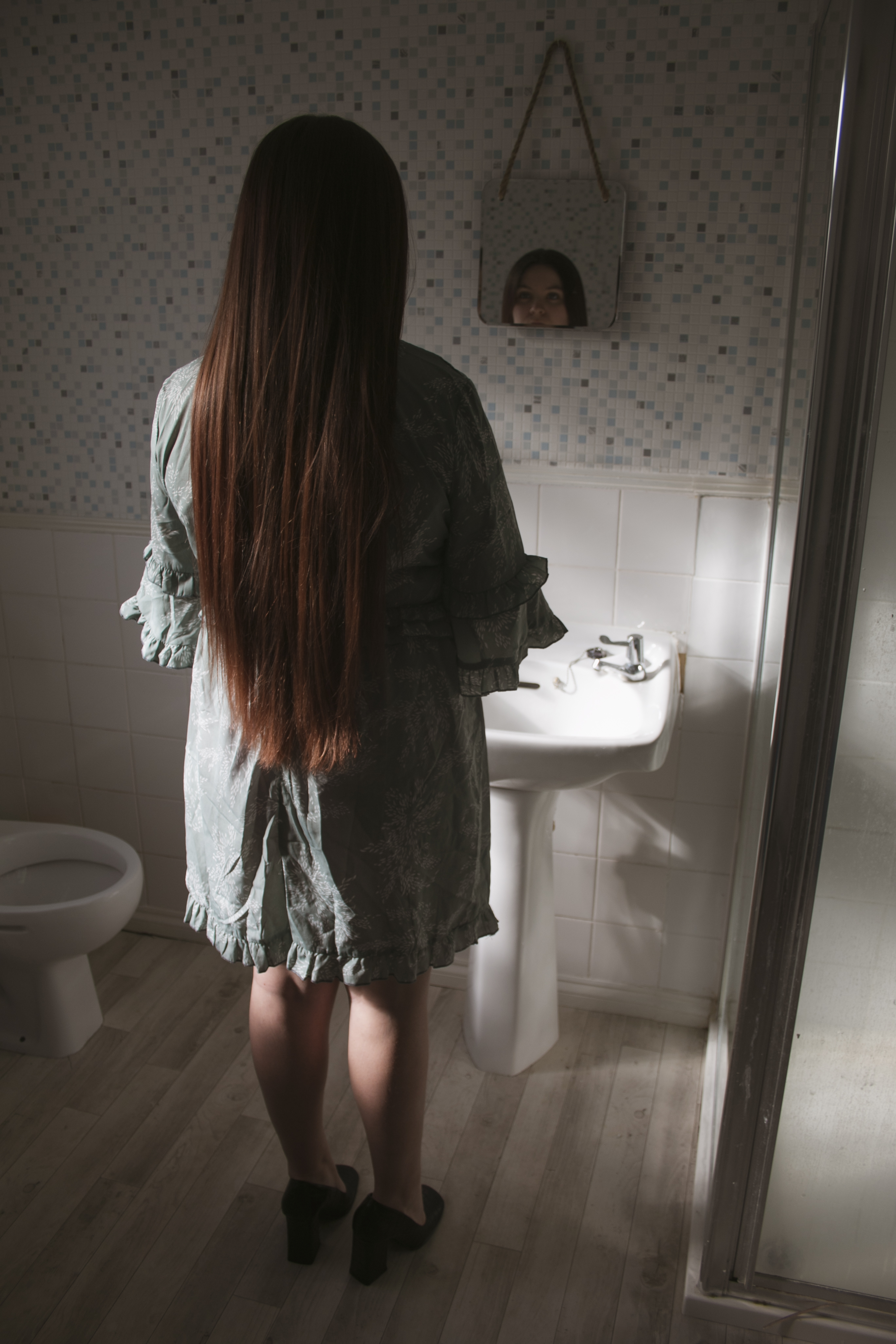
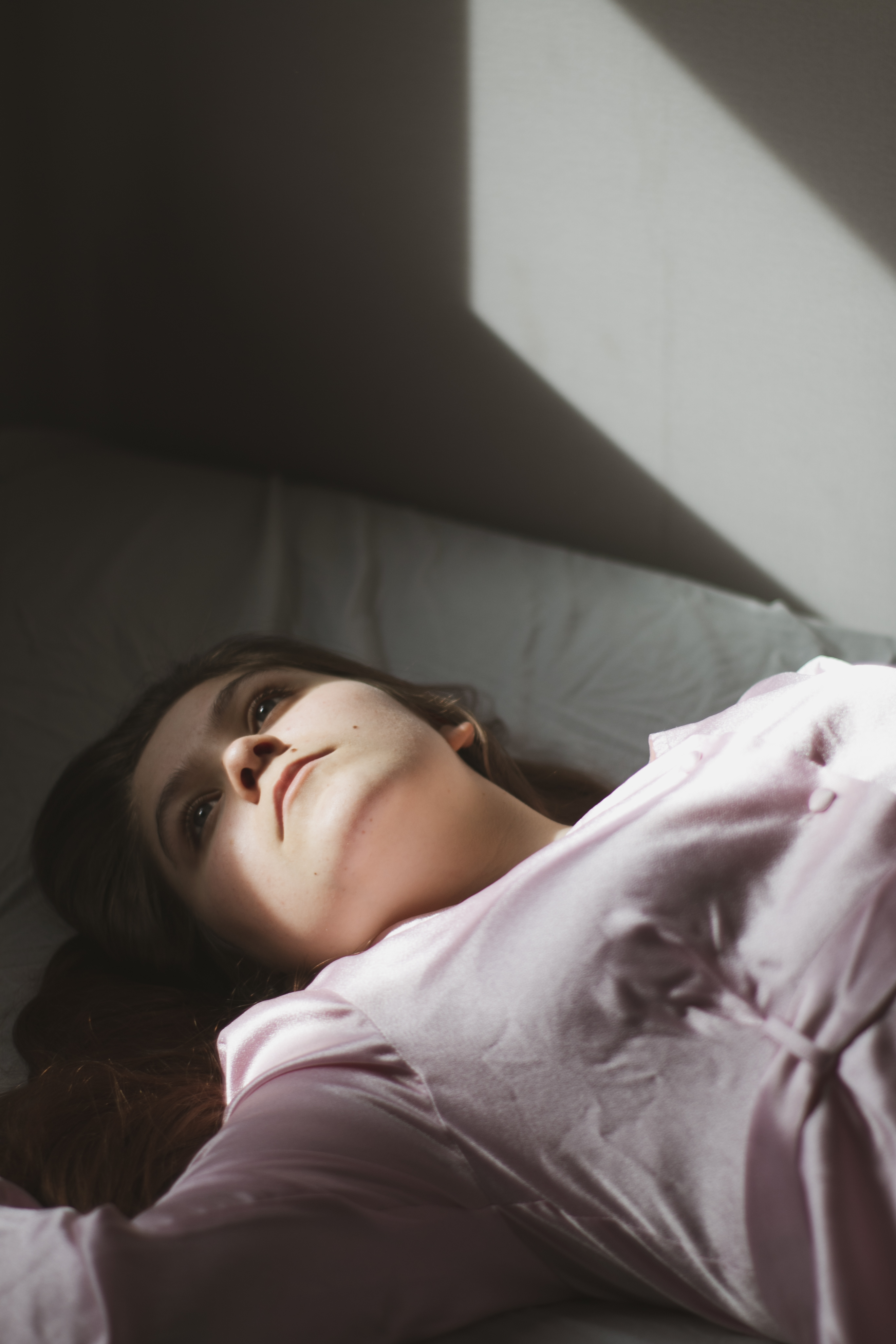
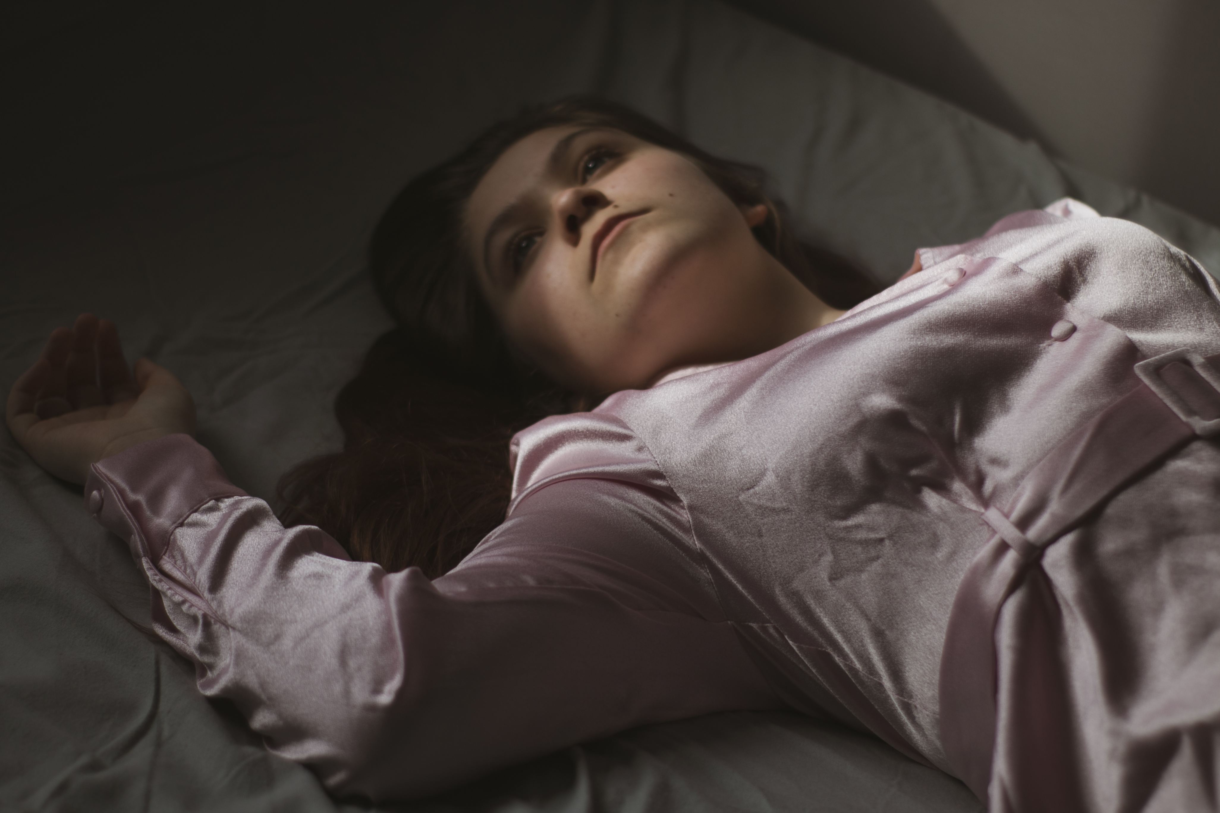
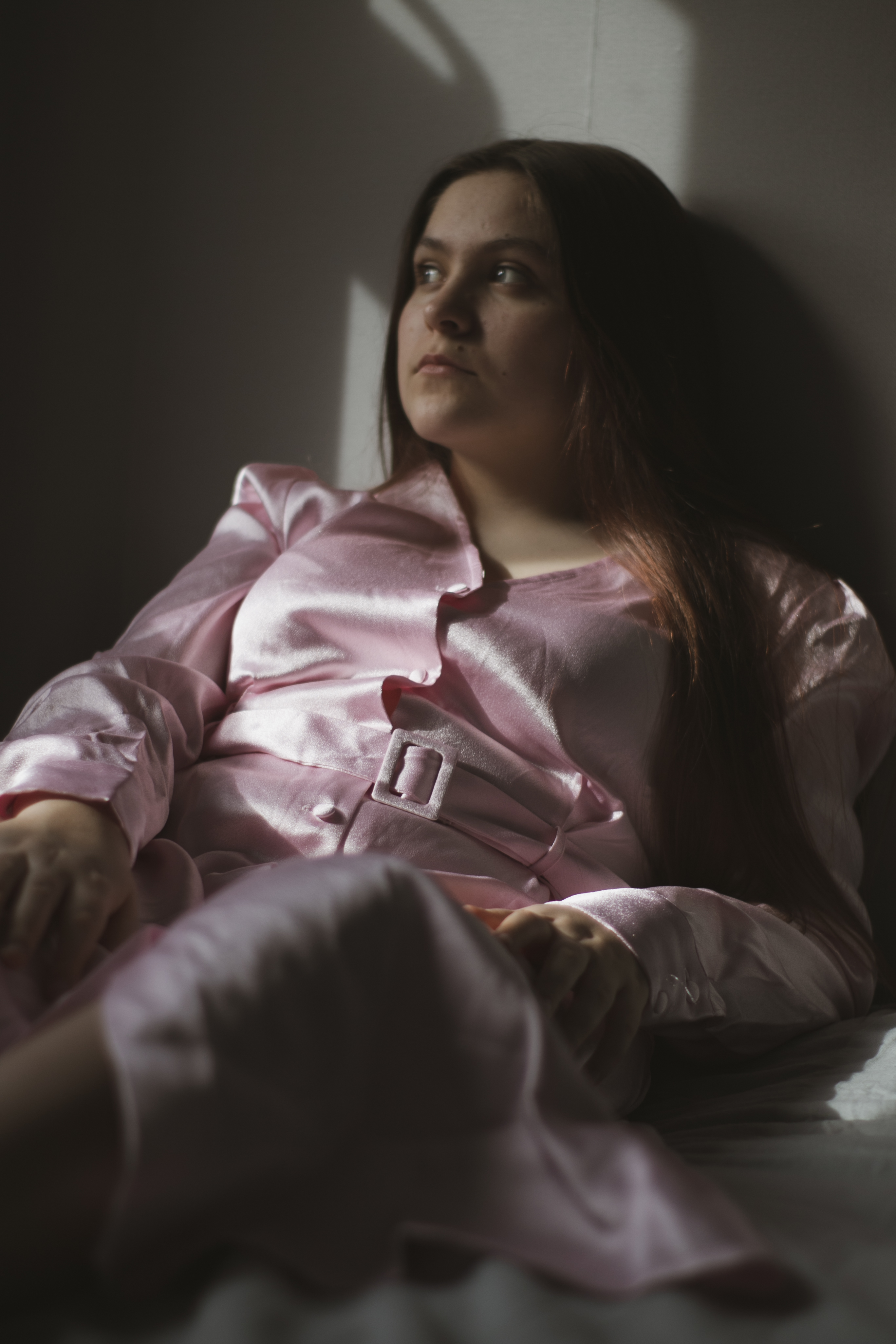
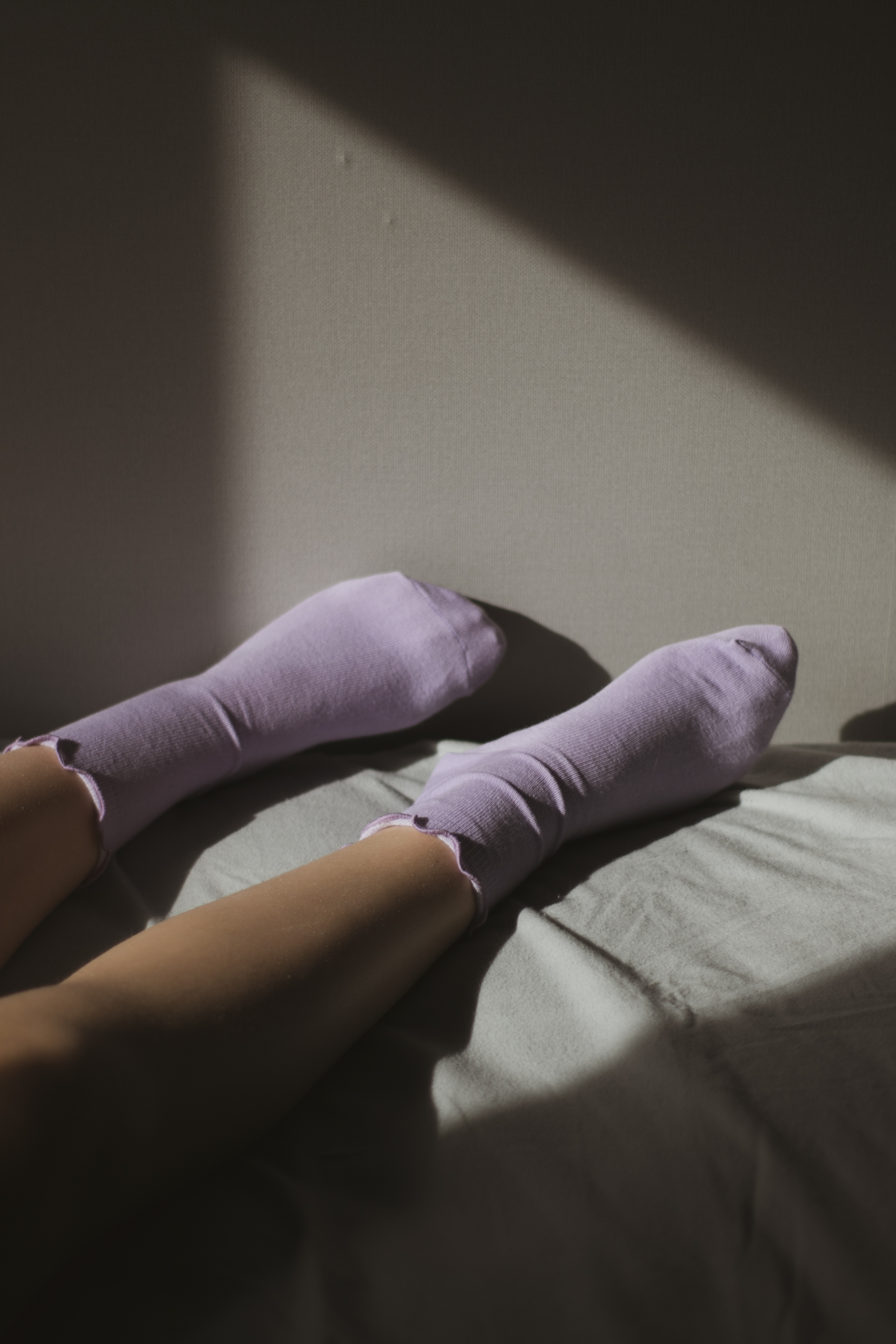
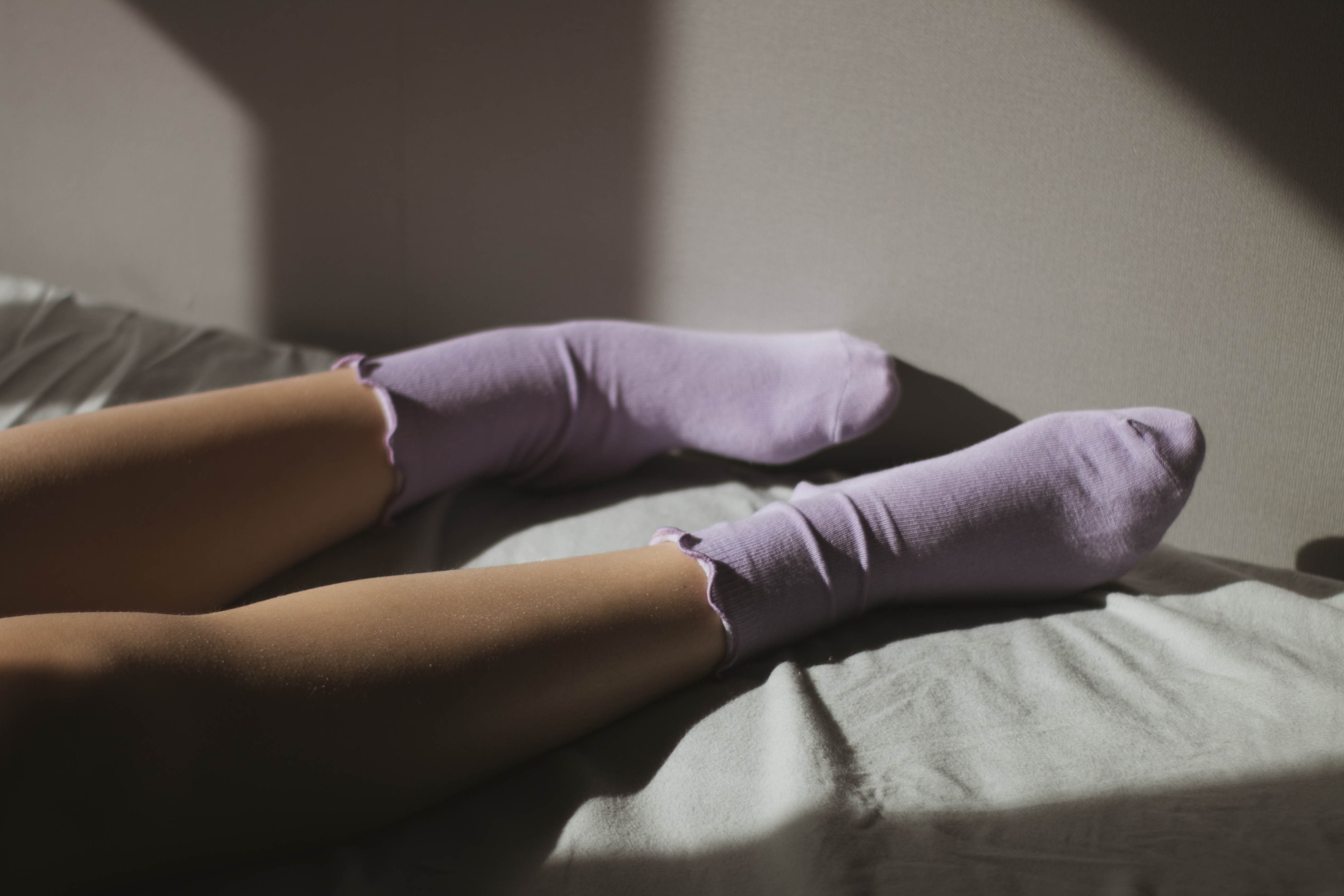
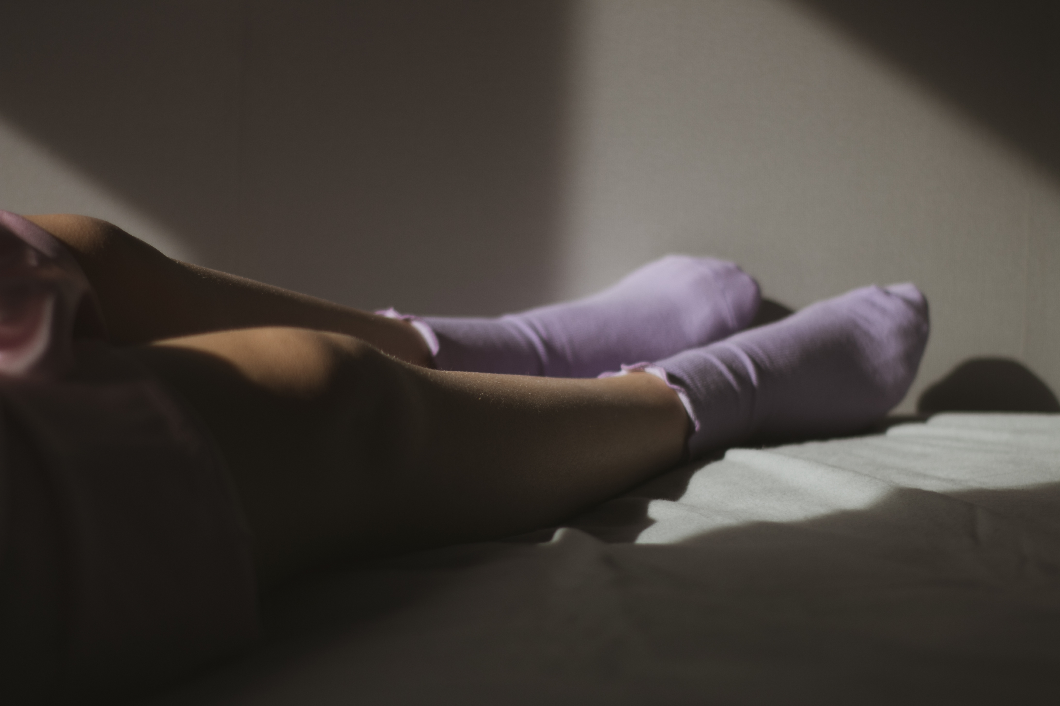
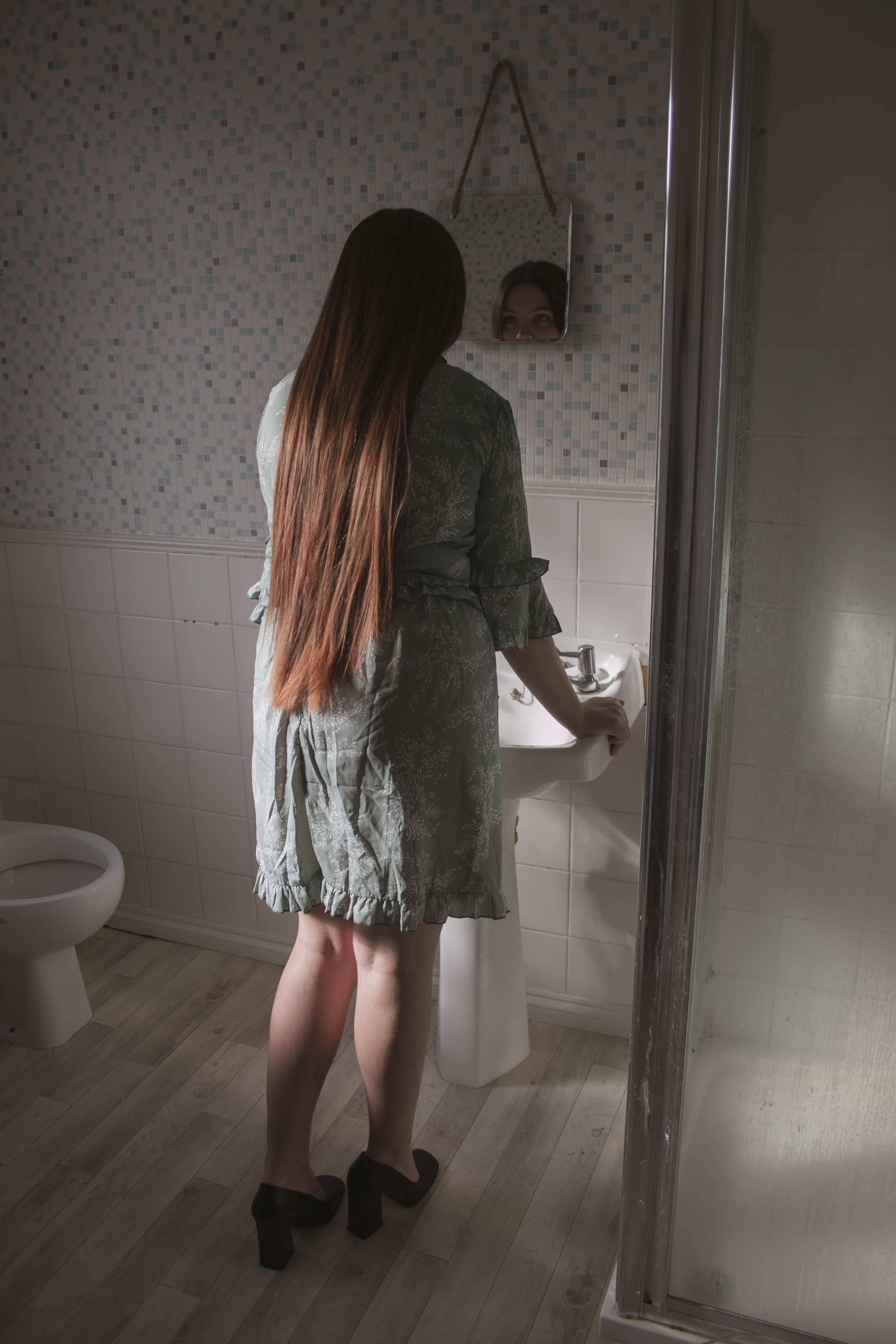
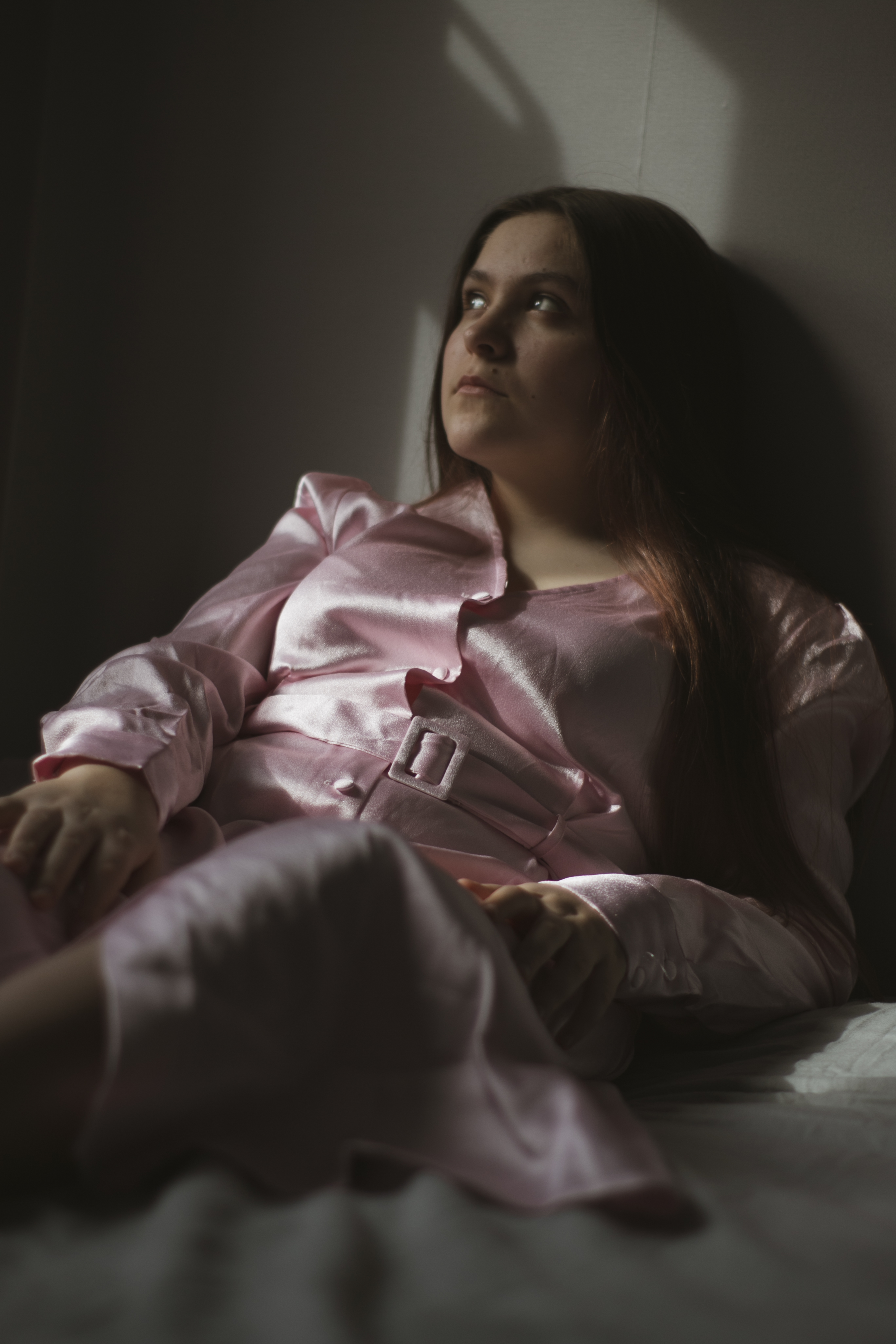
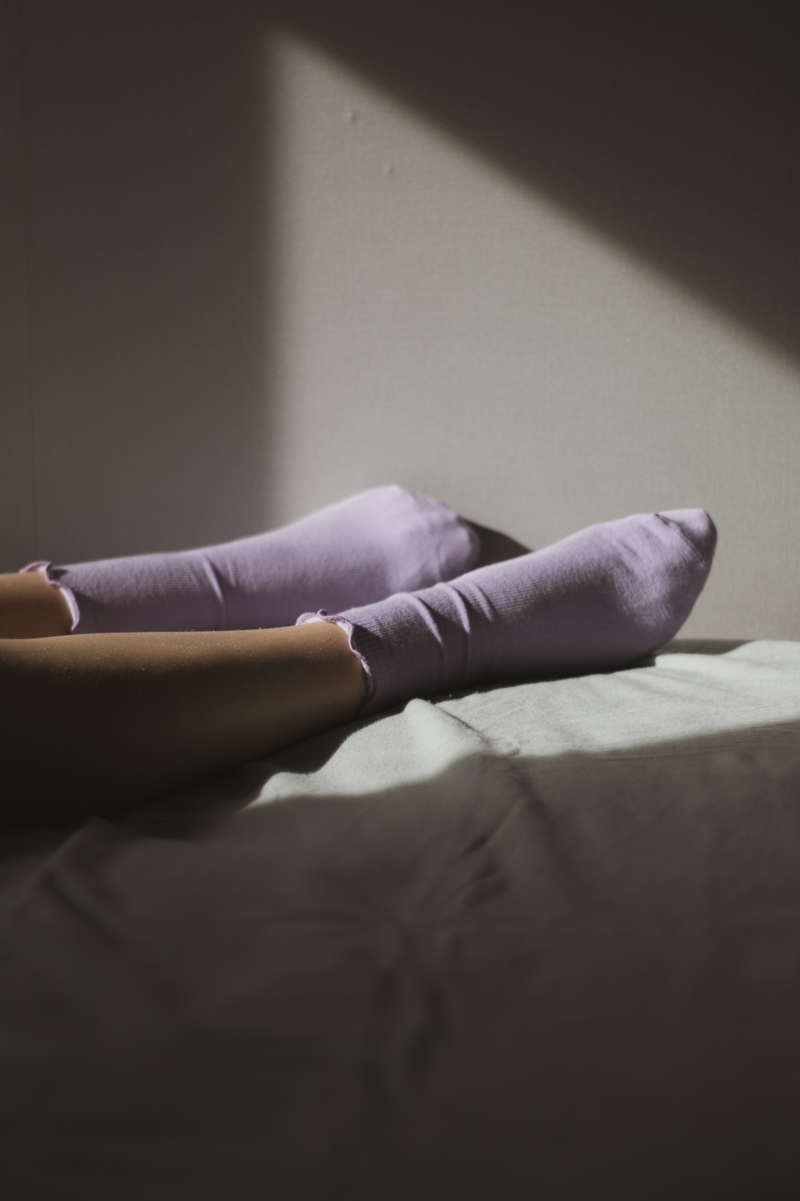
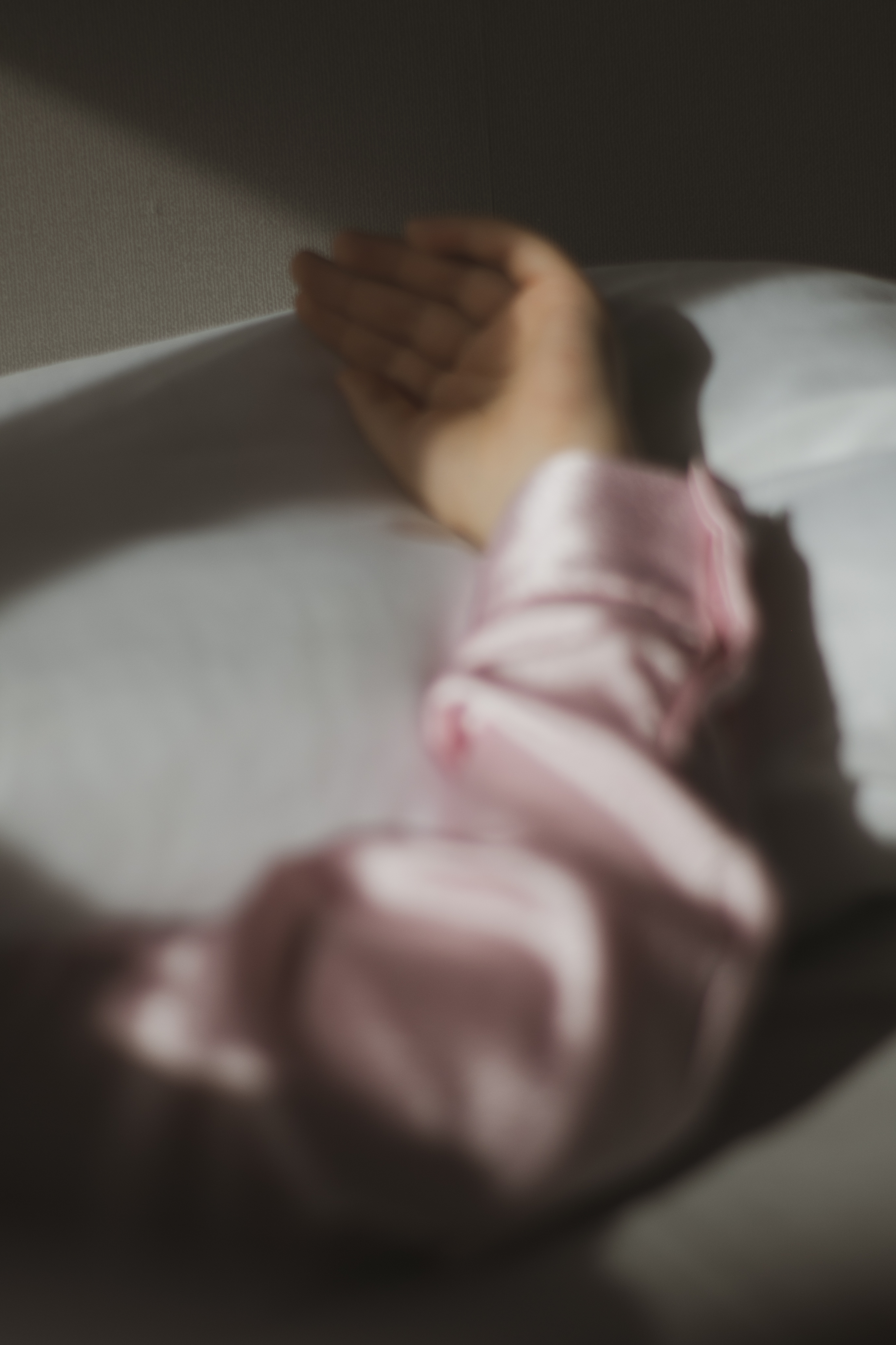
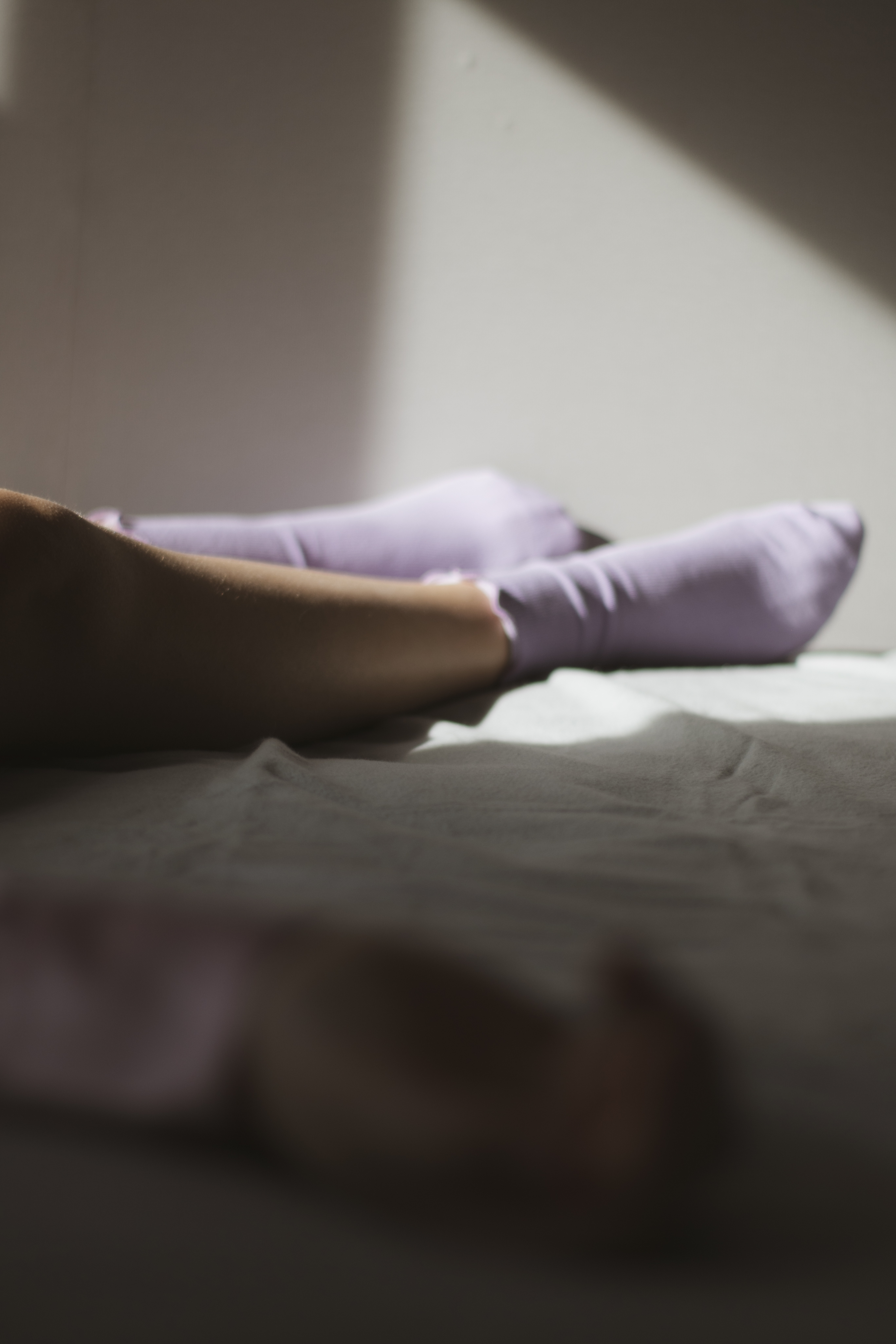
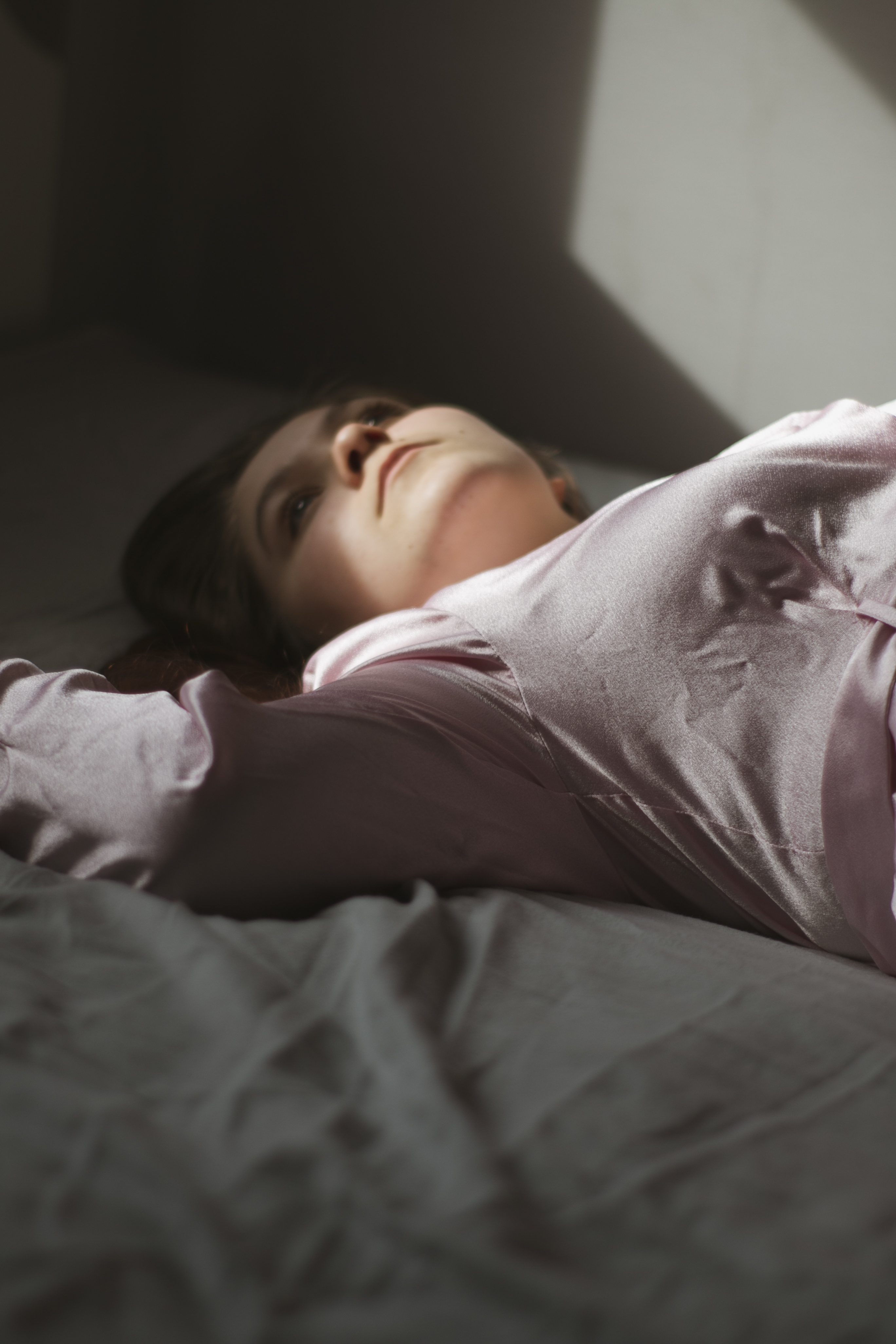
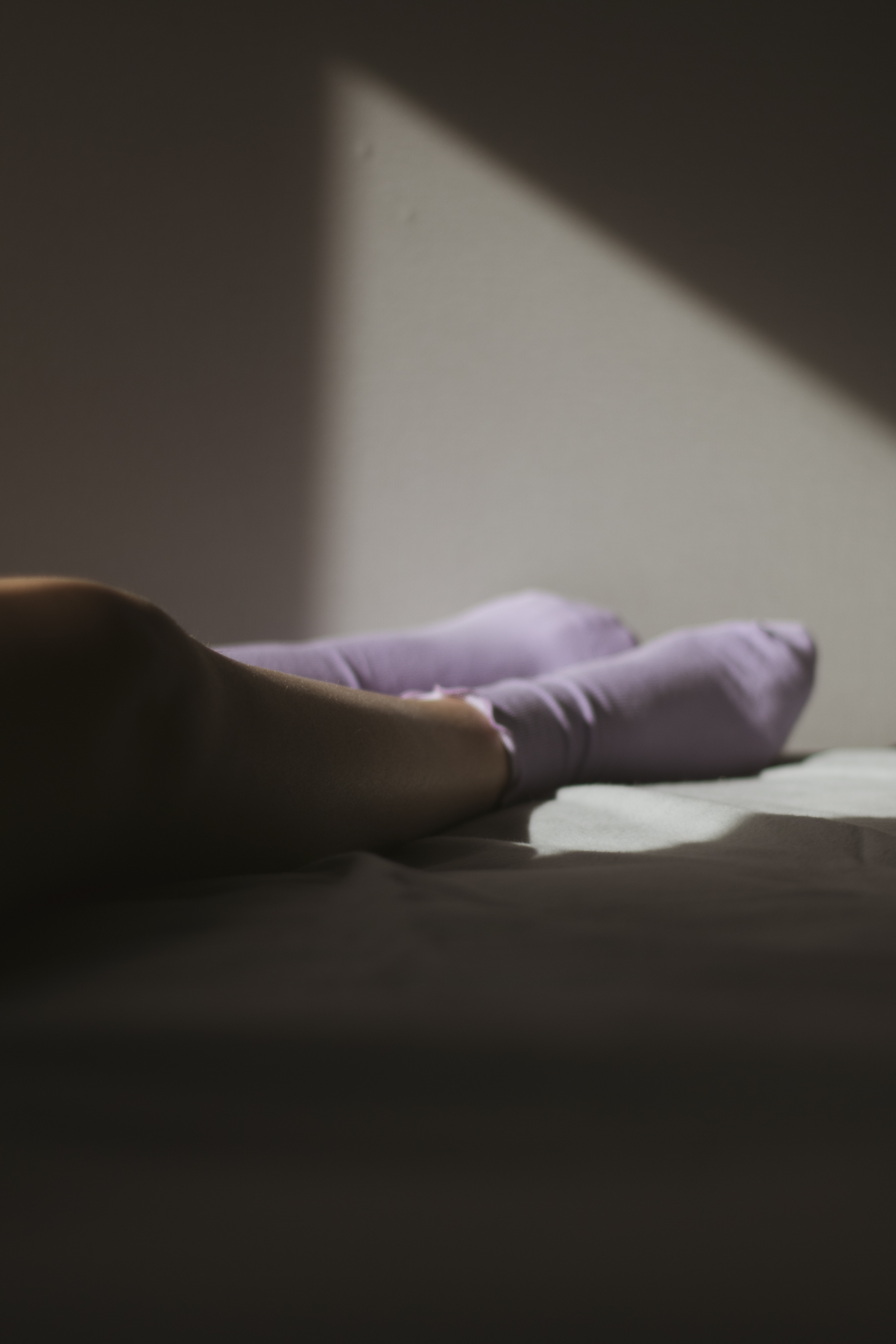
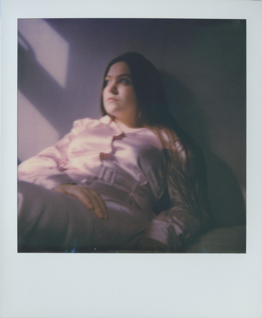
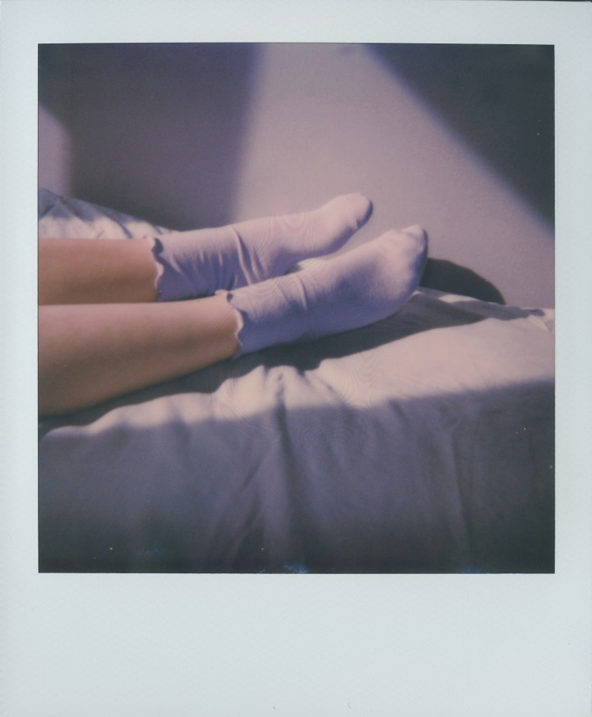
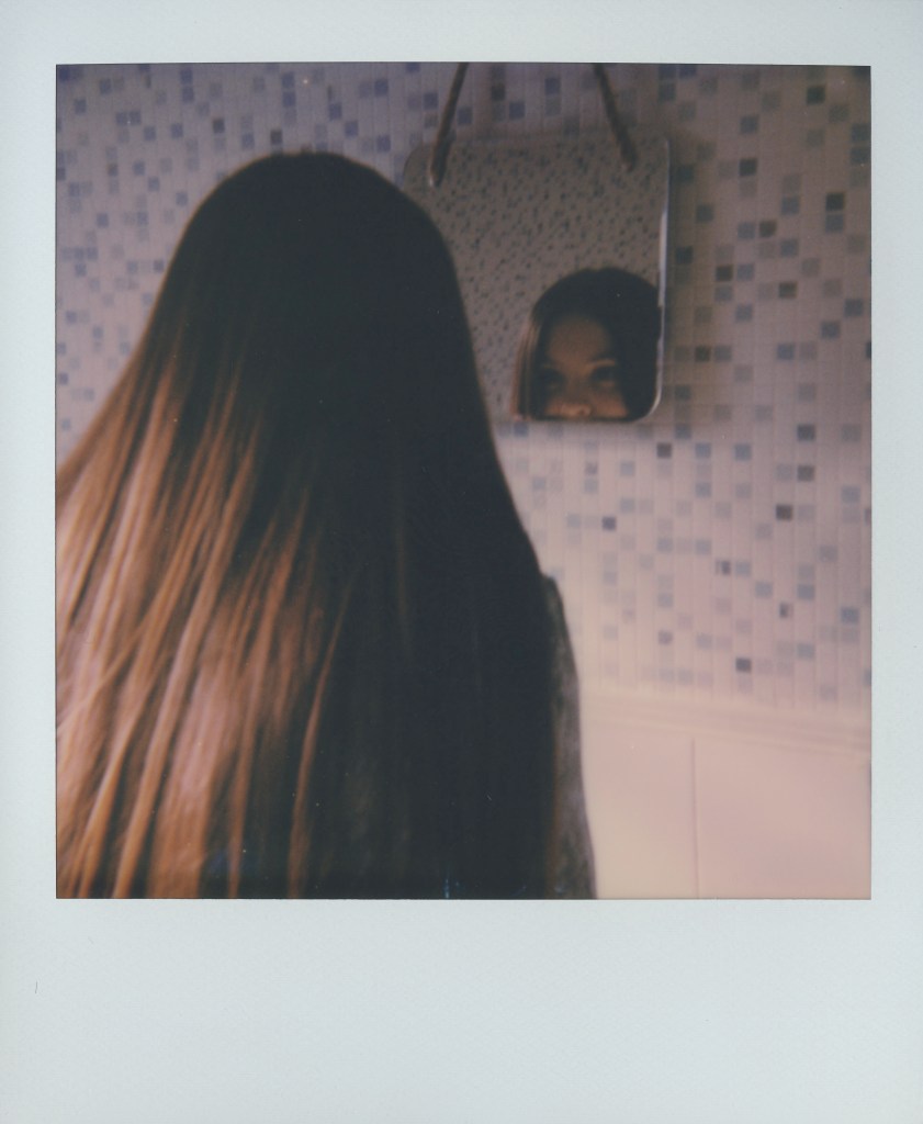
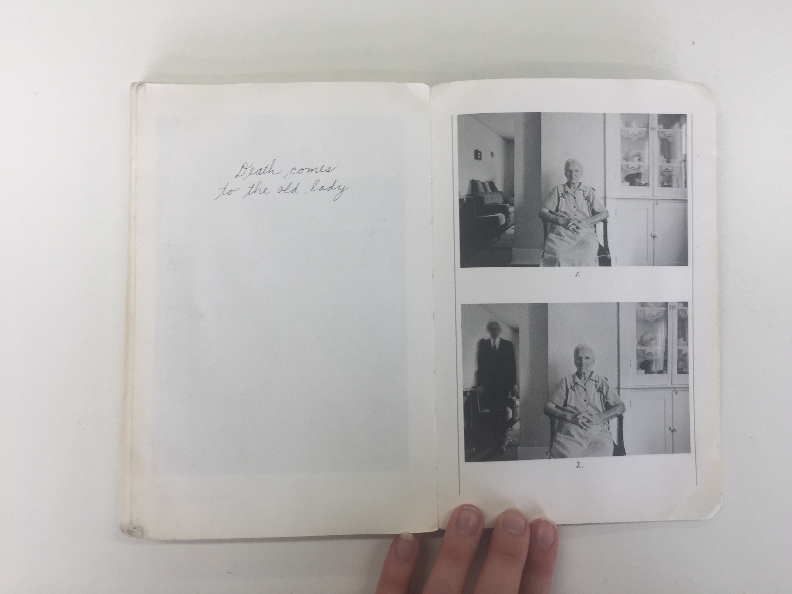
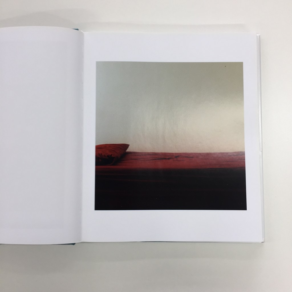
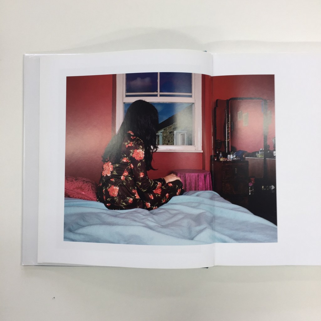
For shoot 1 I want to kill two birds with one stone, I will be doing the lying down on the bed image, the arm/feet close up & the bathroom mirror scene. For this shoot I want to use digital camera, but also a polaroid camera, and see how they turn out.
LOCATION
For shoot 1, i’m doing several images within one day of shoot. Luckily all the locations I can do within my home, so my bed/wall, and the bathroom.
EQUIPMENT
As i’m constructing these images need to prepare outfits, location, lighting etc. Heres a list below of what i’m using for the shoot –
Canon 70D
50mm lens
Pink dress
Lilac socks
Green pattern dress
Standard lens
Model – (Ruby)
Bed/Pillows
Polaroid camera/film
CONTACT SHEET
SCREENSHOTS
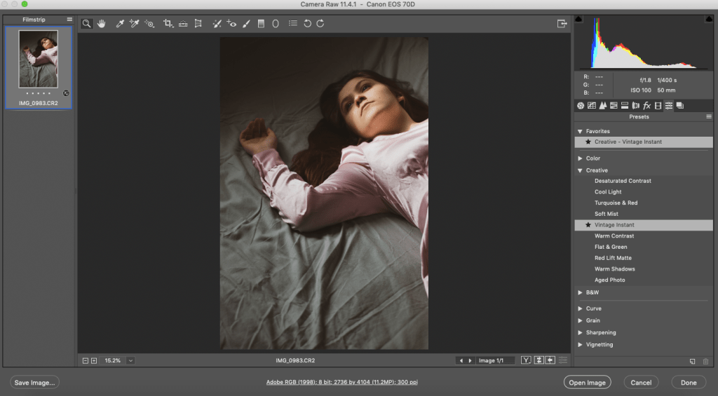
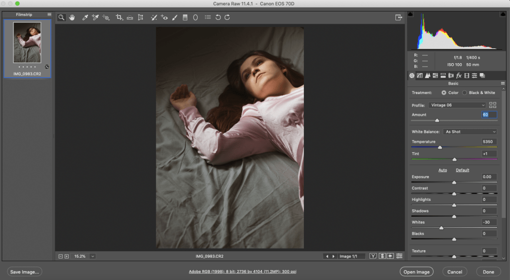
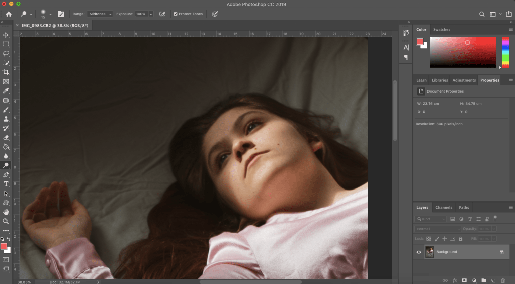
OPENED THE IMAGE UP INTO PHOTOSHOP. USED AN ADOBE PRESET CALLED VINTAGE INSTANT 6
DECREASE THE PRESET SLIGHTLY, TO MAKE IT LOOK MORE NATURAL LOOKING
OPEN IT UP FURTHER INTO PHOTOSHOP, USING THE DODGE & BURN TOOL, TO ENHANCE THE EYES
BEFORE
AFTER
RESULTS
RESULTS OF POLAROIDS
I’m genuinely pleased with how these images came out, initially, I wanted to block the natural light with boards to create this shadow effect. However, by picking a sunny day, the hard light created these patterns through the windows naturally. Which I feel adds depth to the images, making them more visually exciting.
The bathroom images turn out really well. It gave a cinematic feel to it and was exactly what I was going for. I wish I could have got more shots, (in the bathroom images), however because of the very little space, that was the best I could do. The outfit really complements and fits with the subject and themes well, as long with the model emotions and placement. Overall I want to carry on producing images that go with these, however, has the same style of the cinematic bathroom ones.
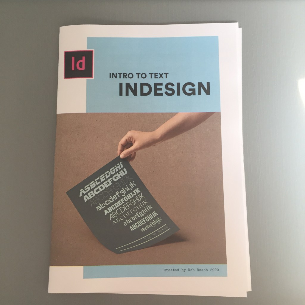
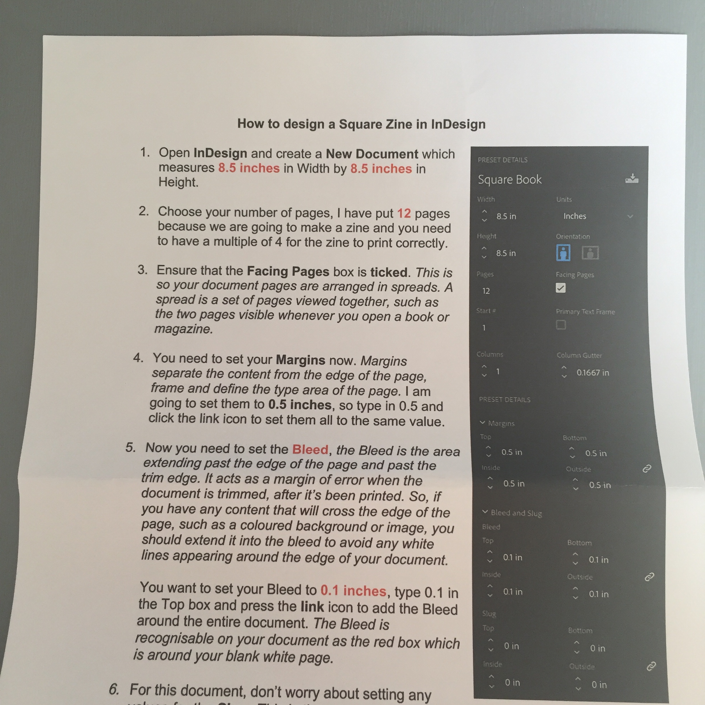
This project was to make a zine, with images from pervious projects, and understanding the principles of InDesign.
We were given instructions and guides, luckily I have used InDesign before, so i found it easier. The idea was to create a mini zine, with the understanding of how to use InDesign.
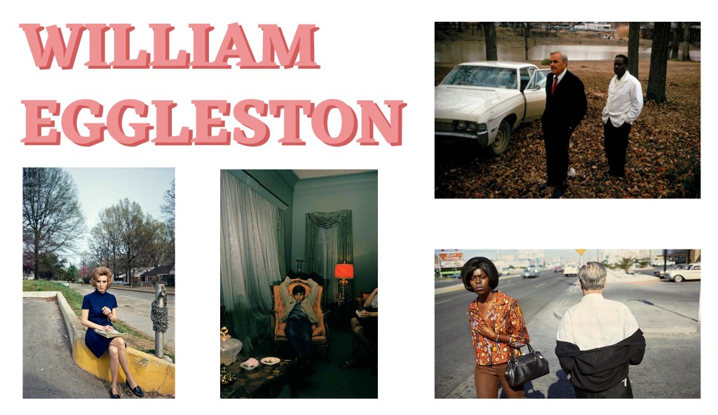
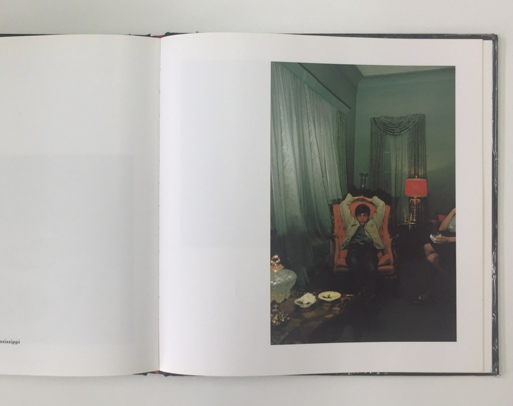
William Eggleston is an American photographer, mostly known for his colour photography work. Eggleston use of colour and his perspective to the every day and the use of him finding small details to present a world artistically. Eggleston timing for these photographs is excellent, for each picture he only takes one shot, no multiples, so he takes the opportunity of waiting for the right moment. And you can see this in his work from the composition, which is very controlled.
He started photography at the age of 18, self-taught, taking photographs using black & white film, printing the images himself. Even his earlier work, he has a similar style to which he later shoots in colour, even the subject matter. Eggleston significant influence was Henri Cartier-Bresson, at the time Eggleston loved how Cartier-Bresson work was so different from everyone else.
Through looking at his work in books, I can see he has a unique vision. His subject matter is the banal and every day, of his hometown, which he has shot thousands of photographs of, for over 50 years. Through a personal discipline of him, is to only take one photo of one thing. Because of this, Eggleston work is very simplistic, but when you analyse it, it becomes quite refined, and the messages in these images are captivating and complexed start too unfolded.
In the image above, (the woman in the blue dress), you start to get a sense of character and attitude to develop, the more and more you look at it. The middle-aged women is dressed clean and presentable, and so is her hair. However, the juxtaposition of this is that this immaculate looking woman sitting on the dirty concrete. Her shoes & dress look brand new, contrasting against, the old, cracked, rumble looking concrete. She may want to present herself as well-off, but may not actually be. You can tell this from her facial expression. The sense of attitude, you can see this in her stare through the camera, to Eggleston. Almost like she is thinking ‘who told you that you can take a photograph of me’ vibe. Though this is every day for Eggleston, it is incredible that Eggleston came across this bold woman. The colour contrast between the woman dress and the yellow of the concrete.
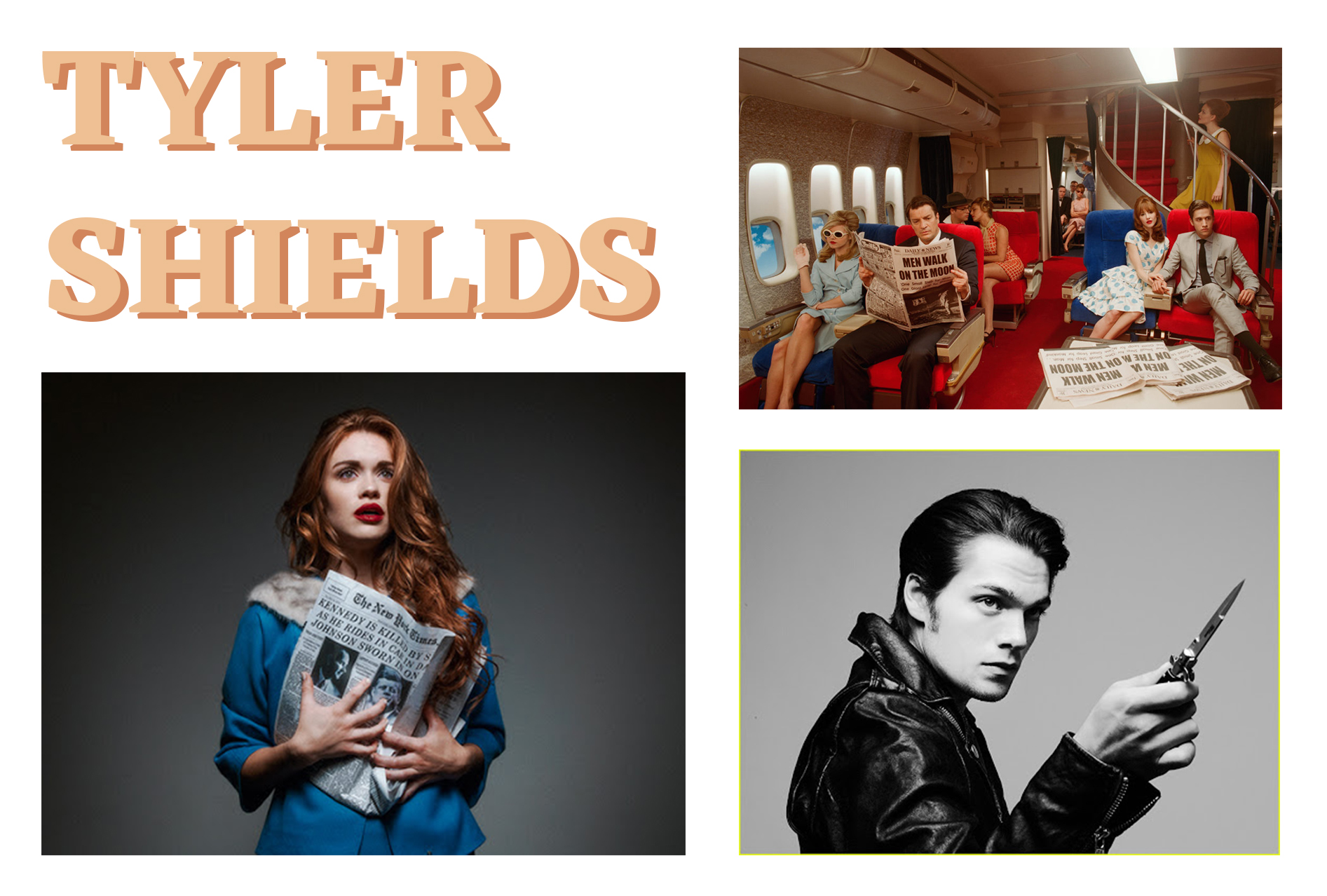
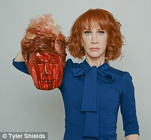
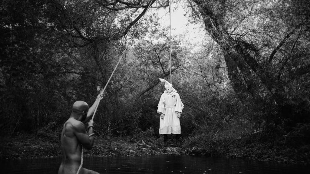
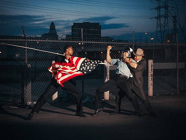
Tyler Shields is an American photographer, mostly know for his provocative photographs, pushing the boundaries of constructing political, religious images. His images create a story and a statement and taps into the soul of society. Shields work is all about shock value; he is not afraid of the boundaries, that people may say or don’t have the guts to do. However, his most provocative photos are his most respectable images, and also his best selling photos. Loved by the press, he is not afraid of backlash, even if his photographs are sensitive subjects. For example the images below-
As you see these images to some people are very offence. Even though they are constructed, they make an impact and statement to the world, on both sides of the party (people who support/don’t support trump). Shields creates the images, to let the viewer interpret it. The video below shows chooses, views, techniques, of Shields work and history of constructing the photos. It is fascinating to watch how his mind works, before, during and after the production of his pictures.
The two images at the top, (the girl holding the newspaper/aeroplane of people holding newspaper), is an interesting perspective of showing historical events. Rather than constructing what the event may have looked. Shields has created the behind the scenes of this event. The people reaction to the past event, whether good or bad. From one image being strongly emotion, but with a simple background. To a whole set, of multiple actors/models, props, clothing etc. Both are impactful, almost like they are real.
I feel this is down to the production of the images; every little detail adds to the story of these images and helps the viewer believe and interpret how they want. When constructing my pictures, i need to think about all the components, to help my viewer get the concept I’m going for. When you type ‘Men Walk On The Moon’ into google all you get are images of the astronauts, no reaction, so it an exciting perspective of the photo.
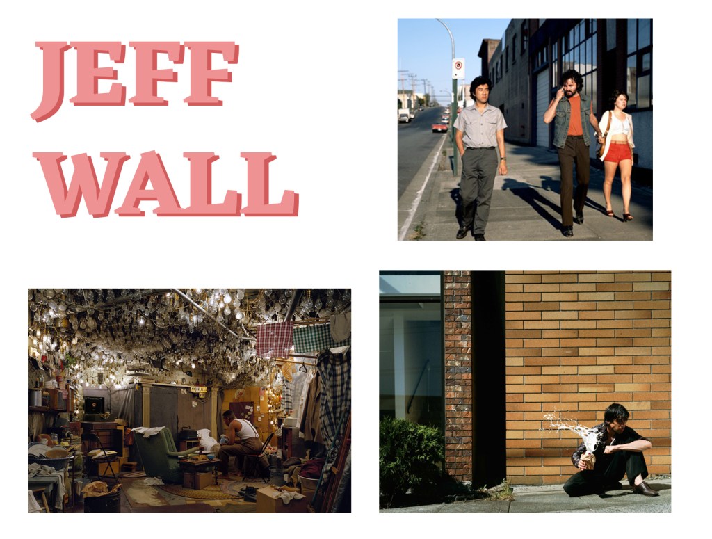
Jeff Wall is a Canadian Photographer that is known for being one of the leading figures of conceptual photography. Wall’s images with the combine fundamentals of photography, with components from other art forms, using parts of literature, cinema and paintings for the construction of his ‘cinematography’ images. Wall uses the word ‘cinematography’ to describe his photography to share specific characteristics, enabling the invisibility of certain things. Producing an image that contains both what is excludes and what it displays. Wall’s narratives and precise detail to his images make the viewer question the authenticity and spontaneity. It is allowing the audience to understand the representation of the event to the viewer.
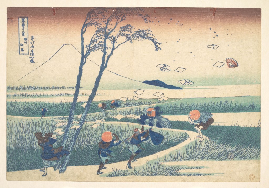
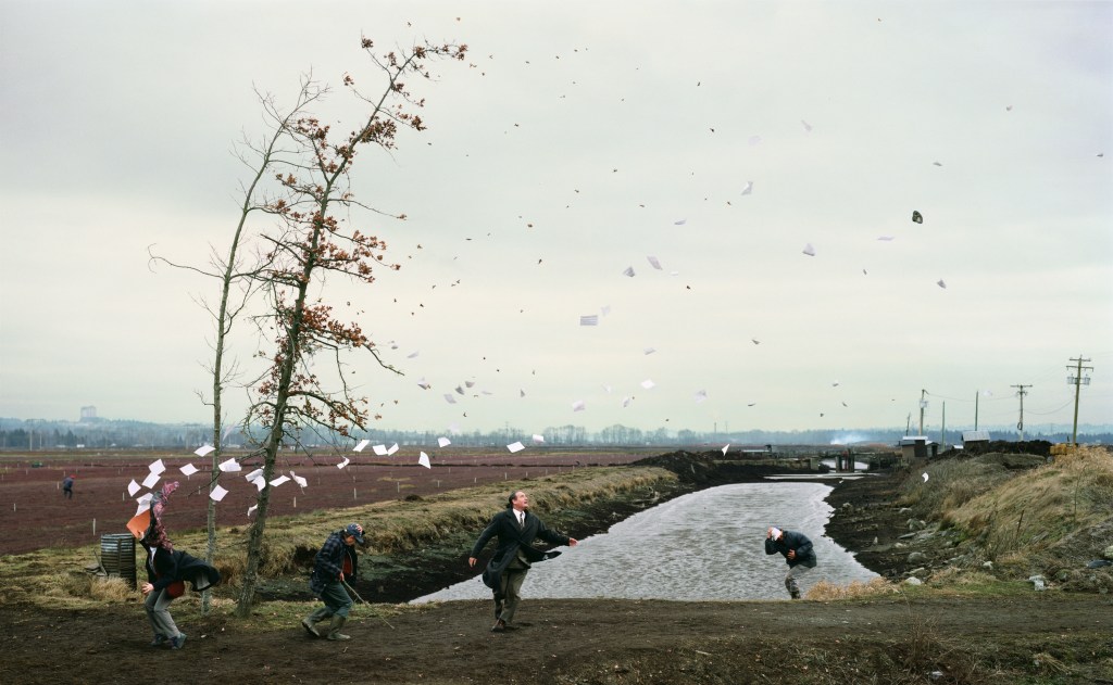
Jeff Wall photograph, ‘A Sudden Gust of Wind, 1993’ (below) was created from the inspiration of a painting. It was based upon a woodcut ‘Travelers caught in a sudden breeze at Ejiri, 1831’, by Japanese painter Katsushika Hokusai. As mention before Wall enjoyed the aspect of producing narratives from the inspiration of other art mediums, and this was one.
In the painting, the foreground has multiple figures crouching down, holding on their hats, as another figure has lost their hat due to the strong winds. The woman figure on the left has all her papers flying into the air. The intensity of the strong winds even causes the leaves to blow off in the same direction as the pieces of paper. In the background of the painting has Mount Fuji, which is bare and simplistic. Making the foreground look busy and chaotic. Wall has identically reworked the structure of the painting to produce it into a substantial photographic version of Katsushika Hokusai painting. However, Wall photograph has less of a romantic notion compared to Hokusai painting. Each produce a different ambience, the painting has a lighter colour palette, which mesmerises us completely. On the other hand, Wall’s photograph has darker tones throughout, which makes the overall image ominous. By doing this it makes the viewer question what is happening, while they try to depict, they get caught in a frozen part of a story.
OTHER RESEARCH THAT HAS INSPIRED ME
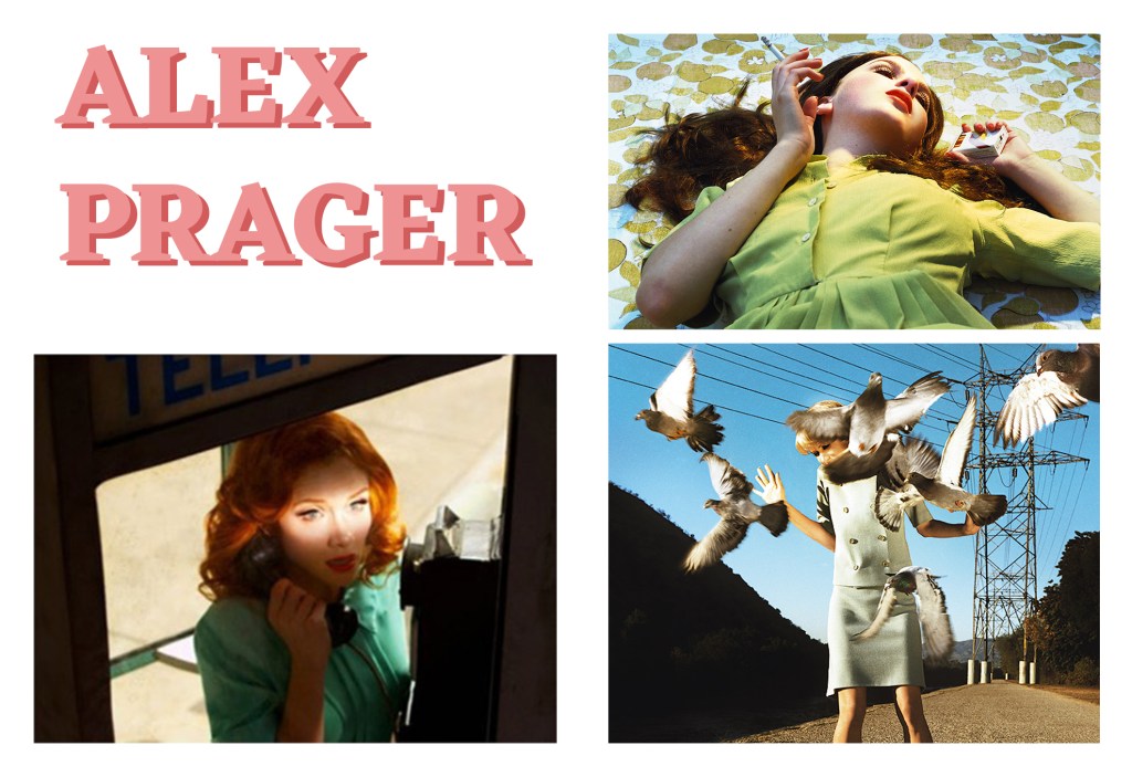
“Alex Prager (b. 1979, Los Angeles; lives and works in Los Angeles) is a photographer and filmmaker who creates elaborately staged scenes that draw inspiration from a wide range of influences and references, including Hollywood cinema, experimental films, popular culture, and street photography. She deliberately casts and stages all of her works, merging past and contemporary sources to create a sense of ambiguity. Her familiar yet uncanny images depict worlds that synthesize fiction and reality and evoke a sense of nostalgia. Prager cultivates the surreal in her photographs and films, creating moments that feel like a fabricated memory or dream. Each photograph captures a moment frozen in time, inviting the viewer to “complete the story” and speculate about its narrative context. Prager’s work often makes the viewer aware of the voyeuristic nature of photography and film, establishing the uneasy feeling of intruding upon a potentially private moment. The highly choreographed nature of her photographs and films exposes the way images are constructed and consumed in our media-saturated society.”
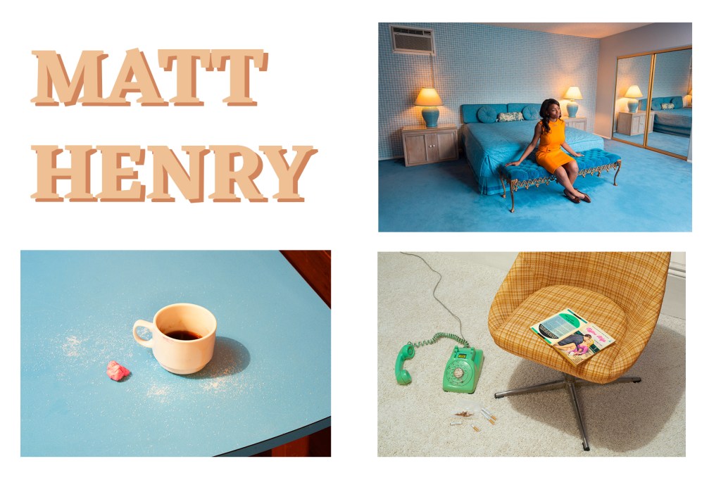
“Matt Henry makes fictional narratives set in the Mid-century era. The narratives comprise a sequence of photographs staged across set-builds and dressed locations in the UK and USA. Each is storyboarded and typically features a cast of actors styled and directed by the artist.Matt’s interests include: the Sixties as unresolved political flashpoint; the counterculture, psychedelics, and social change; dream states and visions of utopia/dystopia; as well as themes relating to race and gender.”
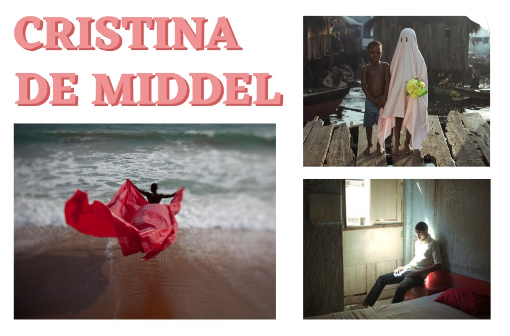
“Cristina de Middel investigates photography’s ambiguous relationship to truth. Blending documentary and conceptual photographic practices, she plays with reconstructions and archetypes in order to build a more layered understanding of the subjects she approaches. Working from the premise that mass media is reducing our real understanding of the world we live in, De Middel responds to an urgency to re-imagine tired aesthetic tropes and insert opinion in place of facts.”
“De Middel’s work shows that fiction can serve as the subject of photography just as well as facts can, highlighting that our expectation that photography must always make reference to reality is flawed.”
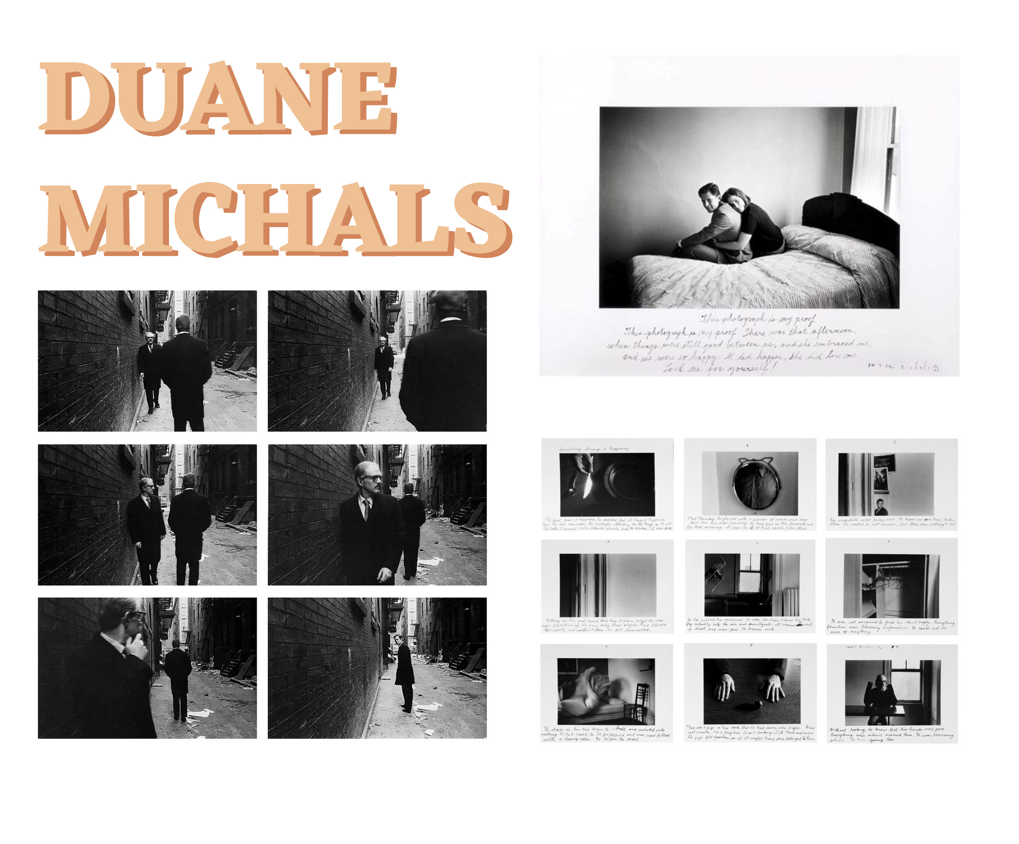
“Duane Michals (b. 1932, McKeesport, PA) is one of the great photographic innovators of the last century, widely known for his work with series, multiple exposures, and text.
Michals first made significant, creative strides in the field of photography during the 1960s. In an era heavily influenced by photojournalism, Michals manipulated the medium to communicate narratives. The sequences, for which he is widely known, appropriate cinema’s frame-by-frame format. Michals has also incorporated text as a key component in his works. Rather than serving a didactic or explanatory function, his handwritten text adds another dimension to the images’ meaning and gives voice to Michals’s singular musings, which are poetic, tragic, and humorous, often all at once.”
VIDEO & BOOKS
I was researching seeing if any other artist has done a photographic project on the theme of ‘loneliness, emptiness & isolation’. I stumbled along with this video. The curator of this book Laurence Von Thomas put together a collection of contemporary photography centred around the theme of desolation and mysterious loneliness. The pictorial assembly features artists from all over the world—those interpreting what ‘Loneliness’ means to them. It’s interesting to see different artist impression of the theme, and the different techniques in ways they chose to produce them.
Most of the images mention in the video say, they are dream-like moody images, which some have intention blur, some with movement or the picture as a whole. Depending on what construction of the image, these techniques/ideas could work well within my photo book.
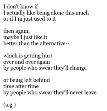
I had a lot of different ways I could go down in the documentary fiction side; however, it was choosing the narrative that would help me produce my photo-book. I have been looking in many books, on Pinterest and reading short stories/poetry for inspiration. However, after a lengthy decision, I thought it would be easier to go with words to base the narrative around, along with a selected poem. Those words are loneliness, emptiness, isolation and being lost. The poem is below –
I found this poem, and thought this would fit in with the theme and concept I was going for. The writer is unknown, I tried to trace it back, but the writer is was still unknown.
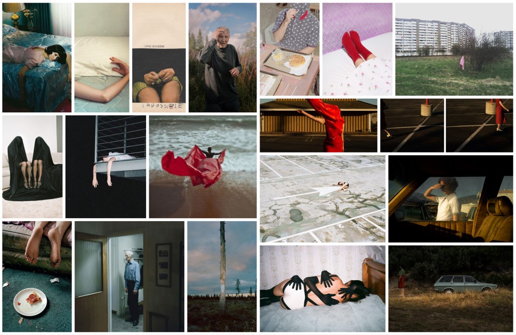
INSPIRATION MOOD BOARD
I want to take images of a narrative that portrays loneliness or isolation in people and their belongings in an artistic way, like above. Allowing the viewer to interpret what they think of the person and emotion behind the images.
For this unit, I had to decide either to do documentary reality or documentary fiction. I wanted to set my self a challenge, and I love the style of documentary fiction more. So the mood board above shows a wide range of narratives ideas for this project.
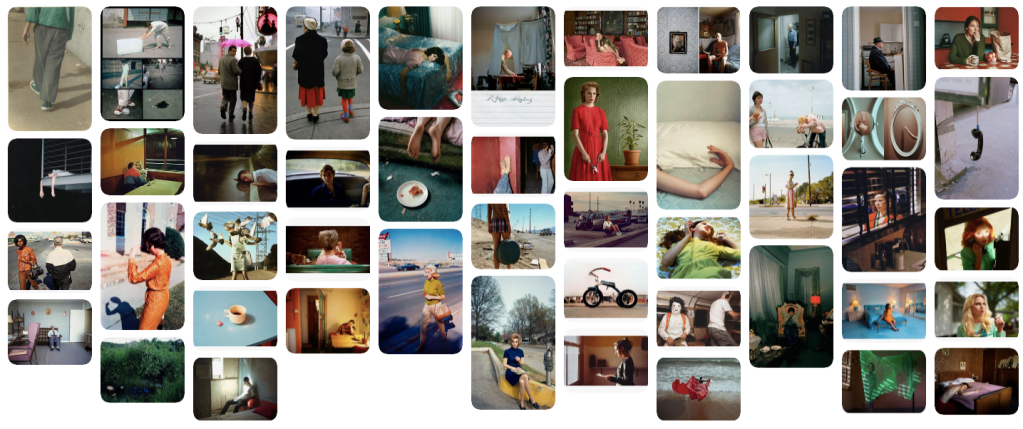
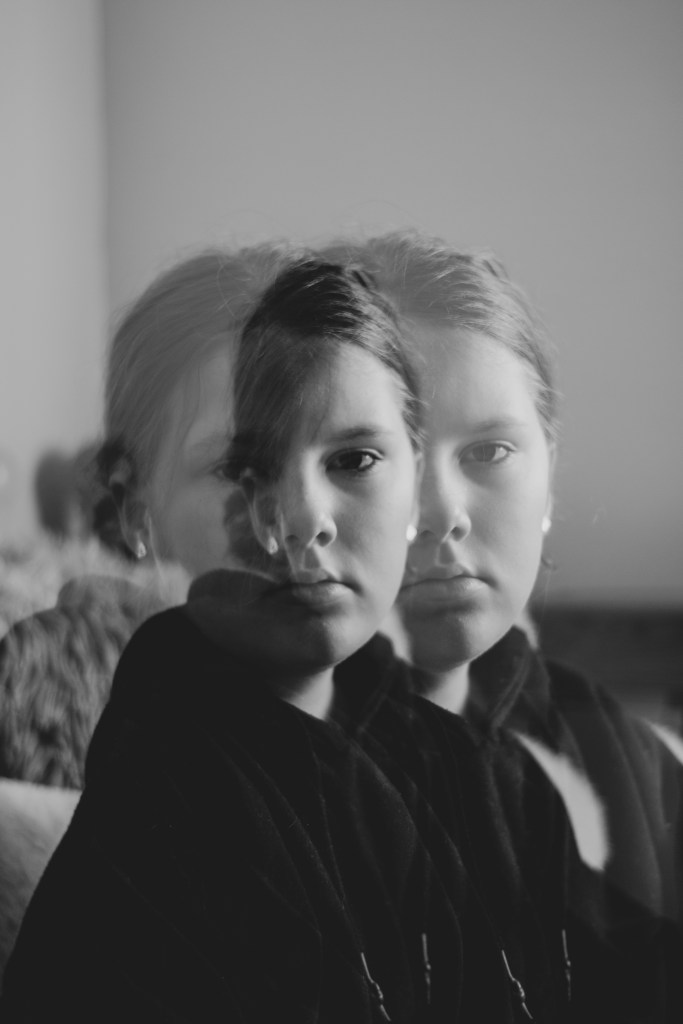
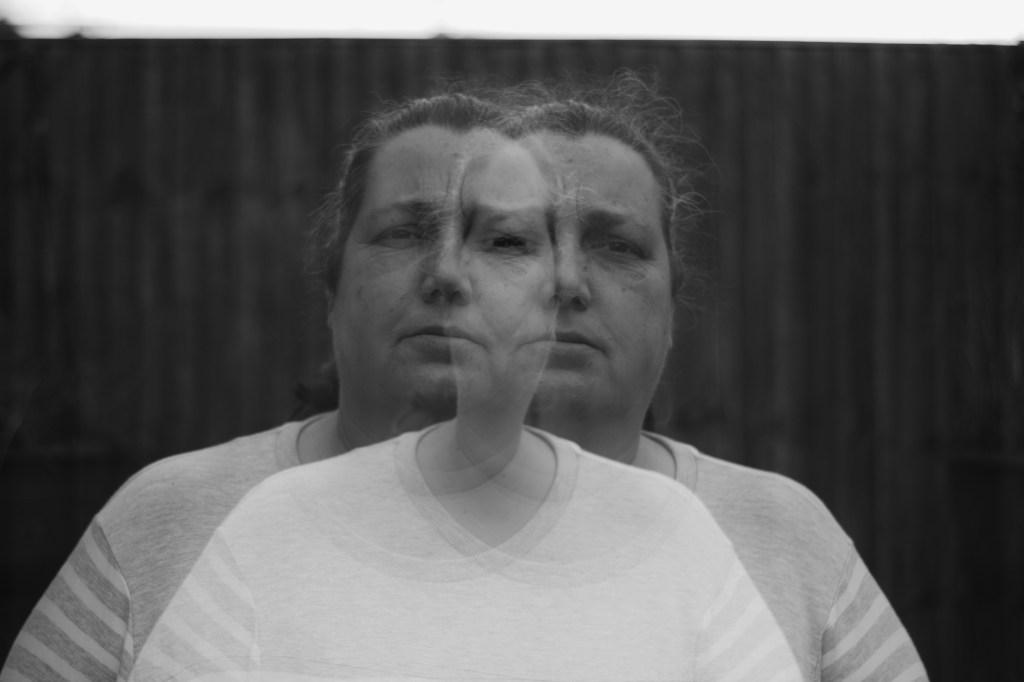
At the start of this project, I had a few ideas, but after talking to a guest lecturer, I settled intending to show the audience what I see. There were several ways that I could portray this. This is when I first started my initial research, guiding me to later choose to photograph my family and different ways in which I could produce this. But still wanting to keep to the theme of identity surrounding me, to what I personally see.
To learn new techniques I had to do my research, I stumbled across photographer John Deakin that inspired me a lot. The way he takes the portraits in multiple exposures is stunning, how he makes the sitter looks so natural, yet mesmerising to look at.
I have never used multiple exposure before, so this process was new to me. Researching it and understanding it was easy, but achieving the desired look I was going for was difficult. There are several settings in the camera that can produce different looks and contrast, and trying to perfect what I see through to the audience, required many attempts and practice.
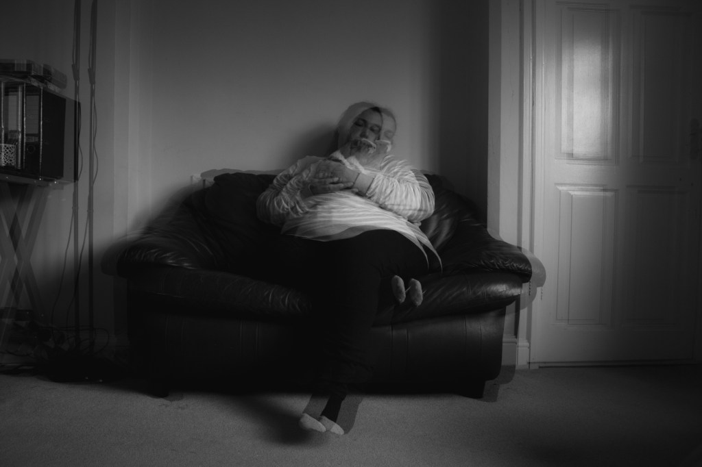
In the final images, I wanted to present how I see people differently, thats why I chose to do a close-up and a more natural far away shot. By doing this, I feel that I have made the series flow better and separate them, making it more visually impactful.
I would prefer it if I had done more shoots with more family members, e.g. my dad, it would’ve made the final images complete. However, I had to prioritise my time for printing, and there were delays because of illnesses. Although I think my final four images are still strong together.
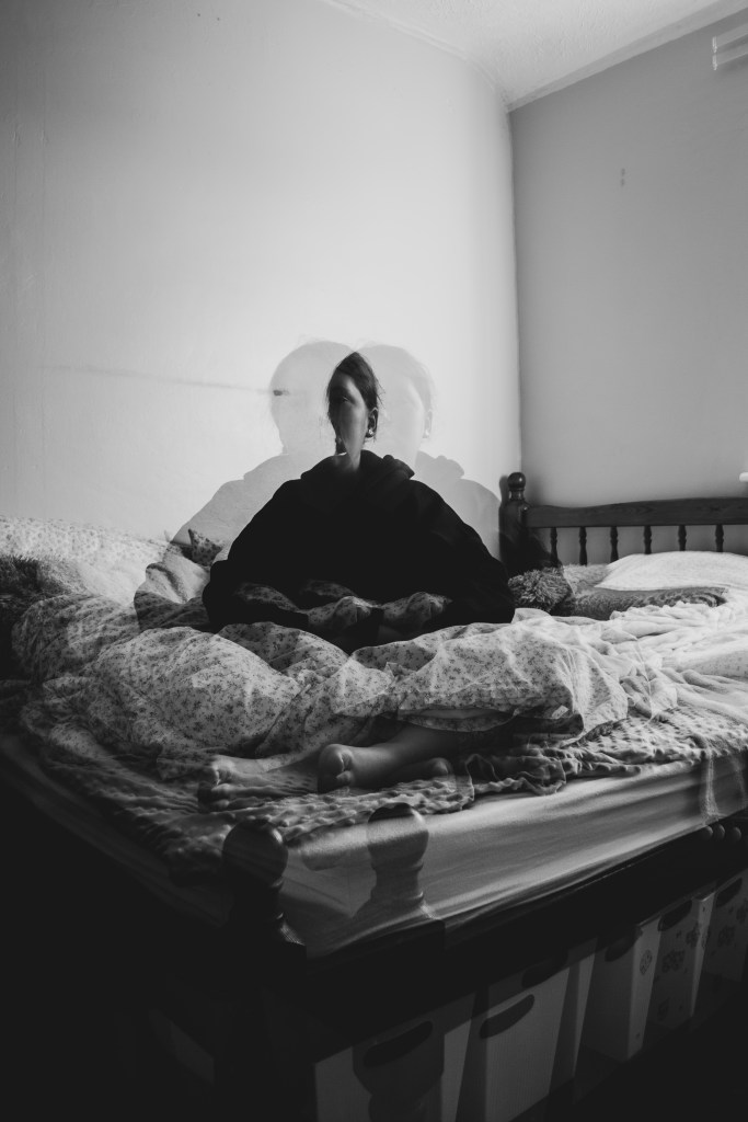
Producing the images was easy once I had perfected the lighting and location. The light couldn’t be too dark or too bright, or it would have caused contrast, which ruins the double exposure effect. Another thing what was difficult with the location was the background. It had to be plain-ish, if there was anything in the background, it would make the image messy like, and confusing to look at. So looking for areas around my home that relate to my family and me was important.
Overall I am pleased with the outcome, this was a challenging project for me while learning a new process and trying to perfect what I see visually through to the audience. However, because of the research, and challenges, it has allowed me to show the viewer a part of my identity, that visually people can’t see or understand.
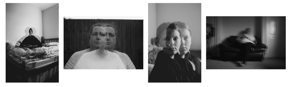
In this project, I have to produce 4-6 images surrounding the idea of identity, and now I have to choose my final images for printing. I want the images to flow through the sequence, but I’m going to narrow down the best images between the two shoots.
I wanted to photograph my dad for the final two images, but because of time restriction, I decided not to focus on getting my printing done. I am getting feedback from fellow peers and friends to see which ones they are visually taken too.
THE SELECTION TO CHOOSE FROM
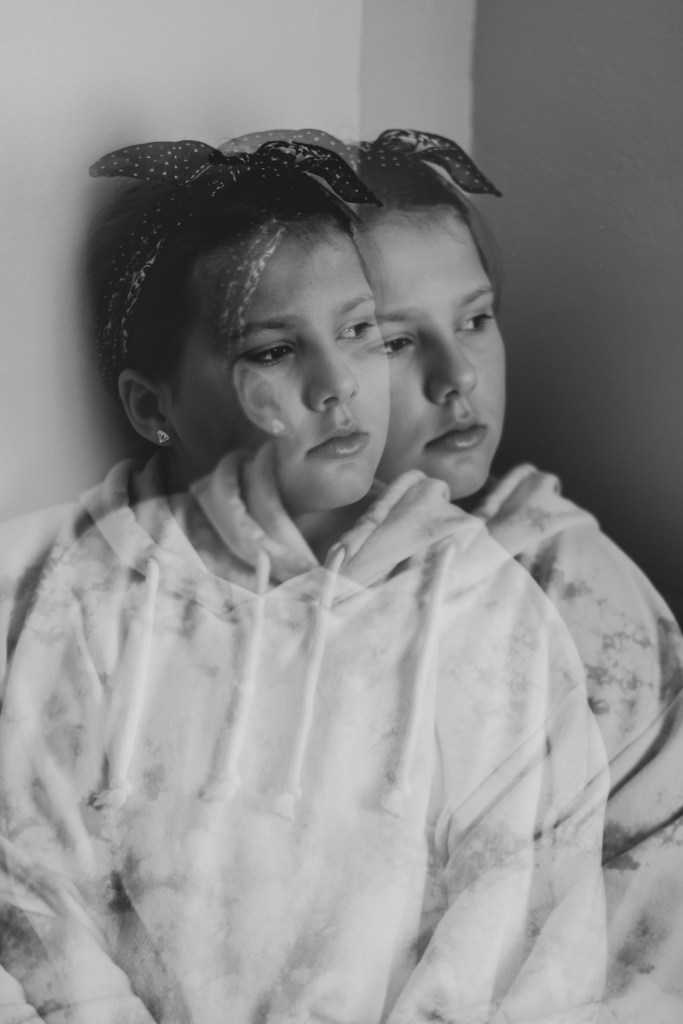
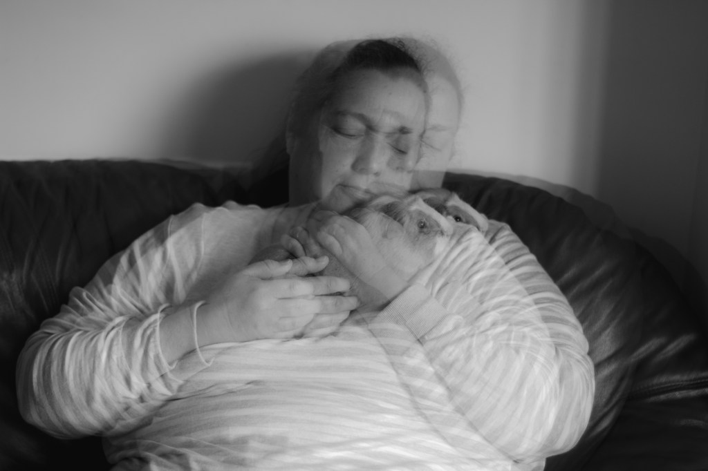
I have rounded down my favourites from these shoots, which relates to the theme of this project, however, which are visually exciting. I definitely want to use one of the closeup portraits of them, it best shows what it looks like when perhaps I’m talking to them. The other images are either closeup or distance, and I think it would be nice to show the difference between the two.
FINAL IMAGES
From all the feedback and putting together different images, I’ve decided to go with the four above. Because i like how half of the photos are close-ups so you can see the details of there face, but then the distance images put them in place to where their identity links them to.
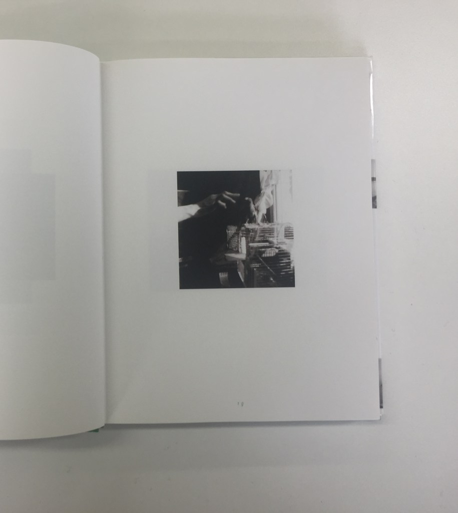
The last image of the series above, I was not going to use, but instead, use a close-up of her holding the guinea pig, but it felt like a series that mostly consisted of close-up portraits. That made the first image feel left out. So when I put the fourth image in it completed the series.
I want to print them in A3 Lustre paper, but I’m also going to print A4 because when doing to double exposure it looks like the quality decreases. Though my camera is 20.2 MP, it is just as a back-up.
The title of this series is going to be called ‘What I See’, as this is one of the most common phrases I use. It represents these images because this is literally what I see, through my own identity.