As this project has the task of creating our website, I am going to use the research I used of layout and design to create my own. I am using WIX to design my site on, and I aim to make it clean and simple. Below are videos I used to help me create it, along with workshop tutorials to help.
SCREENSHOTS
After a lot of changes and layout designs, I finally finished the initial layout, below are screenshots of the different pages.
FRONT PAGE LAYOUT
UPLOADING FONTS TO MAKE THE HEADINGS STAND OUT
FINAL SIDE BAR
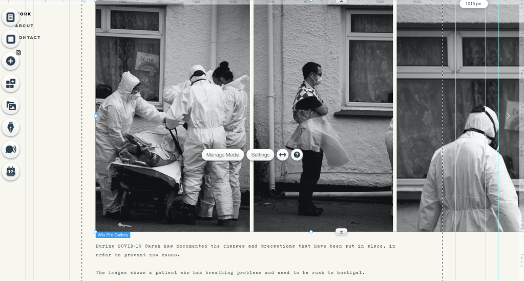
LAYOUT OF WORK PAGE
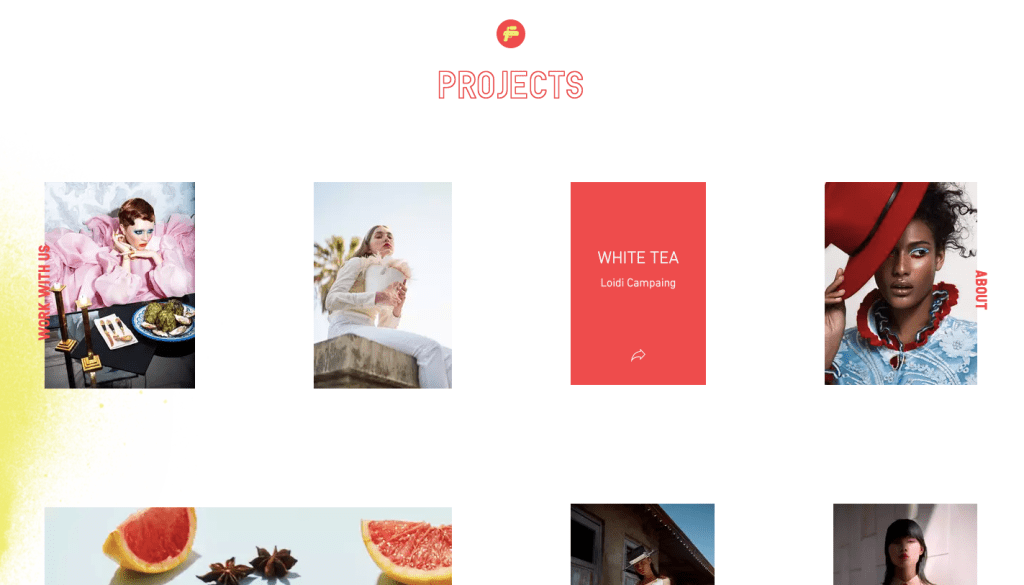
LAYOUT OF PROJECTS PAGES
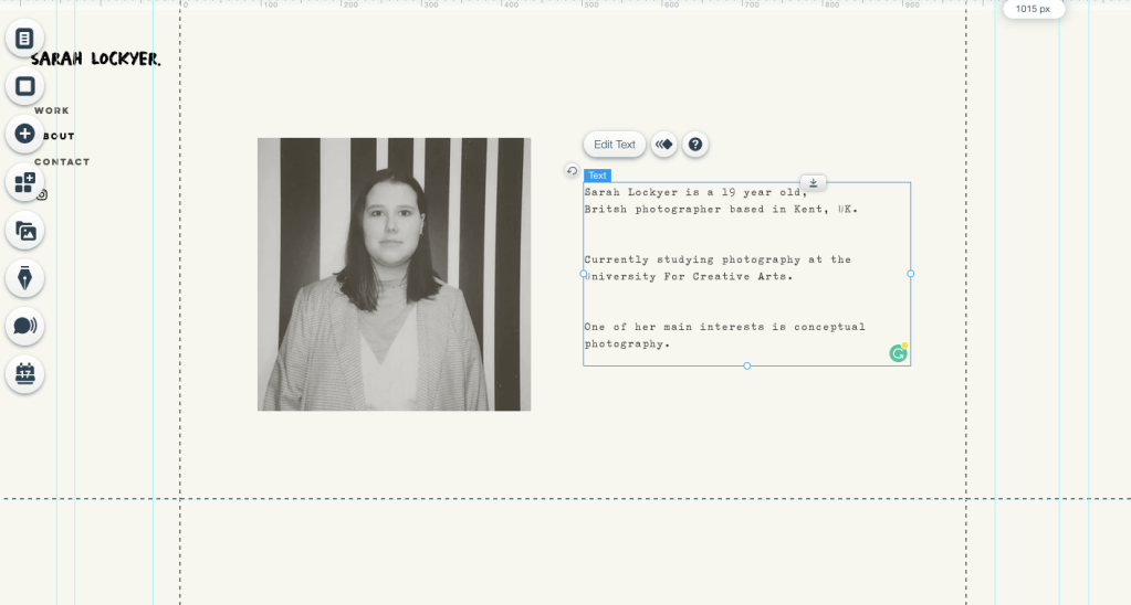
ABOUT PAGE
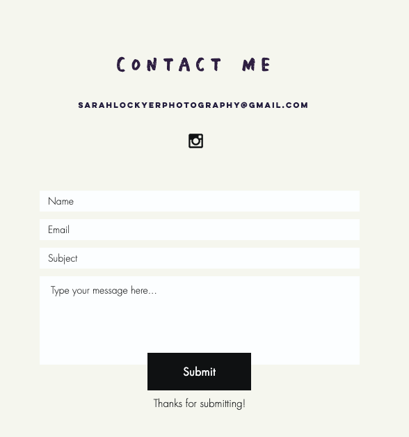
CONTACT PAGE LAYOUT/DESIGN
EVALUATION
Overall building this website was reasonably easy to do; WIX is a great tool to use for beginners. However, as I am perfection, it was hard for me to complete my site, or be happy with the layout. I restarted my site layout over and over, then remembering in my research that the simplistic sites were different better in my eyes. This is what leads me to my final website. Another problem i encounter was choosing what images to put on the site, as I have a project from uni, but also personal projects that I have done—but also deciding how many to put up, what to show.
Researching another photographer website helped in this project, giving me ideas, but also do’s and don’t’s of sites. In the end, I am happy with what I have achieved, not just with my website, but also with my work progress over the past year, allowing me to present my work on a professional website.
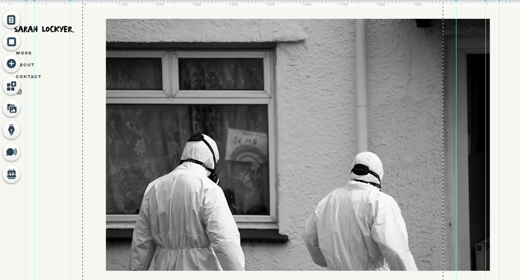
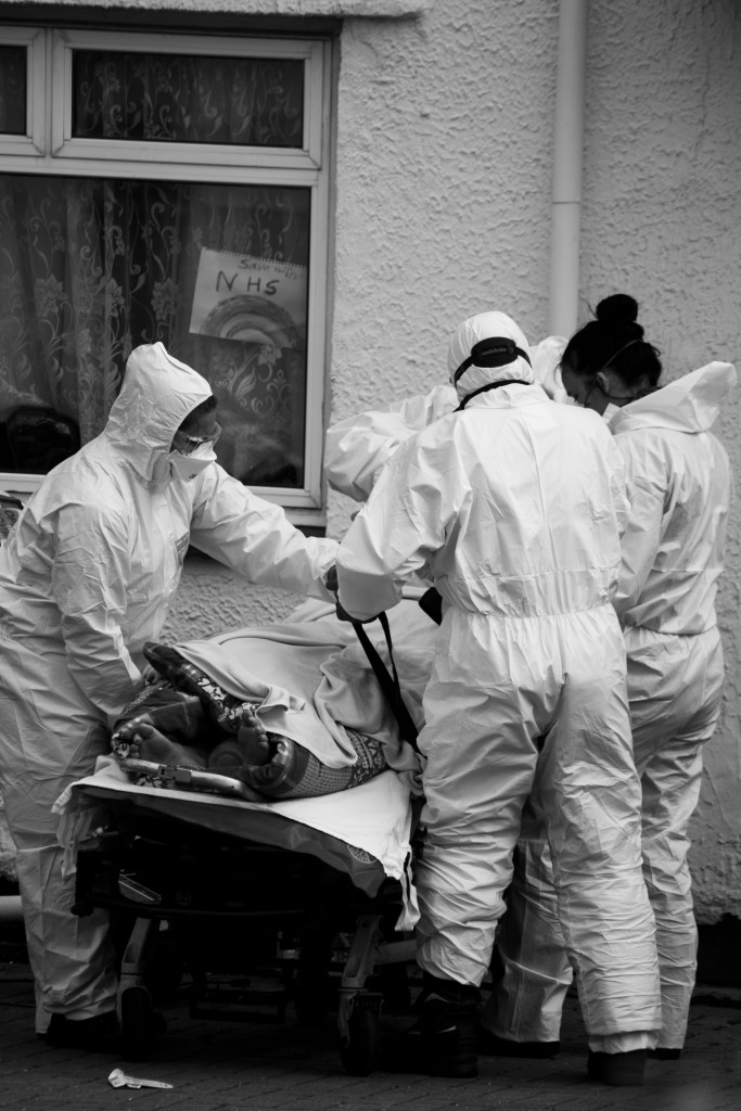
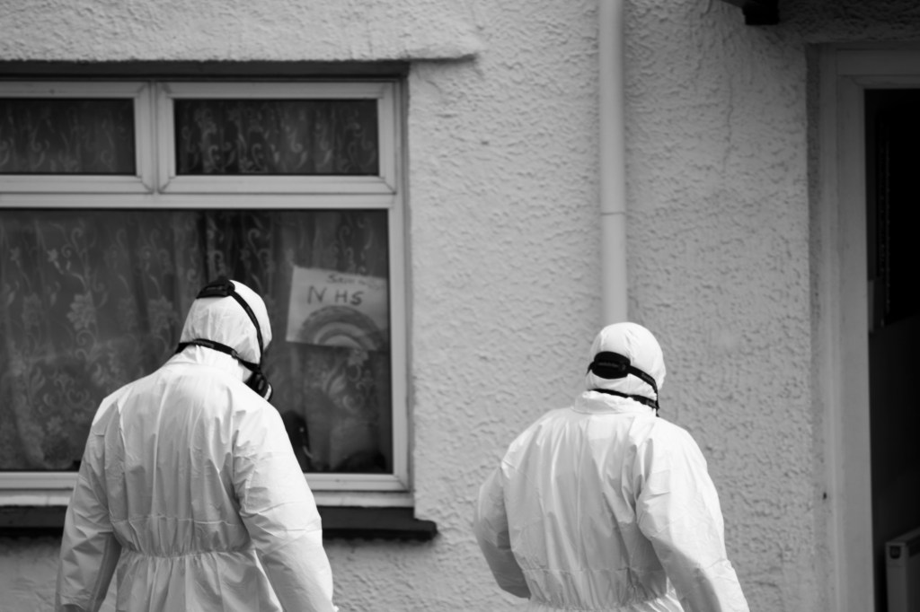
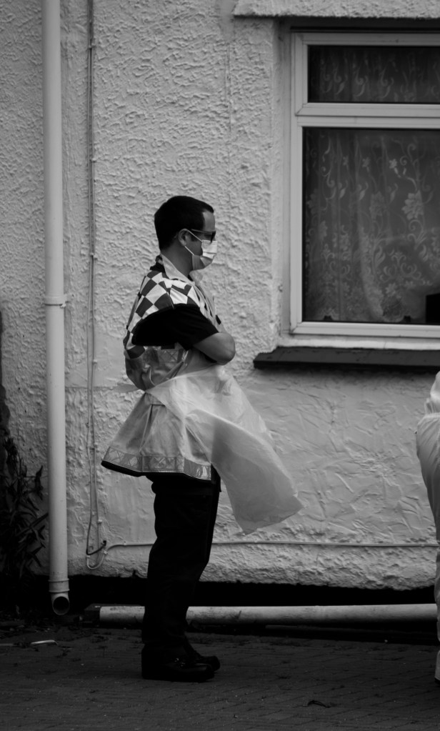
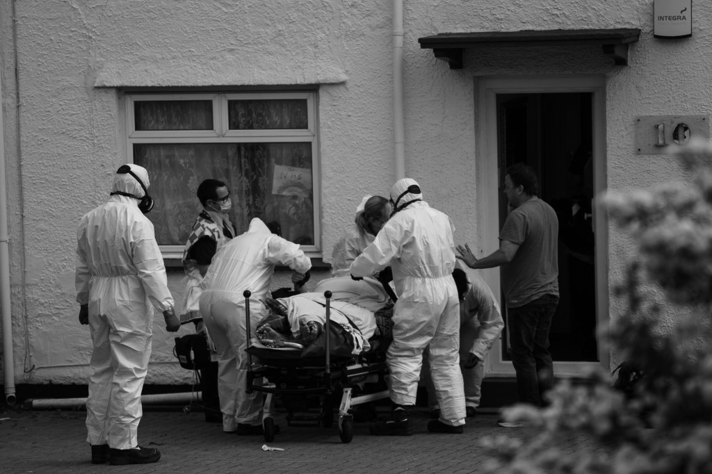
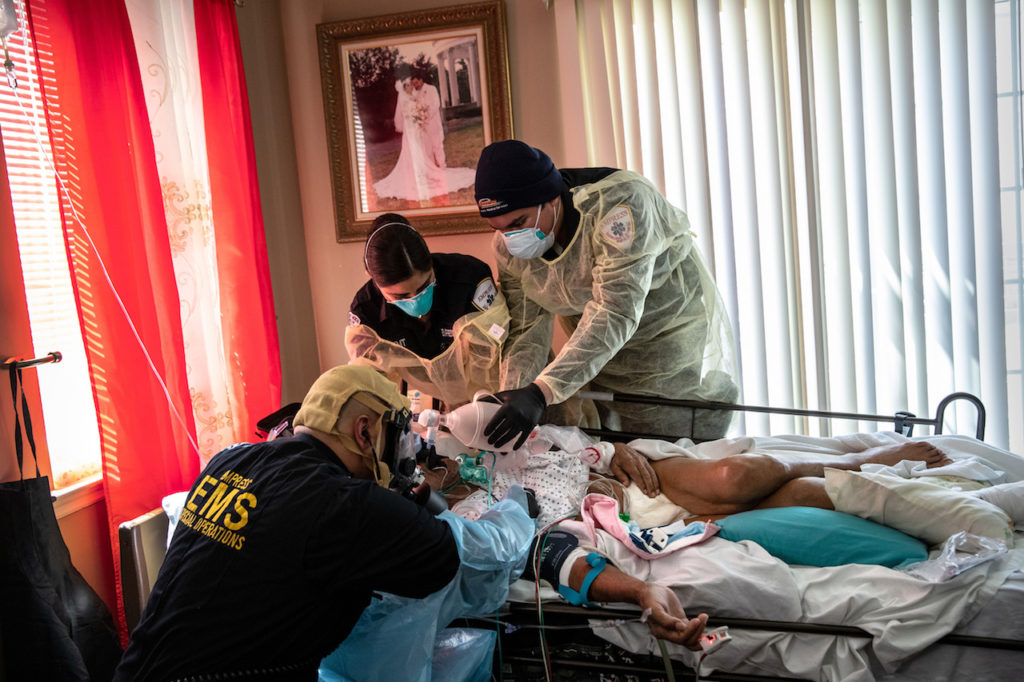
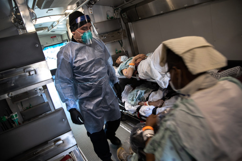
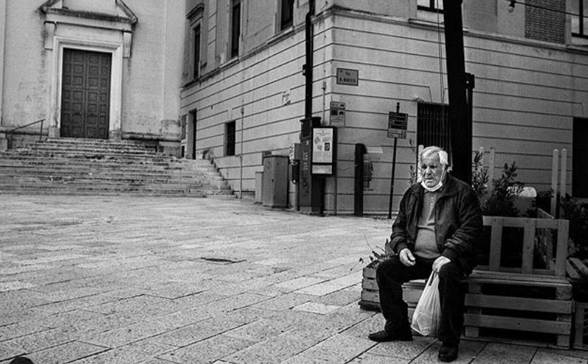
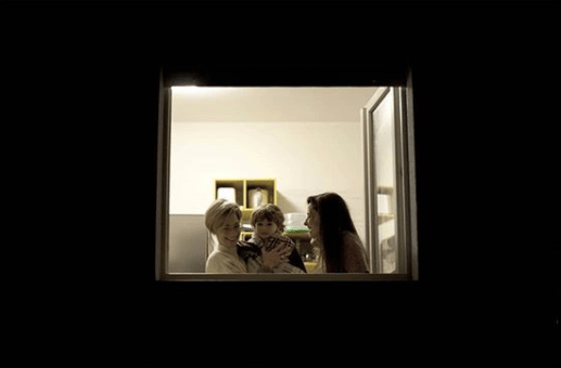
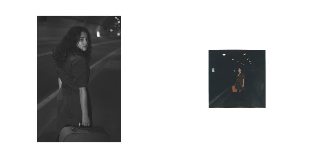
As I stated that I want to document the changes throughout COVID-19, this happens out of the blue. My neighbour across the road is quite old, and I think already has medical problems, and three ambulances and a fire engine were called at there house. It happens all of a sudden out of nowhere. Even if COVID-19 weren’t going on, you would still be worried about what’s happening, but seeing all the medical team wearing suits and gear made the whole situation ten times scarier. All neighbour on the streets were worried and thats when I thought I’ll get out my camera.
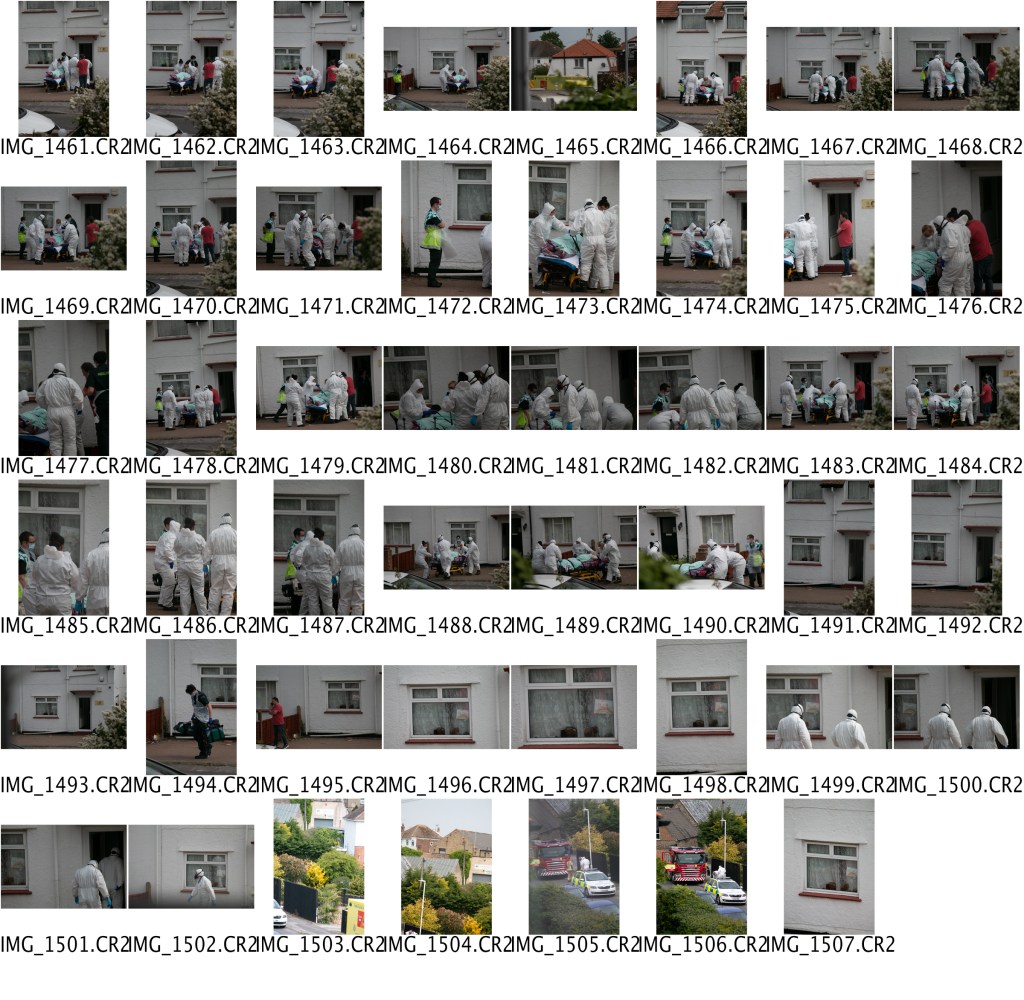
I didn’t want to make this sensitive situation any worse, so I used my 70-300mm lens from my bedroom window and tried my best to get a good composition, as everything was happening fast. I think the other reason that I got out my camera was that while they were trying to get her stable, with oxygen etc. in the window in the background was a supportive poster for the NHS, which was quite ironic, yet powerful. Even when she was on her way to the hospital, the after-process of the medical time was extraordinary, and it took them, I think longer to leave than helping the patient. Which in reality I believe shock a lot of my neighbours. Here are the contact sheet and final images below –
CONTACT SHEET
FINAL IMAGES
Even though this was not what I planned for my final images to be, I am pleased with them, I wanted to document changes since COVID-19, and I think this is an example of that. I put the images in black and white because I thought the original photos were too busy. By putting them in black and white, it allows I believe the images to stand out more and will enable you to see all the details of the situation. I felt awkward and felt that I was doing the wrong thing by photographing this situation, but I have learnt throughout this first year of university, that if you don’t document it, who will. We are living in history right now; no-one has experienced this before. But the main thing was I want to shoot this as tastefully as possible, as it was a sensitive subject for my neighbours.
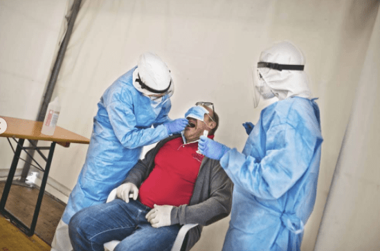
John Moore is the Special Correspondent photographer for Getty Images and was one of the first photographers to cover the 2014 Ebola outbreak. Through this Moore said that “I learned a skill set that I never expected to use in my hometown,” he says, as he reflects on the process of covering the coronavirus outbreak in New York.
It was a helpless and horrible situation, but Moore felt it was important to document, and through it, he learned how to best protect himself and others on the frontline of an outbreak — “A skill set that I never expected to use in my hometown, but here we are,” he says.
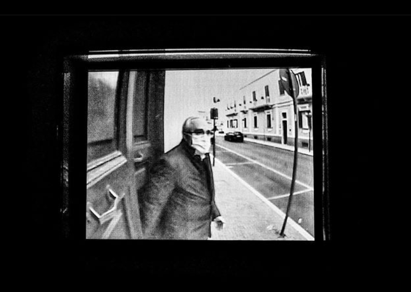
“Over the past week, the state of New York has rapidly become the epicenter of the coronavirus (COVID-19) pandemic. At the time of writing, there have been over 200,000 confirmed cases and 14,000 deaths, 12,000 of which have been recorded in New York City. Moore, who is a special correspondent for Getty Images, has been covering the outbreak in the suburbs of the city, in his hometown of Stamford, Connecticut, and Yonkers, New York. “There is a saying that when New York coughs, the suburbs get a cold,” he explains. “There are many brave journalists doing important work in New York City, so I’ve tried to concentrate on peripheral areas that are also highly affected, but under-covered in the media.”
“It’s our job to find ways to tell stories, even with the restrictions in place, and to do it in a way that respects humans as individuals”
I believe in the statement above when documenting someone as tragic and serious as this; you still have to record it in a way that is tasteful and respectful. When I do my images, I would want to have this in mind when shooting, but also trying to achieve the best I can to tell the story to the viewer. The camera angles Moore uses allows the viewer to see whats is happening in the image, but shooting in such a way, that you only see parts of the patient. Like the feet and arm. Bringing the focus back onto the doctors and nurses.
VITTORIO AULENTI
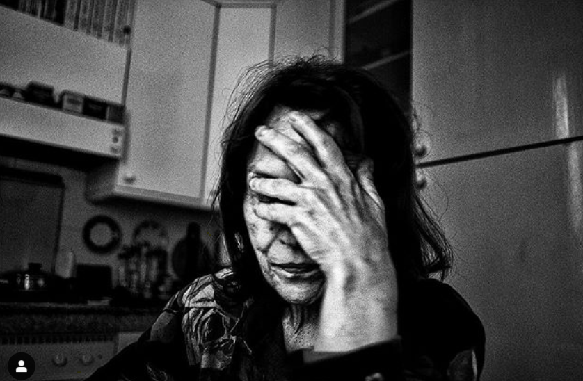
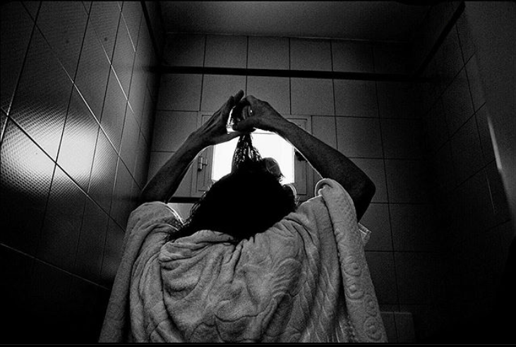
On the other hand Vittorio Aulenti is an Italian documentary photographer, photographs the impact on the everyday people and new daily struggles due to COVID-19. Aulenti loves to describe the world and human’s behaviours in a grainy and sharp way, all with a dreamy background of irony. A few years ago Aulenti started working with black and white film, which represents for him is the best way to photograph and render the reality for what it is: beautiful, imperfect, difficult.
The grainy black and white images, enhance the detail of emotion and defines certain parts of the picture. For example, in the top right image, the hand are the main focus of this woman struggles within these weird, yet hard times.
ANDREA MANCINI
Andrea Mancini is a free-lance, photo-reporter, Italian photographer. Lately, Mancini has been documenting the different types of people during COVID-19. The people who still have to work and the people who are isolating at home. However, Mancini takes these subjects artistically and compellingly. By using the surrounding to shape the subject, allowing the subject to be the main focus for the viewer.
What I’ve taken from looking at these three artists, is that point of view is significant, and make an image even more powerful. Being respectful to the surrounding of what’s happening, but trying to capture a story of what’s happening.
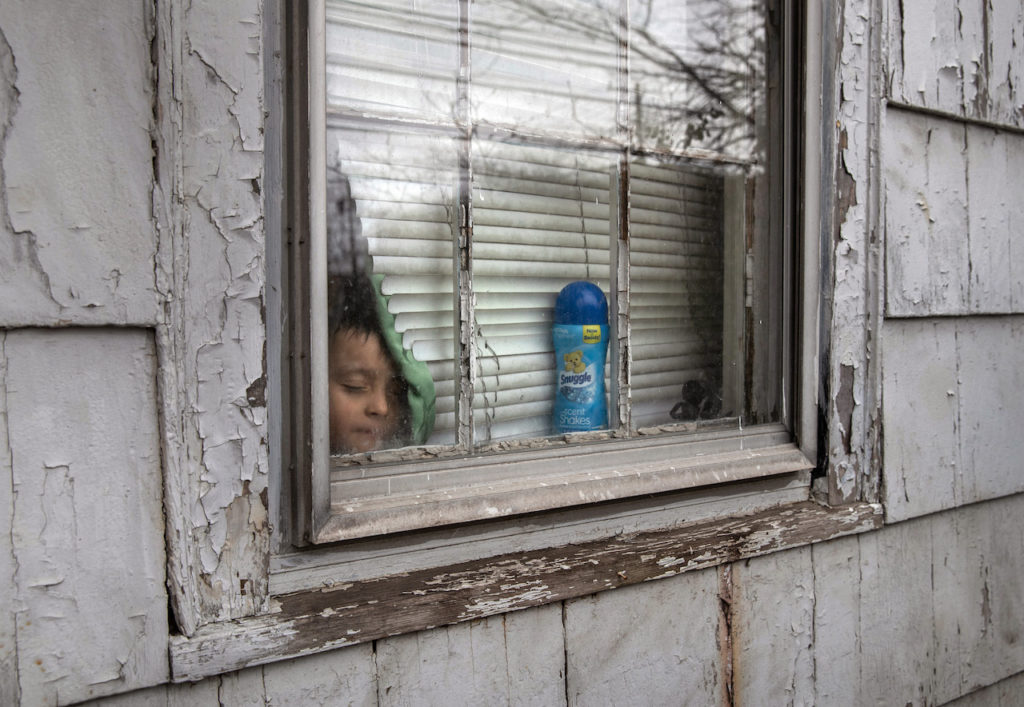
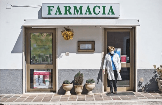
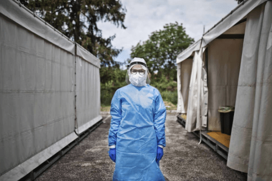
During the time of doing this project, the UK is currently in lockdown due to COVID-19. Restricting photographer to the norms of photography, but allowing them to get creative in different ways, through technology. My idea is to document the changes within my household we have made. Through my Dad working at home, and my younger sister being a high-risk person to COVID-19. Another idea was to also document the changes on the outside, so in shops, people themselves, and even people homes windows (the drawings and poster supporting the NHS).
In this unit, we have to produce our photography website, to do so, I am looking at other photographer websites and seeing all the design, layout and structure details together. Below are examples of people I look at, with concepts in mind I am going to put on my website.
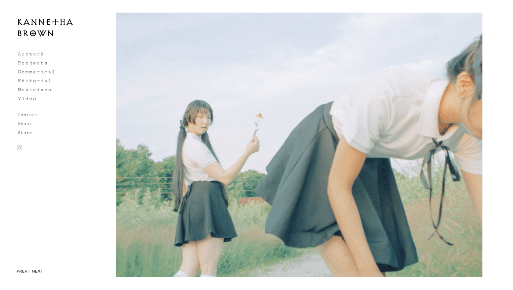
KANNETHA BROWN
I follow Kannetha Brown on Instagram and loved the simplistic of her pages. The use of different, but minimal fonts makes it unique. But the layout makes her work stand out. Her page about me is also short and straightforward, which I like because as looking through lots of websites I see that some people write lots of small amounts. This may be down to age and lack of experience, but I feel that the audience is there to view your work, and perhaps don’t want a lengthy paragraph about the individual. On the other hand, if you have great partnership/clients or awards, I like the way Brown has display it, in a list format. Overall I love her website, with the choices of keeping everything simple.
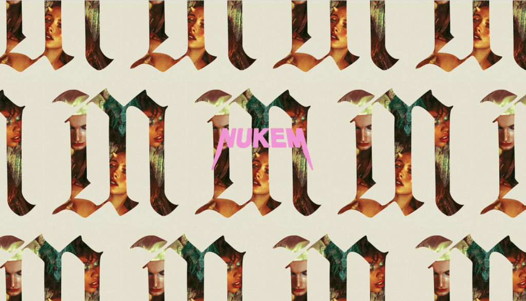
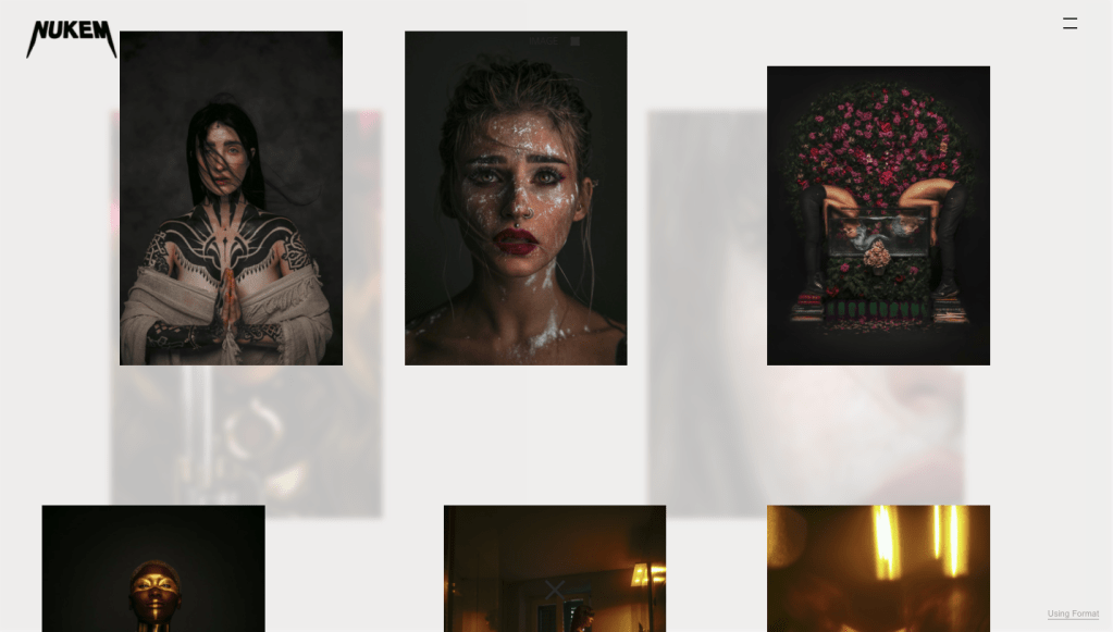
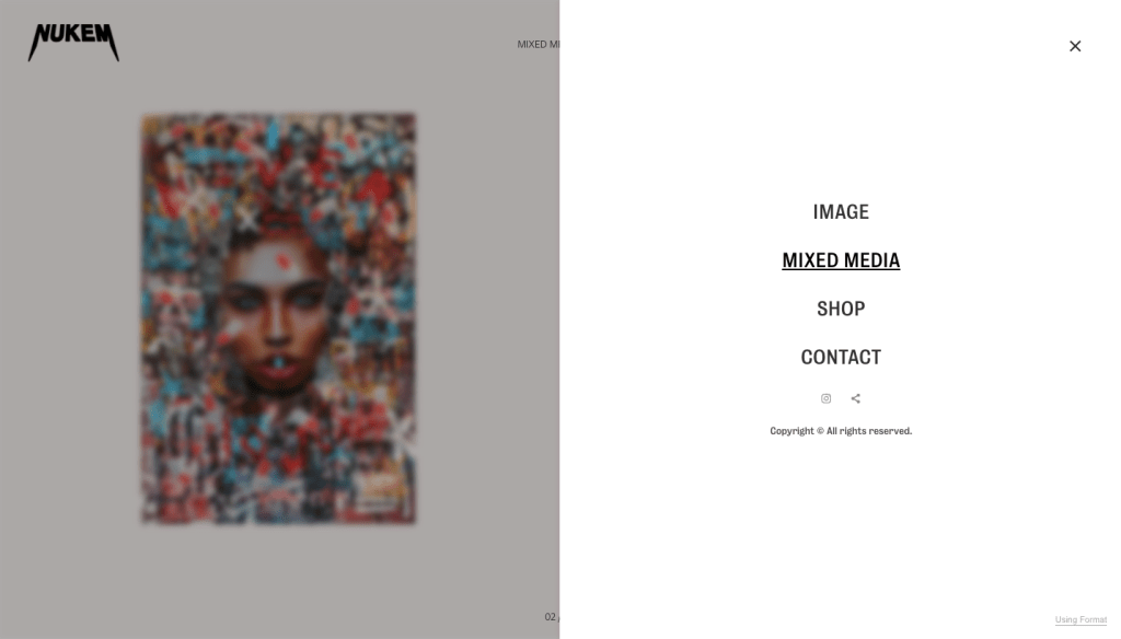
On the other hand, Haris Nukem website is the complete opposite to simple. First, as you open the site, you’re greeted with an intro page, which leads you into the main website, and then instead of scrolling down to looking the images, you scroll horizontally. Each photo is placed together with muted colour boxes, which somehow really works if you didn’t want to view it this way; there’s also an option to see it in a grid format.
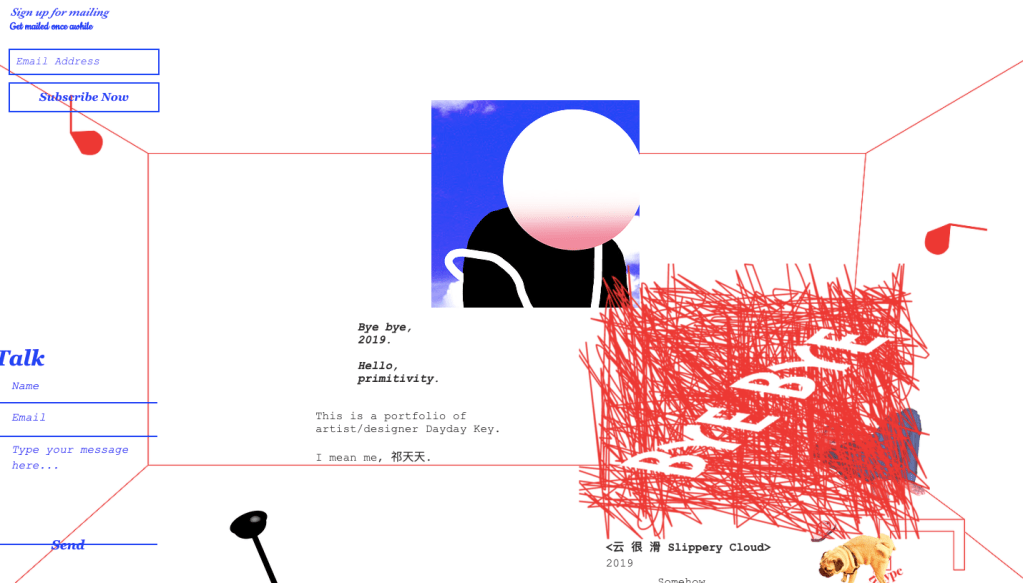
Even though this website isn’t directly photography, i appreciated the time and effort that went into building this site. It is so unique, as you scroll through you see a bit of work merge with little details about Soberika Leeway. I have never seen a website like this before, but it works.
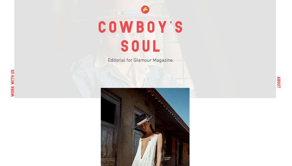
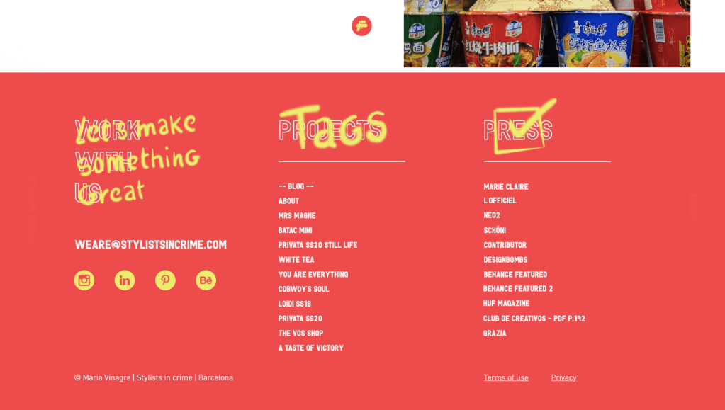
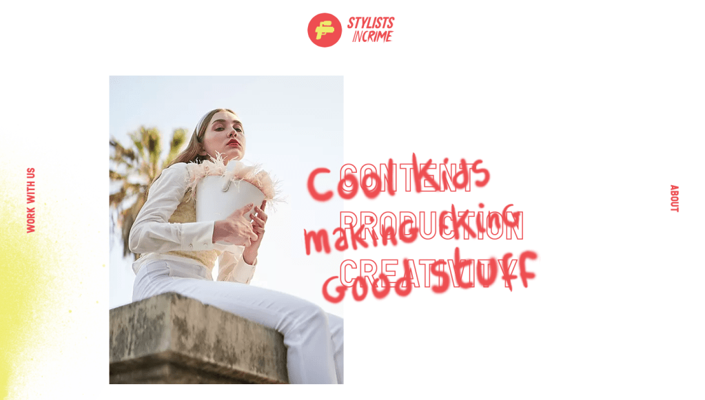
Stylists in crime is a company that has much photography within it. The layout of this site is excellent and again, full of surprises. As you hover over parts of texts, and overlay of something else pops up. Making the website feel more creative but relax. All the small details from the logo, to the spray paint effect, really brings this website together.
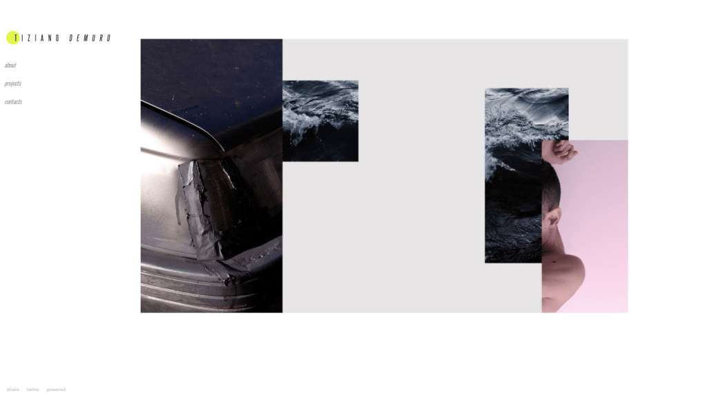
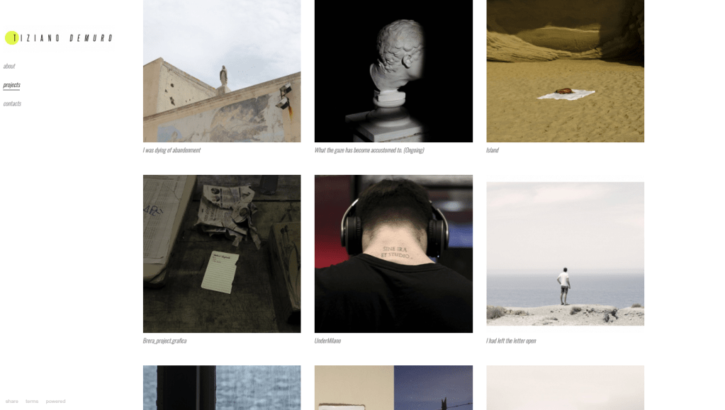
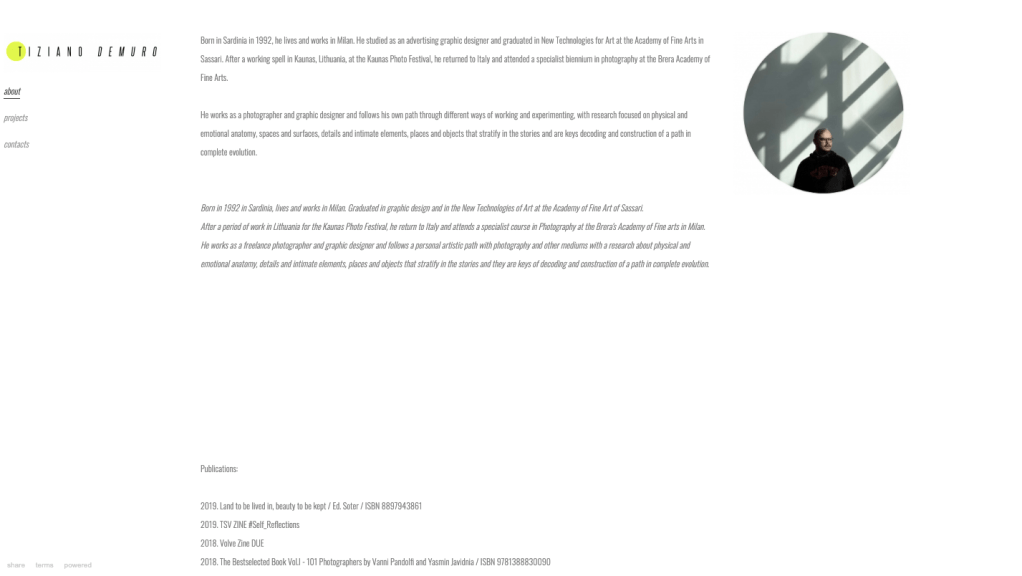
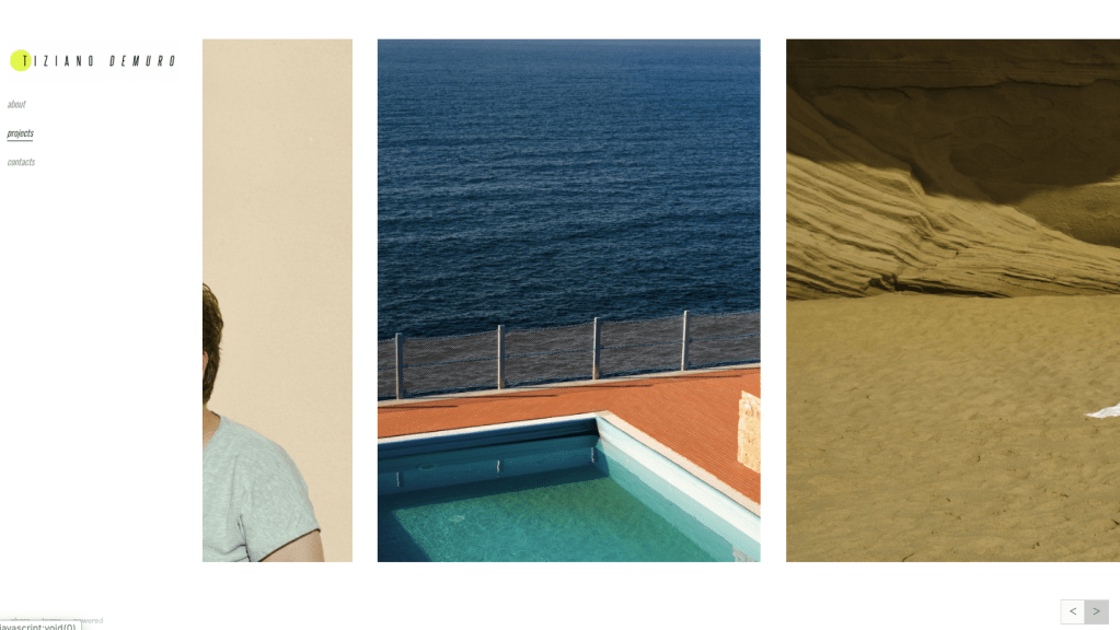
I also follow Italian photographer Tiziano Demuro, and I think his website makes his work stand out clearly than other sites. The layout of each page is clean, simple, and modern. Like Haris Nukem, from above, each one of his projects you scroll to the left to right. Using this method makes the images of the projects feel like a series. When creating my site, I am going to try this. On Demuro homepage, he has a digital mix-media collage of images, that do not make sense with each other. However, the placement makes it feel unique.
For the ‘Image-Making’ unit, I had to construct a series of photographs, which later would be produced into a photo book. I had the choice of choosing two different pathways to go down — both surrounding the theme of the documentary, however, one being reality and the other being fiction.
I’ve always been attracted to the idea of constructing scenes and seeing how the viewer may interpret it. As I began to research, I found that some of my key influences were in the concept and style I was going looking for, which made me more excited about the project.
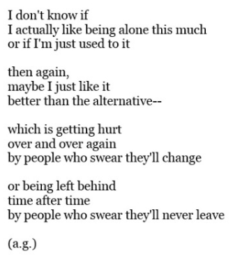
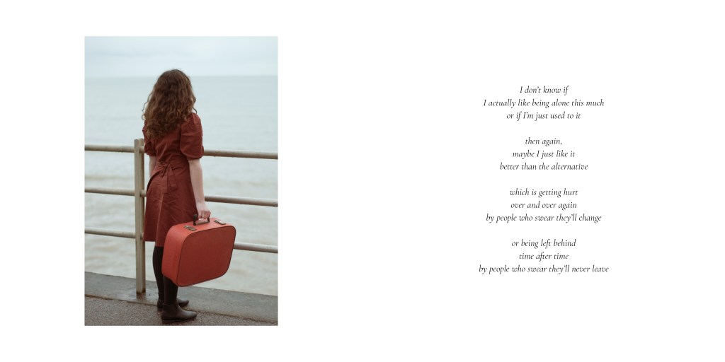
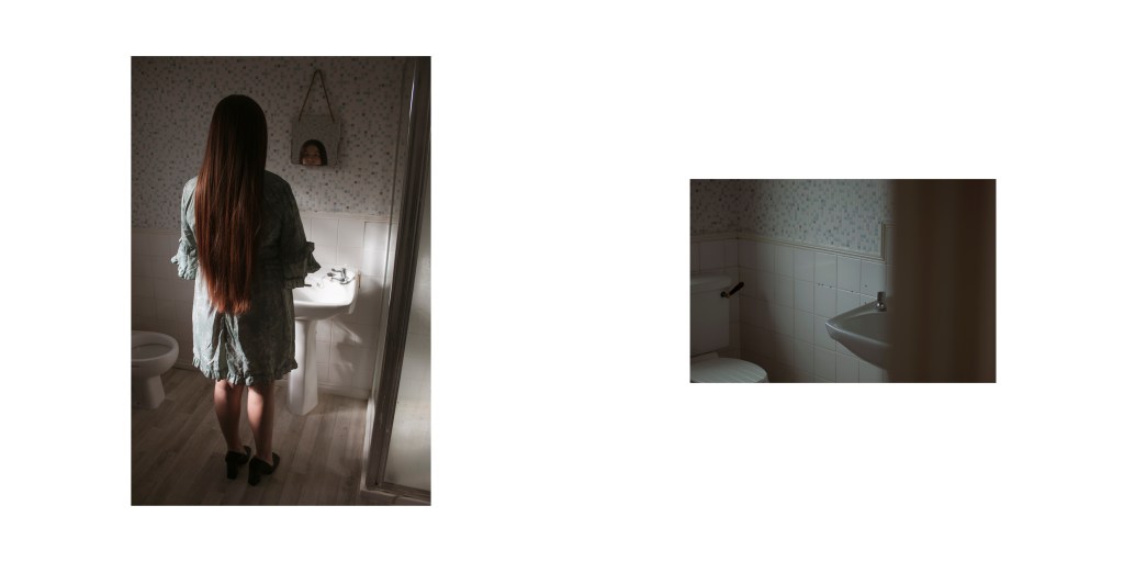
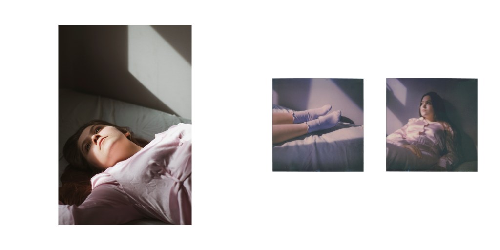
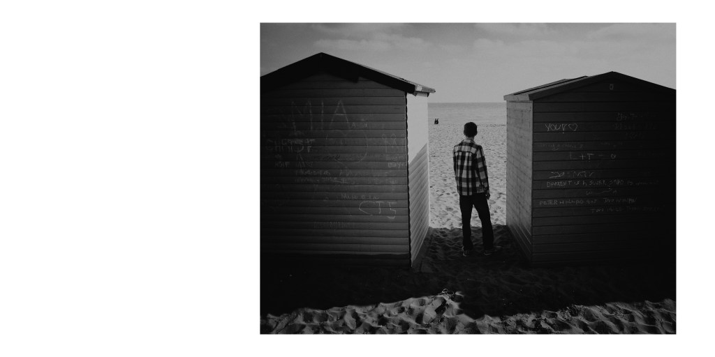
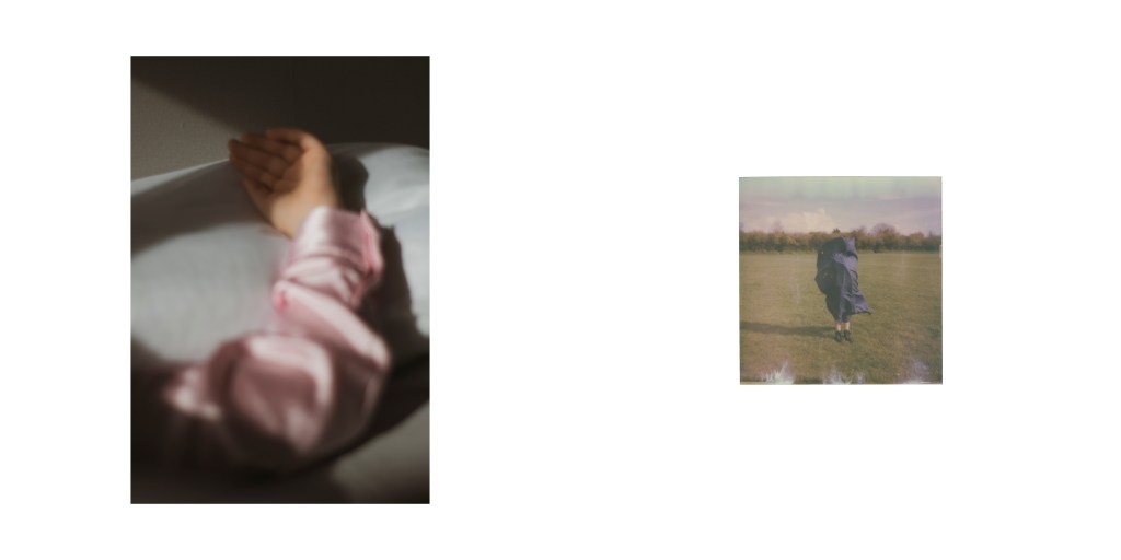
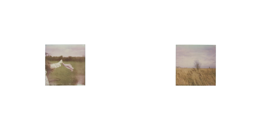
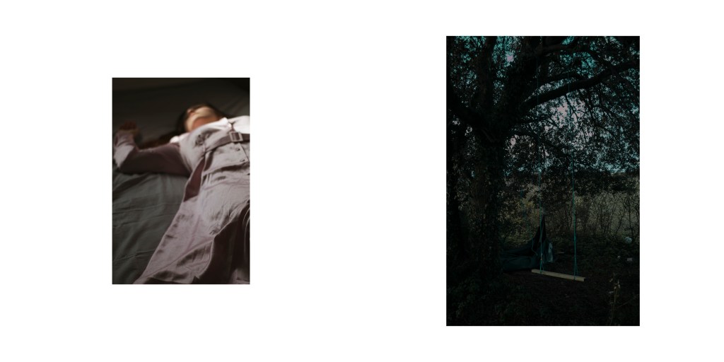
I knew I wanted to push myself and chose documentary fiction, but it was developing that idea. Even after researching, I had a couple of ideas, but I was not entirely sure for myself. So I later started to read short stories & poems and watch short films, to perhaps base my concept on, or to develop some ideas. This is how I got to my plan, I always like to shoot ‘things’ in my work in a simplistic way, and relating that to a poem I found was great. Because I based my concept off of the words loneliness, emptiness and isolation, this idea, along with the poem would be demonstrated through the various subject, differently, but all leading back to the poetry and words.
I believe through this process; I have improved my communication between me and my subject and the planning/production of the images. As I chose documentary fiction, I learnt that I had to think about every little detail. From the clothing, location, props, booking out equipment/subjects and also preparing for backups just in case. But this has taught me a different side of being a photographer, which has taught me valuable lesson/experiences.
Some struggles with this unit were the British weather; I can expect this, at this time of year, but the constantly changing weather. Luckily the dark clouds in some of the images added to the moodiness of the photos. Another issue was a model quit the last minute, as I had the set and outfit ready. Luckily I had someone else to do it, and I feel that he was better suited for the image, but it was still stressful.
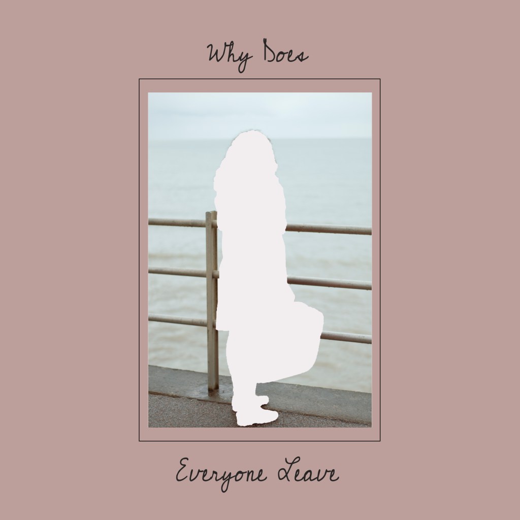
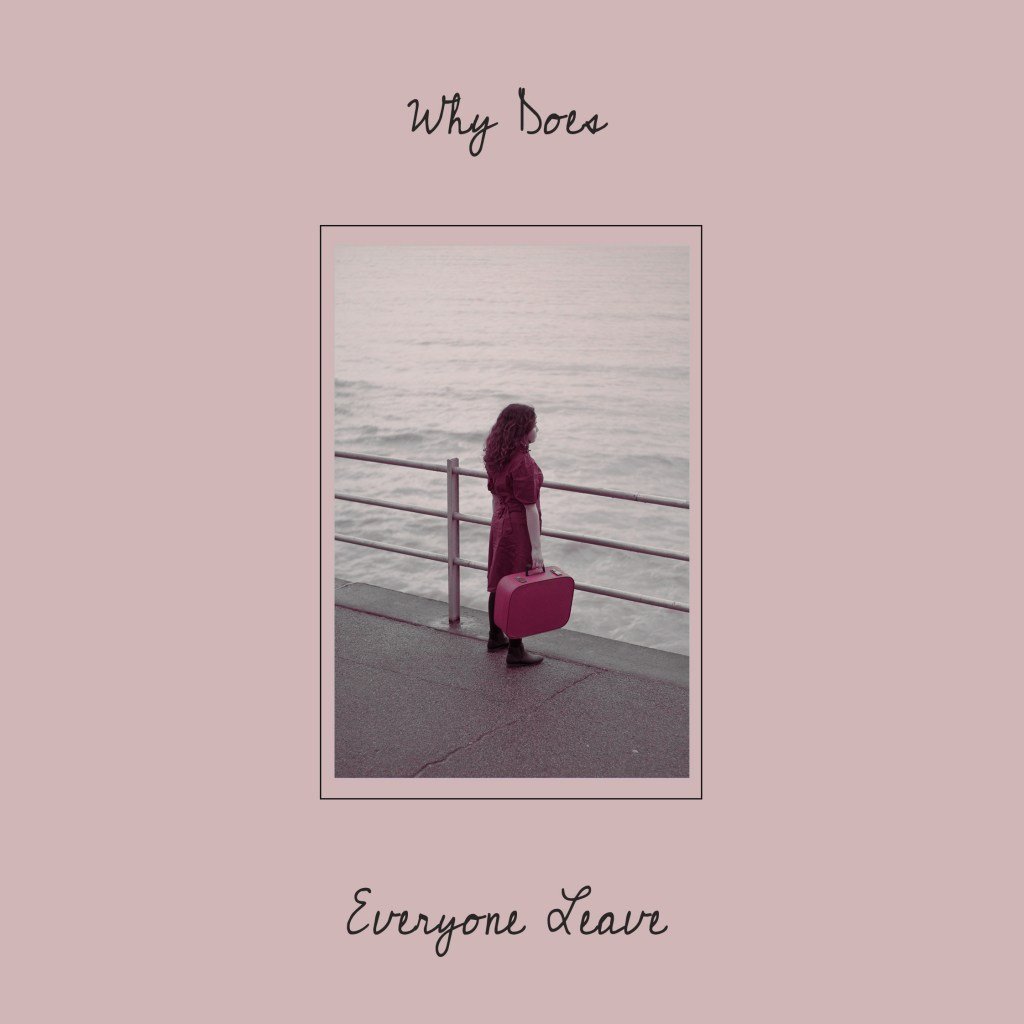
I went with SAAL Digital UK, to print my book with, as they were reasonably cheap for the quality standard. Throughout designing my book layout in InDesign, it took me days, sorting out which picture to put together etc. And thinking maybe I should have had done more shoots, however with the deadline nearing, I wanted to get this sent off, so I could have it back for hand in. I titled my book “Why Does Everyone Leave”, I wanted the title to depict all the different subjects within the book. When I received my book, I was thrilled with it, the printing was excellent quality, and for my first photo book, it wasn’t that bad.
Overall I am delighted with the outcome; I learnt new skills and this project expanded my ideas for the future. I enjoyed exploring new artist and techniques they used in their processes. Hopefully, the viewer can understand or interpret it to their understanding.
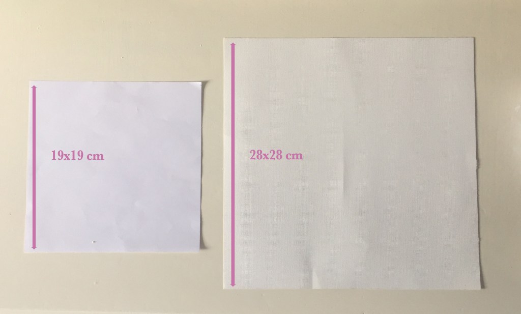
There are many different ways to produce my photo book in various materials and sizes. This is why I’m looking into both handmade and company made. Comparing the differences as I need to make two books, in time for the hand in.
My images are both landscape, portrait and polaroid, so choosing the size of the book is essential. From looking at what different options I have, I’m going with a square format, in size 19x19cm or 28x28cm. Below you will see the difference between the two.
SCREENSHOTS
I made a folder full of my chosen final images
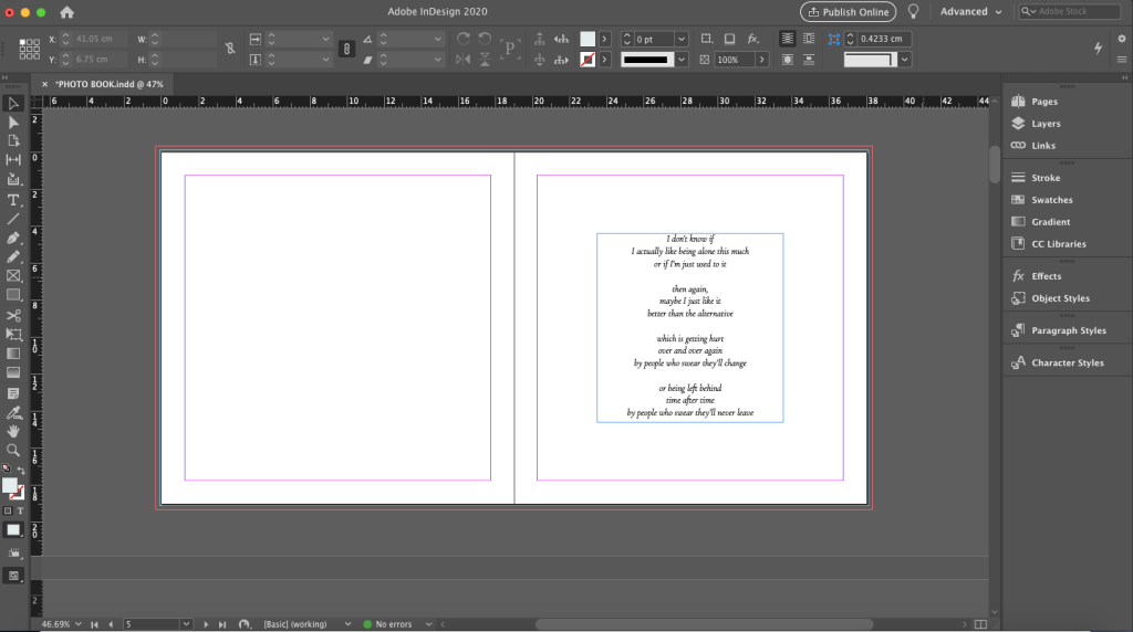
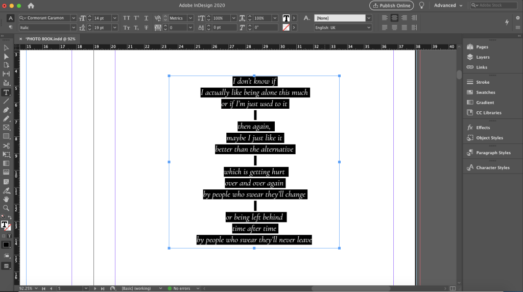
The first page needs to have the poem in it
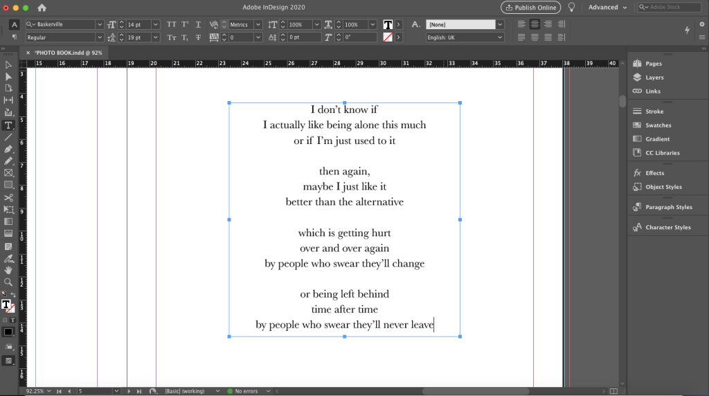
This is the poem up close, that reflects my work
Making decisions on choosing different fonts
Adding in an image to fill up the negative space
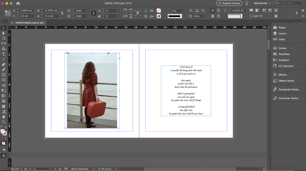
I want the transition from one page to the next, to be smooth. Thats why I chose this image, as it links to the picture before. Then deciding what position to put it in
Again placing in images, and positioning them in different positions and sizes
FINAL LAYOUT
Heres the final text block of my photo book, I wanted it to be clean and straightforward, but have a modern twist to the placement of the images etc. In the end, I went with the 19x19cm square format, I felt with going with the smaller option that it would make it more intimate and meaningful, which is what the book is about.
COVER
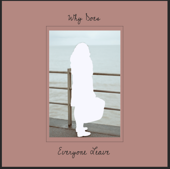
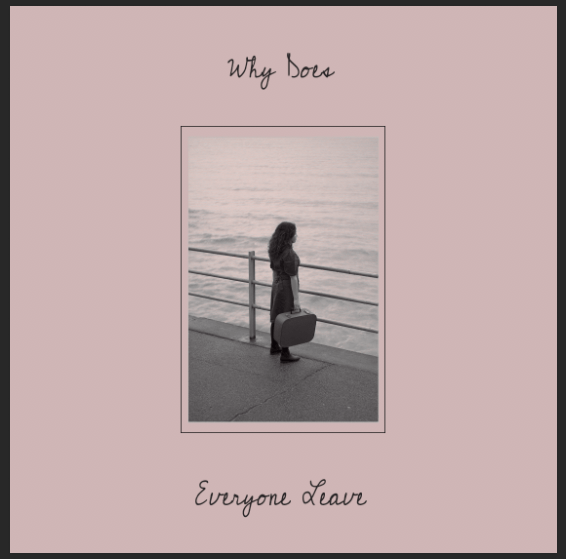
INSPIRATION FOR THE COVER
I want the cover to have a pop of colour, but be simplistic looking, to represent the book. Below is some inspiration for the cover.
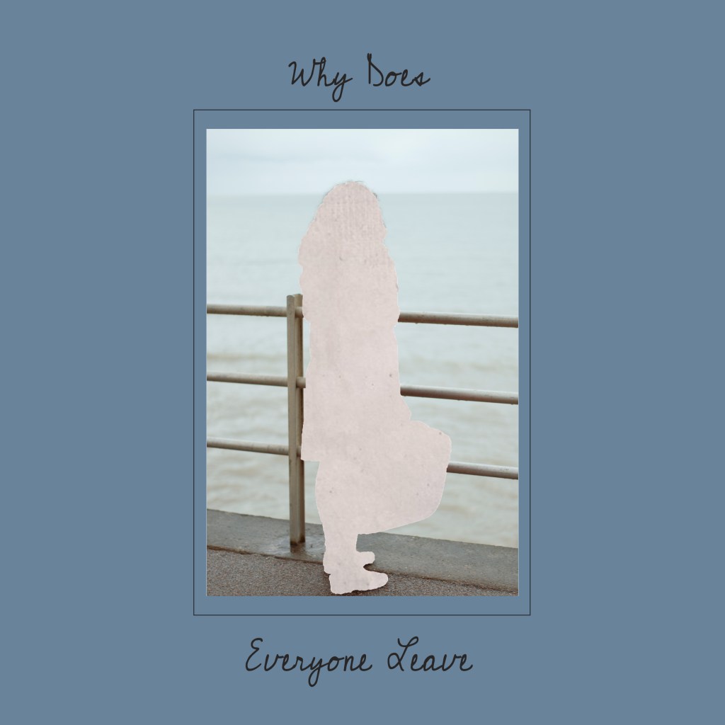
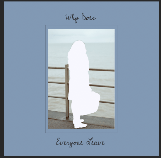
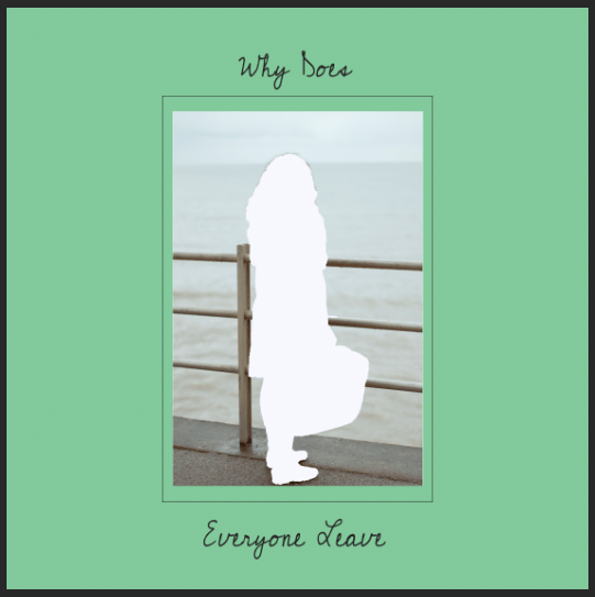
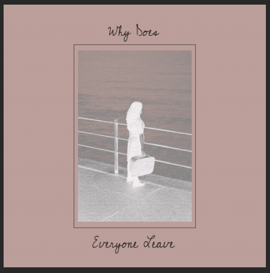
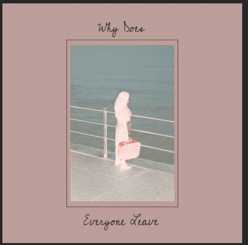
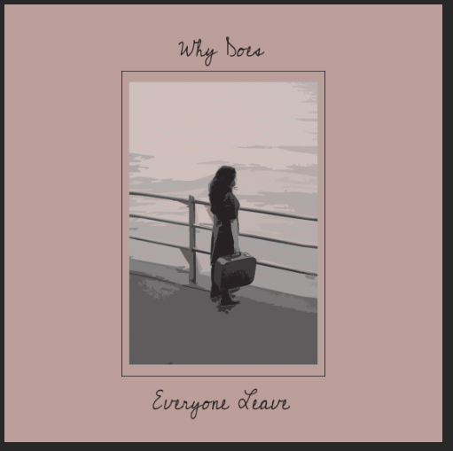
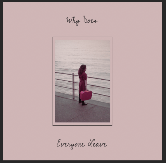
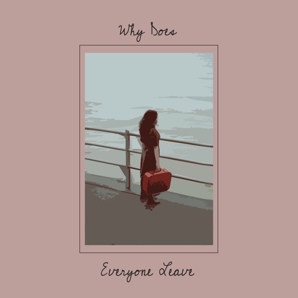
DIFFERENT COVER MOCKUPS
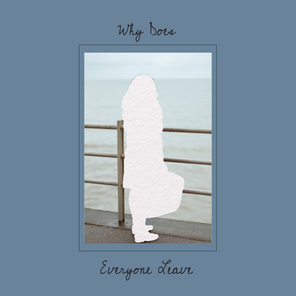
Still thinking of the words loneliness, emptiness, etc., I wanted to incorporate that into the cover, thinking of ways I could potentially produce this in Photoshop. Below are many cover mockup attempts.
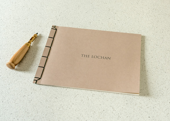
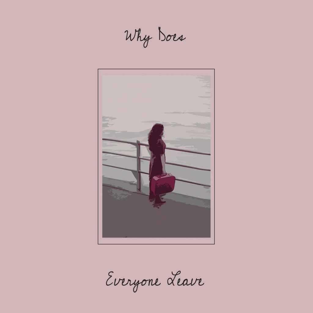
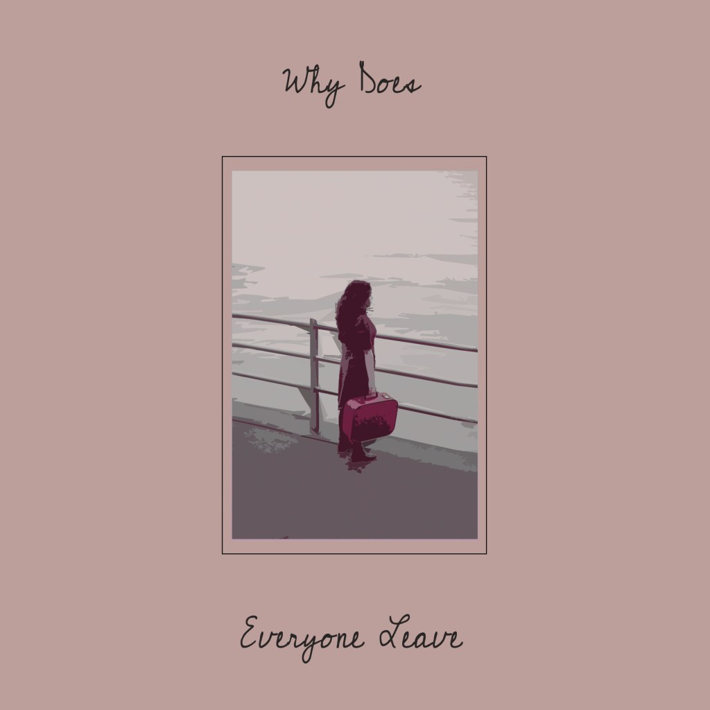
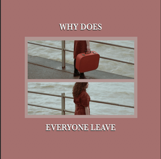
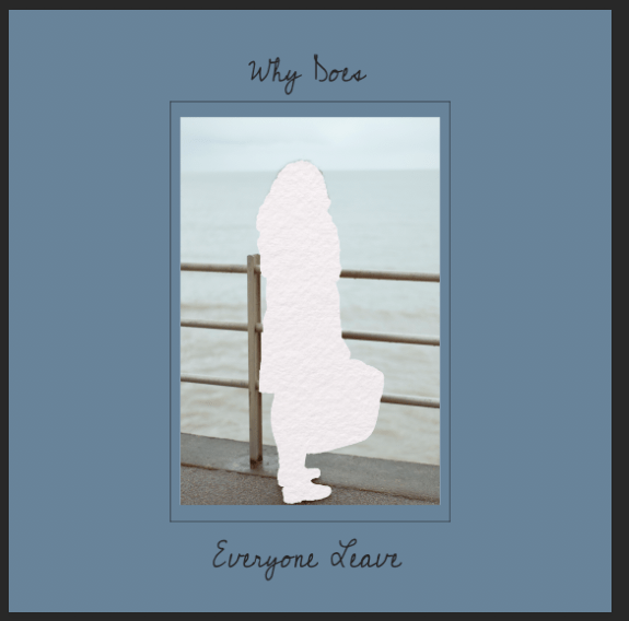
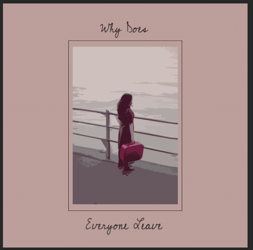
FINAL COVER
The colour I originally wanted it to be blue (as blue represents sadness, loneliness, etc.) but didn’t seem to like it, neither did my peers. In the end, after many different concepts, and with the help of feedback, I’m going with this design. The title is called “Why Does Everyone Leave”, as I have multiple models, I wanted the title to represent all of the images. Also wanting the typeface to almost look like someone just wrote that down.
I’m going to print with SAAL Digital UK, as all the books are excellent quality, all lay flat, and the prices are affordable. I wanted to make my still, so I might also have an attempt at that, and see how the book comes back.
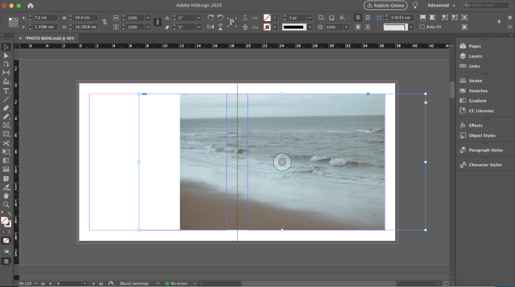
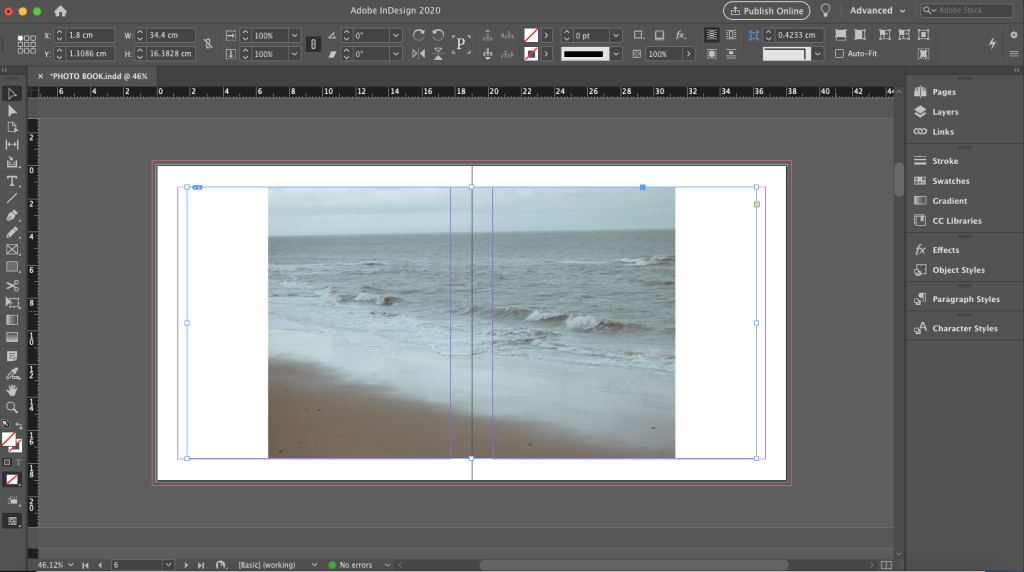
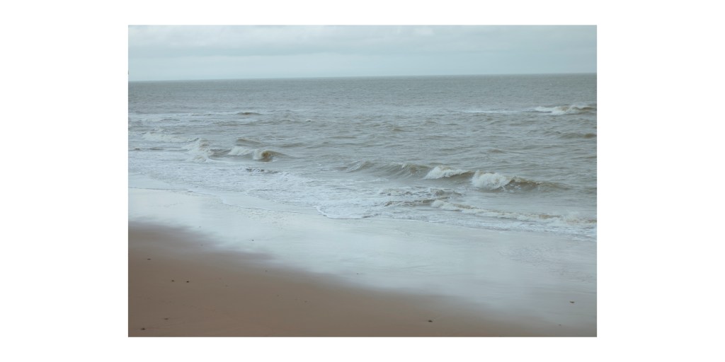
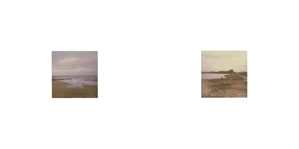
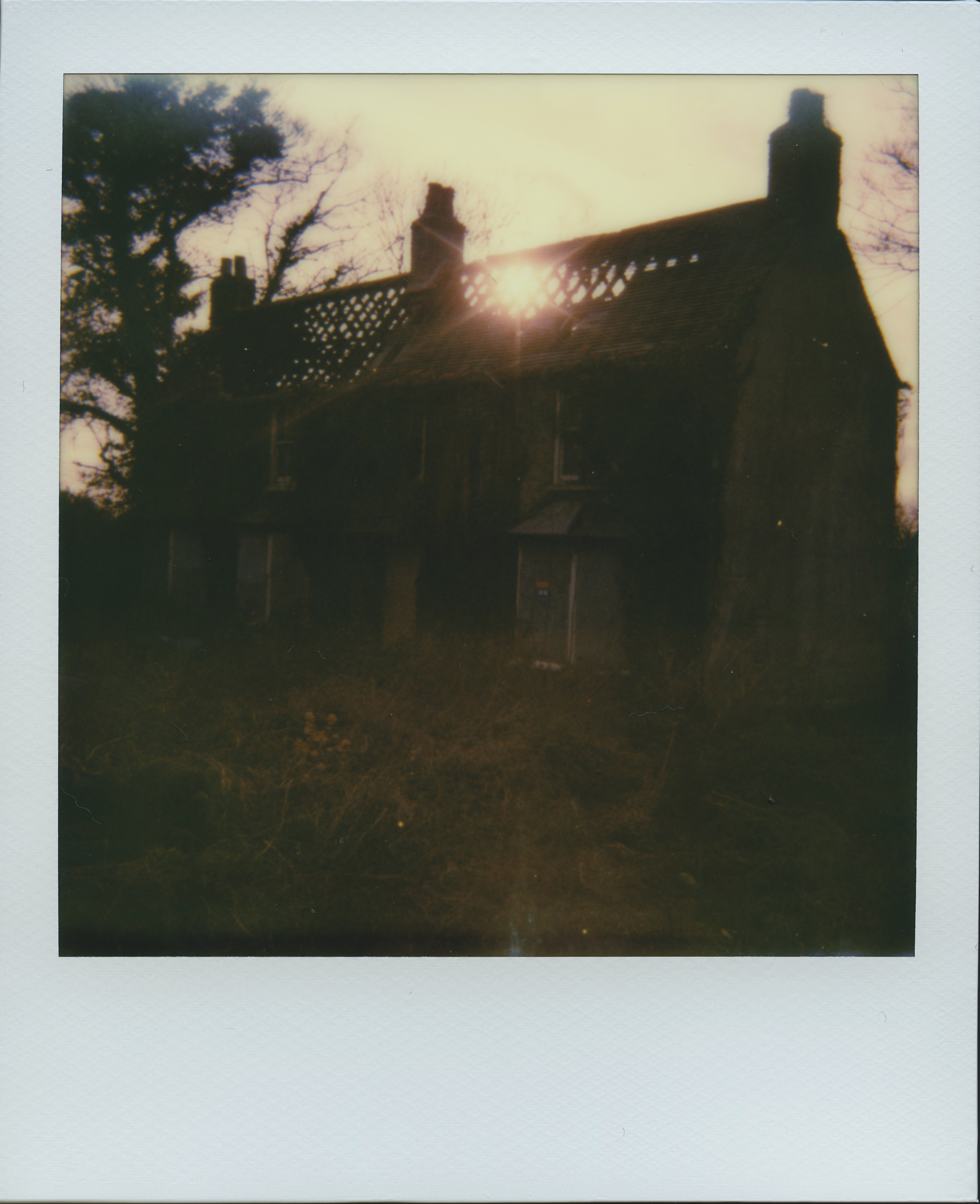
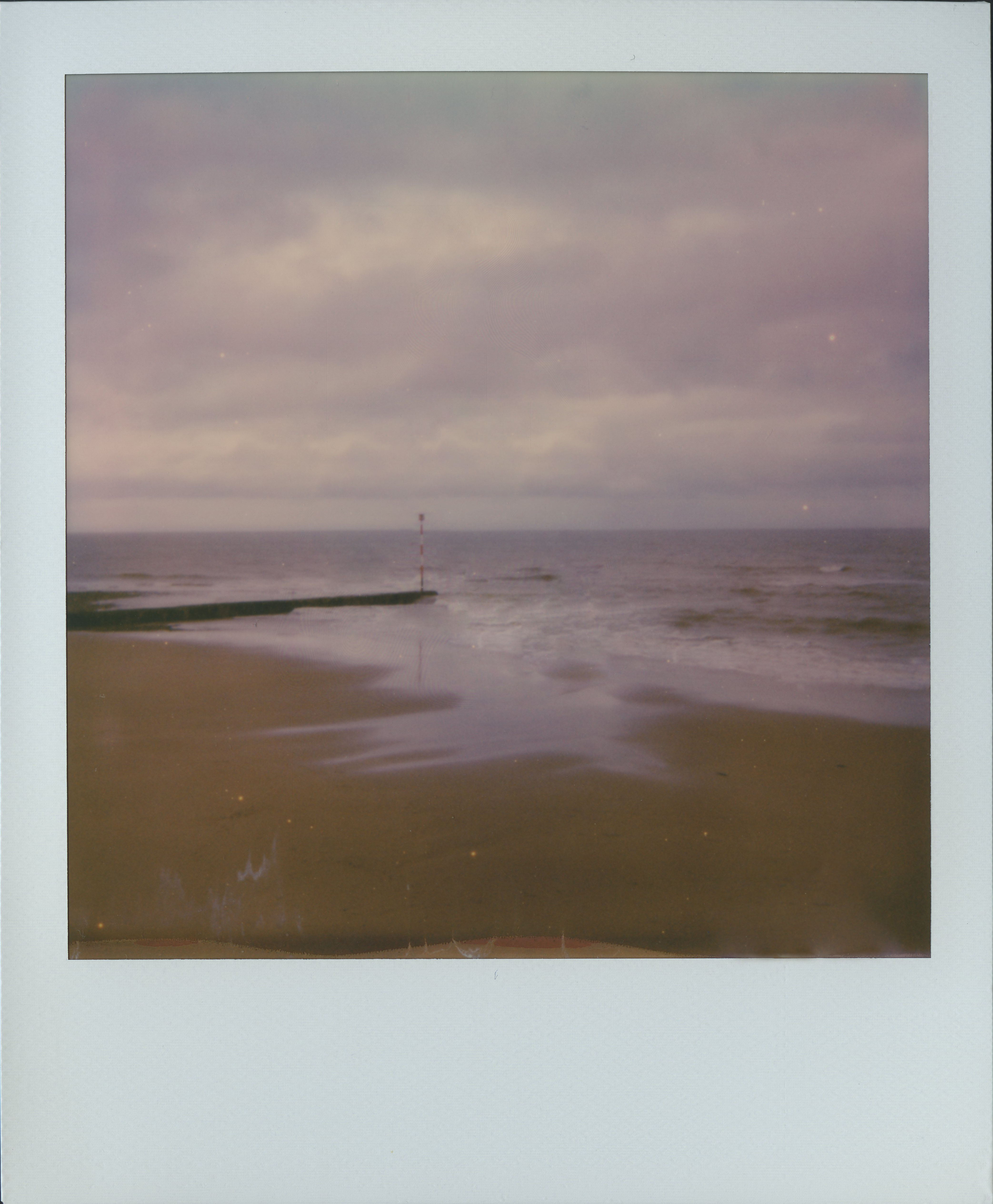
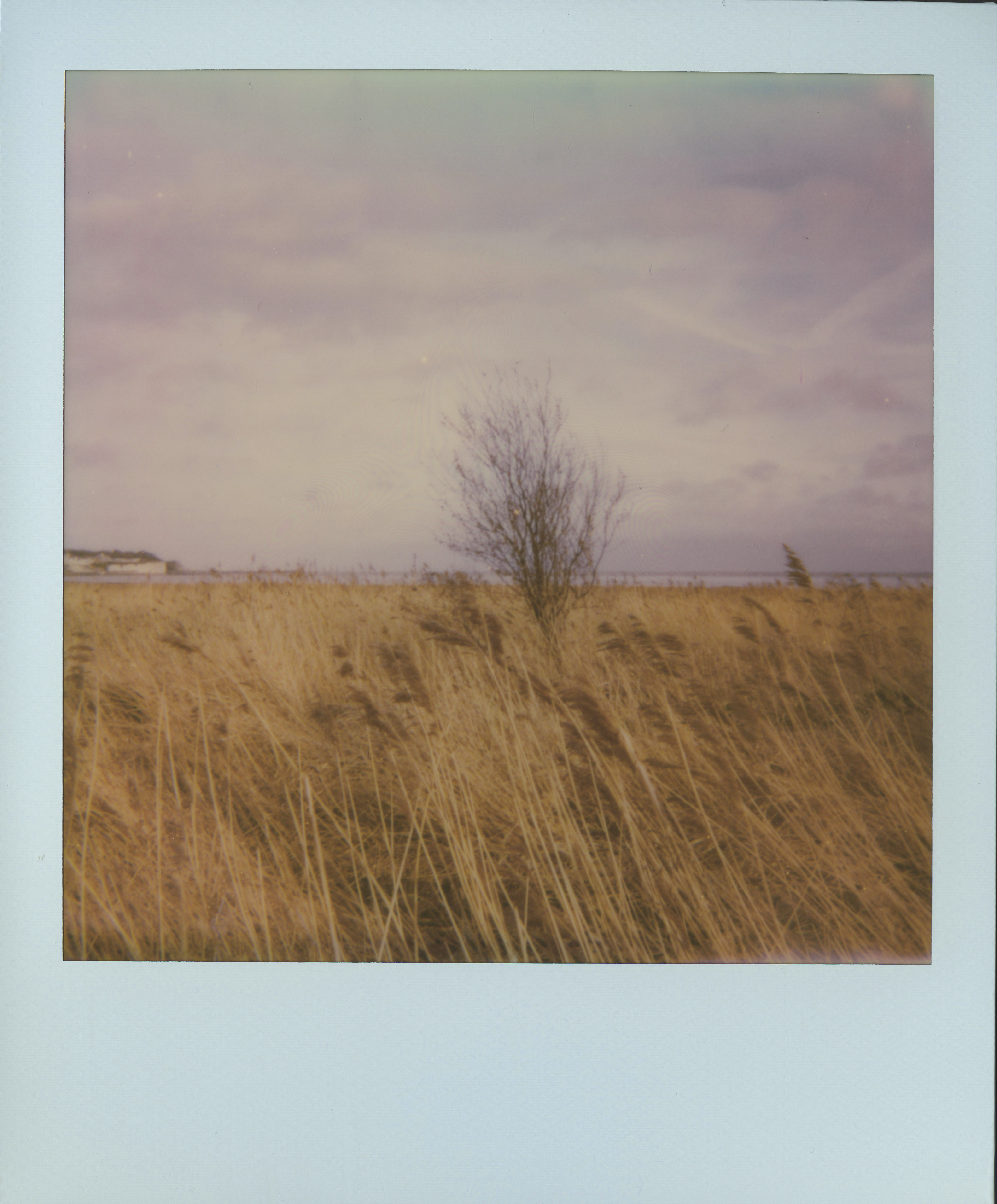
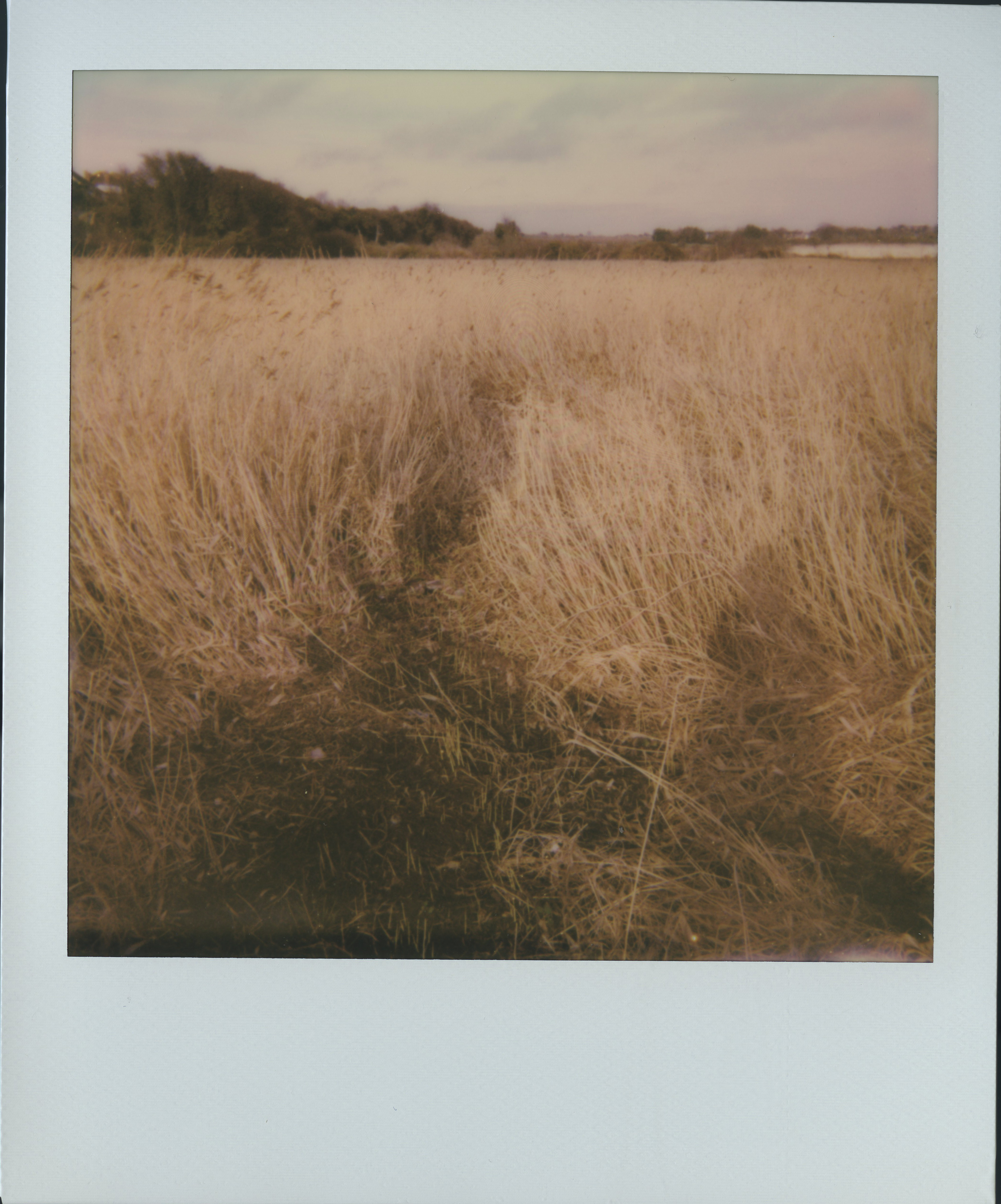
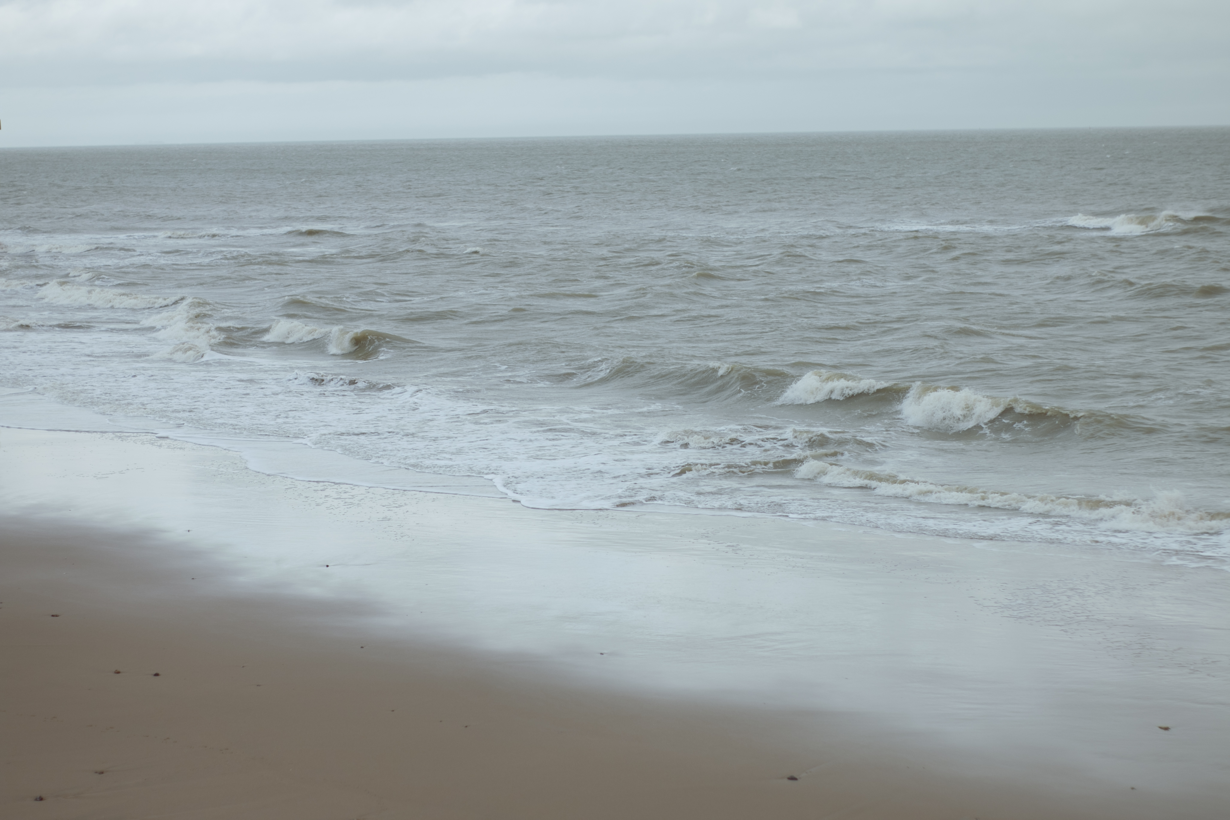
In the series I’m doing, even though all the different shoot has the same theme, they are different. So I wanted to photograph empty/abandon landscape, to space out the shoots in the photo book.
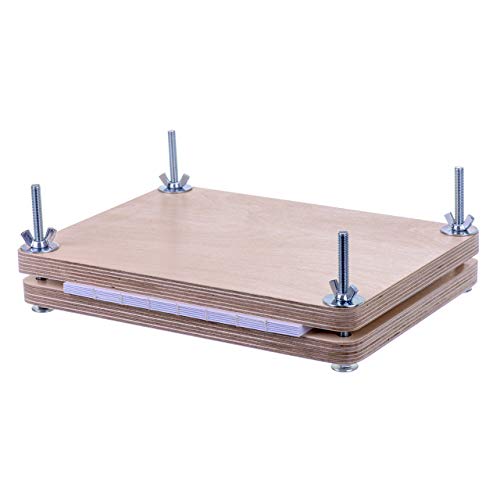
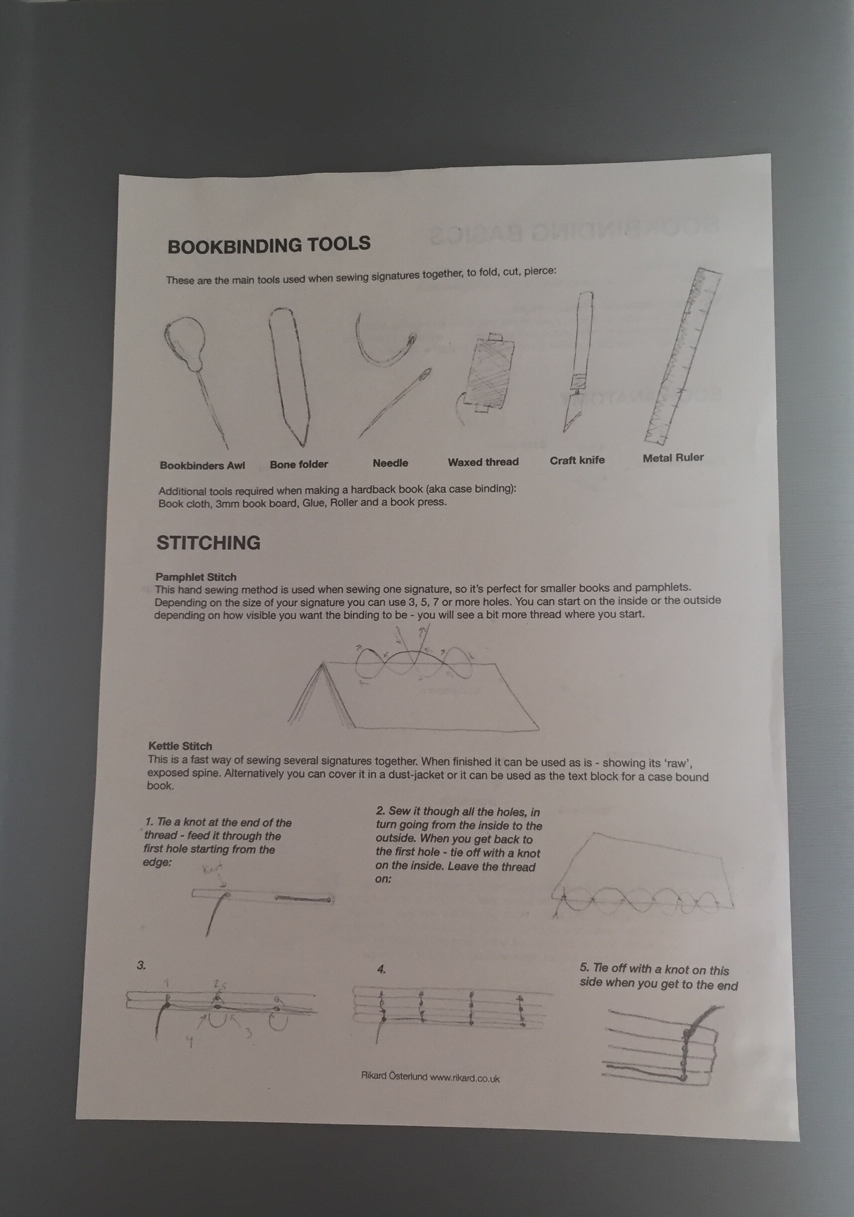
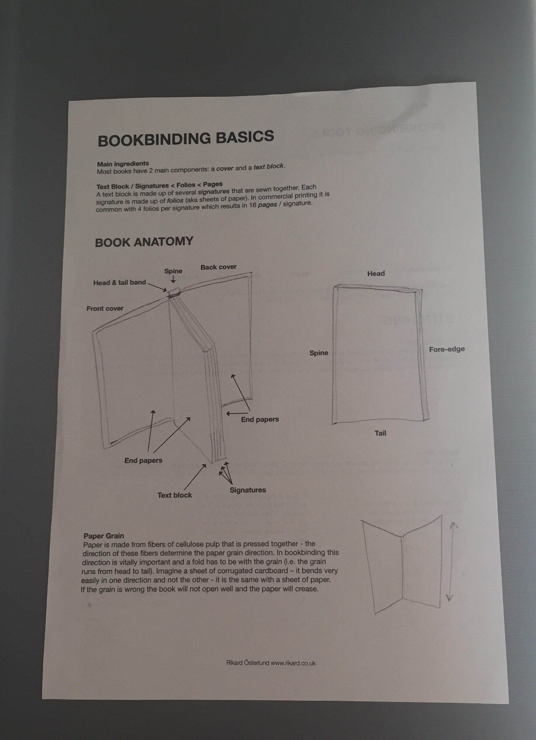
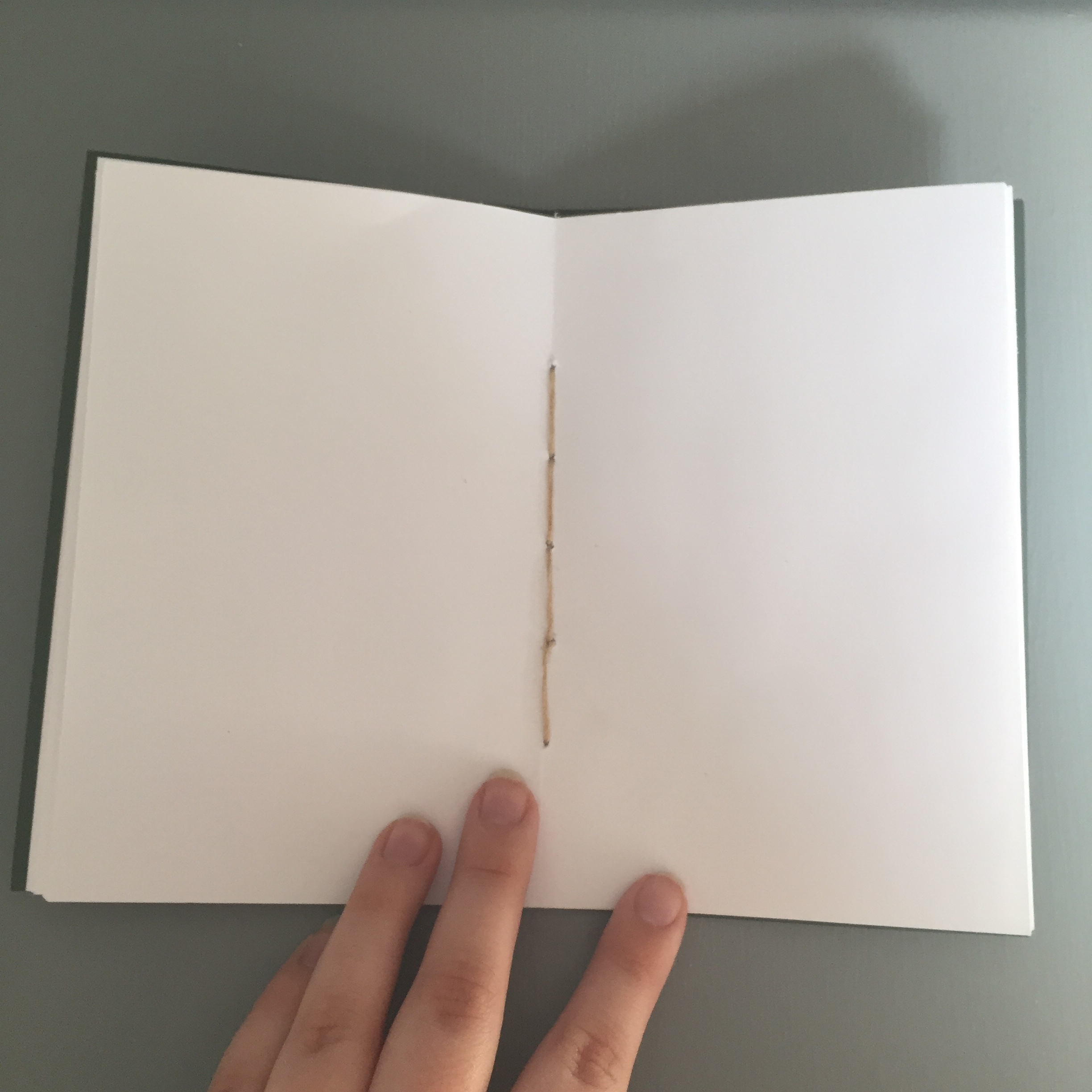
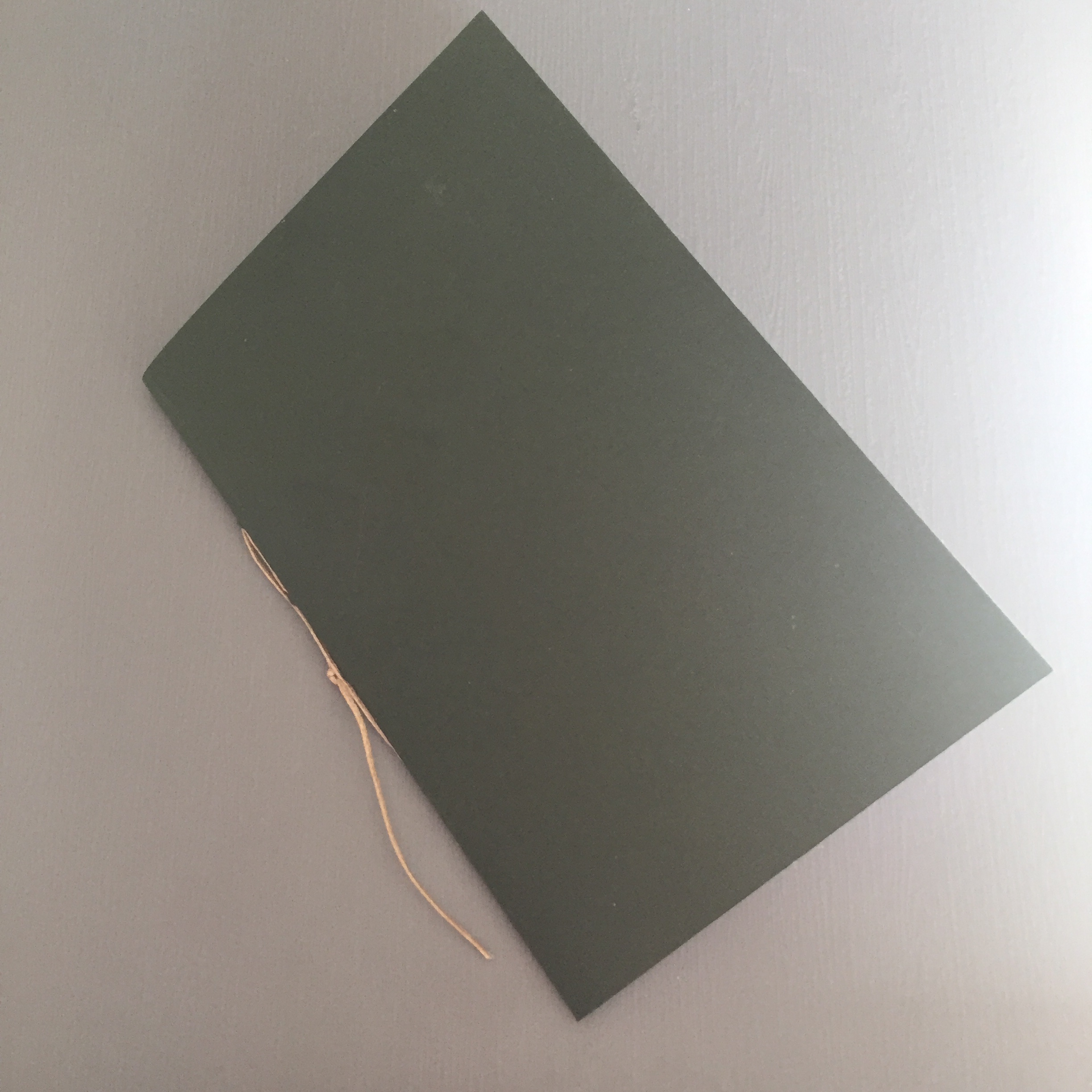
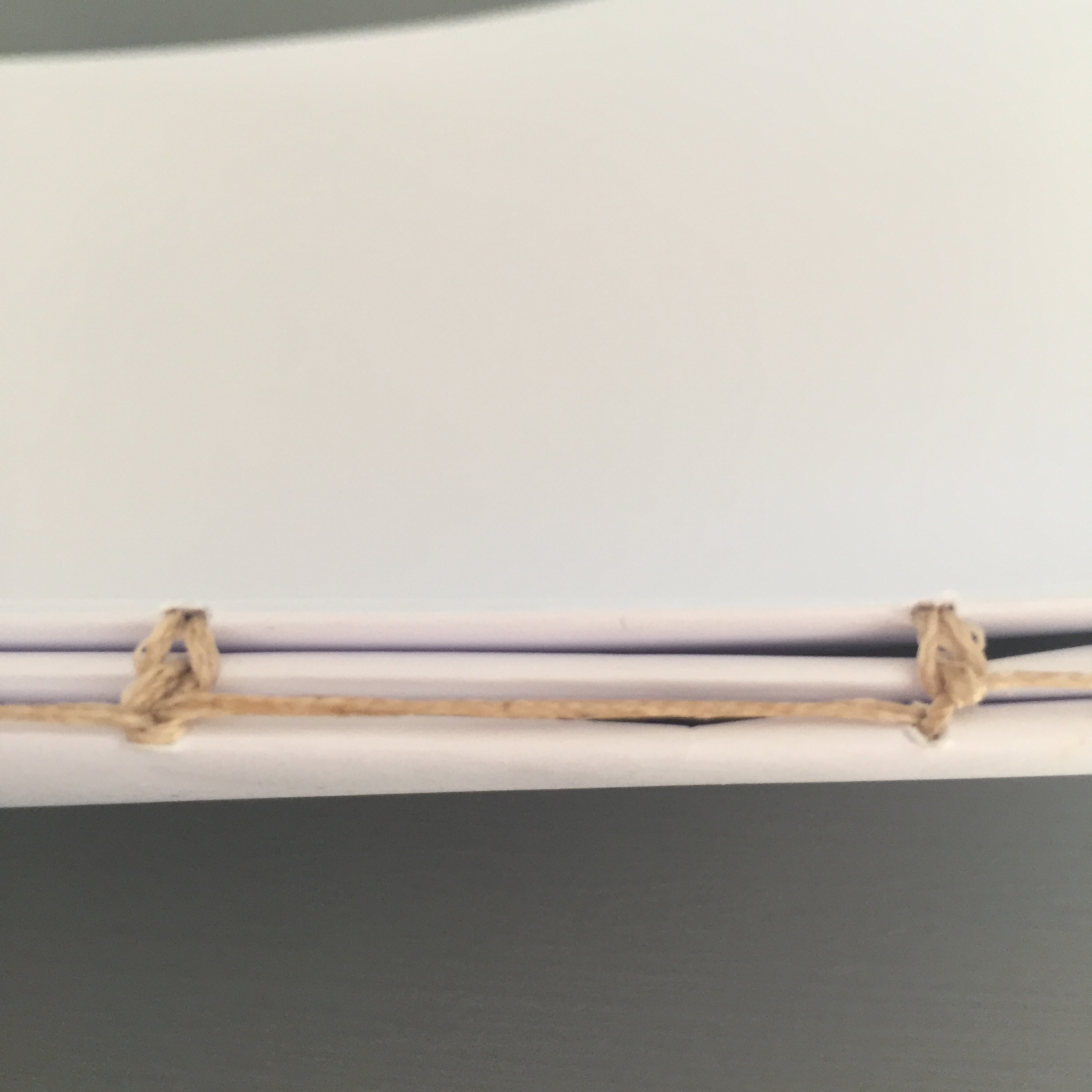
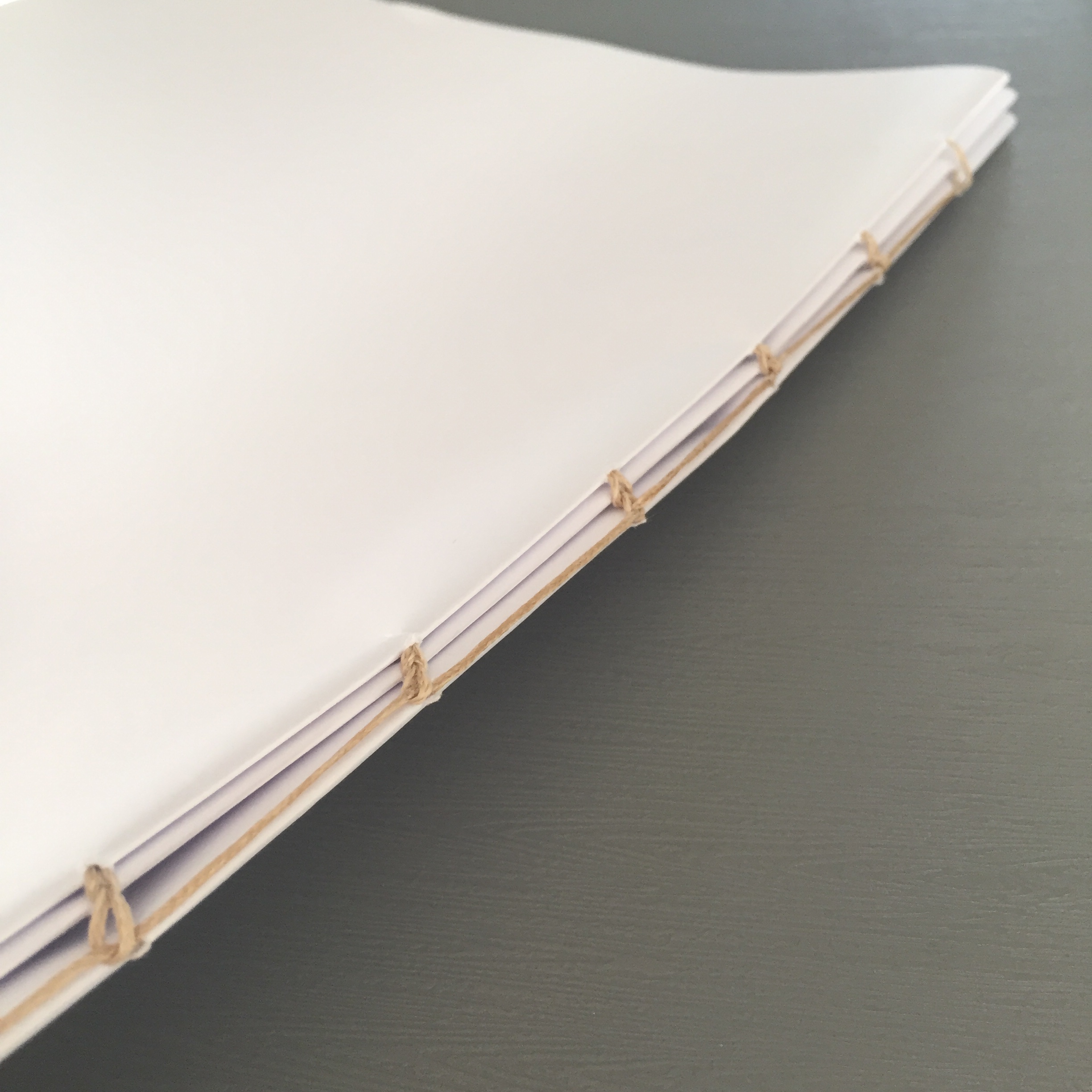
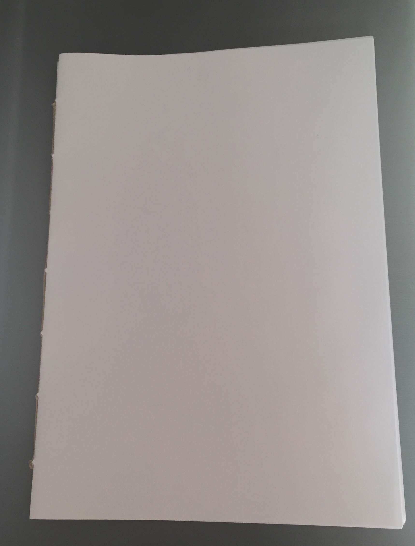
We had a workshop in book making, and had a guest lecturer Rikard Osterlund show us different was todo this and how. We learnt about signatures, different stitches etc.
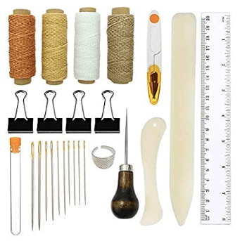
WHAT WE USED
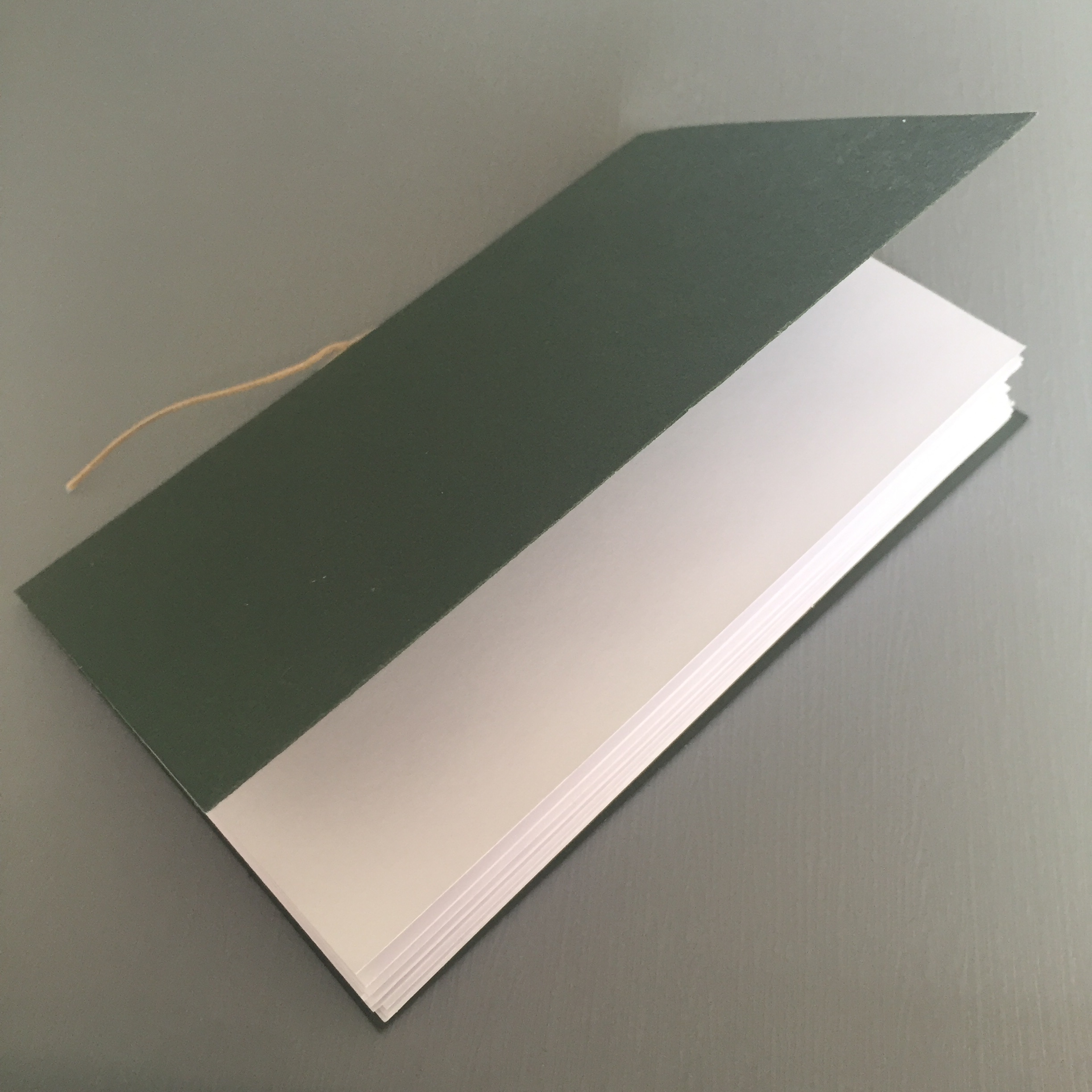
These were the tools we used, and Rikard gave use instructions about the sewing, that he made himself. We first made a small book with a cover, then next we made a bigger version, with more signatures. The results are below –
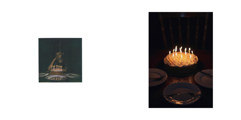
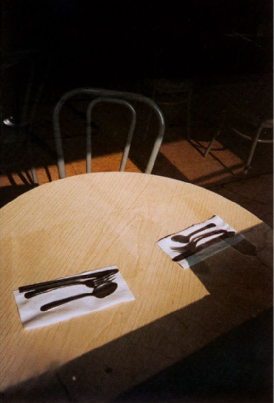
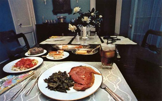
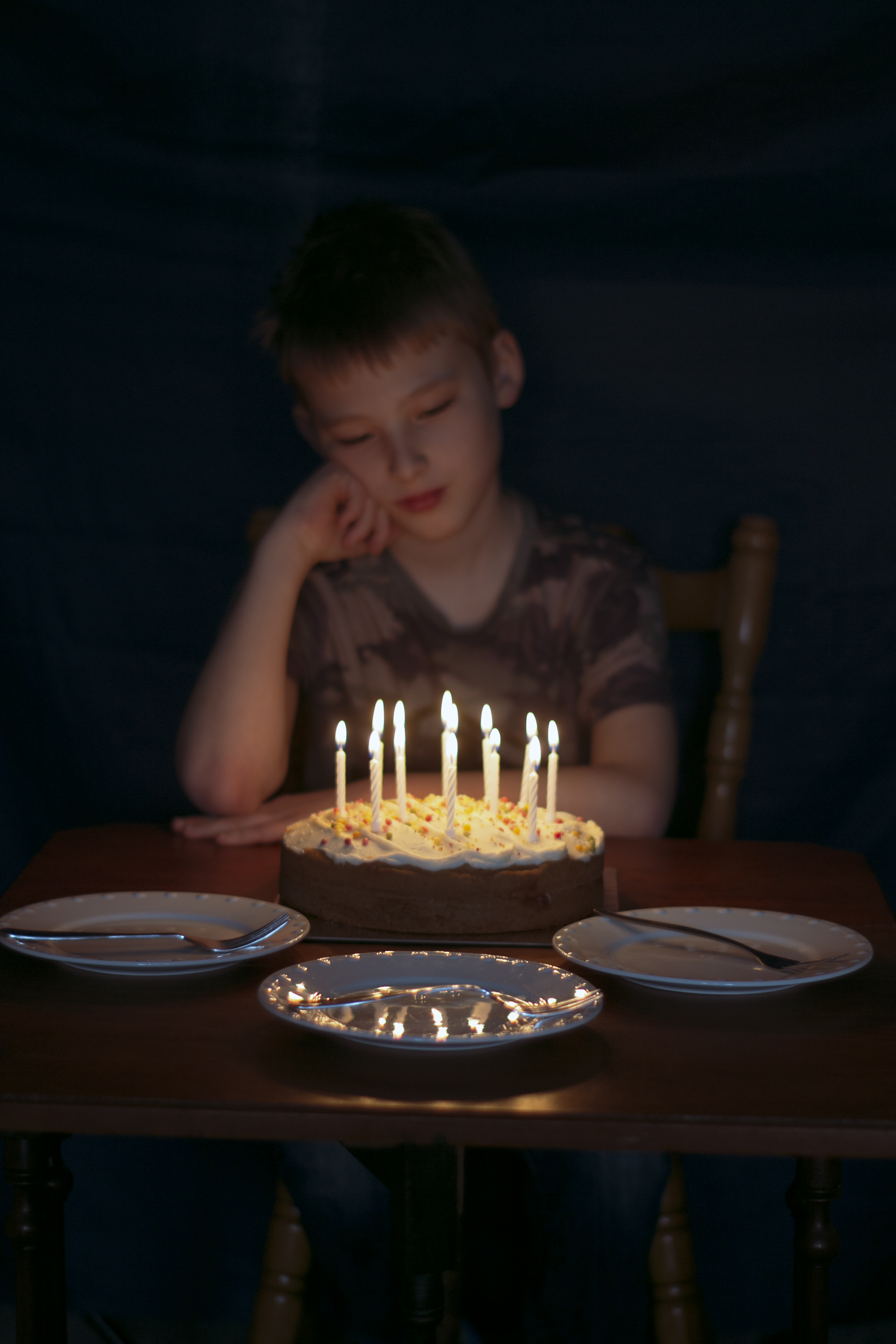
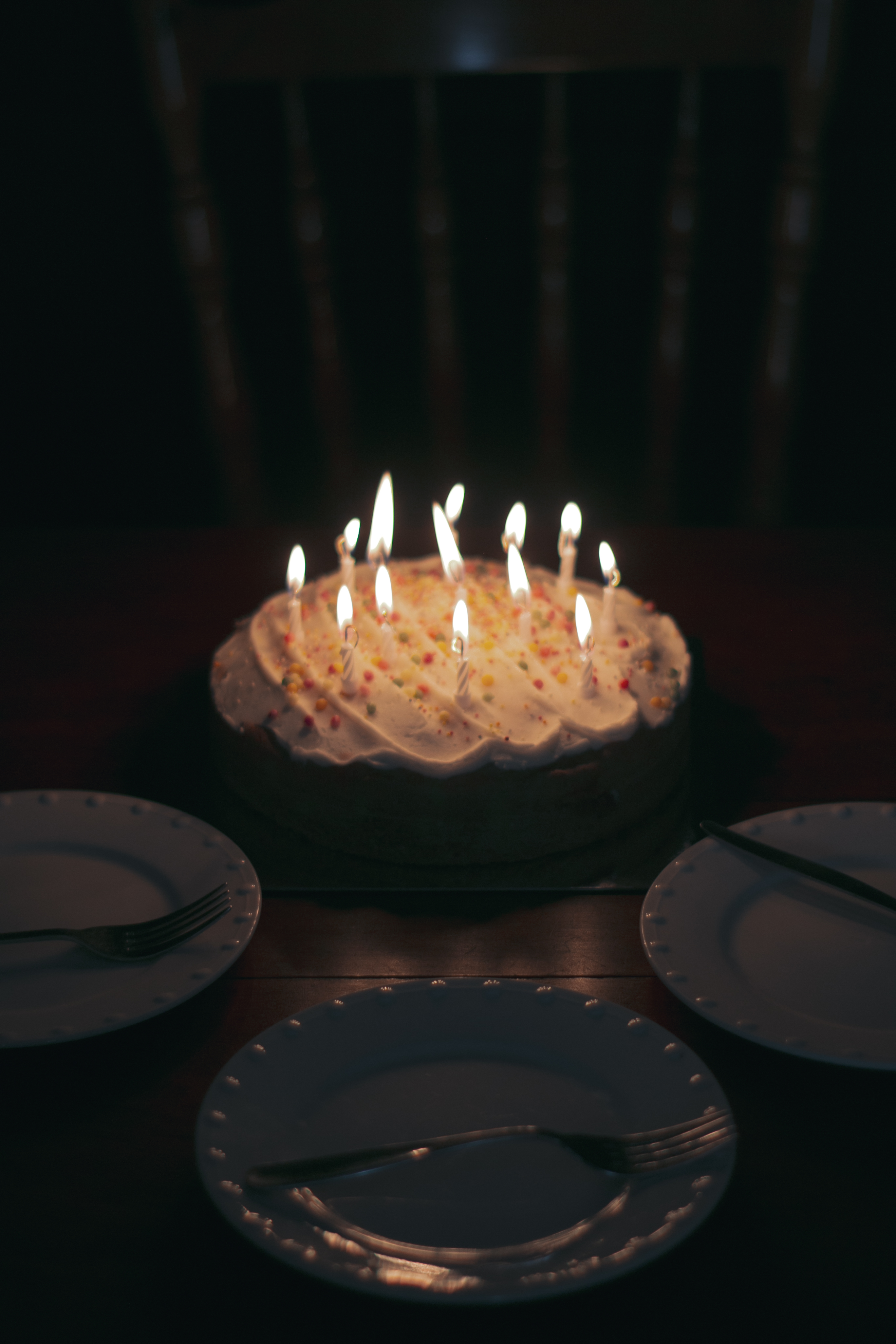
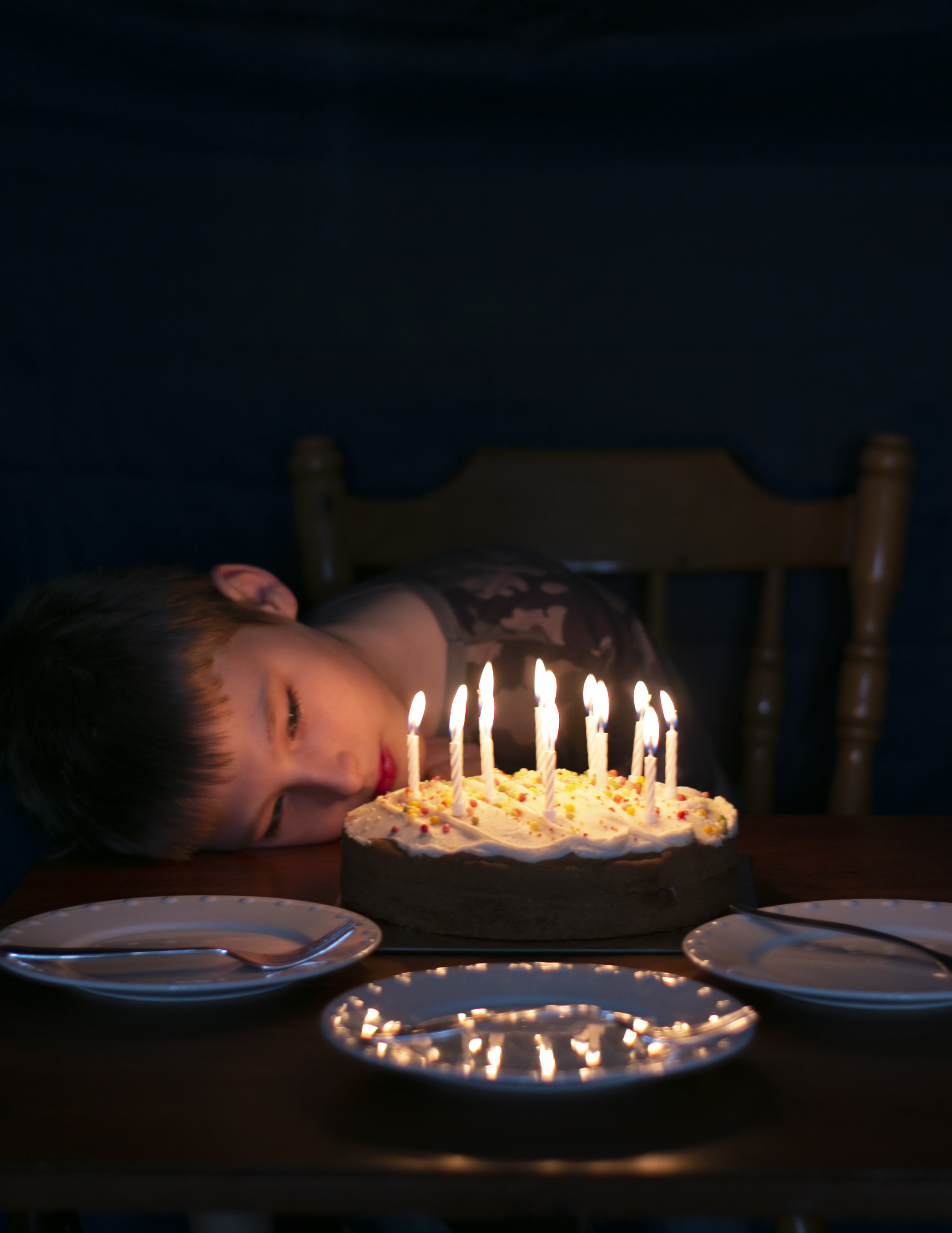
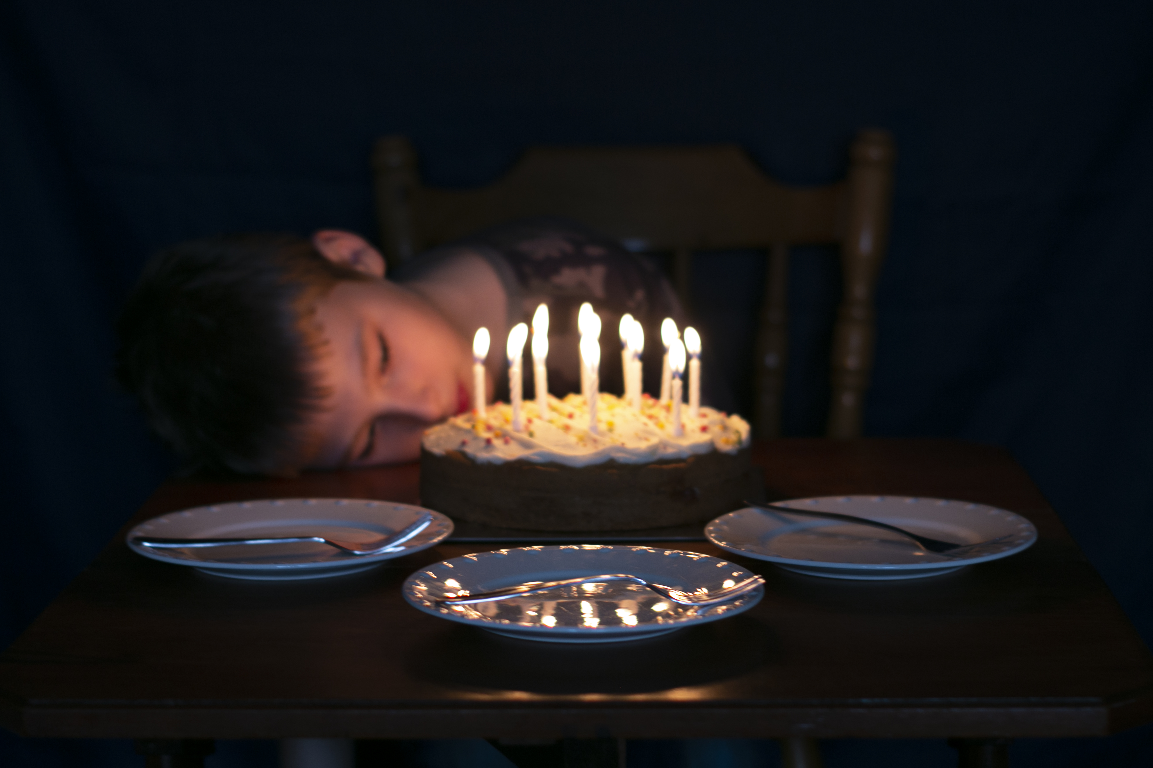
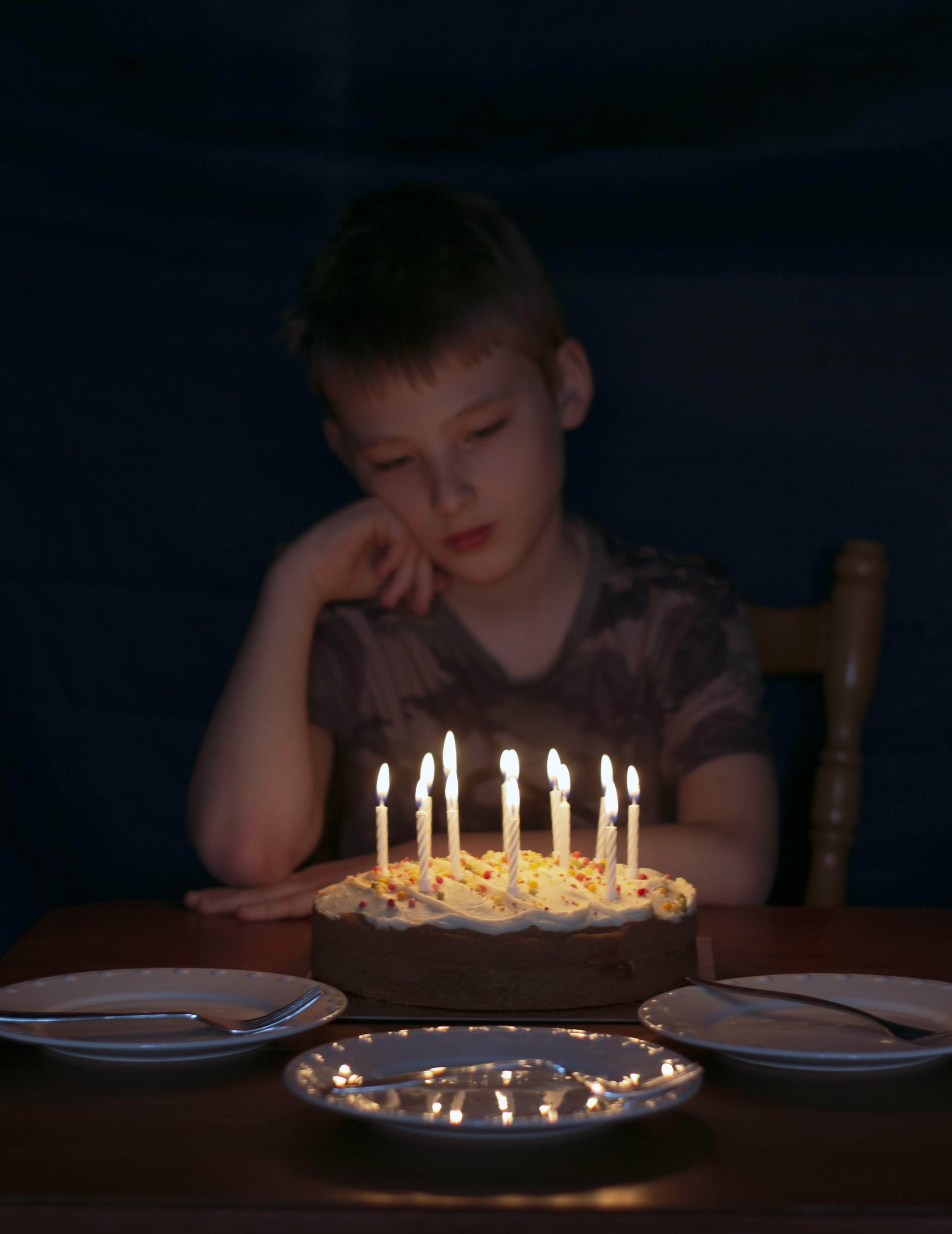
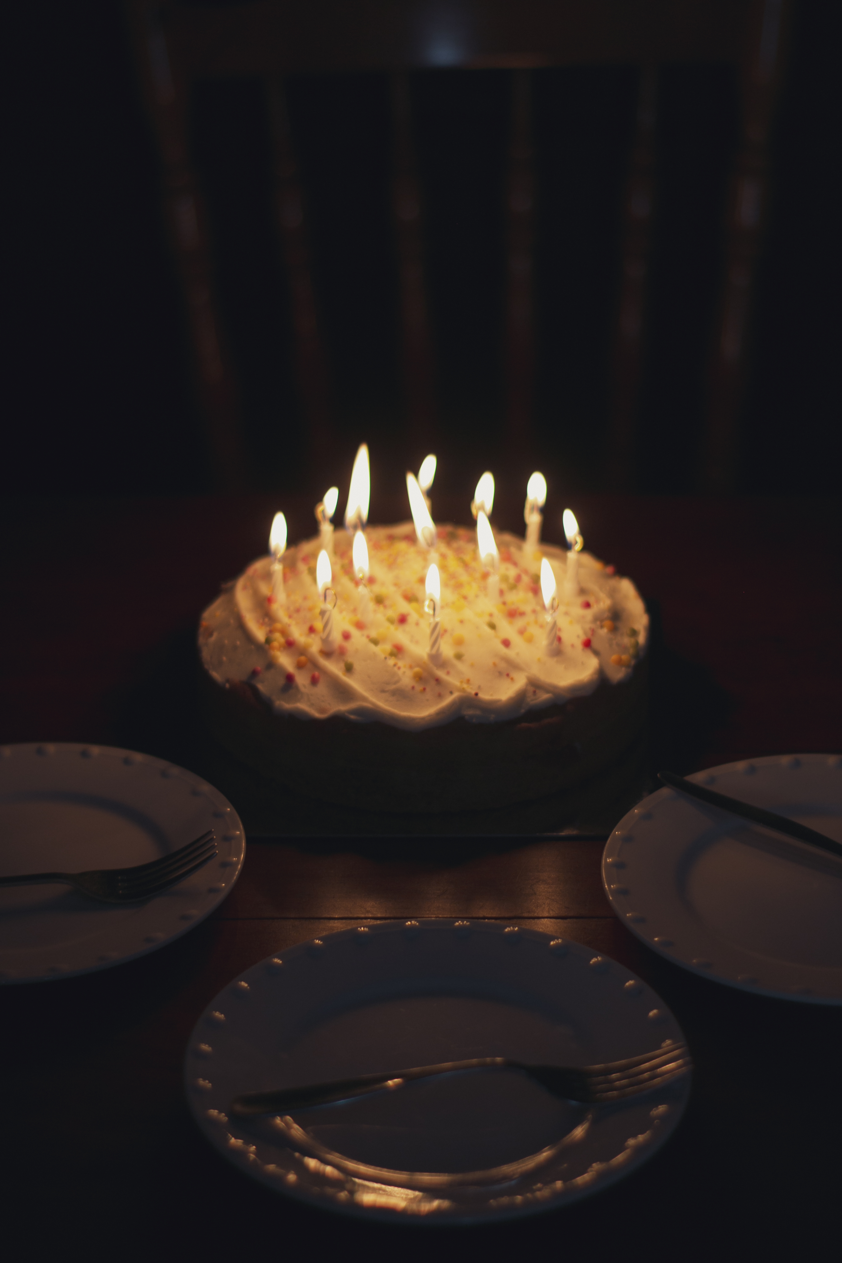
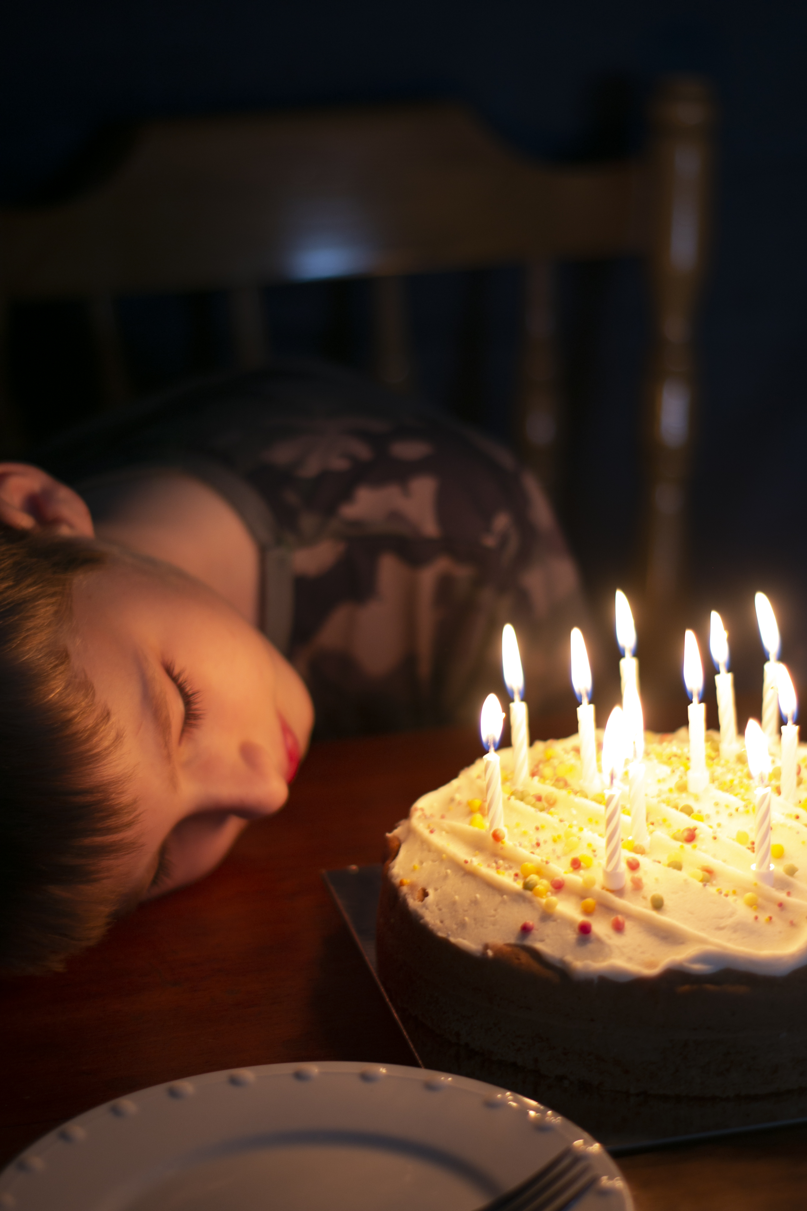
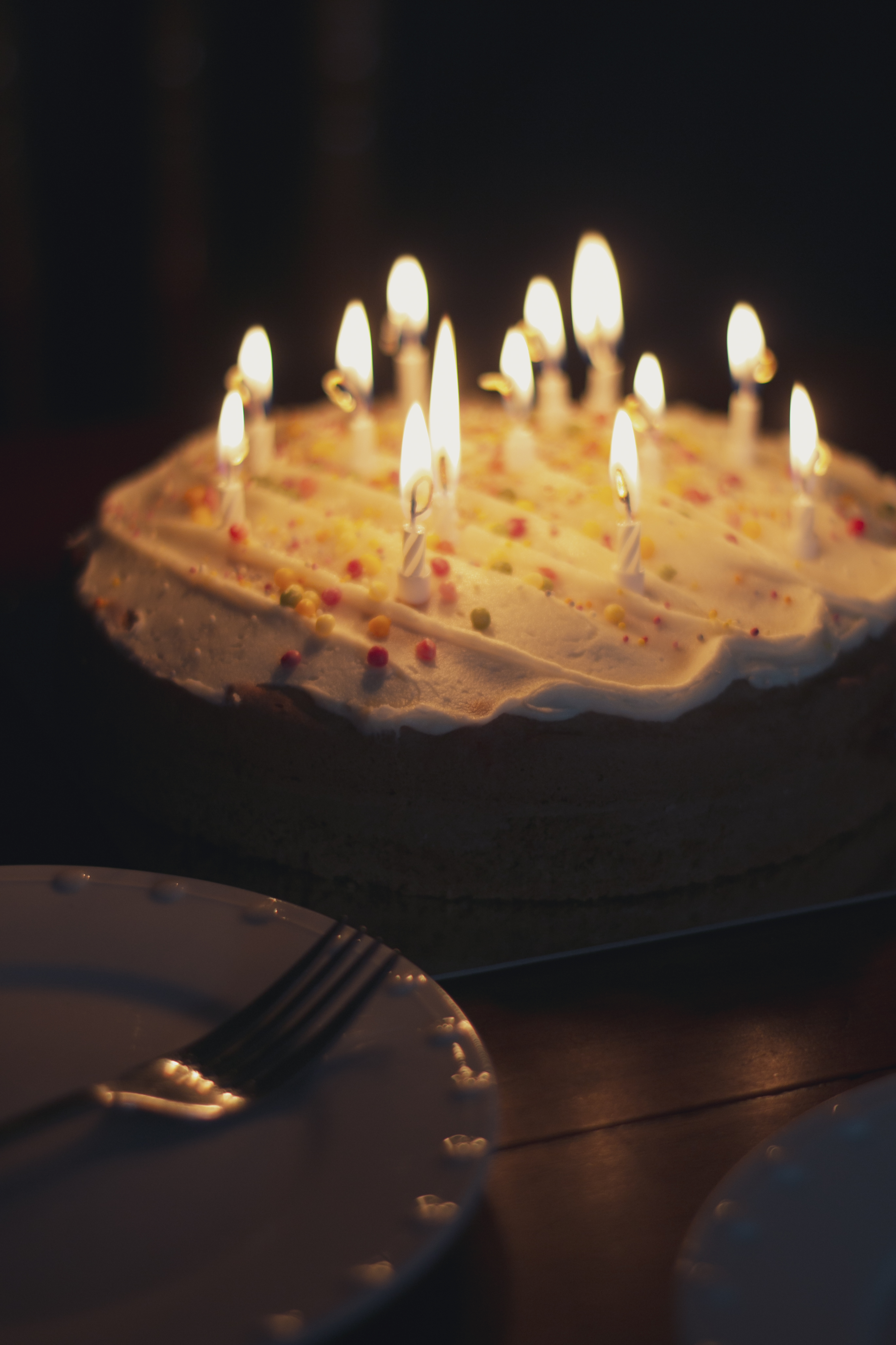
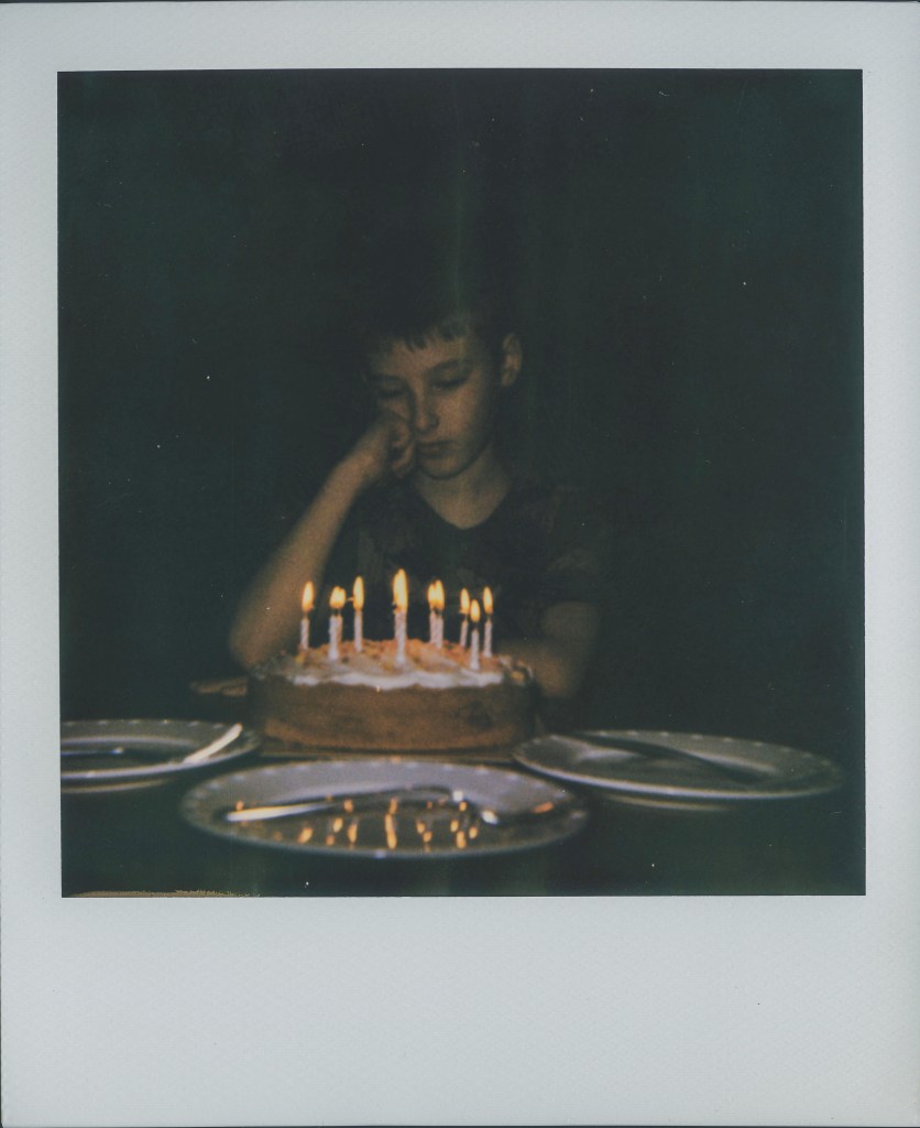
My other shoots have been constructed as in location, clothing, but for shoot 3, I want to set the scene. The plan is to create an empty, lonely birthday table. The subject is going to be sitting alone in the dark, staring at the cake with the candles still lit. With empty plates surrounding the table. Below is some inspiration for this shoot –