INSIDE & OUTSIDE – TASK 4

Contextual Studies, Contextual Work - More, Environment
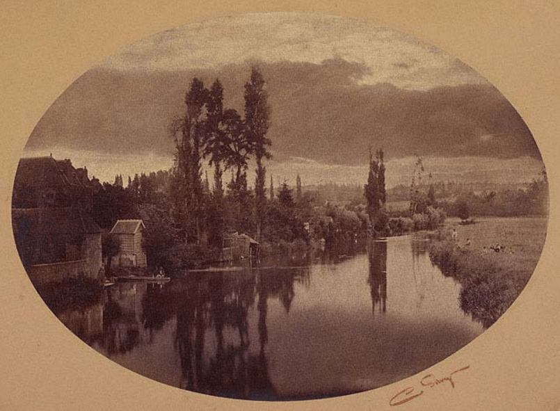
WILLIAM EGGLESTON UNTITLED (MISSISSIPI) 1984
DANGER, POLICE, WATCHING, DISTANCE

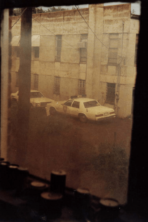
In this image, I get a sense of danger and safety at the same time. As the viewer, I feel danger from the police car outside, the surroundings and atmosphere don’t seem the friendliest. We know this from the bordered up and dirty windows to the lack of life and low living conditions. It makes you question the emptiness of the area.

However, as the image was taken from the inside of the building, looking out at the danger. It makes me feel safer, that I’m inside away from the police and outside. William Eggleston is making us feel that we are at a safe distance waiting/watching for something to happen at any time.

ROBERT FRANK, FROM STORYLINES, 2005
MYSTERY, BLACK&WHITE, SHADOW, FILM

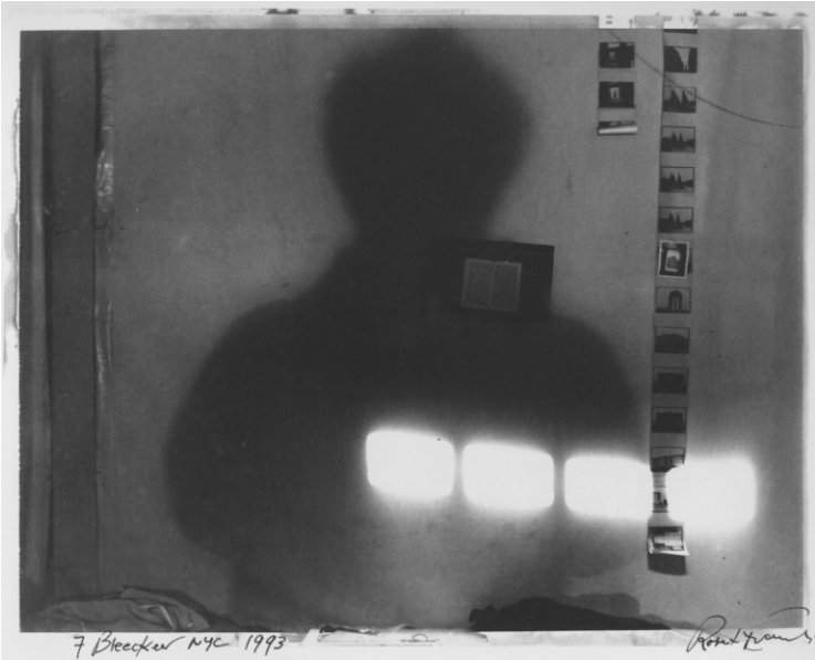
Robert Frank has brought a different viewpoint, by bringing the outside in, with the film negatives. The shadow of the person creates a sense of mystery, making the viewer’s eye look closer at the individual film images. To work out who this person is? What’s there lifestyle? Why are they doing this?

The contrast between the shadows and bright light enhances the shapes created, to draw the viewer eye to the film. Especially as the subject is in an empty room, it makes these shadows, bright lights and film stand out even more.

It is an exciting way of bringing the outside in, by taking a photograph of photographs and keeping the atmosphere mysterious.

BOUNDARIES BETWEEN THE INSIDE & OUTSIDE

The boundaries between the inside and the outside can produce different views within a photograph. A line of division between the inside and outside, or an intermix of each other. By intermixing makes the image blend more, rather than feeling like a wall between the boundaries. Below I have two images exploring these ideas, I’ve mentioned above.

FRANCESCA WOODMAN, THE OPTICAL UNCONSCIOUS, 1993

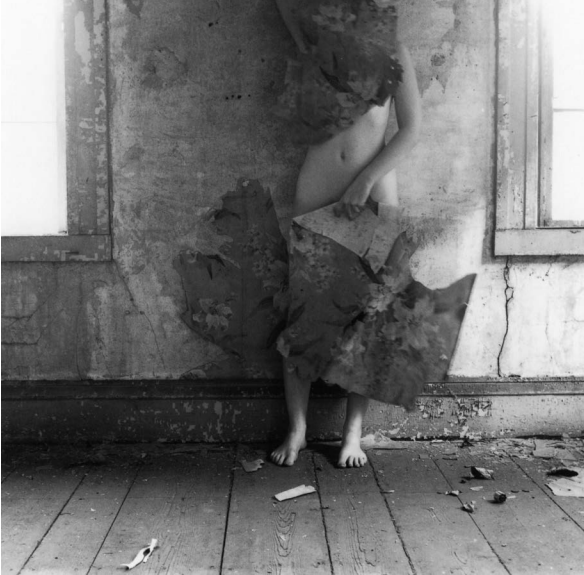
Francesca Woodman has used the person body from an outside environment to camouflage themselves to the inside surrounding. They’re making themselves apart of the inside. Almost like they have taken over the inside now, that they own it.

The place isn’t homely, and it makes the viewer feel alienated, as the inside doesn’t have any carpet, furniture, or wallpaper. The person is bringing the outside material in (wallpaper) and blending in with the inside. This is a different way of bringing together the inside, and outside, it also feels quite mysterious, the way Woodman has framed the image. Woodman has chosen not to frame the face, which makes the body blend into the inside better. The way Woodman has framed the windows is interesting. It draws you away from thinking about the outside and directs your viewpoint straight to the body.

KEV FILMORE, INSIDE OUTSIDE, 2011

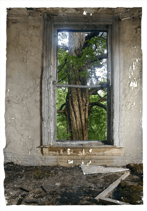
Kev Filmore has framed the inside and outside together. This juxtaposition shows the dead, uninhabited, muted, rotted, ugly, dangerous inside and frames it with a beautiful, alive, colourful, fresh tree outside surrounding. Placing together two opposites works, this shows development over time, the inside has disintegrated, but on the outside is a flourishing, lively environment.

The way Filmore has framed the image, making the window central is smart because this leads the viewer eye towards the window. The colour palette also helps with this, as the inside is a muted colour and the outside is colourful.

The image is different from Woodman’s image above, rather than camouflaging or blending the inside and out, Filmore has used the window as a wall of division. Dividing itself from the ugly to beautiful, or the rotted to growing.

WHAT IS A LANDSCAPE? – TASK 2

Contextual Studies, Contextual Work - More, Environment
Camile Silvy, River Scene, France, 1858

PICTURESQUE, BEAUTIFUL, REFLECTION
Ansel Adams, Monolith, The face of half dome, Yosemite National Park 1927

SUBLIME, VIEWPOINT, DANGEROUS, CONTRAST
Lee Friedlander, from America by Car 2007

INSIDE/OUTSIDE, VIEWPOINT, DIVISION, PERSONAL
Richard Misrach Hazardous Waste Containment Site, Dow Chemical Corporation 1998 

REFLECTION, ABANDONED, NATURE, HIGH-KEY
Joe Deal Untitled View 1974 

AERIAL, SPACE, DEMOLITION
Robert Adams Colorado Springs, Colorado 1968 

DISTANCE, SUBURBAN, QUIET, VIEWPOINT
Mark Power 26 Different endings 2003 

DIRECTION, SUBURB, TRADDITIONAL

Martin Munkacsi, American Harpers Bazaar, December 1933

MOVEMENT, FREEDOM, SEASCAPE
Louise Dahl-Wolfe – Harpers Bazarre 1941 

SHADOWS, SPACE, CONTRAST
Norman Parkinson Anne Gunning in… India & Kashmir 1956

REFLECTION, CULTURE, FASHION, BEAUTIFUL, PICTUREQSE
Wolfgang Tillmans – Lutz and Alex sitting in the trees 1992 

FREE, NATURE, FASHION
Tim Walker Vogue Spring 2015 

COLOUR, SUBLIME, NEGATIVE SPACE, PICTURESQUE
Mel Bles Pop 2014

OUTSIDE, FASHION, WACKY
Juergen Teller Kanye, Juergen & Kim 2015

JUXTAPOSITION, SUBLIME, CELEBRITY, NATURAL

COMPARING

In both images, you can see they’re related, for they both have a car in the image, but the photographers have created a different feeling across from my perspective.

The left image by Lee Friedlander has an interesting viewpoint. Where it makes the viewer feel inside, but outside at the same time, giving the image more depth and structure. The car door is closed; it feels like a wall of division between the inside & outside landscape. However, the image on the right has a more distant viewpoint. Both of these different viewpoints produce different emotions for me. Friedlander image feels more personal and close, whereas the other image feels distant, lonely and cold.

They do have another thing in common, where they both don’t have any people in the images. They show peoples possessions and the living environment against the natural landscape that surrounds them. But by doing this, it makes it feel like a ghost town and cold. Like they are in the middle of nowhere.

The landscape that surrounds the cars looks vast and wide, especially in Robert Adams image on the right. The use of negative space in the sky enhances the isolation of this suburban town, allowing the viewer’s eye to focus on the car. Whereas Friedlander image is fill up with different subjects making it more busy and loud, rather than the other one is quiet.

WHAT IS A PHOTOGRAPH? – TASK 1

Contextual Studies, Contextual Work - More, Environment

JASON EVANSSMASH BABYLON MIND CONTROL , i-D, 2005

CONTRAST, ABSTRACT, FASHION, CULTURE, BRIGHT

SIMON NORFOLK – FROM SERIES FULL SPECTRUM DOMINANCE: MISSILES, ROCKETS, SATELLITES IN AMERICA, 2008

NATURAL, SOFT, BEAUTIFUL, REALITY, DANGEROUS

EDWEARD MUYBRIDGE

TIMELASPE, 180 DEGREES, PORNOGRAPHY?, REACTION

CHOSEN PHOTOGRAPH

Simon Norfolk has produced beautiful images, but they are not, because of the missile. Looking at these images the missile reminds me of shooting stars, especially with the dreamy coloured environment surrounding. At the time he took these images, it makes the sky and atmosphere look soft and calming for the audience. In reality, the ‘shooting star’ is a missile being launch. Simon has documented something as destructive, harmful, and dangerous look beautiful. He has made them look otherworldly like they are not supposed to be from this earth. It is an art piece of time.

The missile curve path, produces the leading line of the image, wondering where is this line leading to or is it going up in the sky further? As there is lots of negative space in this image, the line also breaks it up, giving the image more depth. The image itself is a juxtaposition, from the deadly missile and the peaceful environment surrounding it. I believe that Simon wanted to document this moment, showing what a missile can do to this beautiful earth, we live on, and why would we want to destroy it.

CHOSEN QUOTE

Steve Edwards:

“when we look at photographs we realise that the image before us is tied to the thing it represents. Truth claims attached to photographs largely turn on this recognition”

Photography: A Very Short Introduction, 84

Through every photograph taken, there is always a reason or meaning behind it. I relate to this quote because of the sense of representation. There are many ways to represent a photograph, such as messages can be embedded through to the audience, capturing reality, and genres etc. This representation behind the image can help get the recognition of a photograph it needs, perhaps to convey a powerful message. Thinking back on some of my work, I can see that I work towards a meaning. Which helped shape the way I take photographs.