For the first project, I had to produce 4 images surrounding the theme of ‘environment’. Initially, I started idea generation from mind-maps, mood-boards and research. This helped me form ideas for shoots, and shape my journey to producing my four photos. This project has developed my way of approaching photography, looking for key elements of the space around me. I wanted to produce something that reflected the environment and how it has change over time.
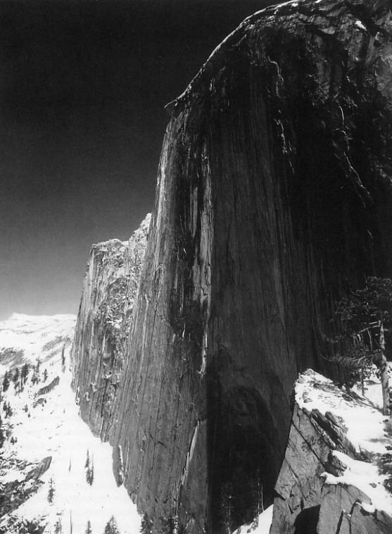
I’ve always photographed people in my photography, but with this project, I wanted to push my skills and try something different. Photographing objects or areas that once used to be used by people. This inspiration especially came from Marc Wilson, the ideology and simplicity of his work. But there are many landscape photographers with different styles, which made exploring landscape broader.
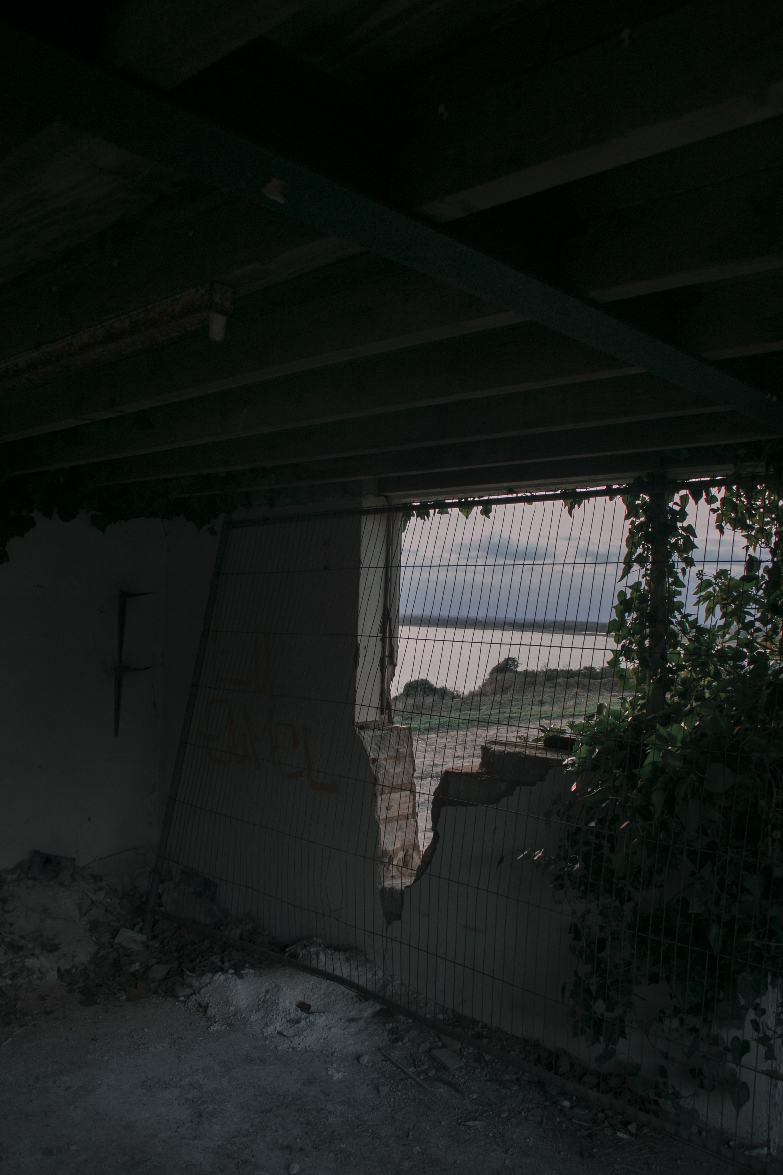
In all four photos, there’s an element of something that’s has been left behind. From what once used to be used by us, but now left behind for the environment to take over. It has a sense of abandonment. Most of the images have affected the environment in some ways or another. Humans are the ones that are contributing to destroying the natural beauty of the environment that surrounds the landscape. But it’s interesting how the environment can change, and what new objects can be found, which is what I tried to photograph — looking for different shapes, lines, patterns, but also the simplicity of some objects. I think that sometimes the barer a photograph is, the more powerful or effective it can be.
The issues for me was choosing which locations to go with and picking the four final images. As the two locations are so different, however, both had lots of potential in different ways. But looking at what I wanted to do at the start initially, this guided me to shoot at Pegwell Bay more than the other. Another issue for me was shoot 3, as I wanted to shoot at the other end of the reserve, I wanted both shoots to match up. So I could potentially use them in the final four images. So I had to think about the time of day and weather. Shoot 1 had a clear sky, and I went late in the afternoon, but as I was doing this project at this time of year. The weather and brightness are unpredictable, as the sun sets earlier. Unfortunately, as I left, the sky was clear, but once I got to the location, clouds were gathering. But in the end, I don’t think it affected the result as bad as I was expecting.
Overall I’m happy with my outcome, this was a challenging project for me as it was out of my regular photography comfort, but I enjoyed exploring the theme of the environment. I wanted to capture a different style of landscape, rather than the typical traditional landscape photography. I feel that because of this, my images are stronger.
For this project, I have to produce four final images of the theme environment. After choosing the location Pegwell Bay Nature Reserve, I knew the concept of what my final four images were going to be. But I wanted to produce the four, so they link together and create a story. Before I chose Pegwell Bay as a location, I got feedback from a group critic, which help me shape my journey and choices through the project.
GROUP CRITIC – WHAT DID I SHOW?
During the class crit, I took the opportunity to show my work and get a response/feedback. I showed photos from the two previous shoots (Shoot 1&2) – Pegwell Bay Nature Reserve and Deal pier. Even though these two shoot locations are very different, they sort of match because of the relation between the sea. The styles I took the images were changed as well, the Deal shoot was more street, and the Pegwell was very landscape. Even though I won’t be able to use these images together to create my four final photos, I wanted to do this shoot to find out what location and style I wanted to do and to see what the audience is leading more towards.
GROUP CRITIC – POSITIVES
Overall I had an excellent response, saying that I have an eye for the vertical images, and looking for shapes, lines etc. As I had quite a lot to show, as a combined pile of the two shoots, the students raise their hand to in which images they like. Here are some of the most liked photos –
GROUP CRITIC – FEEDBACK
Overall I could have potential images above, but the group mention that I need to stick to one area. Ethier that being Deal or Pegwell Bay. As they dont really match each other. I wanted to go to two different locations, one of the people and one that does not, in a landscape theme. I wanted to see what differences I would get and how would they turn out. They both have strong images, but I think there is more potential in the Pegwell Bay area. Also, by the reactions of my peers, they seemed to like the Pegwell Bay images more.
They also mention that I seem to take better portrait images, down to the framing and etc. So maybe focus more on that for further shoots and making them blend together for the final four images.
GROUP CRITIC – WHAT AM I GOING TO DO NEXT?
As I didn’t get many images from the Deal Pier location, I would like to go again at the same time of day and weather conditions. Focusing on the people, as it was a significant favourite for some people. But also go and do another shoot at Pegwell, as I didn’t explore the whole nature reserve and know there is more to photograph. See which ones turn out better, and round down each location to four images, and ask fellow peers which one they prefer.
Again as I mentioned before I would want to go on a day close to the previous shoots (weather), so I can mix the two shoot together if I need to. I think these shoots are an excellent start to the theme environment, and by doing two locations + receiving feedback has made my mind clearer in the direction to go in. But as the two shoots dont really match up, I can’t use both together. So I would have to choose to go down one location.
PICKING POTENTIAL FINAL 4 IMAGES FROM SHOOT 1&3
From feedback and creating a story/link between the images, these are potential final images. I’ve now got to make it down to four final images. Down to the photos but the order they go in, you want to make an impact on the audience. Perhaps putting the more impactful images in the middle or last, as a build-up of tension. I’m going to make a template of different combinations of the images, which all have a link between them. Then showing my peers and getting there feedback to make a final decision. Making sure they get the relation between them.
FINAL IMAGES MOCKUP IDEAS
As I’m not sure which images to pick, I decided to come up with a PSD mockup concept. This way, I can visually see how they look together and do they link along with the theme. I will also ask for peoples opinions, as I have stared at these images for a while now, its made me even more confused and it would be nice to get other peoples opinions.
MOCKUP 1
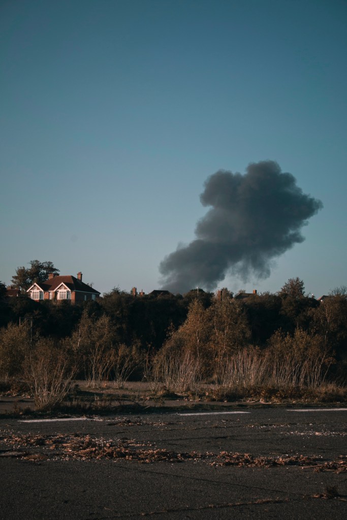
“I like mockup 1 because once you have gone from the car image then the smoke, your eyes are drawn through the building and leads out to the last image on the coast. The diagonal line then leads you back round to the beginning again.”
“As the set of images goes on they become more fascinating, overall this mockup is more impactful.”
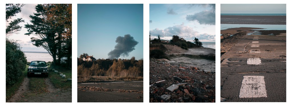
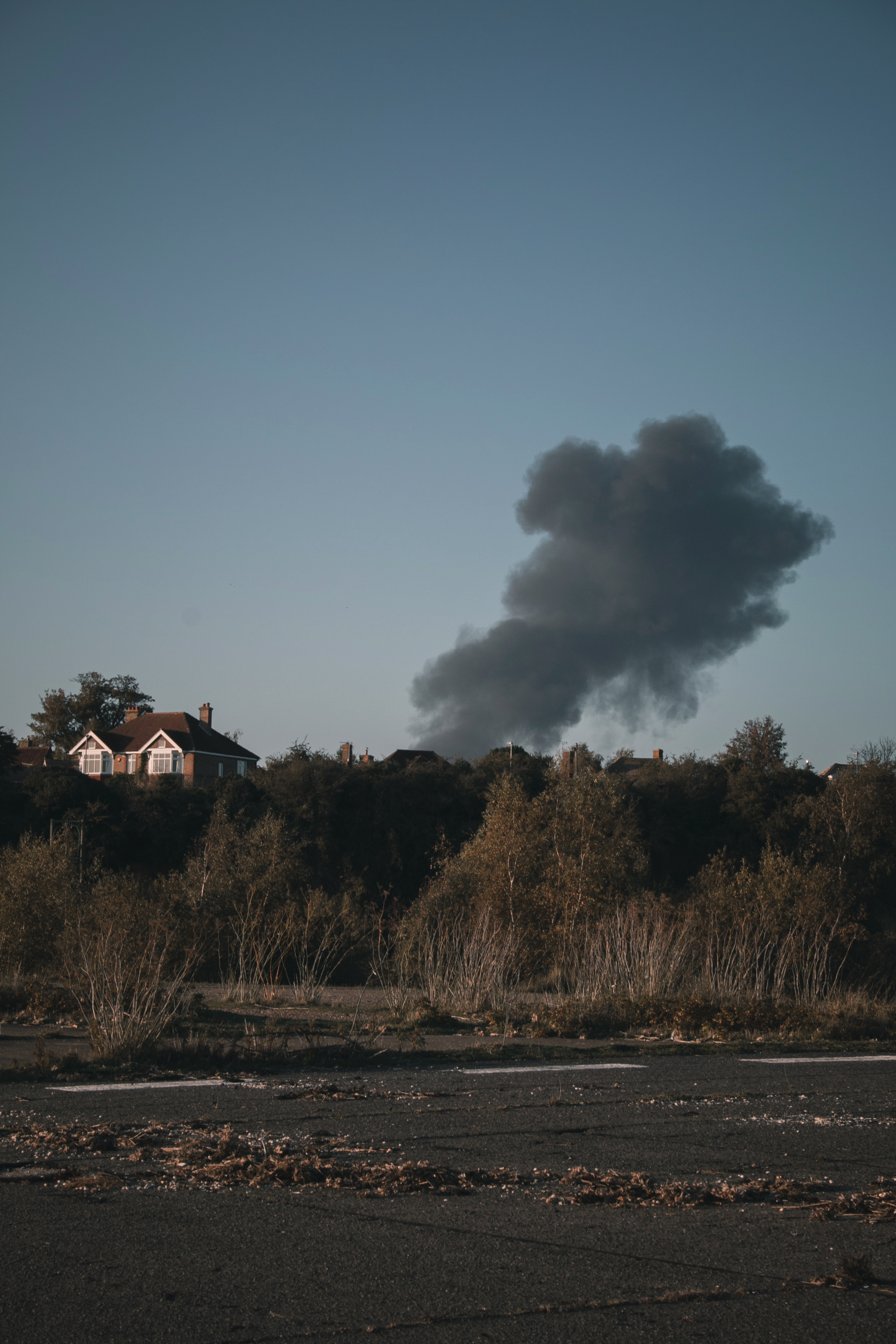
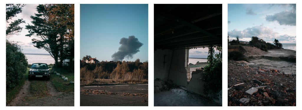
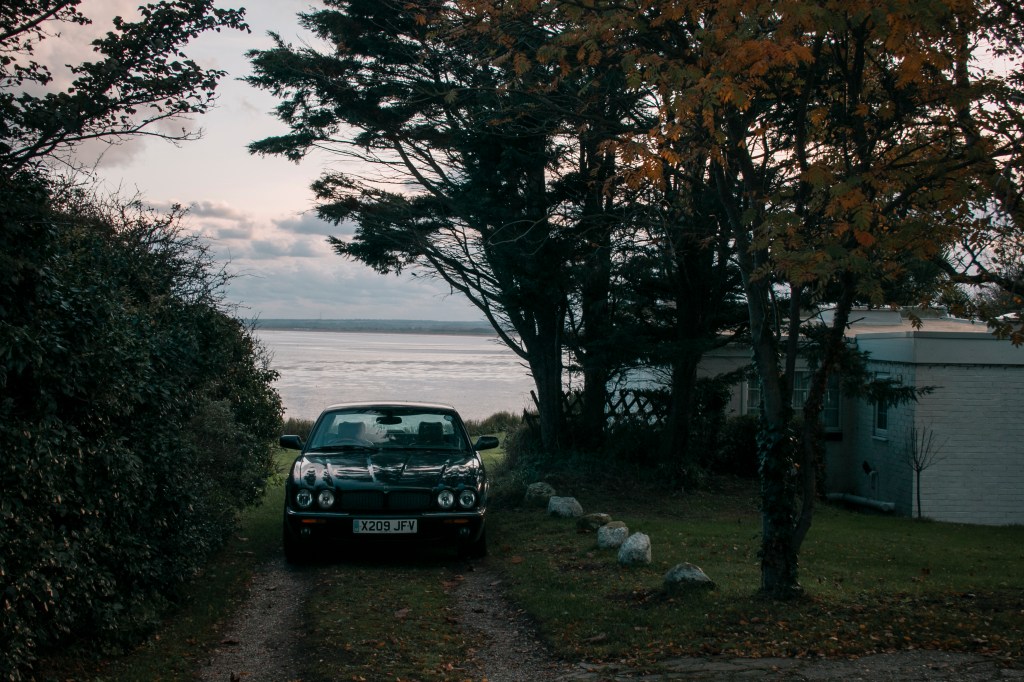
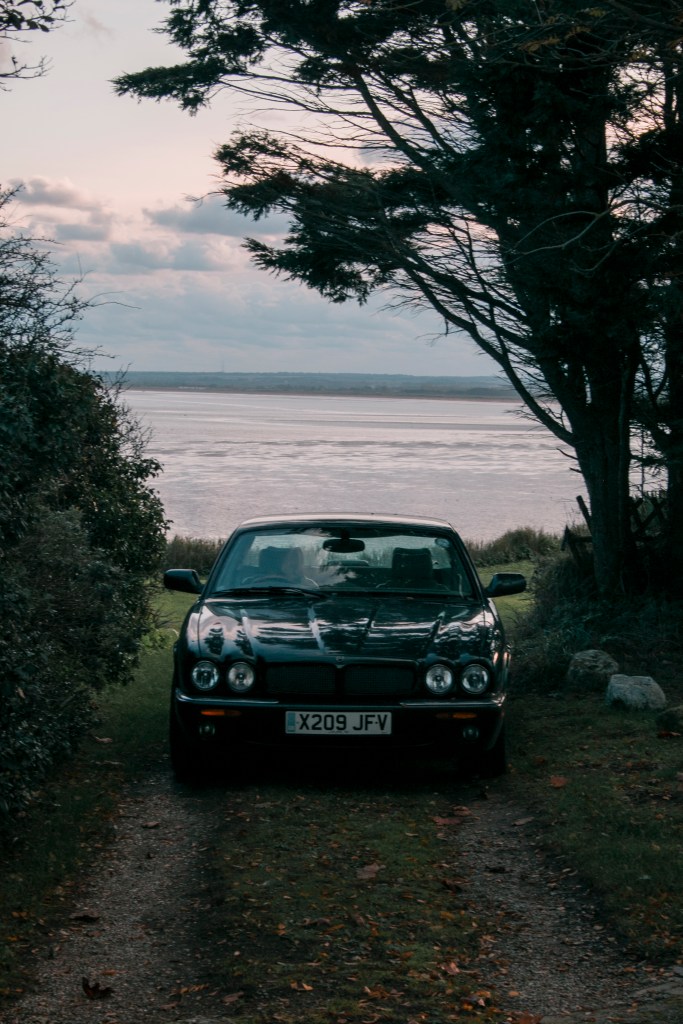
With this mockup, I’ve used one image from shoot 1 and the rest from shoot 3. To me, the fire and house image is one of the most potent images, so no matter what mockup I did, I would always have this image in the set. When picking out the photos, I wanted to create a story, but also a link between them. To me, the story shows a place where someone lives, then a fire happens, and the last two images shows the remains of what is left, in a landscape style. Showing how a landscape can change over time in different environments. But also could show a journey along with this environment, from one point to another.
MOCKUP 2
“I like this one because I can see a story, but they are all different at the same time, which makes it interesting. I feel that mockup 1 has two photos that are the same thing, thats why I find this mockup more interesting”
“The last image is interesting and cool, it’s like a road going out to the sea.”
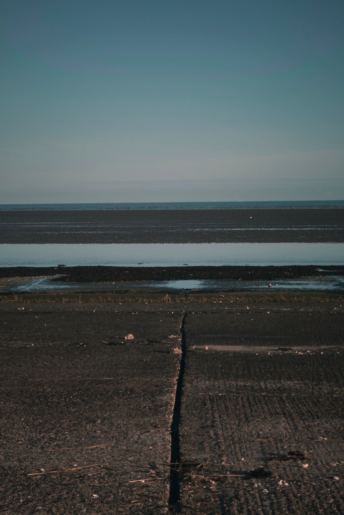
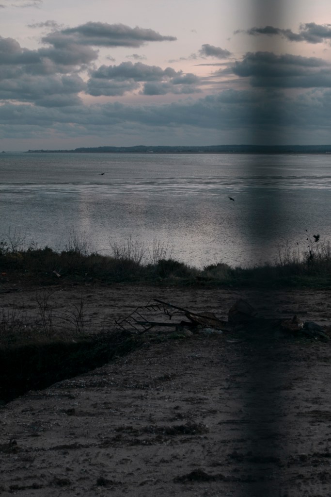
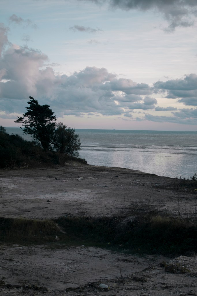
With this mockup, it doesn’t somewhat show a story of events like the previous mockup. However, all of the images link together because of the place. Image 1 and 3 links because of the sky and sea background. Image 2 and 4 links because of the line marking on the floor. But all four images do seem to fit together. From the location and the colours matching each other (blues and greens). A lot of people say they prefer this mockup because the 3rd image on mockup 1 is a bit darker than the rest.
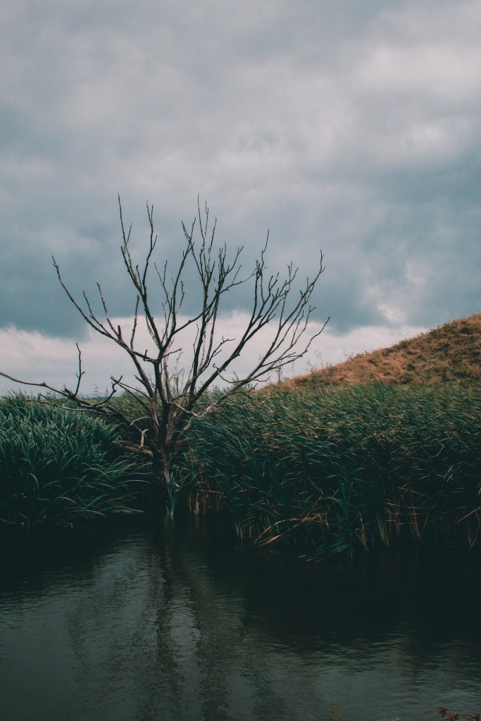
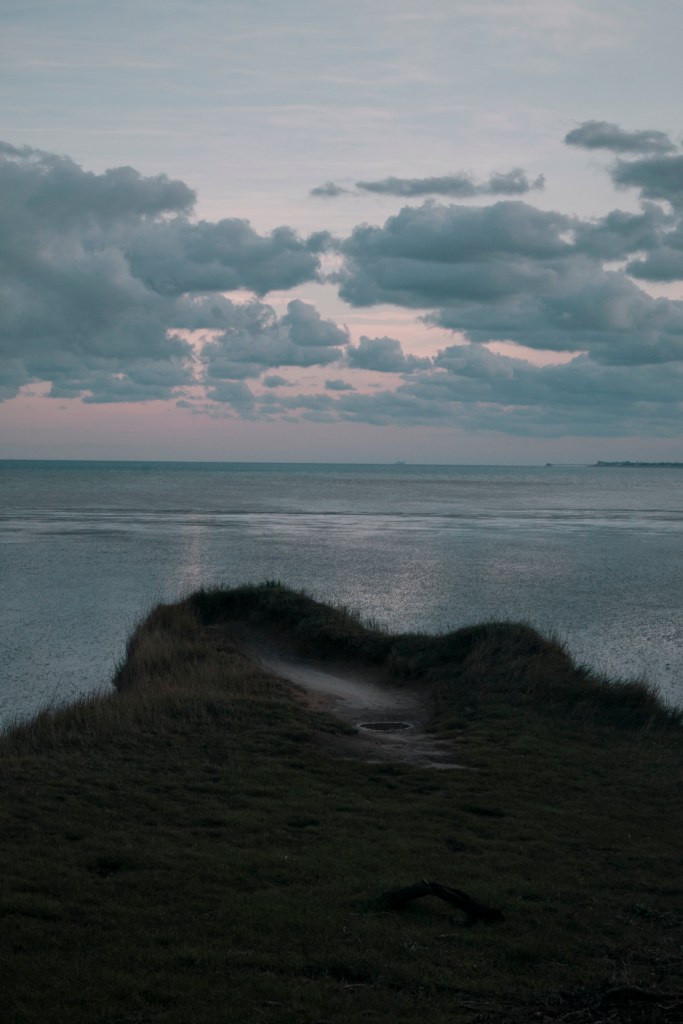
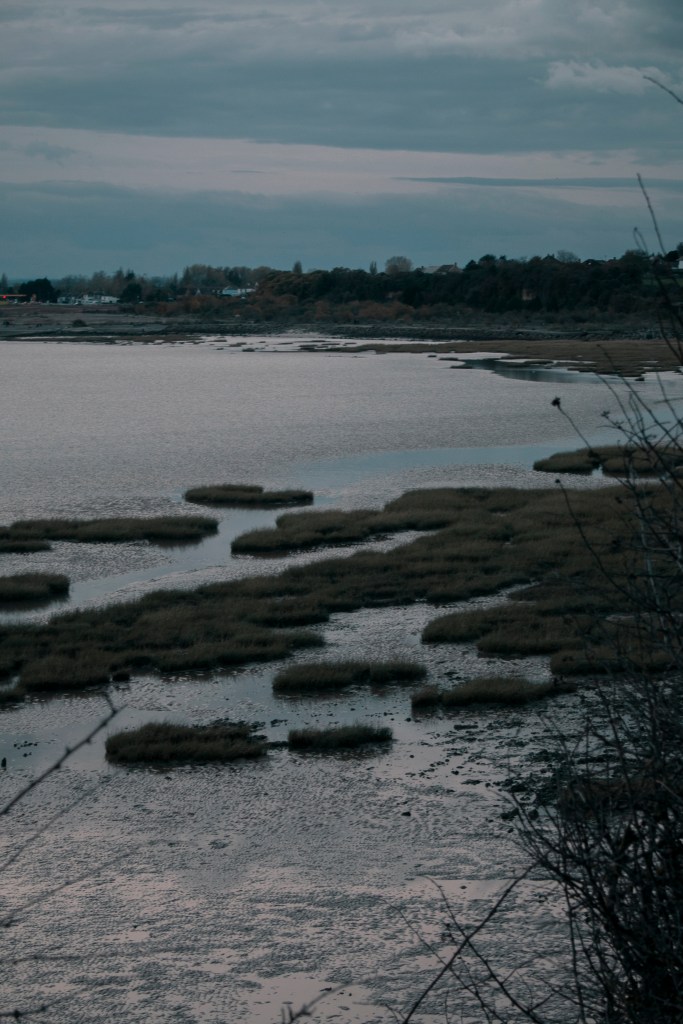
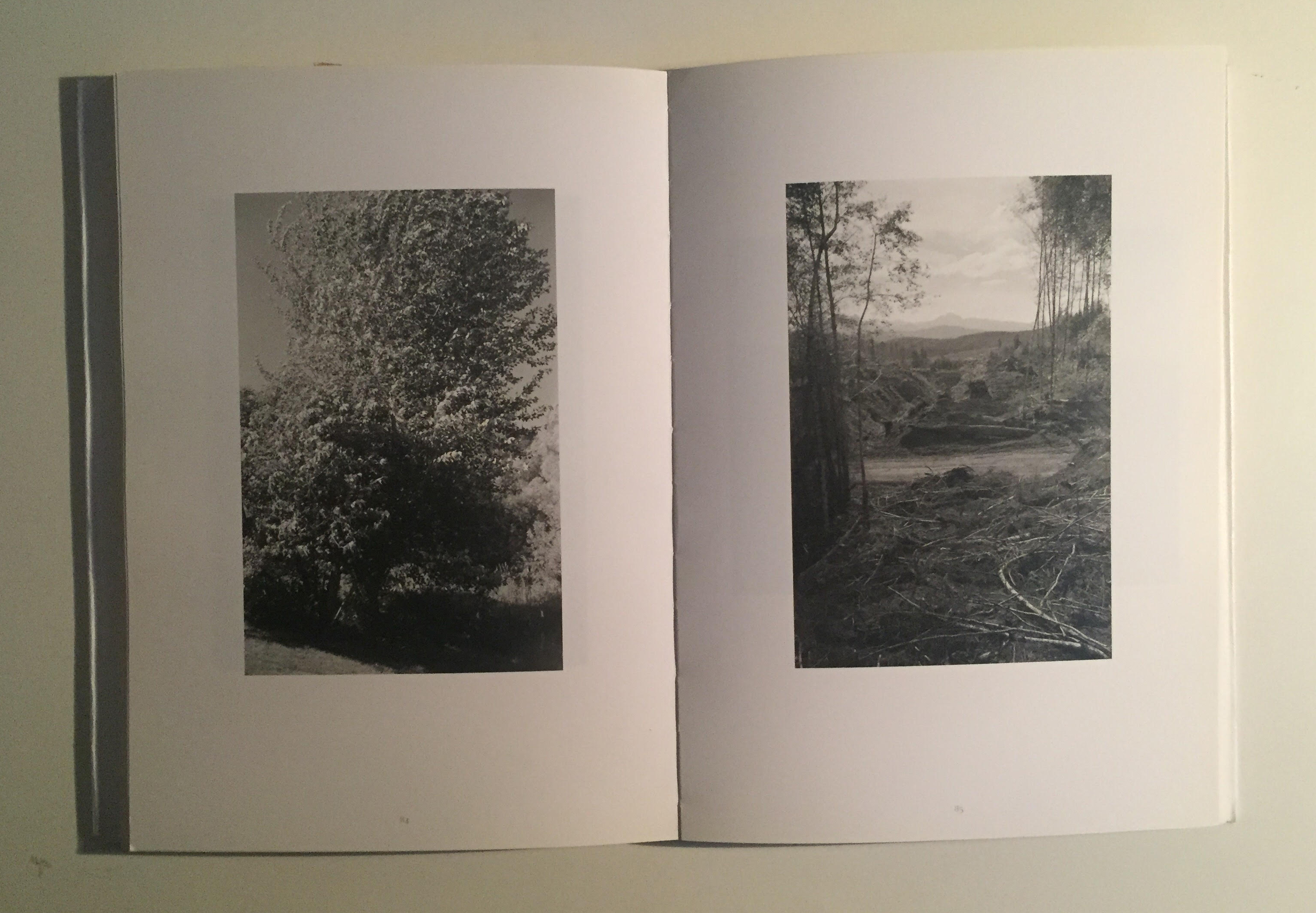
One other image that I wanted to use was the tree reflection image below. I feel that the composition of this image I have capture exciting, and the reflection produced in the water. The shapes and colours from the tree and grass mounds break the image up nice.
The reason I didn’t put this in my mockup designs, is because it didn’t really match the rest of the images. It does with the water, nature and some of the colours, but it doesn’t link together.
FINAL IMAGES
Overall the feedback and choices of my peers and friends have been 50/50, which doesn’t help, but I got useful information explaining why they like the one they chose, which has made my decision a little easier.
What’s Left Behind
I have chosen to go with mockup 2 because I think this will best fit the theme of the environment project and the concept I was going for. The feedback did help shape my opinion, though both had a valid reason for why my peers like them. Which made it even harder to chose. I feel that this set of images and order is something different and they all link together.
I was going to pick mockup 1, because I like how they all flow, the sense of the inside/outside leading down to the beach, but I feel that the third image is too dark and similar to the rest.
While doing the mockup design, I quite liked the white border around the edge of each image, so with each image when printing they will have a white border around it; also I think it looks smarter. I have also chosen to go with size A4 paper and Lustre paper. I think the lustre paper (in between matte and glossy) will suit these images much better than glossy paper.
The title of the final four images series is called ‘What’s Left Behind’, I came up with this name through the environment I photographed. In all four photos, there’s an element of something thats been left behind. From what once used to be used by us, but now left behind for the environment to take over.
I wanted to explore my options of different locations to shoot landscapes in. Two thoughts that came to mind was a nature reserve/abandoned man-made object taken over by nature, and the other was a seaside town. I wanted to photograph two places that included people and not within a landscape location.
IMAGES THAT FIRST CAME TO MIND WHEN I THOUGHT OF MY IDEAS
Thats why I chose Pegwell Bay Nature Reserve and Deal pier. Both are very different, but I wanted to experiment and do a shoot at both locations to find out which one I wanted to go with for my final four images.
WHY DID I CHOOSE THESE LOCATIONS?
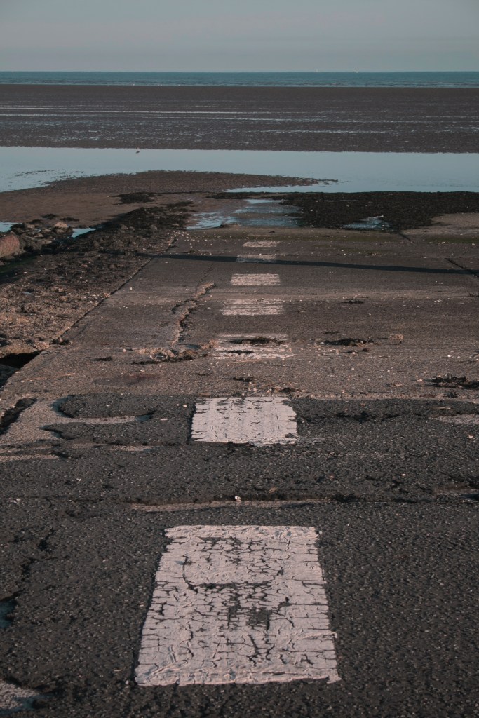
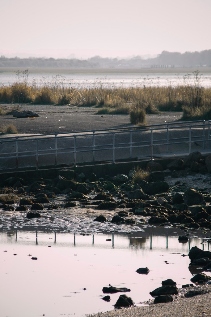
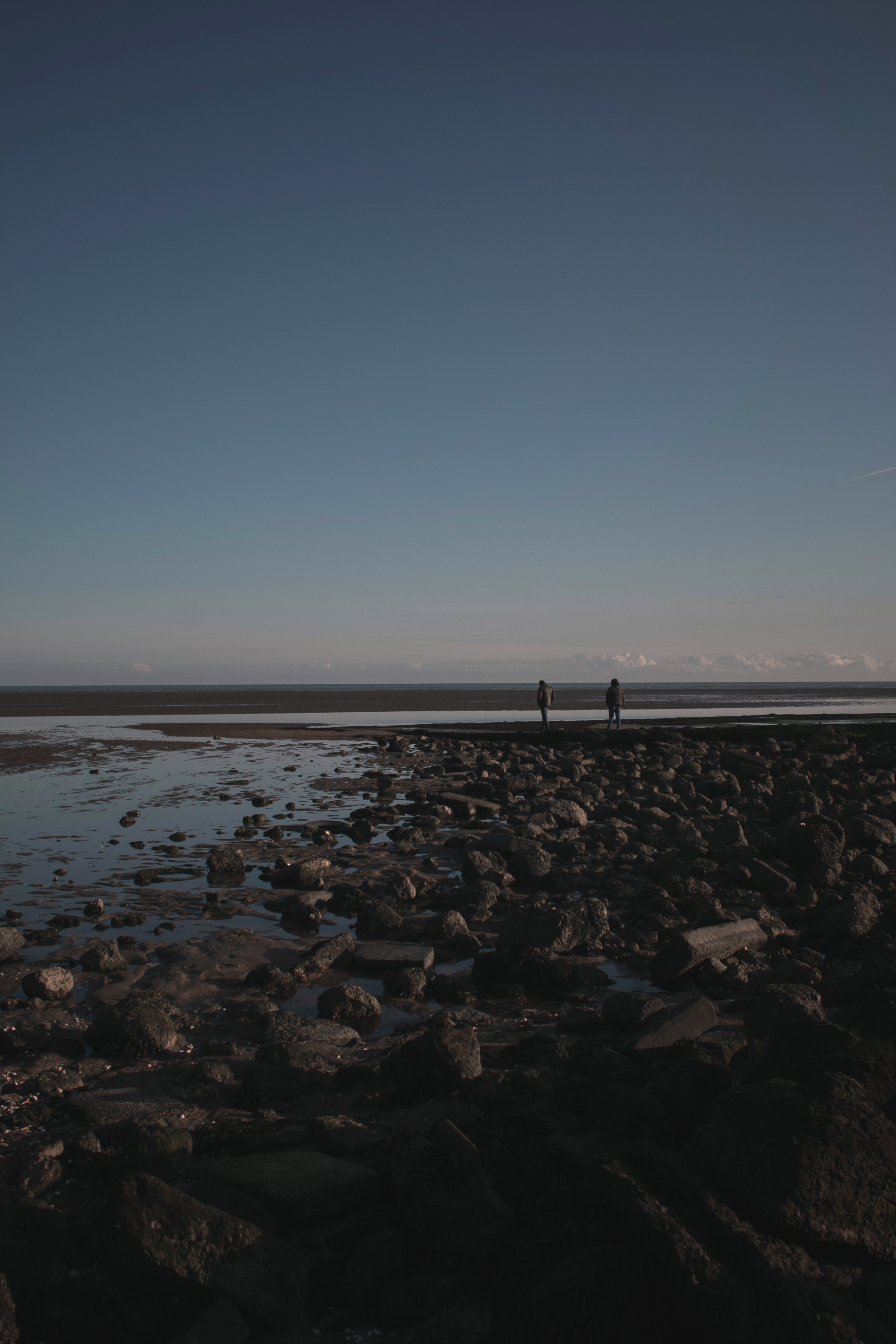
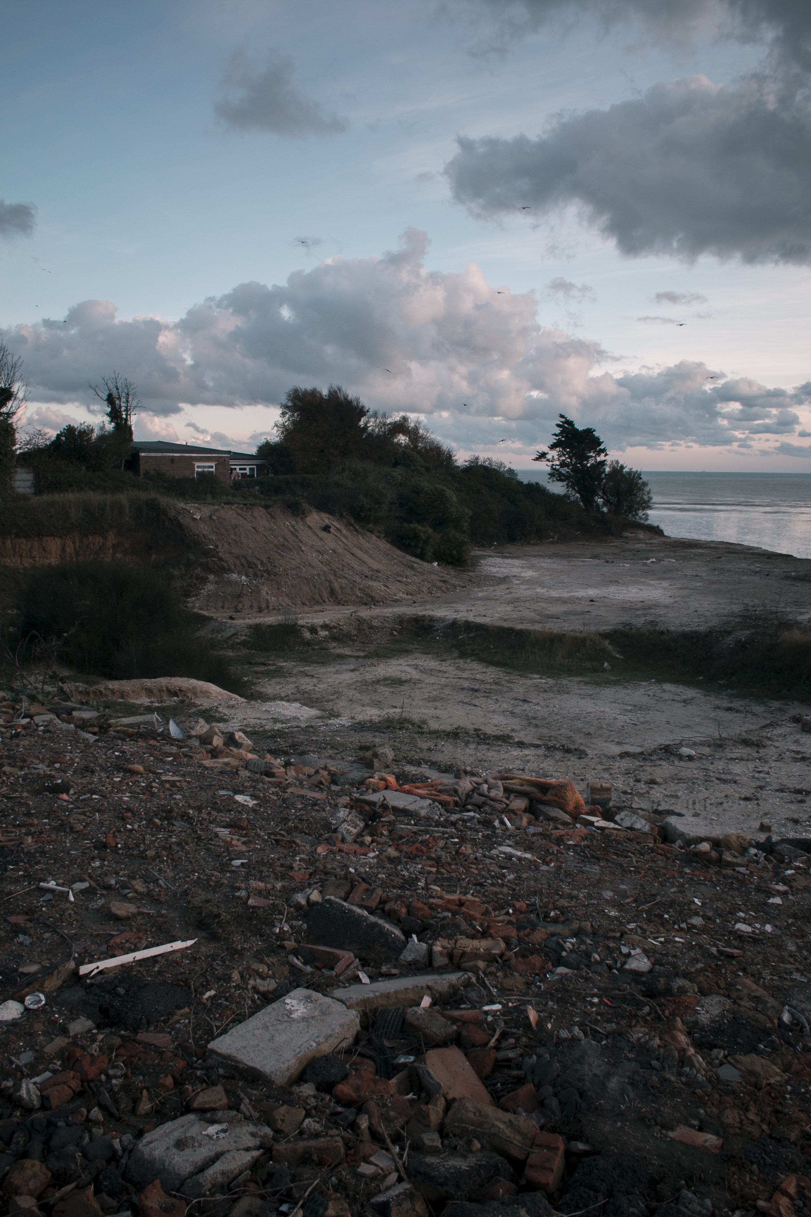
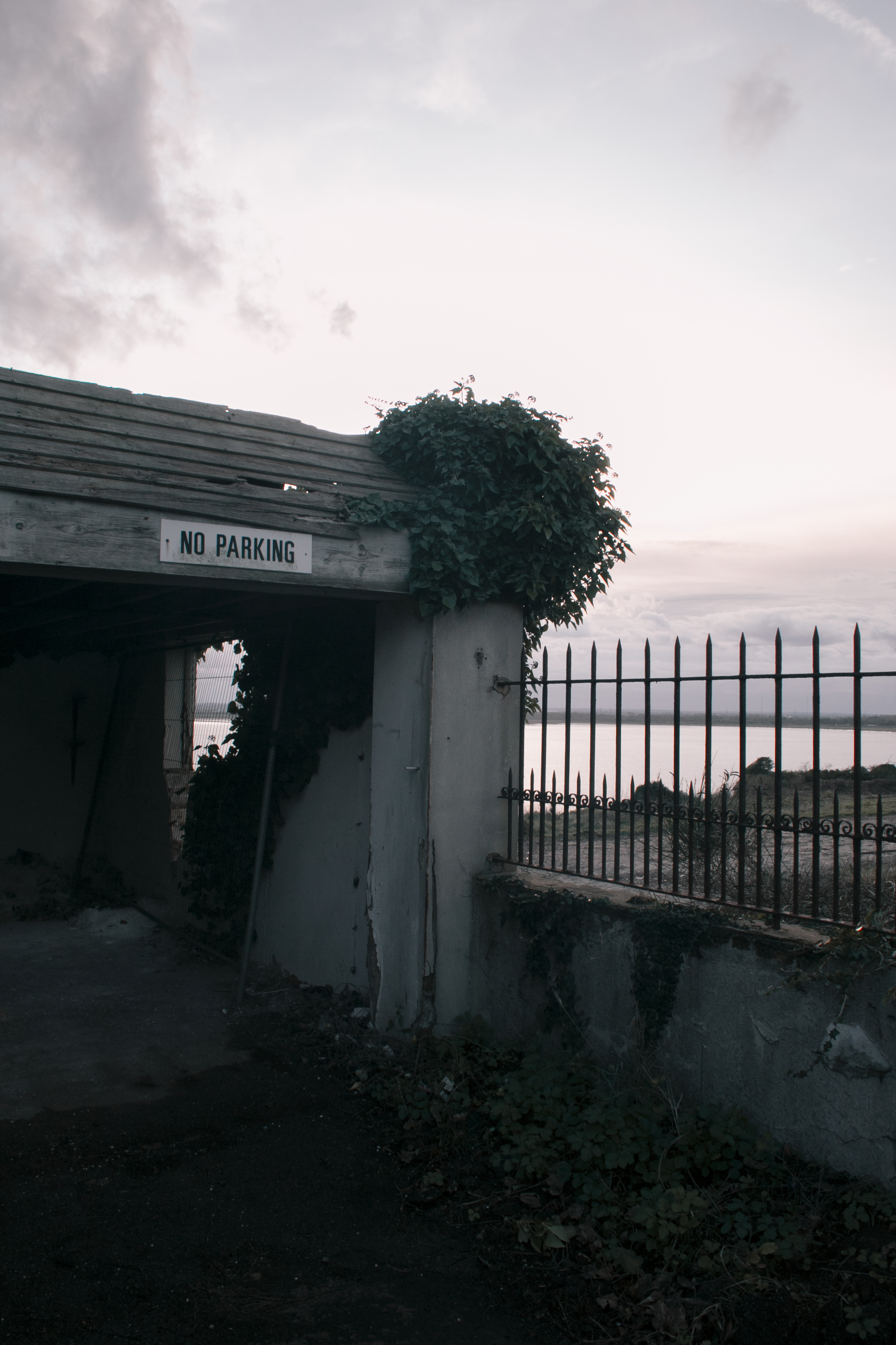
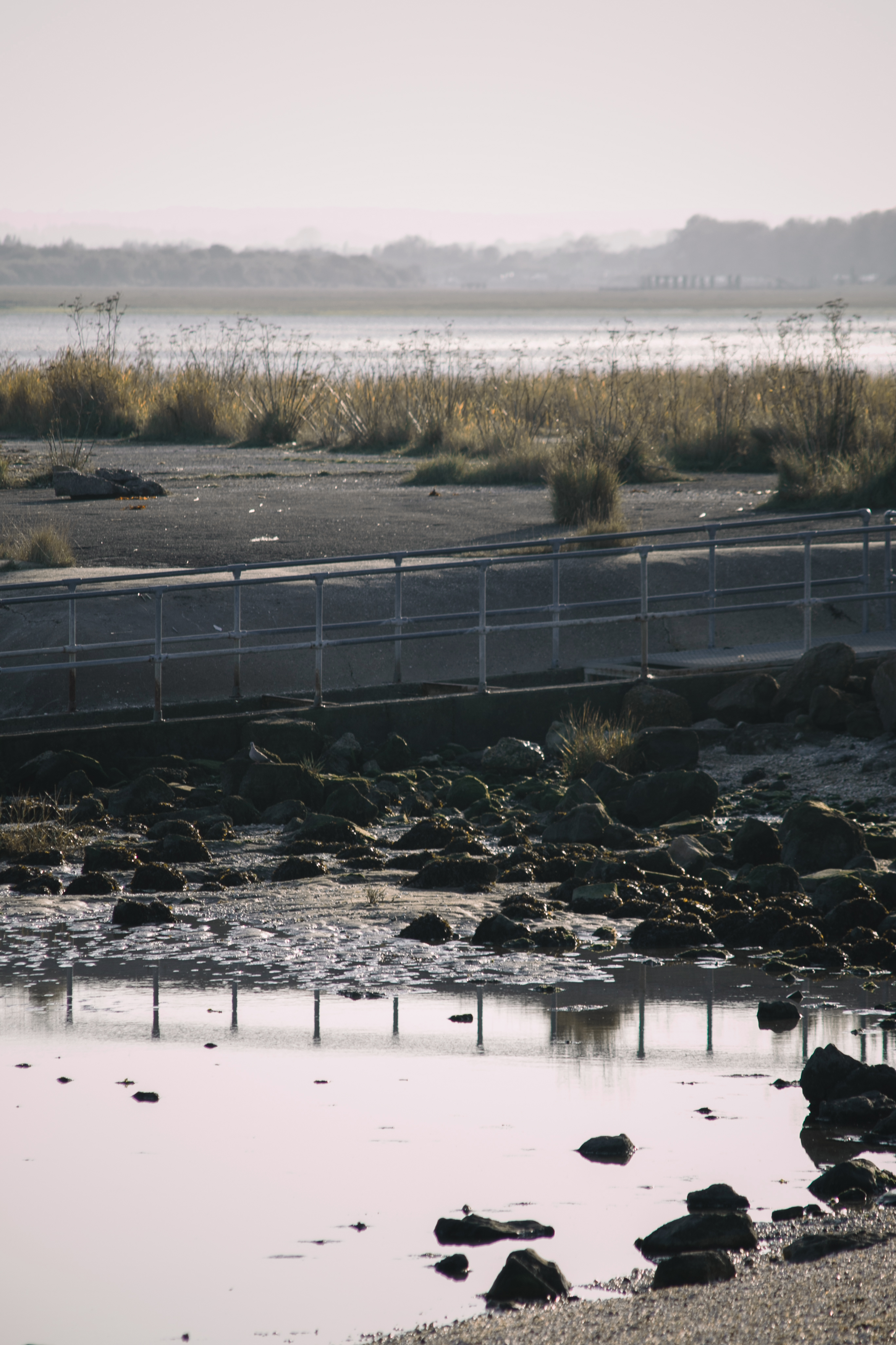
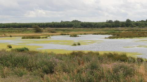
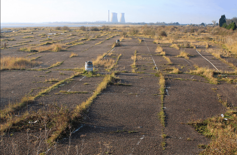
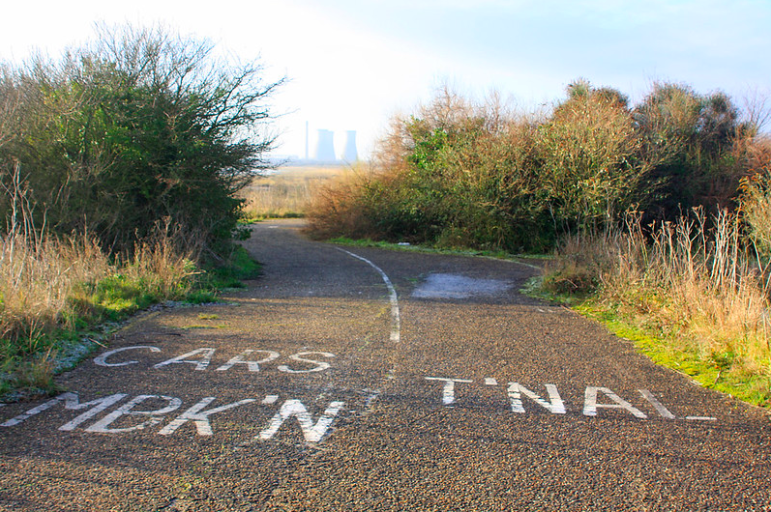
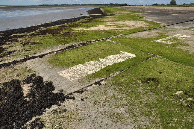
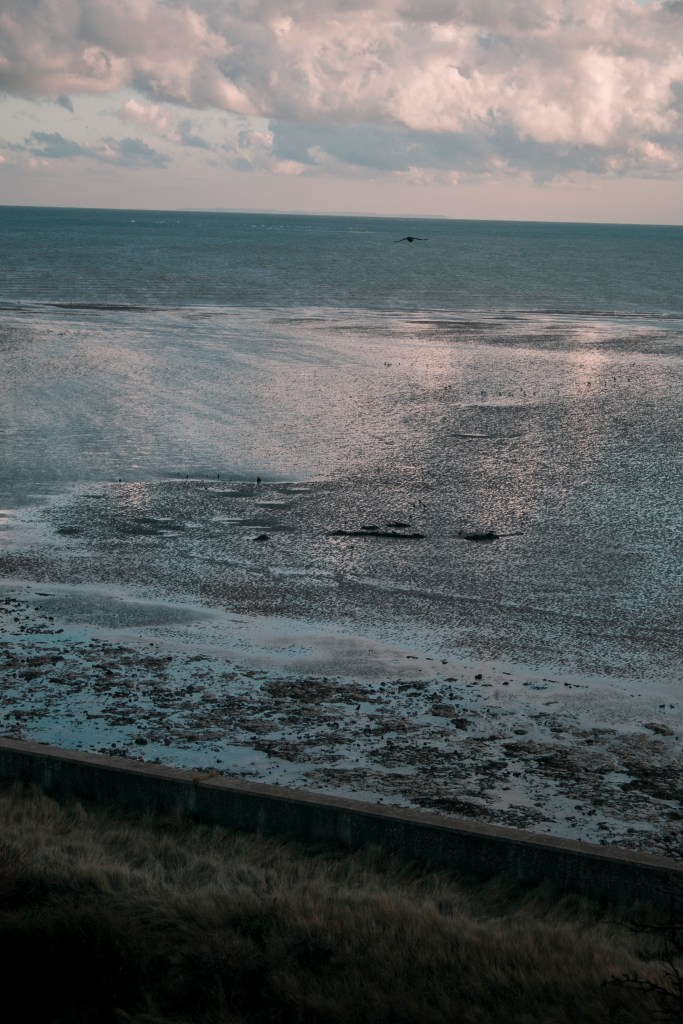
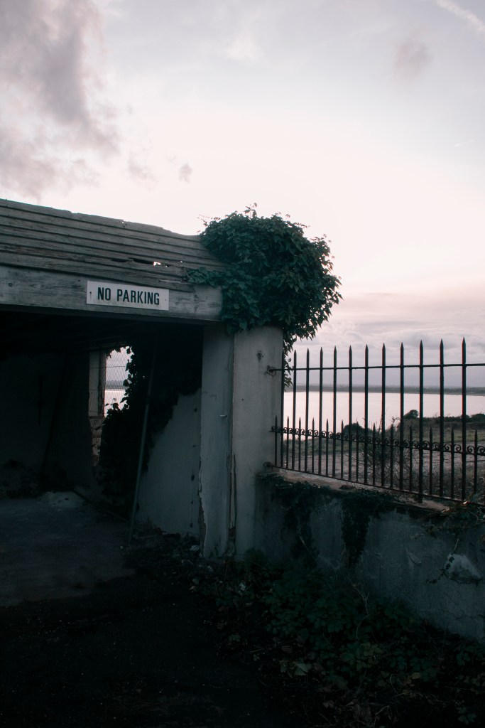
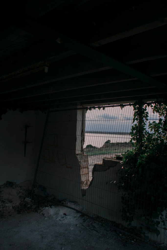
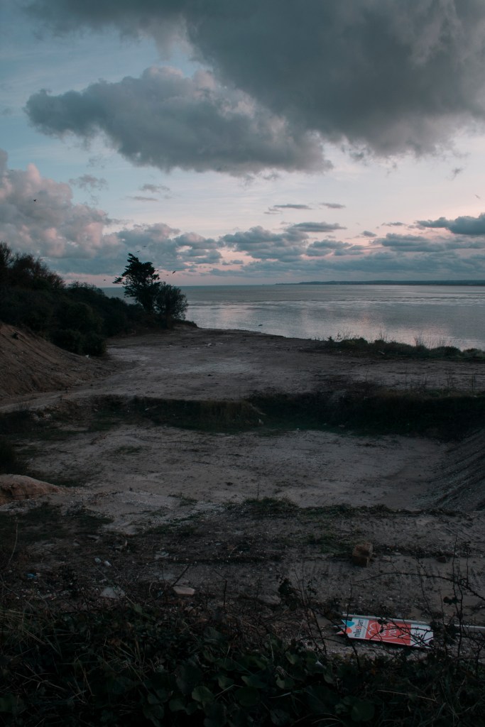
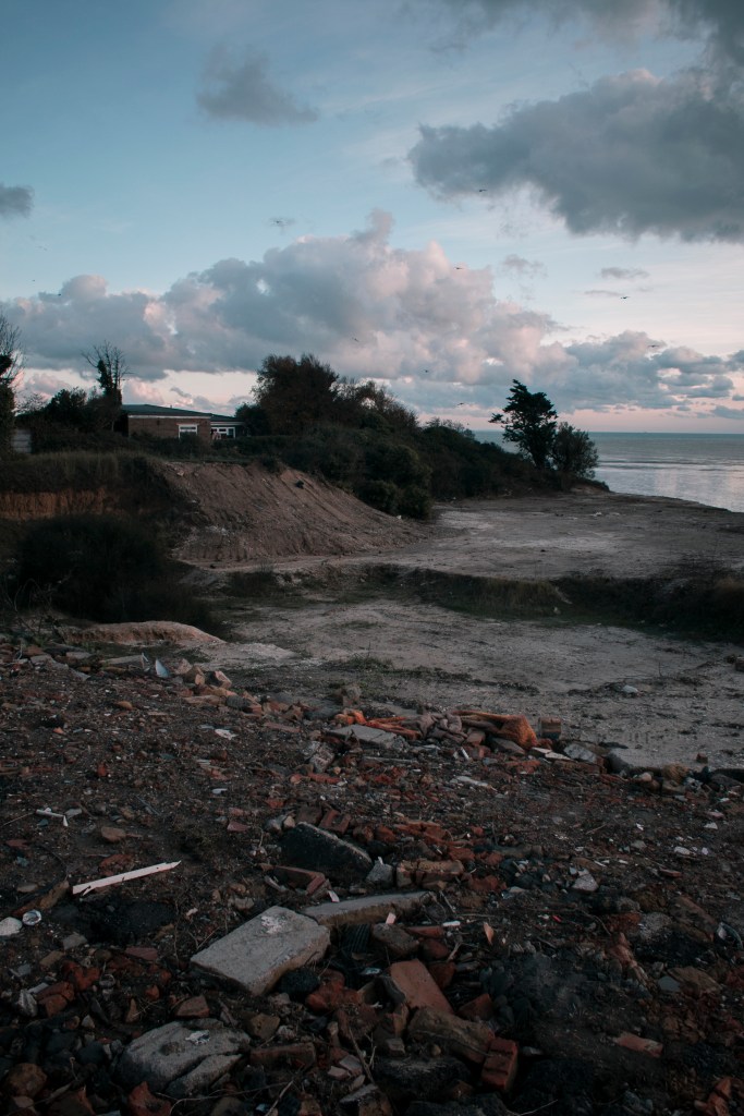
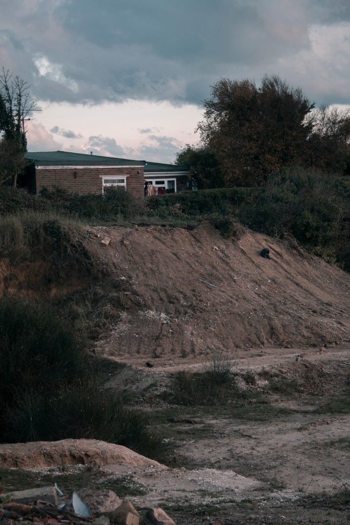
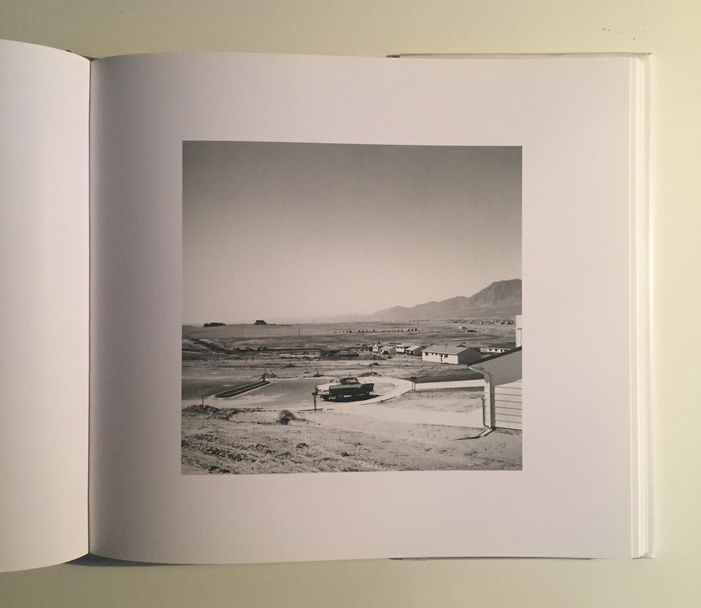
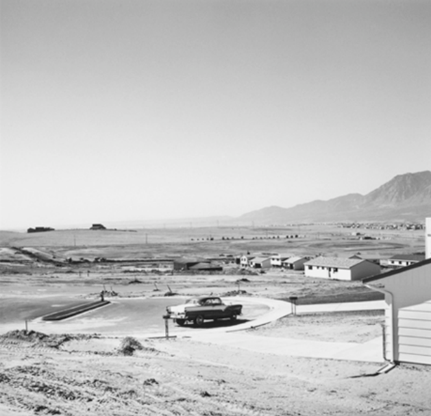
Pegwell Bay is full of nature along the coastal cliffside, as you make your way around, you come across a flatten down concreted land of space. This used to be a hoverport, but now closed, and nature has taken over. But the other end of the nature reserve has abandonment as well, but it has features of people, or what use to belong to people. It shows how the landscape has changed with human impact, but how nature has overcome and grown once more through it.
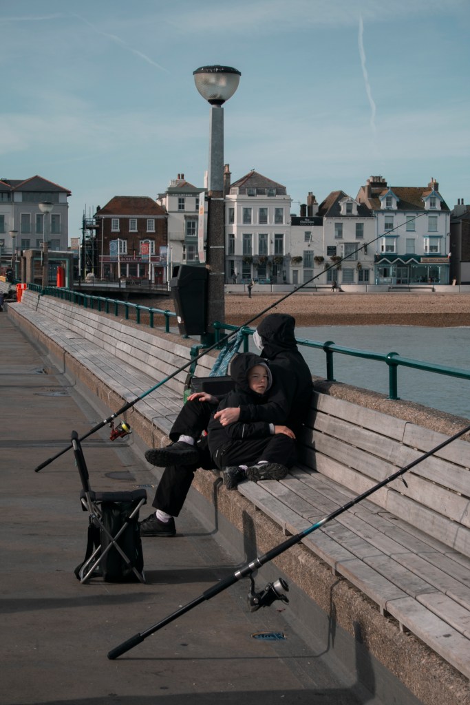
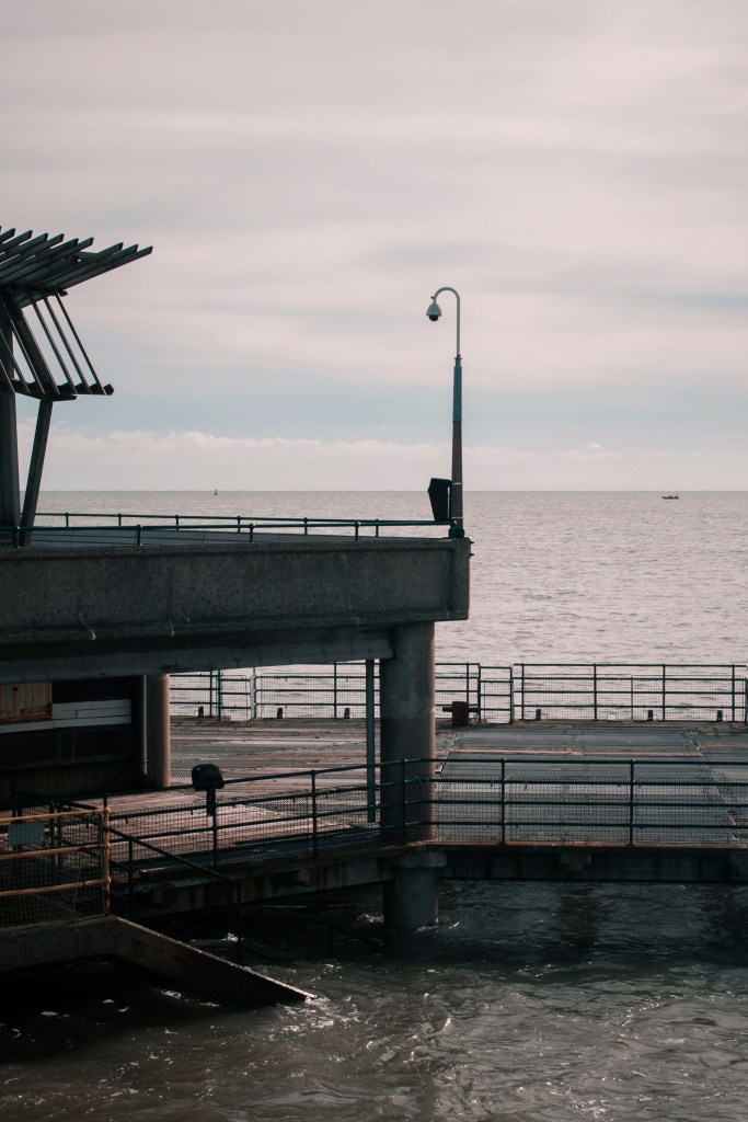
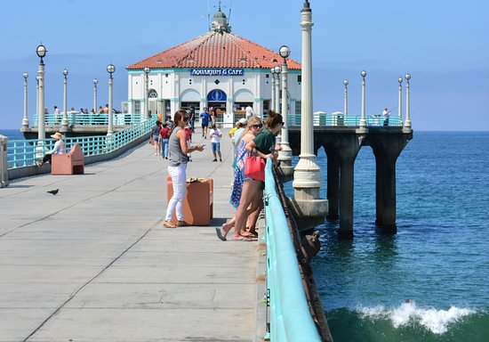
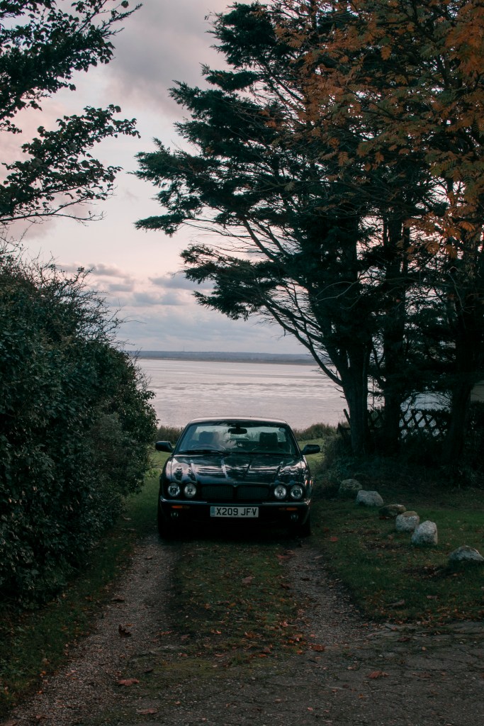
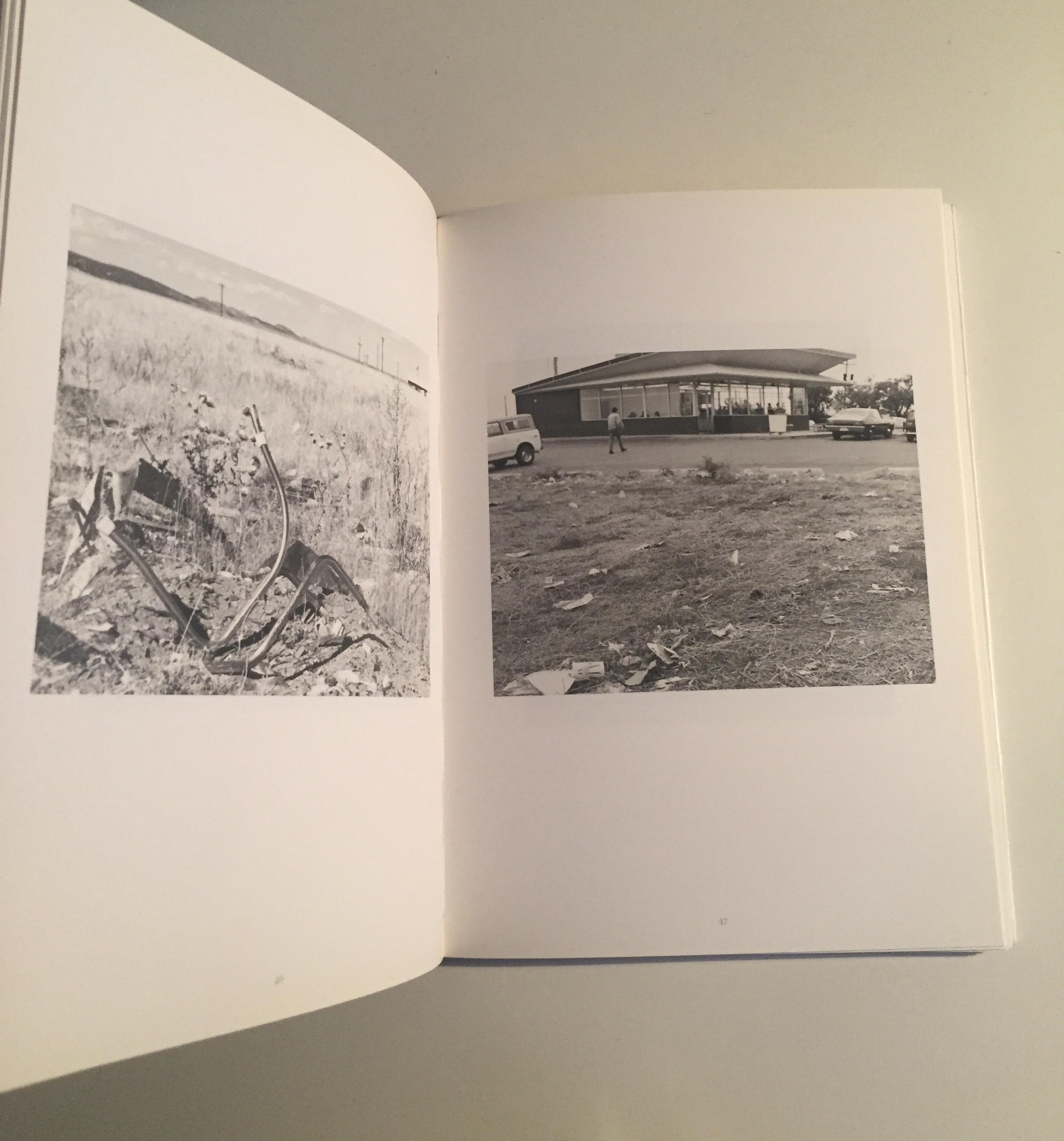
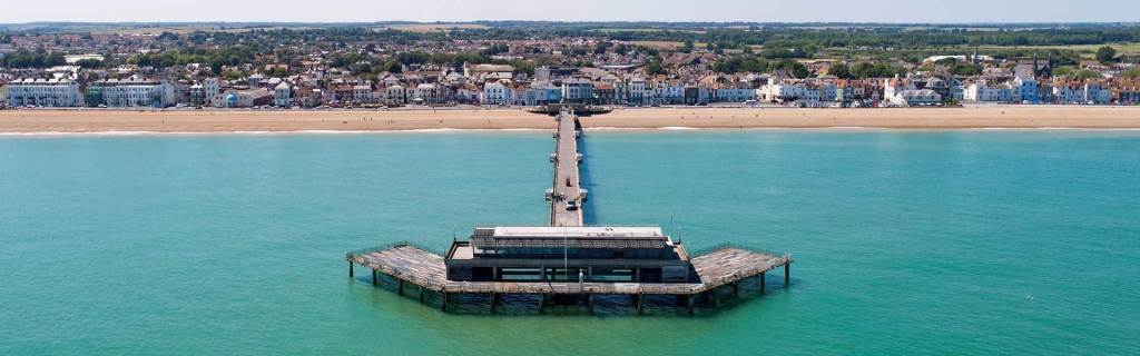
Deal is a seaside town in Kent and holds lots of character. The pier is one of the main features, from its shapes, but the people. The fishermen and families that go fishing bring a sense of community. But not just the pier but the rest of the beach has other objects and families that go there to enjoy a day out. This location would have more of a street style photography, along with the landscape theme. But to photograph the people that surrounds this location can really shape what the environment is like.
One of these locations shows life and the other shows what once use to hold people possession, but now empty in their environment.
OVERALL CHOSEN LOCATION
I have chosen to go with the location of Pegwell Bay Nature Reserve. This is because of the sense of what used to be there in that environment. How the natural environment has taken over what once used to be their (e.g. hoverport). After all, the environment and nature were here before us.
But most of the images have a sense of uniqueness, for example, the image with the fire and house, that event may never happen again. Maybe in another ten years time, this location will be more eroded and will look less like it once did. Capturing this location in this point of time, (in a landscape format and with the rest of the reserve), will be different and exciting.
HISTORY BEHIND CHOSEN LOCATION
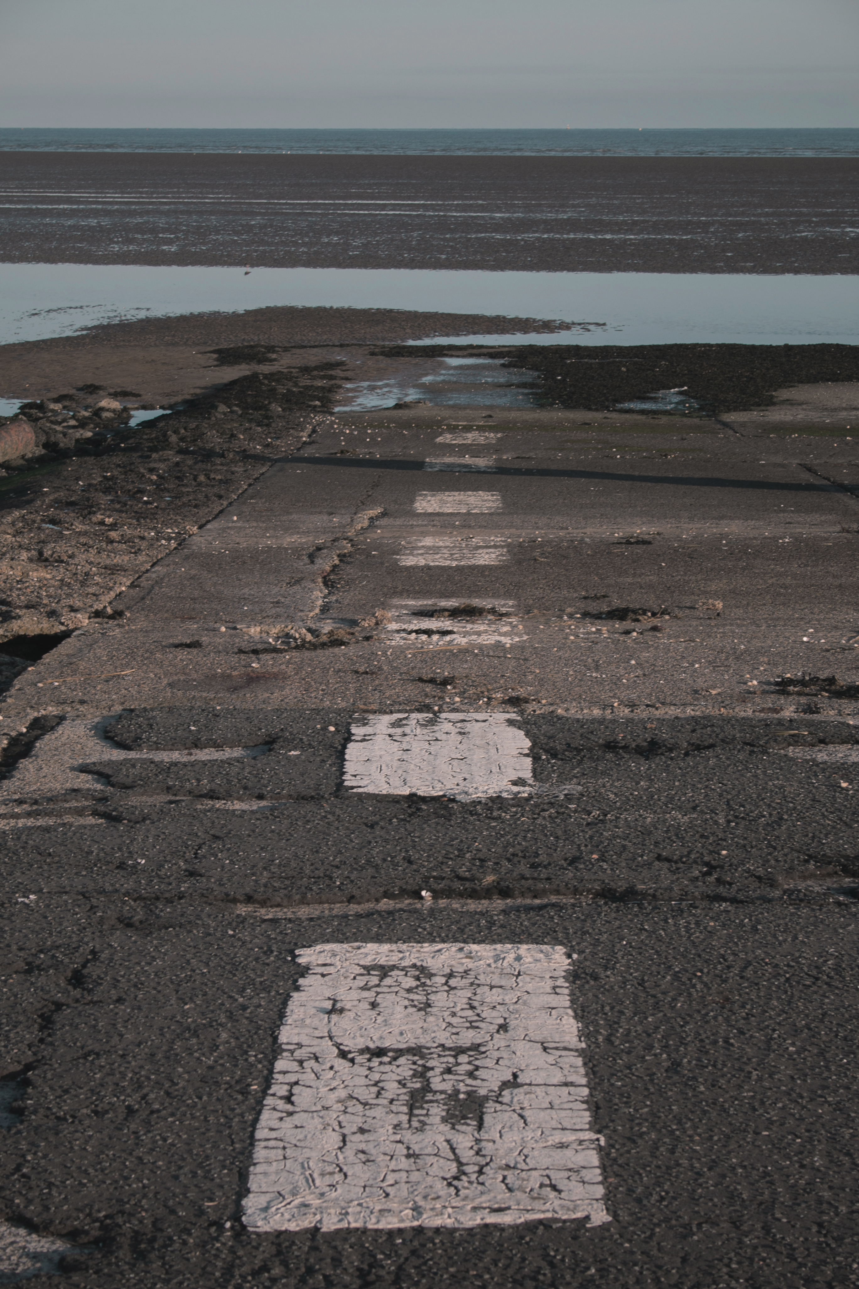
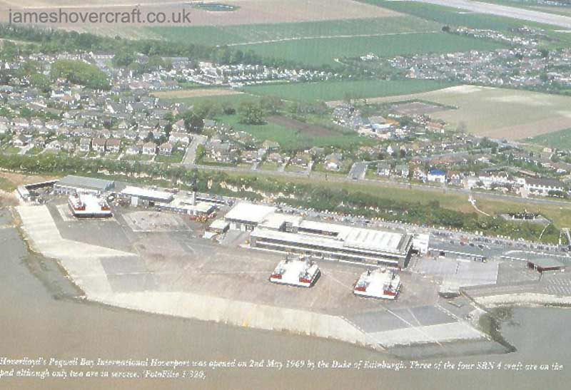
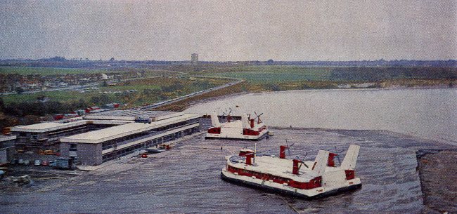
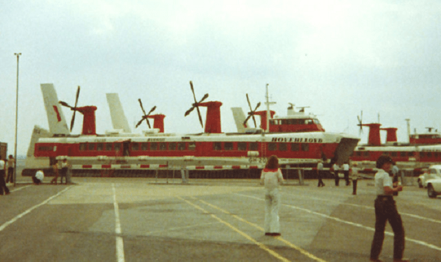
Pegwell Bay Hoverport was one of the parts of the nature reserve I heard about that was still there, but overtaken by the natural environment. When I went down to the area, my mum was trying to explain to me what it was used for and looked like. So when looking up images, I found interesting information and stories.
IMAGES FROM WHEN HOVERPORT WAS ACTIVE
“This hoverport, the pad of which is still intact at Ramsgate with the approach markings and car park outlines still visible, was the home to four SRN4 Mk II craft owned by Hoverlloyd between 1968 and 1987 prior to its shutdown resulting from the merger of Seaspeed with Hoverlloyd to form HoverSpeed. The ramp had terminal buildings and an access road coming from just north of Cliff’s End. The access road still exists today but is blocked off to traffic by a barrier. The pad is accessible on foot, however, from the road or from the nearby beaches.” (Jameshovercraft.co.uk, 2014)
IMAGES OF THE HOVERPORT IN THE PRESENT
Incredibly, this was opened in 1969, 50 years ago and some of the painting marks, are still there. Even the light poles, fences, and the main stairs are still intact. Though its rusted and nature has grown in between, it’s refreshing to see a part of this history.
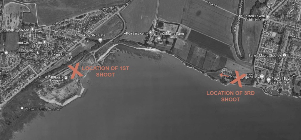
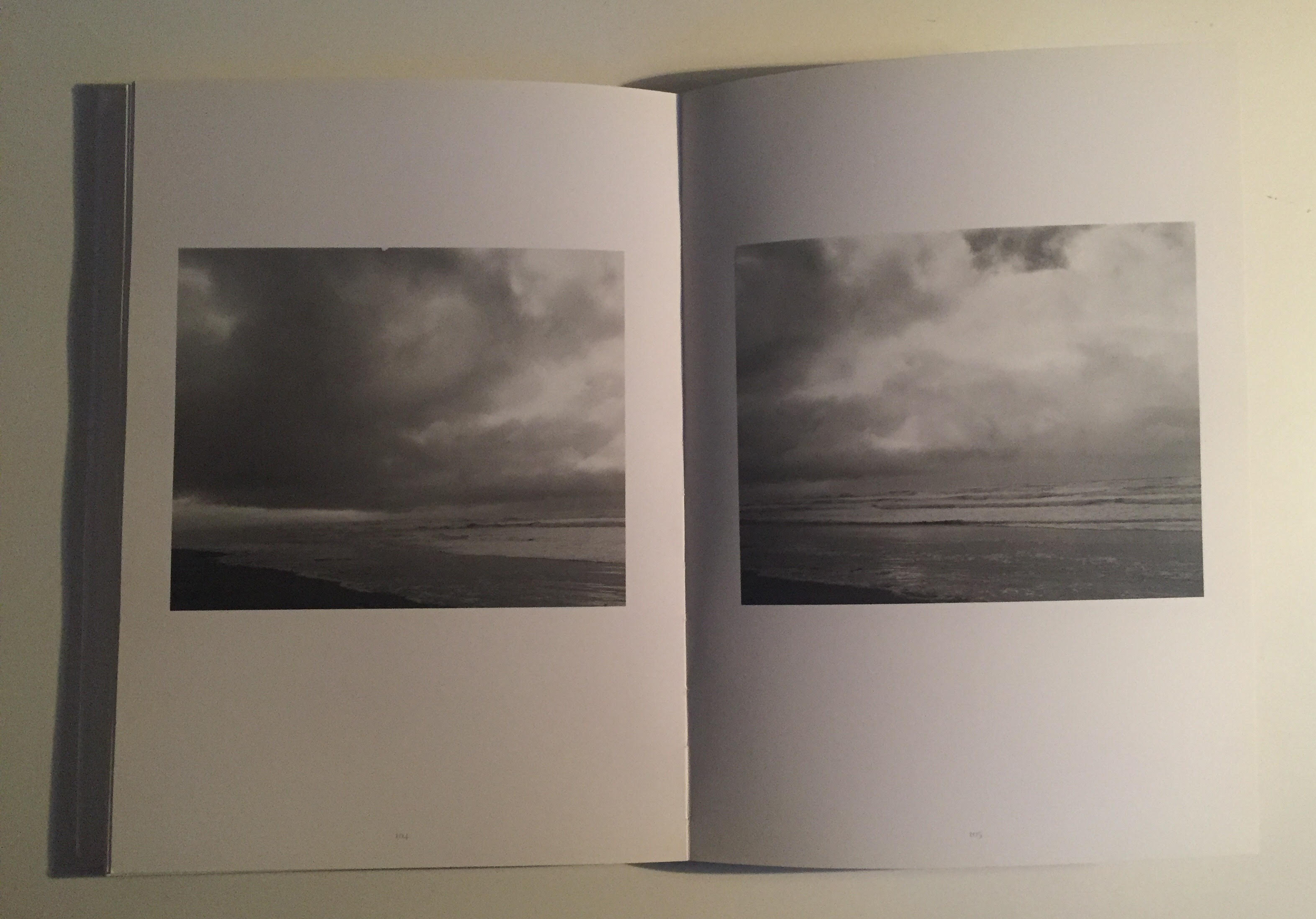
For shoot 3, I want to go back to the Pegwell Bay location, where I went for shoot 1. Shoot 1 definitely has some final images, but I wanted to go again to see what else I can capture. However doing this by starting at another end of the reserve, I will mention more below. I will also focus more on what I learnt from my research. But I have to take lighting and weather into consideration. If I want to use final images from the two different shoots, I would want them to match up as well as possible. So I would have to go on a day with little or no cloud cover, and in the afternoon, when the sun is starting to go down (2/3pm).
LOCATION
Below I have created a map of the Pegwell Bay Reserve location. The ‘x’ on the left shows where I took shoot 1 images, and the ‘x’ on the right shows where I’m planning on going. Also, the direction I’m going in from the arrow. I feel that going from the opposite side will bring a new perspective and area to photograph from.
MAP SHOWING PART OF PEGWELL NATURE RESERVE – SHOWING THE LOCATION I WENT FOR THE 1ST SHOOT AND 3RD
EQUIPMENT
As I want the shoot to be in the same style as shoot 1, I’m bringing Canon camera with a standard lens and also the 70 – 300mm as well.
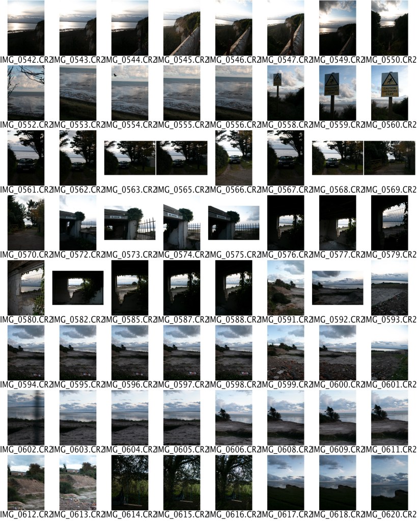
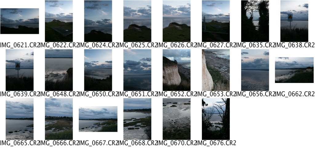
CONTACT SHEET
I EDITED THEM THE SAME WAY AS THE OTHER SHOOT, SO THEY BLEND TOGETHER
RESULTS
When I got to the location, there were more clouds than I expected, but it still works, because of the scenery. I haven’t been to this side of the reserve in a few months, and I was surprised that some of the areas were bordered off with fencing and some spaces where having development done to it. Which in comparison to shoot 1, these set of images look different. But I’m glad it was different because it made the photos not look like your typical landscape photography. I think this area help, it adds texture, shapes and life/lifeless.
As I’ve chosen to go with the landscape theme for this project, I wanted to research further into the landscape itself and artist that are related to my work. Which I took inspiration from for my shoots. I went to the library, finding books that were related to the theme, and others through the internet.
LANDSCAPE
The first book I look at was Photography and Landscape by Rod Giblett & Juha Tolonen. This introduced me to the concept of different ideas and artists. I focused more on chapter 3 – It highlights that a landscape is used for “aesthetic appreciation”. “The land which we photograph is laid out for ‘viewing pleasure’ for people.” (Giblett and Tolonen, n.d.). Places like reserves, untouched by humans, are beautiful and pleasing to the eye. Like most people have a landscape photo somewhere around there house, they have it because its aesthetically pleasing to the viewer’s eye, and the place in the image is probably nothing like where they live, so they want to bring some of that peacefulness into there home.
“Landscape sets up a subject-object distinction between the viewer and the viewed.” (Giblett and Tolonen, n.d.). “It’s a visual experience for the roaming eye …. who occasionally stops to take in the prospect from a static viewpoint.” (Giblett and Tolonen, n.d.). “With landscape the surface of the land is set up against the self. The notion of landscape, as Veronica Brady (1998: 433) puts it glossing Judith Wright, ‘implies a division between the self and the land’. The land becomes a surface against which self poses itself, and a screen against which it projects its fears and desires, and from which it gains pleasure. Landscape separates subject and object. Landscape is a phenomenological and psychological category of the distinction between subject and object.” (Giblett and Tolonen, n.d.).
The land is set up before us, and we can’t change this environment landscape, only with a man-made object. But in a studio, you can change how objects are presented, but in a landscape environment, you cannot change these elements. The only thing you can change is perspective, from taking images from different angles and heights can change the emotions and the way the land is presented.
KEYWORDS OF LANDSCAPE PHOTOGRAPHY
After reading about landscapes in chapter 3, I move onto chapter 4, which is about Sublime and had other keywords. “Sublime is often considered to be one of the three major and legitimate modes of representation in landscape aesthetics along with the beautiful and the picturesque.” (Giblett and Tolonen, n.d.)
SUBLIME – Of very great excellence or beauty.
PICTURESQUE – Visually attractive, especially in a quaint or charming way.
COMPOSITION – Positioning the objects in the frame in such a way that the viewer’s eye is automatically drawn to the most interesting or significant area of the capture.
EXOTICISM – The quality of being attractive or striking through being colourful or unusual.
VIEWPOINT – The angle, direction or stance from which you choose to shoot each image.
ANTI-LANDSCAPES
When reading through this book, I came across the word ‘Anti-Landscapes’, and I was curious about what this means. “The Anti-Landscape examines the emergence of such sites, how they have been understood, and how some of them have been recovered for habitation. The anti-landscape refers both to artistic and literary representations and to specific places that no longer sustain life.” (Nye and Elkind, 2014).
Rather than focusing on romantic, picturesque landscapes. Anti-landscapes, present an opposite to clichés of landscape photography, celebrating the ugliness. Without ugliness in this world, how would we distinguish beauty?
“The objects which the “anti-landscape” term studies are of central importance in the Anthropocene, not only because industrialized and even degraded landscapes are proliferating, but also because at a moment when human influence shapes every possible ecosystem and region, such landscapes are ‘nature.’ To say that degraded landscapes do not sustain life is in some ways to contradict the evidence offered by many of the essays included in this collection: that though toxicity and degradation maybe no fault of their own, families and communities continue to choose to live and work in such places. (B, Ross, 2014).
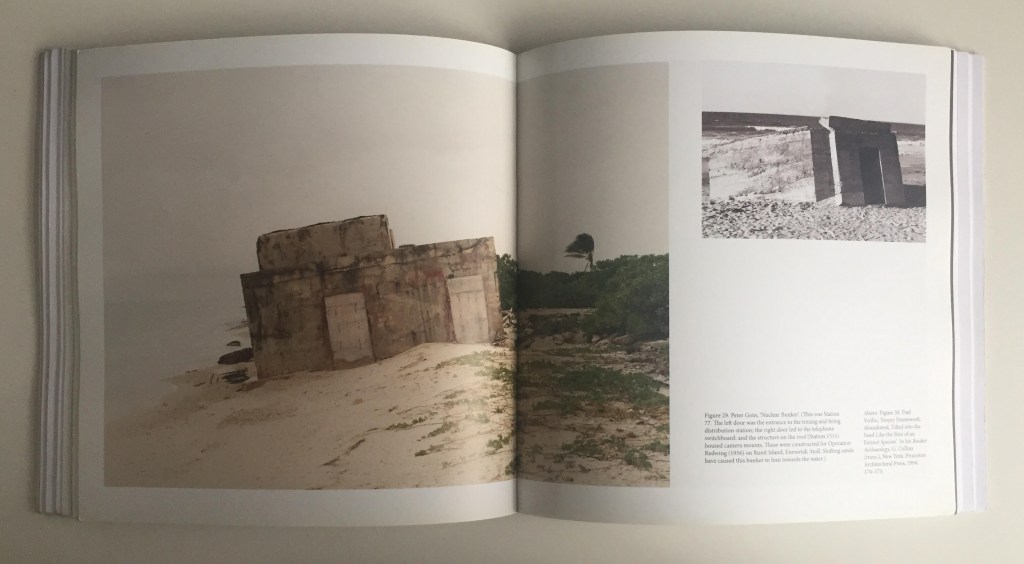
EXAMPLE OF ANTI-LANDSCAPE
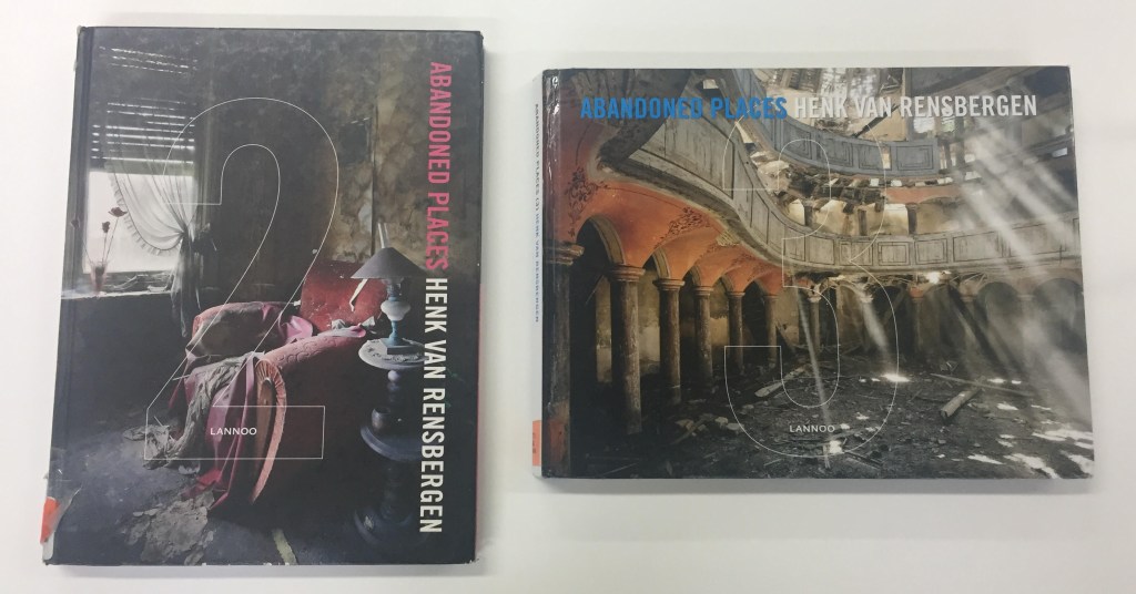
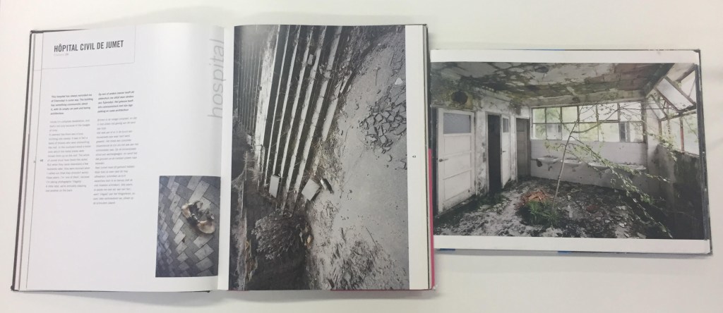
While looking at other books in the library, I stumbled across these books. They are by Henk Van Rensbergen, and called ‘Abandoned Places 2&3’. Henk van Rensbergen’s thoughts were, “why travel to far-off natural jungles, when there are far more interesting places in your own neighbourhood – abandoned places, just waiting to be explored. Van Rensbergen sets off, looking for abandoned hospitals, overgrown industrial complexes, or urban palaces, ravaged by the driving rain, overgrown with weeds, decorated with graffiti. The resulting photographs are unequalled – beauty meets decay.” (Rensbergen, 2010).Not all of the images inside the book are landscapes, but they represent the sense of anti-landscape, making the ugly, decay look fascinating and beautiful.
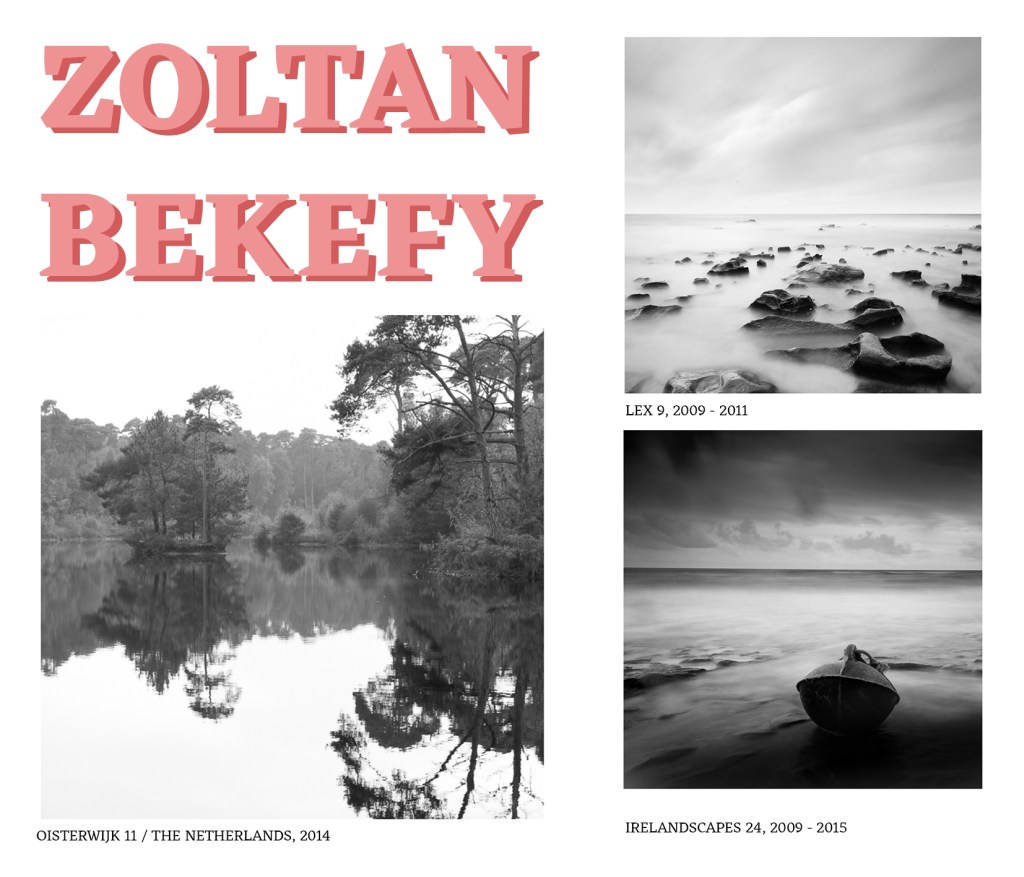
“Zoltan Bekefy is fascinated by the constant spectacle offered by nature. He has traveled the world with his camera in hand, striving to sublimate the landscapes that he discovers in the course of his unusual journeys. Capturing the essential, his work constitutes a silent report on the beauty of the world, in which simplicity, purity, and minimalism set the tone.”(Zoltanbekefy.com, n.d.)
Bekefy uses the simplicity of the environment around and produces a mood by creating images in black and white. Even though some of his other work is dark, because of these tones between the blacks & whites, it produces a calming ambience. Bekefy captures the perfect moments and transforms them into pieces of art, of the natural beauty that surrounds us.
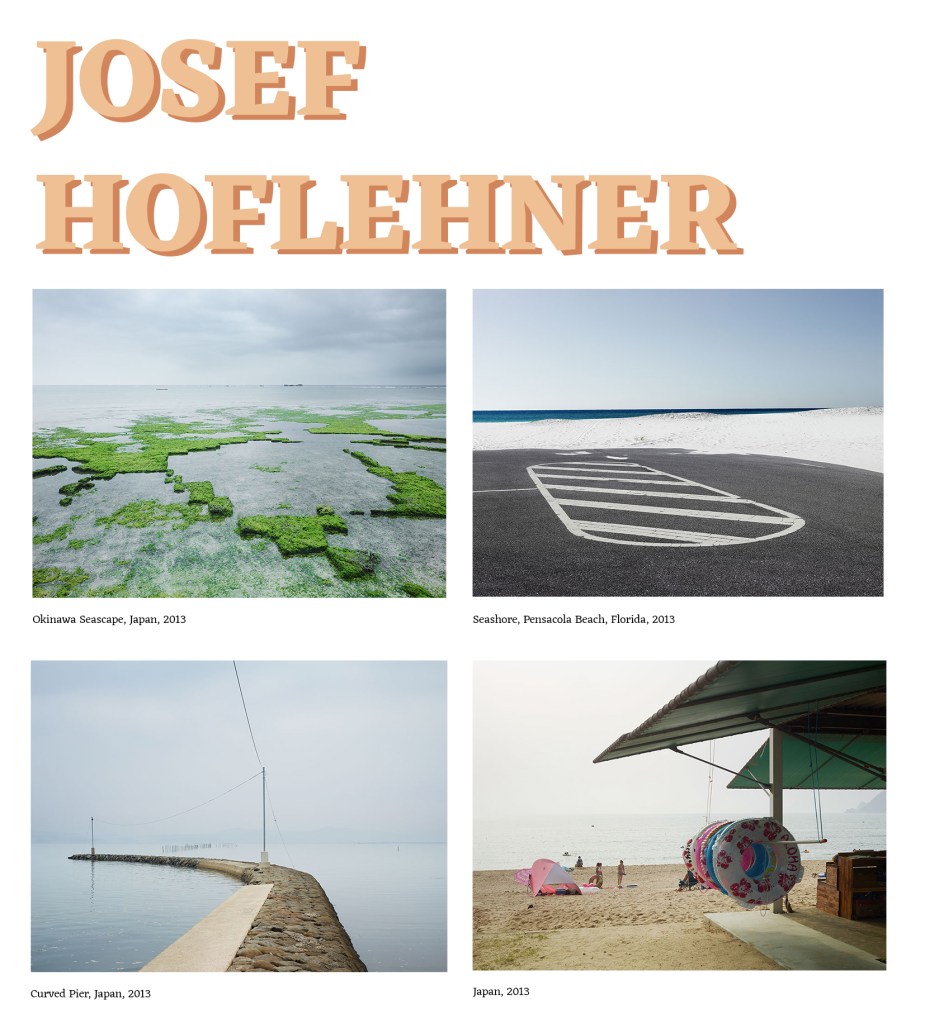
“Josef Hoflehner’s photographs of cities and landscapes are filled with silence and solitude. Working mostly in black-and-white, he emphasises the relationship between the natural and the man-made, placing figures or physical traces of human presence against vast, sometimes eerie emptiness.” “I like empty spaces,” Hoflehner has said. “I prefer bad weather. I love snow and ice … and trees. I mix up or change my style often. I like to experiment with focus and time.” (Artsy.net, n.d.)
To me, Hoflehner likes to wait for the perfect conditions to take a photograph. Whether this is about the weather, interactions, or waiting for people to go (to make the surrounding empty), I feel like time is the main element in his work. He also focuses on the simplicities of the environment around him, which in the end can produce more compelling images. From this, it can create formal elements such as lines, shapes, patterns, contrast etc.
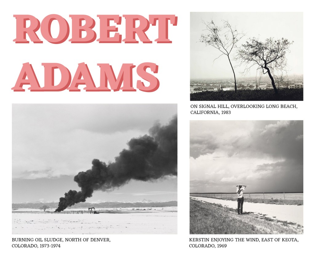
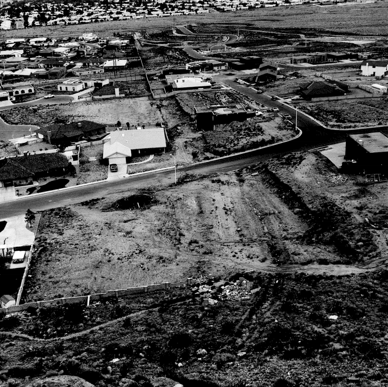
“Robert Adams is an American photographer who has focused on the changing landscape of the American West.” (En.wikipedia.org, n.d.) When Adams started to take landscape photography, he took inspiration from Ansel Adams. Robert Adams look for mountains and rivers and move out of the part of the country where it had poor air and suburban housing. But then he started to take pictures of roads and the development of houses.
The photograph ‘On Signal Hill, Overlooking Long Beach, California, 1983’ (above) admits that it was a happy accident, in Robert Adams words it –
“Capture both the resilience of nature and the isolation of nature often in Los Angeles. It’s got the full burden of mystery and damage.” (San Francisco Museum of Modern Art, 2019)
I feel that I can relate to this sentence, in which I didn’t want to take ordinary landscape photography, even though it is beautiful, I wanted to tell a story and make it intriguing for the viewer.
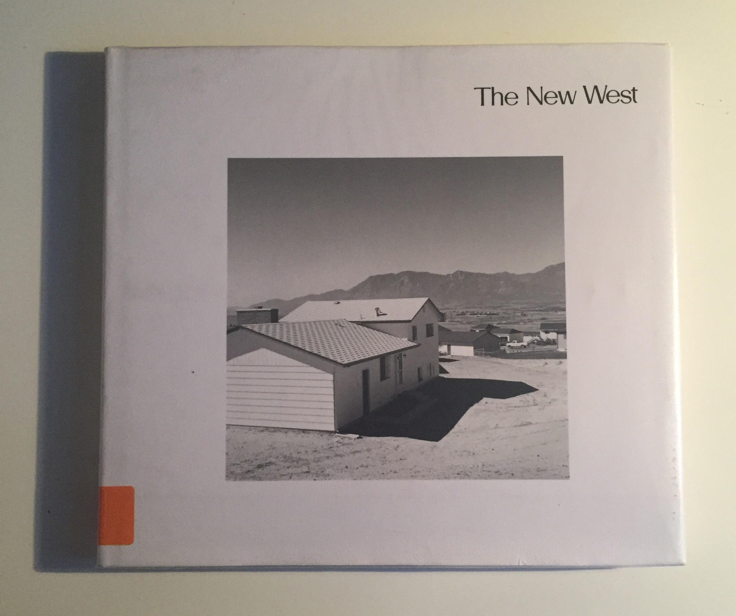
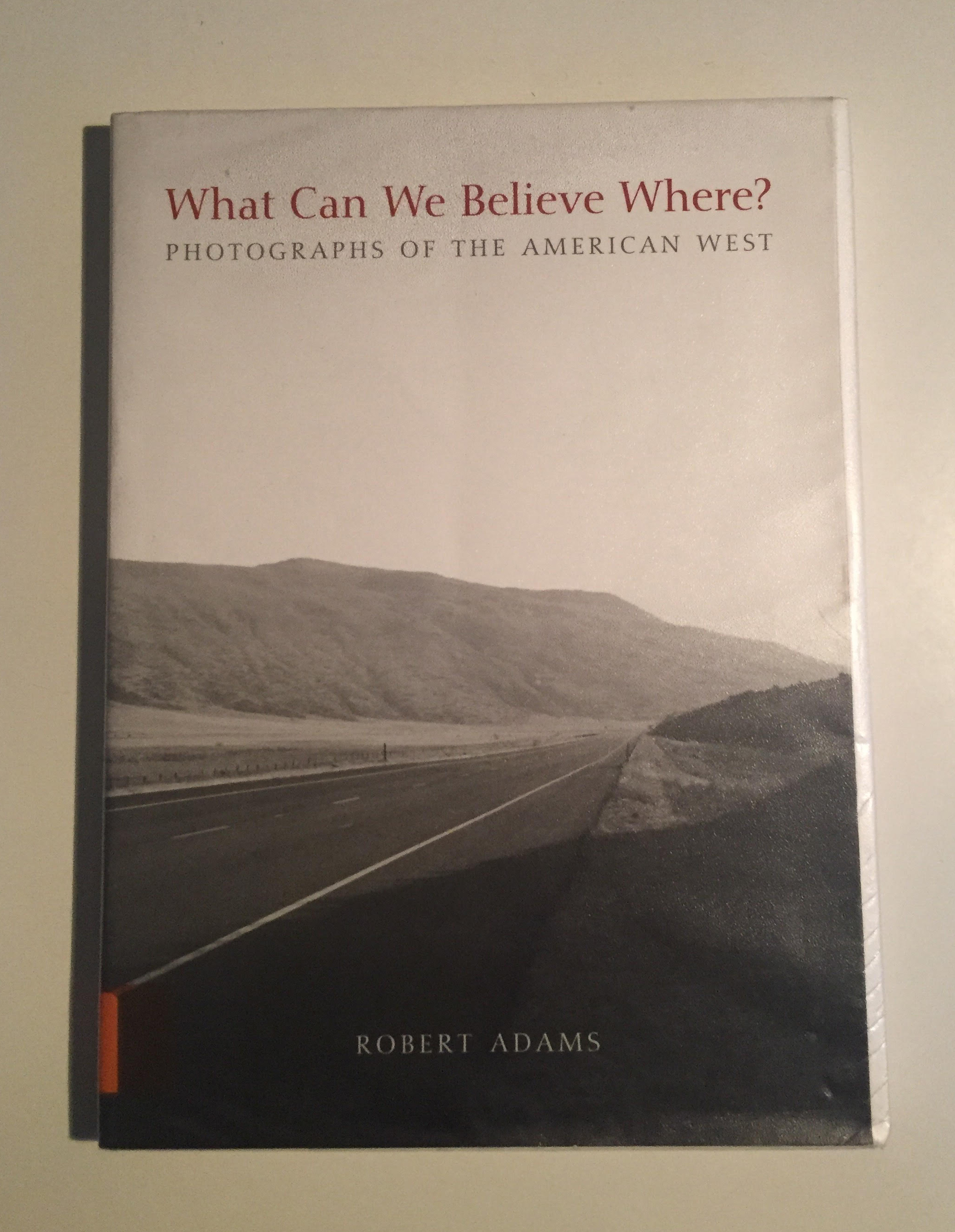
BOOKS BY ROBERT ADAMS THAT I RESEARCHED & TOOK INSPIRATION FROM
BIBLIOGRAPHY
Adams, R. (1974). The new West.
Adams, R. (2010). What can we believe where?. New Haven, CT: Yale University Art Gallery.
Giblett, R. and Tolonen, J. (n.d.). Photography and Landscape.
Josefhoflehner.com. (n.d.). Josef Hoflehner. [online] Available at: https://josefhoflehner.com/ [Accessed 8 Nov. 2019].
Nye, D. and Elkind, S. (2014). The anti-landscape.
Rensbergen, H. (2010). Abandoned places 2. Uitg. Lannoo N.V.
Rensbergen, H. (2013). Abandoned places 3. Uitg. Lannoo N.V.
San Francisco Museum of Modern Art (2019). Robert Adams: Photographing a “landscape of mistakes”. Available at: https://www.youtube.com/watch?v=XuhxlLv_f2k [Accessed 8 Nov. 2019].
Zoltanbekefy.com. (n.d.). About award winning fine art photographer / Zoltan Bekefy Photography. [online] Available at: https://www.zoltanbekefy.com/about.html [Accessed 8 Nov. 2019].
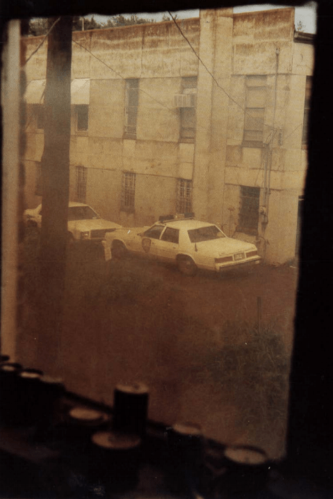
In this image, I get a sense of danger and safety at the same time. As the viewer, I feel danger from the police car outside, the surroundings and atmosphere don’t seem the friendliest. We know this from the bordered up and dirty windows to the lack of life and low living conditions. It makes you question the emptiness of the area.
However, as the image was taken from the inside of the building, looking out at the danger. It makes me feel safer, that I’m inside away from the police and outside. William Eggleston is making us feel that we are at a safe distance waiting/watching for something to happen at any time.
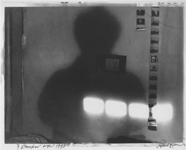
ROBERT FRANK, FROM STORYLINES, 2005
MYSTERY, BLACK&WHITE, SHADOW, FILM
Robert Frank has brought a different viewpoint, by bringing the outside in, with the film negatives. The shadow of the person creates a sense of mystery, making the viewer’s eye look closer at the individual film images. To work out who this person is? What’s there lifestyle? Why are they doing this?
The contrast between the shadows and bright light enhances the shapes created, to draw the viewer eye to the film. Especially as the subject is in an empty room, it makes these shadows, bright lights and film stand out even more.
It is an exciting way of bringing the outside in, by taking a photograph of photographs and keeping the atmosphere mysterious.
BOUNDARIES BETWEEN THE INSIDE & OUTSIDE
The boundaries between the inside and the outside can produce different views within a photograph. A line of division between the inside and outside, or an intermix of each other. By intermixing makes the image blend more, rather than feeling like a wall between the boundaries. Below I have two images exploring these ideas, I’ve mentioned above.
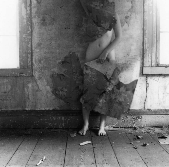
FRANCESCA WOODMAN, THE OPTICAL UNCONSCIOUS, 1993
Francesca Woodman has used the person body from an outside environment to camouflage themselves to the inside surrounding. They’re making themselves apart of the inside. Almost like they have taken over the inside now, that they own it.
The place isn’t homely, and it makes the viewer feel alienated, as the inside doesn’t have any carpet, furniture, or wallpaper. The person is bringing the outside material in (wallpaper) and blending in with the inside. This is a different way of bringing together the inside, and outside, it also feels quite mysterious, the way Woodman has framed the image. Woodman has chosen not to frame the face, which makes the body blend into the inside better. The way Woodman has framed the windows is interesting. It draws you away from thinking about the outside and directs your viewpoint straight to the body.
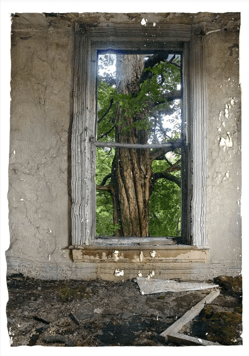
KEV FILMORE, INSIDE OUTSIDE, 2011
Kev Filmore has framed the inside and outside together. This juxtaposition shows the dead, uninhabited, muted, rotted, ugly, dangerous inside and frames it with a beautiful, alive, colourful, fresh tree outside surrounding. Placing together two opposites works, this shows development over time, the inside has disintegrated, but on the outside is a flourishing, lively environment.
The way Filmore has framed the image, making the window central is smart because this leads the viewer eye towards the window. The colour palette also helps with this, as the inside is a muted colour and the outside is colourful.
The image is different from Woodman’s image above, rather than camouflaging or blending the inside and out, Filmore has used the window as a wall of division. Dividing itself from the ugly to beautiful, or the rotted to growing.
Street Photography – “Street photography, also sometimes called candid photography, is photography conducted for art or enquiry that features unmediated chance encounters and random incidents within public places.” (En.wikipedia.org, n.d.)
From researching, I have created the list above of keywords, that I think relates to the street.
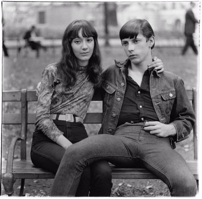
DIANE ARBUS
Young couple on a bench in Washington Square Park, N.Y.C., 1965
PROTECTIVE,PORTRAIT, DISTANCE
In this image, Arbus has taken a candid portrait image of a couple. This couple seems typical, but as you start to look closer, perhaps you start to see that the women isn’t happy or comfortable around the man. From the position of her hand and the distance of her pulling away from the man, she seems awkward. But on the other hand, the man is dominant as he has his leg on top of her, this could imply that he controls the relationship. As he also doesn’t make eye contact with the camera, he seems less approachable than the woman, and angrier. I like the use of selective focus on the couple, as it blurs the background it gives the people more movement, as they walk past them. Sometimes it good to show people like this, because the street is not always full up of happy people.
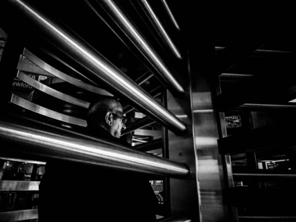
DON SPRINGER
Going to the train
TONAL CONTRAST, TRAP, PRISON, SINISTER
In the photo, the subject seems to be a trap. Like the man is trap inside a prison, it has a dark atmosphere about it. The tonal contrast contributes to this, making it look more sinister and dangerous. The low viewpoint and closeness of the surrounding make the viewer feel trap and claustrophobic as well.
It’s an uncomfortable feeling, even though most people use this every day of their way of commuting. When you imagine making your way to the train station you don’t imagine it to look like this. The fact that Springer hasn’t shown the face of the man makes the image more mysterious. Springer has also done a great job at framing because these gates move quickly round, and the station was probably busy, especially being in New York.
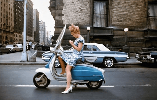
JOEL MEYEROWITZ
Girl on a Scooter, New York City, 1965
MOVEMENT, BLUE, CITY, SELF-CONSCIOUS, POSSIBLE DANGER
In the image, Joel Meyerowitz has taken an image of a woman on a scooter, amid New York City. What’s fascinating is that the woman is more worried over her looks than her safety. She is stopped in the middle of the road to check her nails. There may have been a red light in front of her, which could have been a possibility. But also by the way she dressed, she is wearing a dress in heels. Which implies that she is not worried about the danger of herself, because heels are not the safest shoes to drive in, also stopping in the middle of the road is dangerous as well.
The colours in the images are beautiful. Meyerowitz captured the woman in a blue dress on a blue scooter, and a blue car in the background. With the browns, greys colours of the roads and buildings surrounding her, this makes her stand out well. And direct the viewer’s eyes directly onto the woman.
Movement in this image is a crucial element, you can tell she is in a blur, I don’t know if that was intentional, but it works. The movement of the people in the background and other cars makes up the photograph. It tells a story about her and the city that surrounds her.
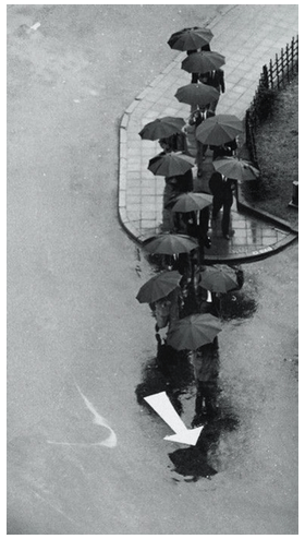
ANDRE KERTESZ
Rainy Day, Tokyo, 1968
FOLLOWERS, LEADING LINES, DIRECTION, BLACK&WHITE
The use of direction from the people and the arrow produces a leading line in this image. It’s like they are all followers. All the people under the umbrellas, look the same and are taking the same direction. As the image is in black & white, the arrow becomes a bright white, and your eye is drawn to this first, it is effective.
The weather condition can help make images more effective and certain elements stand out more. In this case, the rain brings out the shininess of the ground and the umbrellas. Especially as Kertesz has taken this image from a high viewpoint, makes it feel like they are taking a path, as the pavement is making a curve shape leading the people round to the arrow. From the height, it makes the people look ant-like, because of how small they are, they all look the same, and they are taking the same path as ants do. It also makes you think, do all of these people work together? Do they know each other? Is this their way of travelling? Where are they going?
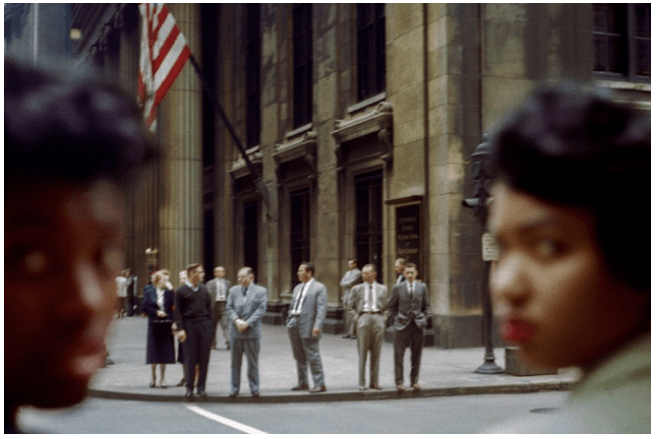
In this photograph, my initial reaction is the separation between colour. I don’t know if this was deliberate, or was a consequence, but it seems like separation of the people. The way how the only people looking back are the dark tone women is interesting. It could imply that the white businessmen and women won’t listen or look their way. As they are blurred, this could mean that back in that time, society pushes them to the back. This links as there is an American flag hanging, meaning that this building is where people perhaps have good, well-paid jobs. And the sense that the reason why the women are looking back is that they don’t have good jobs.
The way Maier has framed the women is also like a window. This window is what they see, and maybe who society (at that time) thinks was more important. There are mixed emotions in this image, and you can tell from their faces and body language. The darker tone women look unhappy and sad with a bit of attitude. However, the white men and women, look relaxed and happy. Maybe because they don’t have to worry about many things, whereas the other women do. This is why street photography is essential, because it can document and pick up moments and emotions about that part in time and where in the world.
DEFINING ‘THE STREET’
‘The street’ to me can mean many things — a way to lead you home or to meet new people. Compared to the landscape, the street is fast-moving, busy and tends to be a lot more happening. For example, vehicles, crossing a street, architecture, people, even to the displays of the shop windows. The street is a modern urban experience, where people put on their best clothes, but never even talk to each other, or let alone see that person ever again. So why do people do this? Street fashion is not a catwalk fashion style. The street is full of real people. However, the street is not just made up of people; it’s the architecture. The windows and doors make up the city, from the objects on display, to the idea of space between the window & display. Even advertisement such as people holding a newspaper can make up a street and bring it even more to life.
I think the street is about the moment. In a studio, you can reproduce an image asking the model to do the same pose again, but on the street, you can’t ask a car or person to go past you again, it’s in the moment and timing. Also, this can be down to the time and day. The streets can change character over time — for example, Saturday night vs Tuesday night, or night vs day. Parts of the world are culturally different, from London streets vs Tokyo streets.
But the street can also be used to document life and events. For example, protests, this could highlight a great sense of community and sub-culture. But also could document the ugly sides to the protests going on in the world. There are also two different sides to the protest that could have an interesting interaction. The sides are the protesters and the police. Most of the time, the police are there to keep things civil and safe, but there are some times where incidents happen, and these communities could turn into crime, which crime is another part of the street. Peoples lifestyles and choices could influence this. Capturing these moments requires patience and time. Waiting around for the perfect moment can make the street characteristics come to life, and show the true essence of a particular area.
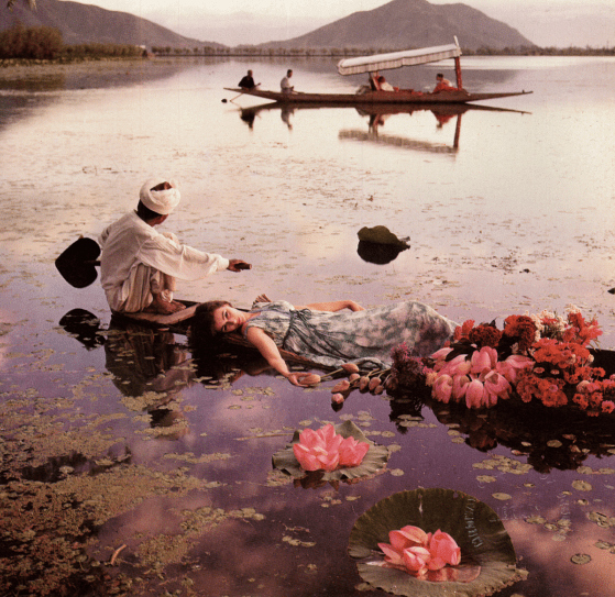
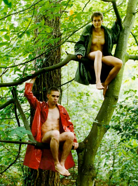
Wolfgang Tillmans – Lutz and Alex sitting in the trees 1992
FREE, NATURE, FASHION
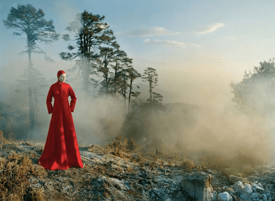
Tim Walker Vogue Spring 2015
COLOUR, SUBLIME, NEGATIVE SPACE, PICTURESQUE
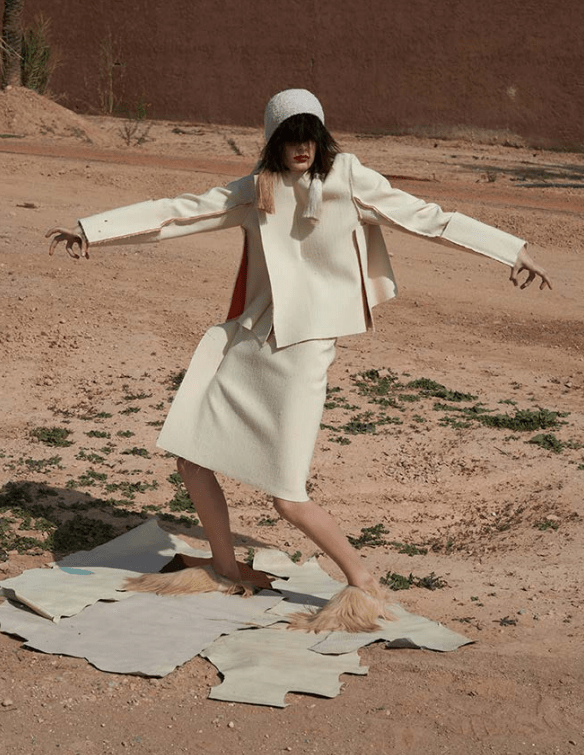
Mel Bles Pop 2014
OUTSIDE, FASHION, WACKY
Juergen Teller Kanye, Juergen & Kim 2015
JUXTAPOSITION, SUBLIME, CELEBRITY, NATURAL
COMPARING
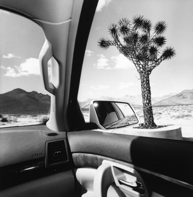
Lee Friedlander, from America by Car 2007 & Robert Adams Colorado Springs, Colorado 1968
In both images, you can see they’re related, for they both have a car in the image, but the photographers have created a different feeling across from my perspective.
The left image by Lee Friedlander has an interesting viewpoint. Where it makes the viewer feel inside, but outside at the same time, giving the image more depth and structure. The car door is closed; it feels like a wall of division between the inside & outside landscape. However, the image on the right has a more distant viewpoint. Both of these different viewpoints produce different emotions for me. Friedlander image feels more personal and close, whereas the other image feels distant, lonely and cold.
They do have another thing in common, where they both don’t have any people in the images. They show peoples possessions and the living environment against the natural landscape that surrounds them. But by doing this, it makes it feel like a ghost town and cold. Like they are in the middle of nowhere.
The landscape that surrounds the cars looks vast and wide, especially in Robert Adams image on the right. The use of negative space in the sky enhances the isolation of this suburban town, allowing the viewer’s eye to focus on the car. Whereas Friedlander image is fill up with different subjects making it more busy and loud, rather than the other one is quiet.
JASON EVANS – SMASH BABYLON MIND CONTROL , i-D, 2005
CONTRAST, ABSTRACT, FASHION, CULTURE, BRIGHT
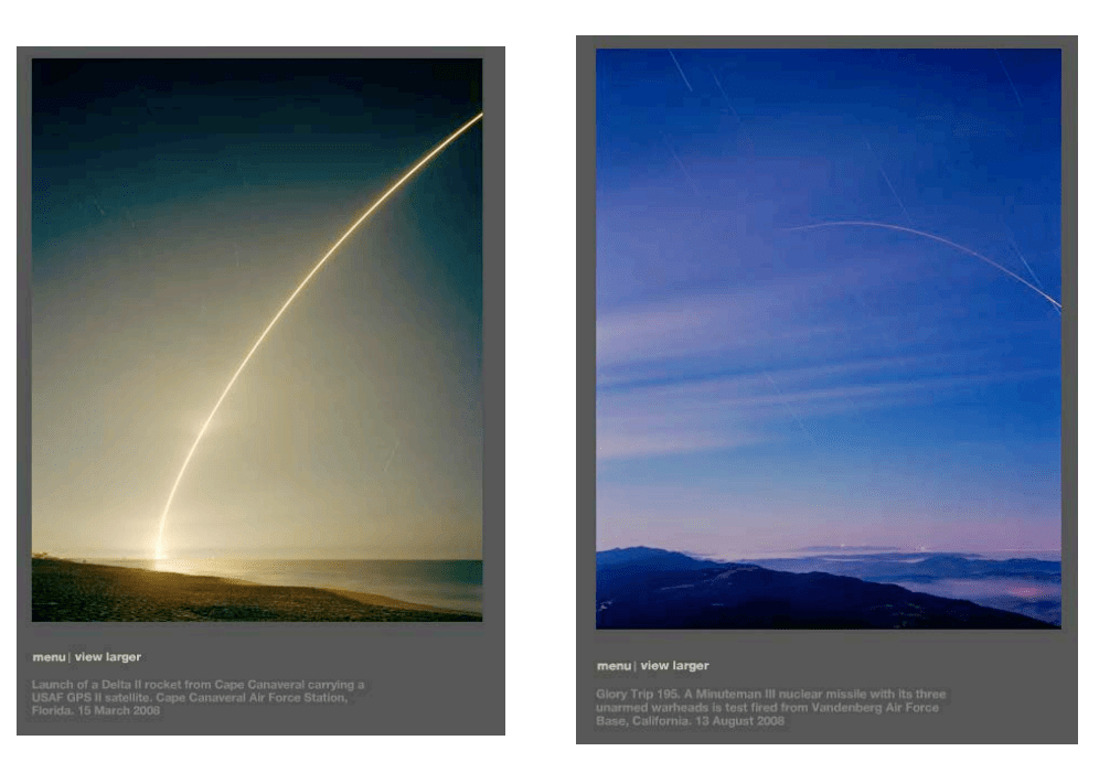
SIMON NORFOLK – FROM SERIES FULL SPECTRUM DOMINANCE: MISSILES, ROCKETS, SATELLITES IN AMERICA, 2008
NATURAL, SOFT, BEAUTIFUL, REALITY, DANGEROUS
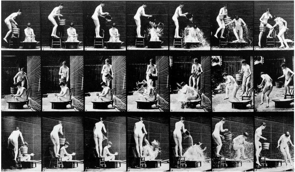
EDWEARD MUYBRIDGE
TIMELASPE, 180 DEGREES, PORNOGRAPHY?, REACTION
CHOSEN PHOTOGRAPH
Simon Norfolk has produced beautiful images, but they are not, because of the missile. Looking at these images the missile reminds me of shooting stars, especially with the dreamy coloured environment surrounding. At the time he took these images, it makes the sky and atmosphere look soft and calming for the audience. In reality, the ‘shooting star’ is a missile being launch. Simon has documented something as destructive, harmful, and dangerous look beautiful. He has made them look otherworldly like they are not supposed to be from this earth. It is an art piece of time.
The missile curve path, produces the leading line of the image, wondering where is this line leading to or is it going up in the sky further? As there is lots of negative space in this image, the line also breaks it up, giving the image more depth. The image itself is a juxtaposition, from the deadly missile and the peaceful environment surrounding it. I believe that Simon wanted to document this moment, showing what a missile can do to this beautiful earth, we live on, and why would we want to destroy it.
CHOSEN QUOTE
Steve Edwards:
“when we look at photographs we realise that the
image before us is tied to the thing it represents. Truth claims attached to
photographs largely turn on this recognition”
Photography: A Very Short Introduction, 84
Through
every photograph taken, there is always a reason or meaning behind it. I relate
to this quote because of the sense of representation. There are many ways to
represent a photograph, such as messages can be embedded through to the
audience, capturing reality, and genres etc. This representation behind the
image can help get the recognition of a photograph it needs, perhaps to convey
a powerful message. Thinking back on some of my work, I can see that I work
towards a meaning. Which helped shape the way I take photographs.
I plan to visit a local seaside town, this is because even after my experimental shoot 1, I really enjoyed taking images of the environment around me, if thats natural or man-made. But I quite like the in-between. The seaside, even after researching the photographer Marc Wilson and Carl De Keyzer, this inspired me even more to shoot this place and idea.
My thoughts are to shoot street style, but also artistic at the same time. Looking for patterns, shapes, lines, textures, reflection and even moments of the life of the locals (fisherman).
LOCATION
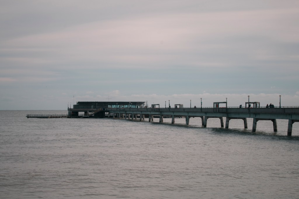
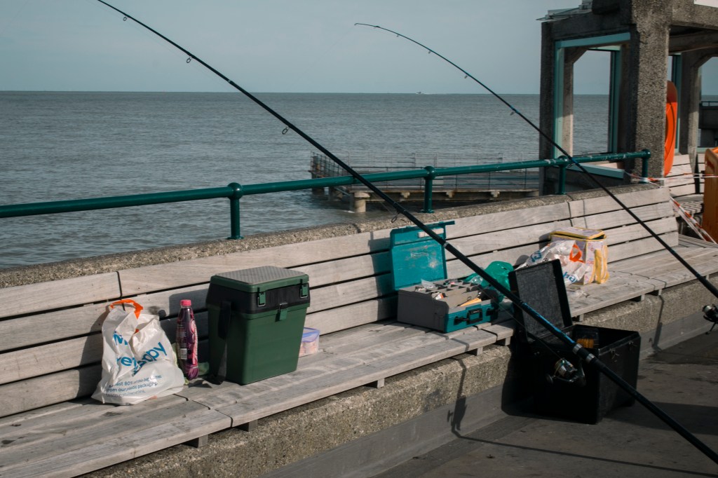
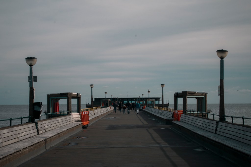
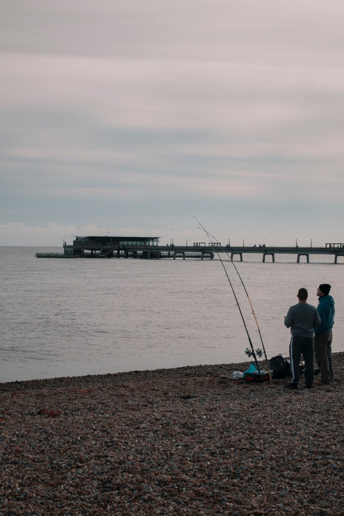
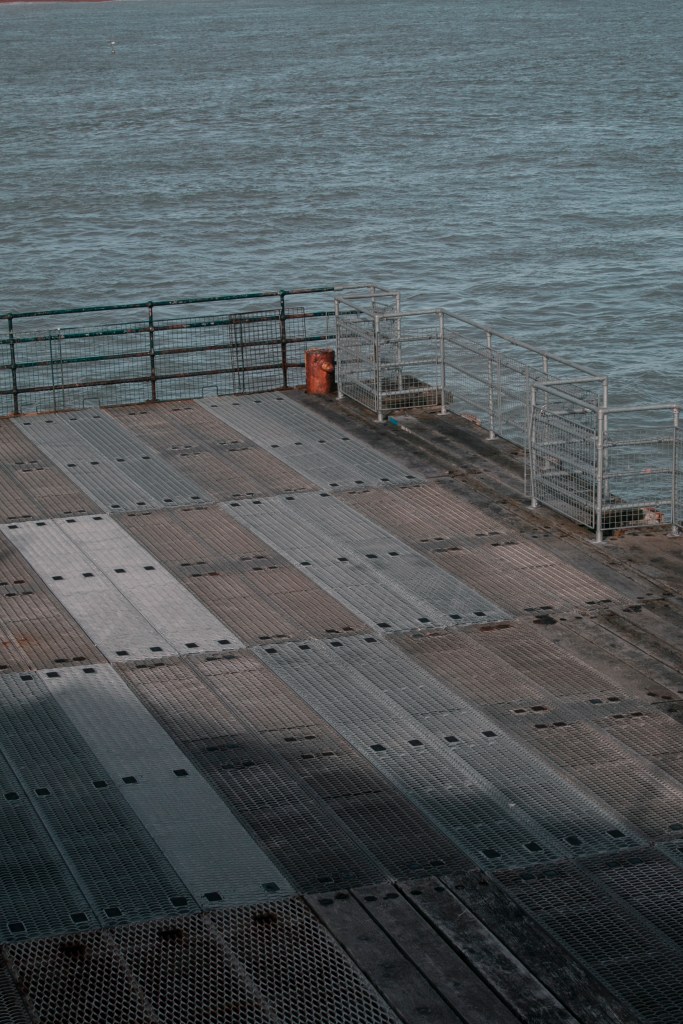
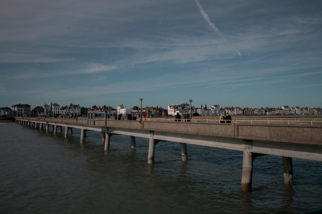
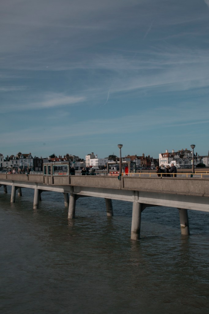
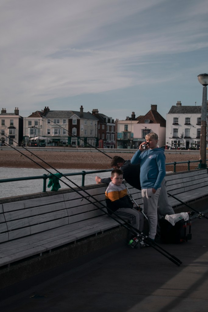
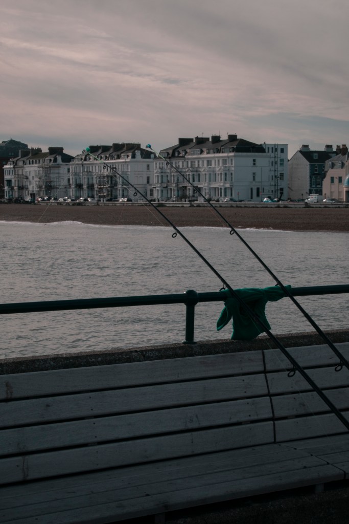
My chosen seaside town is Deal, Kent, and I will be taking the images on the weekend. Deal is mostly known for its fishing and mining past. Still, some of the remanence left behind could be interesting to photograph. Especially the pier, its pier is the home of local and family fishers, this is why I’m going on a weekend because the town and pier become busier and full of life.
EQUIPMENT
I will be using a Canon camera, along with bringing two lenses. One is the standard Canon lens and the other being the 70 – 300mm lens. In the last shoot (experimental shoot 1) bringing the 70 – 300mm, did come in handy in some shots, so thats why I’ve chosen to retake the lens.
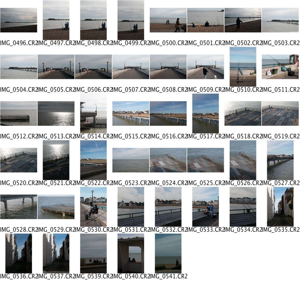
CONTACT SHEET
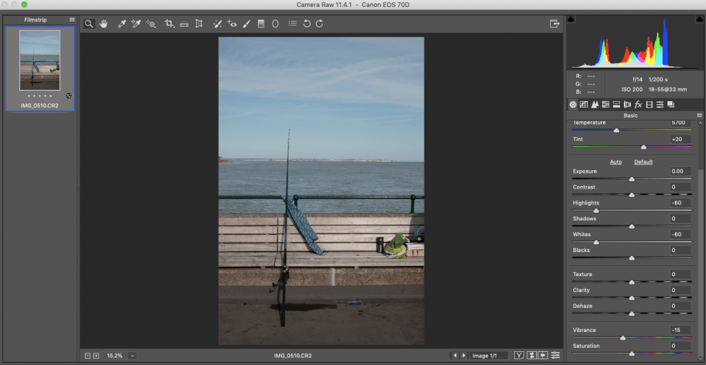
SCREENSHOTS OF EDITING
DECREASING THE HIGHLIGHTS, WHITES AND VIBRANCY
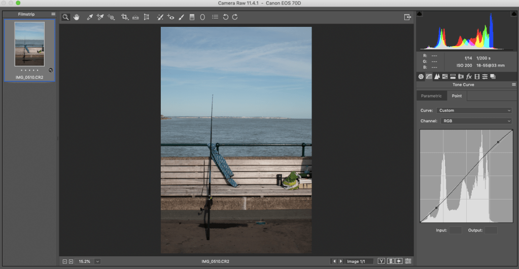
MAKING THE TONE CURVE INTO A SLIGHT ‘S’ SHAPE, TO ADD CONTRAST
ADJUSTING THE HUE ADJUSTMENTS
ADJUSTING THE SATURATION ADJUSTMENTS
ADJUSTING THE LUMINANCE ADJUSTMENTS
ADJUSTING THE SPLIT TONING HIGHLIGHTS AND SHADOWS
ADDING VIGNETTING
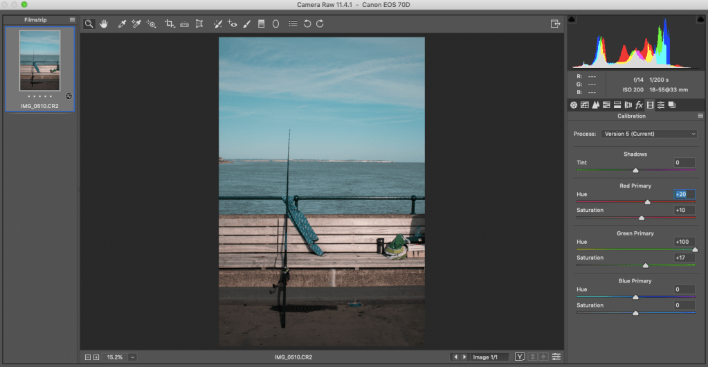
ADJUSTING THE CALIBRATION RED AND GREEN PRIMARY
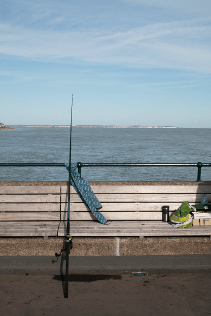
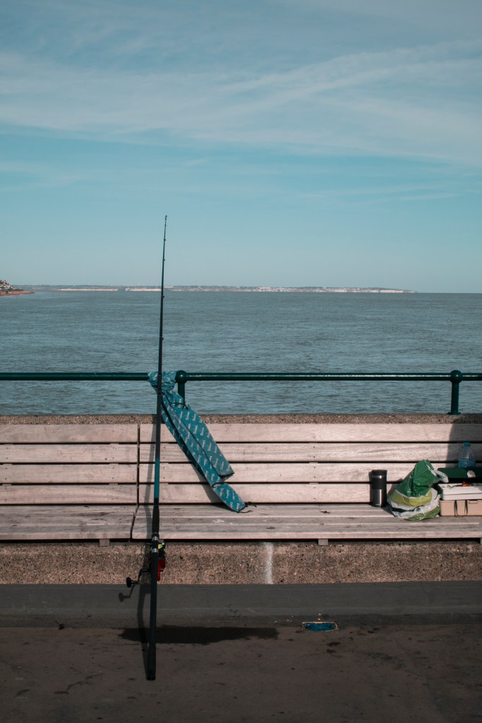
BEFORE
AFTER
THIS IS THE SAME EDITING PROCESSES AS BEFORE IN THE EXPERIMENTAL SHOOT 1. I LIKE HOW THEY TURN OUT SO, I DECIDED TO TRY IT AGAIN, AS THIS LOCATION HAS A LOT MORE BLUE WITHIN IT.
RESULTS
When I got to Deal, I wasn’t sure if I made the right choice in location, but in the end, it worked out better than expected. Some of the photos above stand out more than others. I didn’t have as many final images as the Pegwell Bay shoot, but I think I managed to get some great photos. I did try to convert some into black & white, but I felt that it lost the liveliness and story of the environment that surrounds. I would want to go back to the location on a similar day, and weather and try to get more images of people, like the fisherman.
When showing this shoot to fellow peers, one of their favourites (and mine), was the boy hugging his dad. It was almost like the barrier between the rods is their space. This was taken while going off the pier and thought it would make a charming image. The images have warmth, from the boy hugging his dad, but also the bonding experience between the two shows the character of this environment.