WRITTEN EVALUATION

IMAGE MAKING, WRITTEN EVALUATION

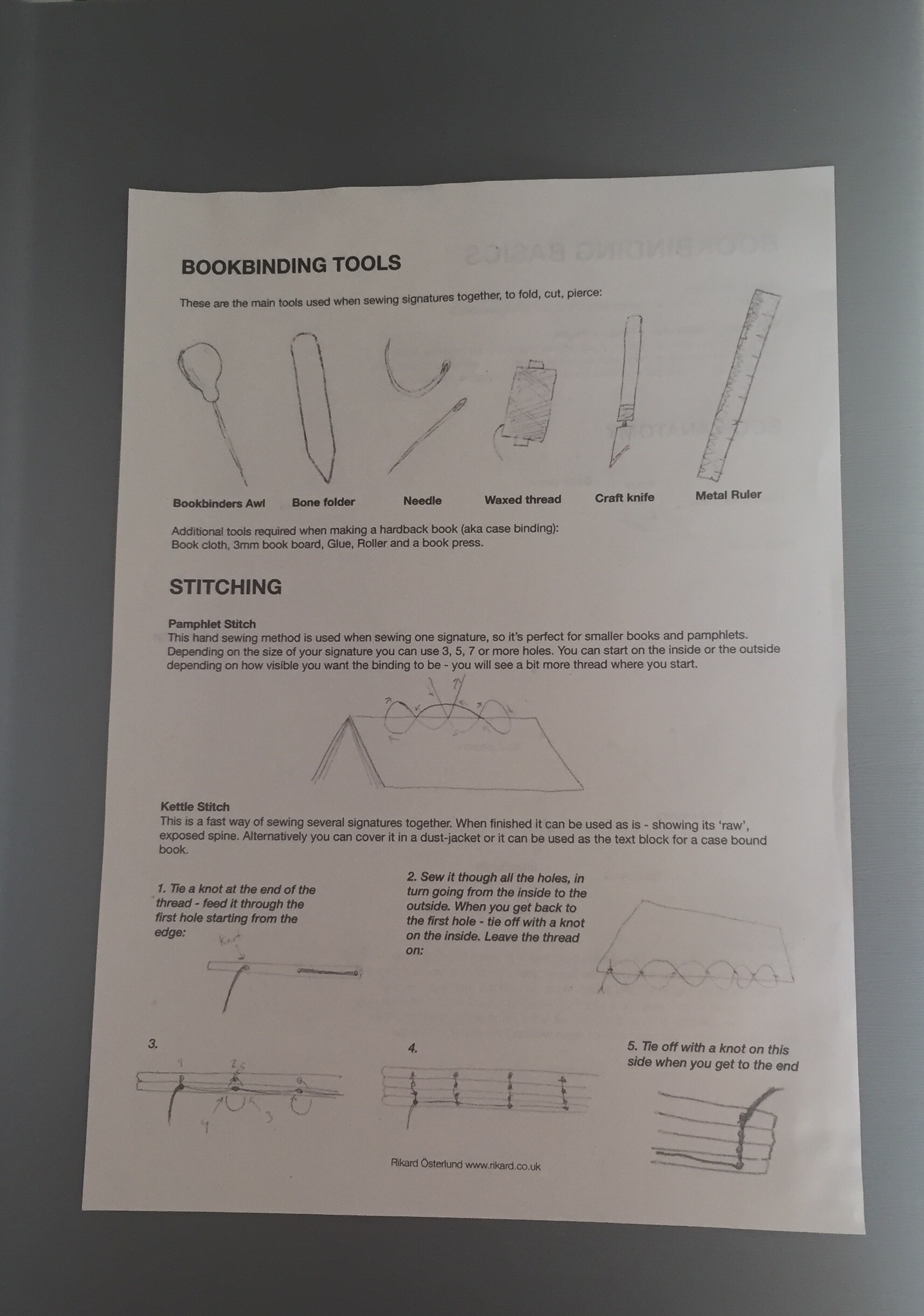
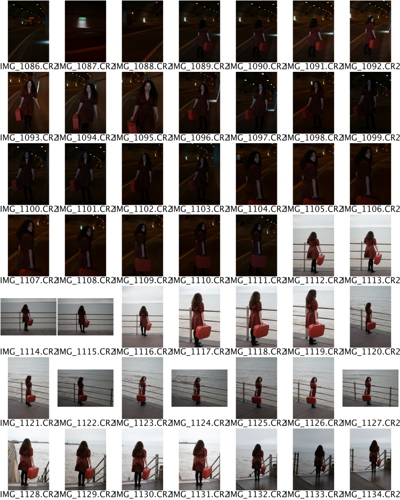
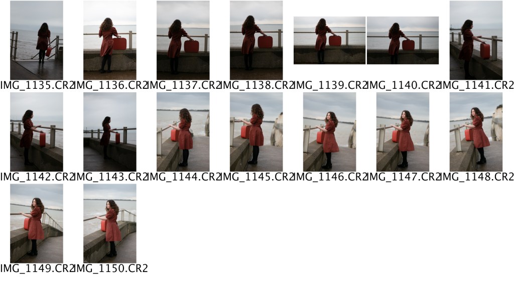
For the ‘Image-Making’ unit, I had to construct a series of photographs, which later would be produced into a photo book. I had the choice of choosing two different pathways to go down — both surrounding the theme of the documentary, however, one being reality and the other being fiction.


I’ve always been attracted to the idea of constructing scenes and seeing how the viewer may interpret it. As I began to research, I found that some of my key influences were in the concept and style I was going looking for, which made me more excited about the project.


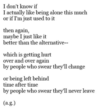
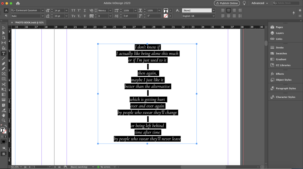
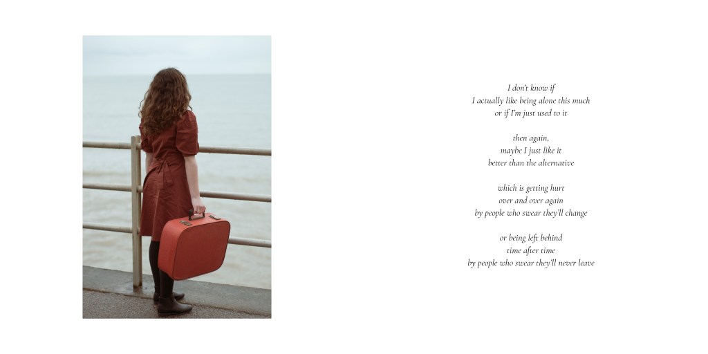
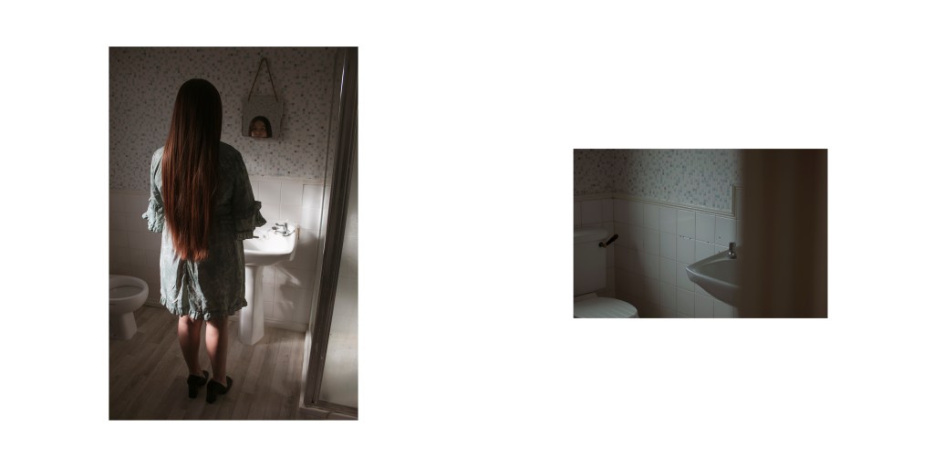
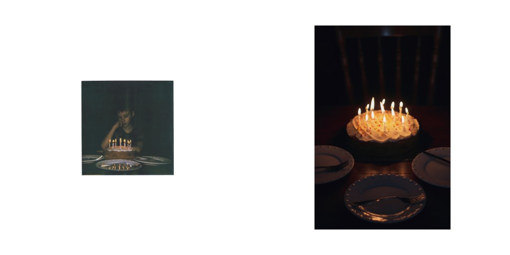
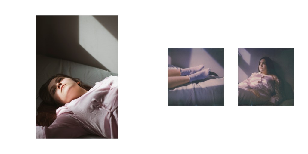
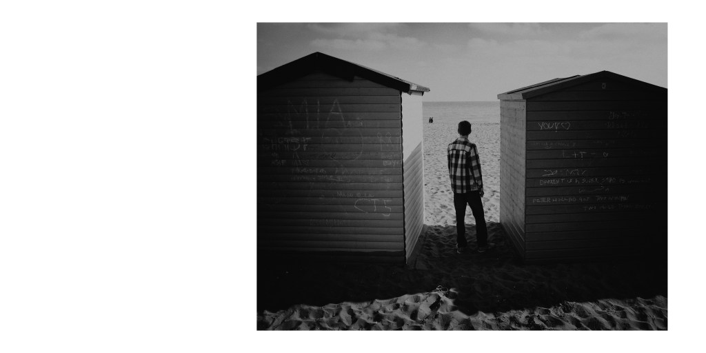
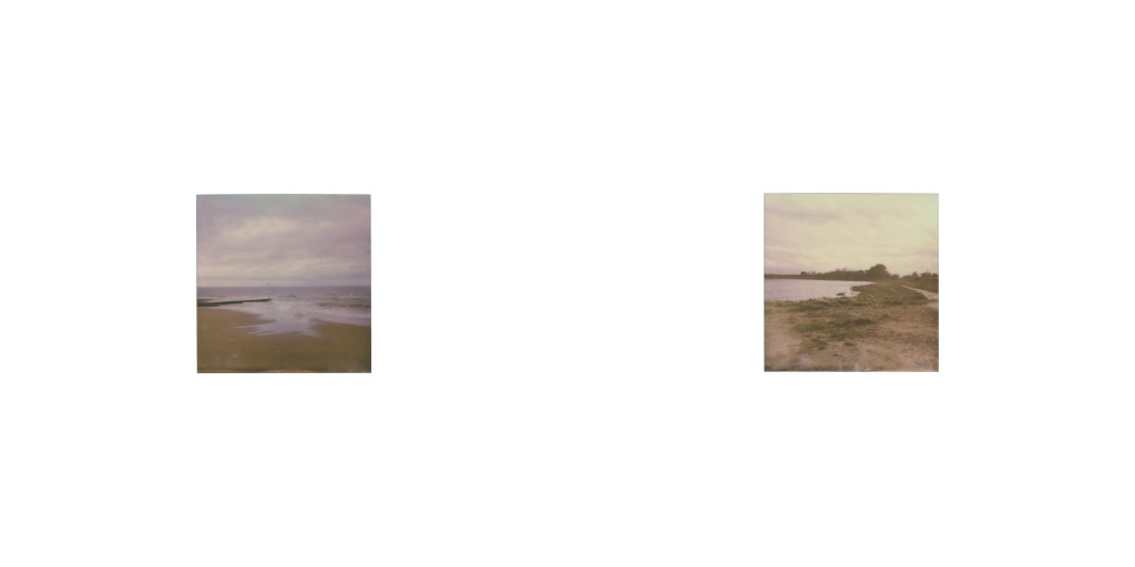
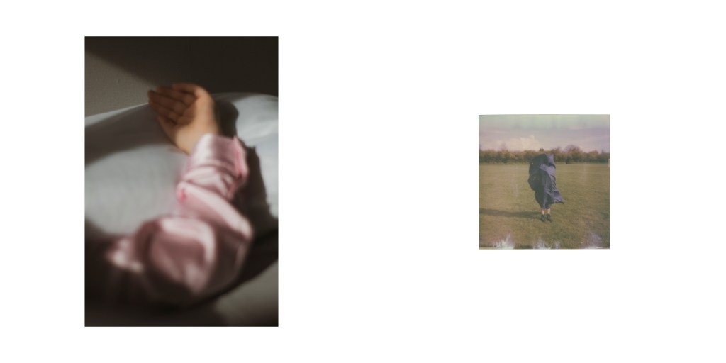
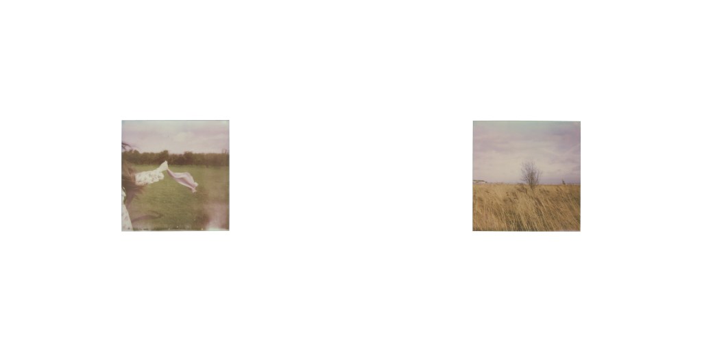
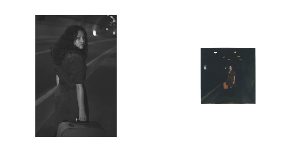
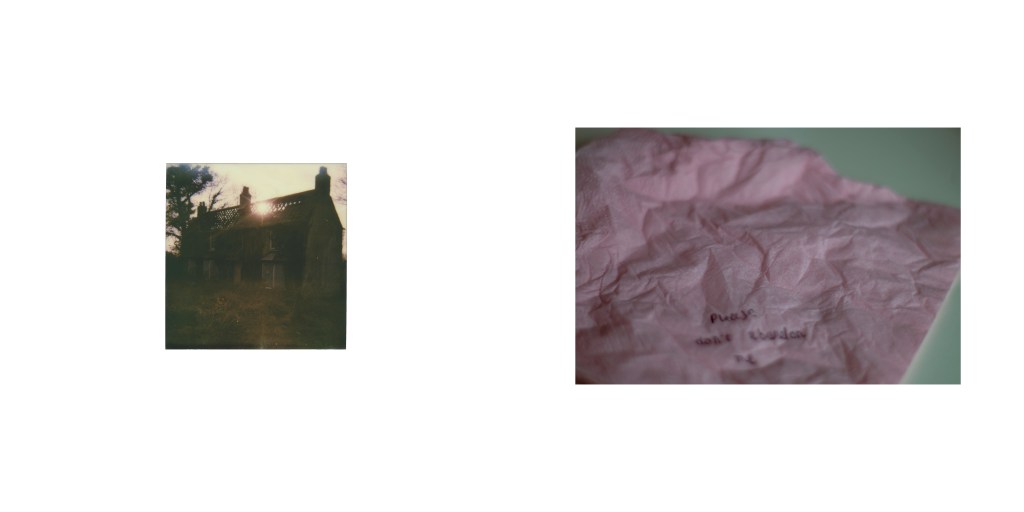
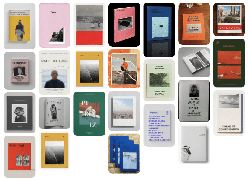
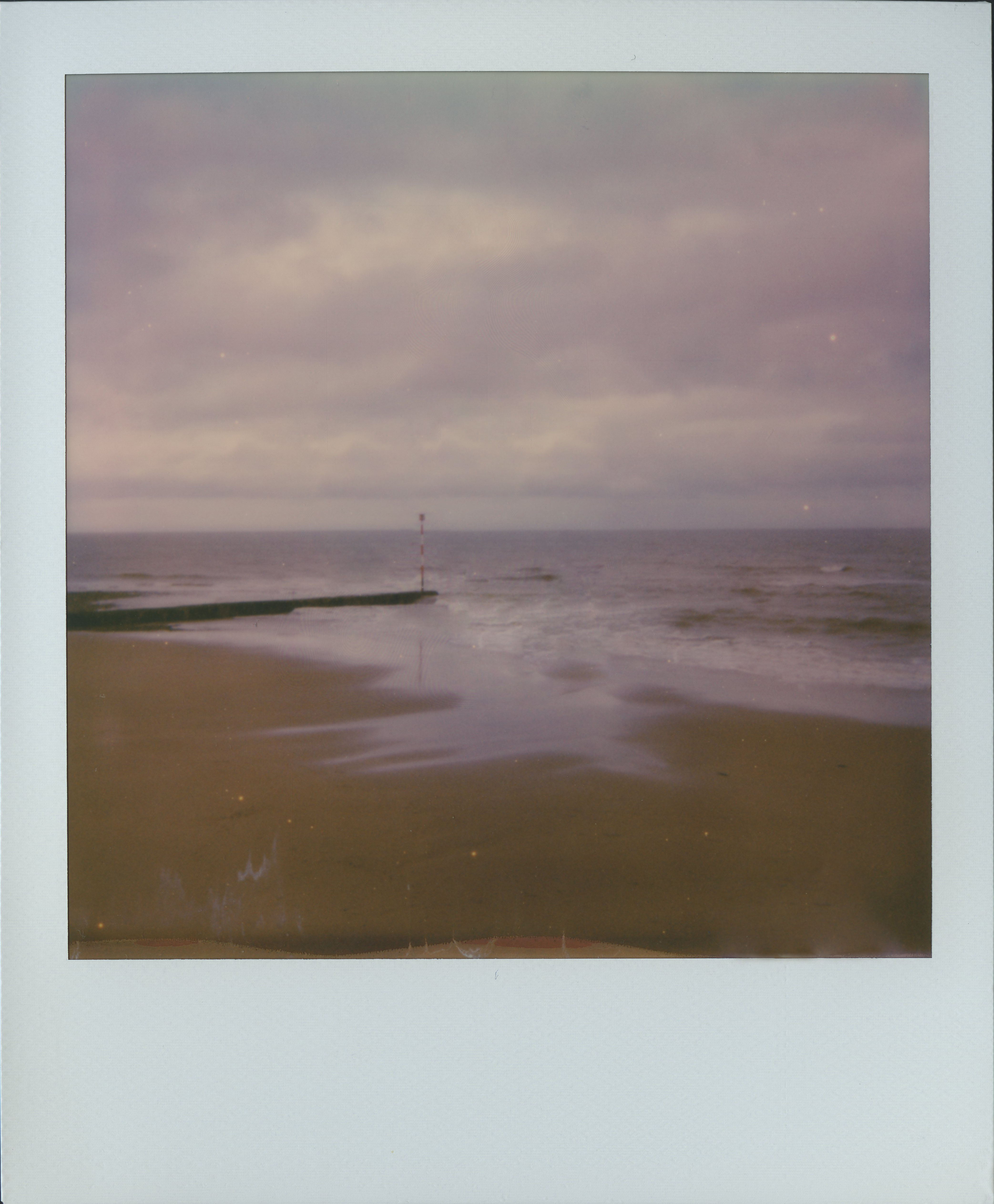
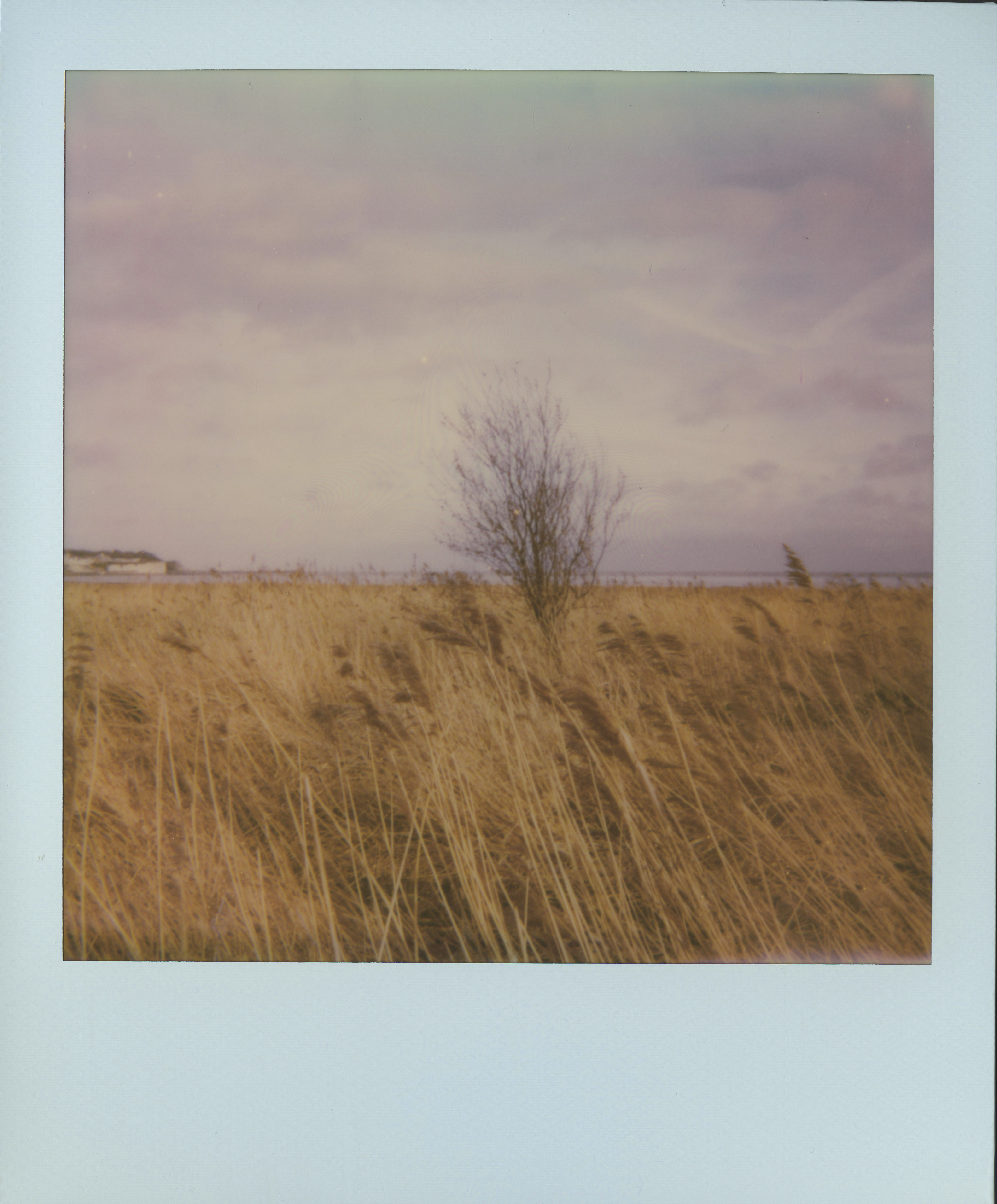
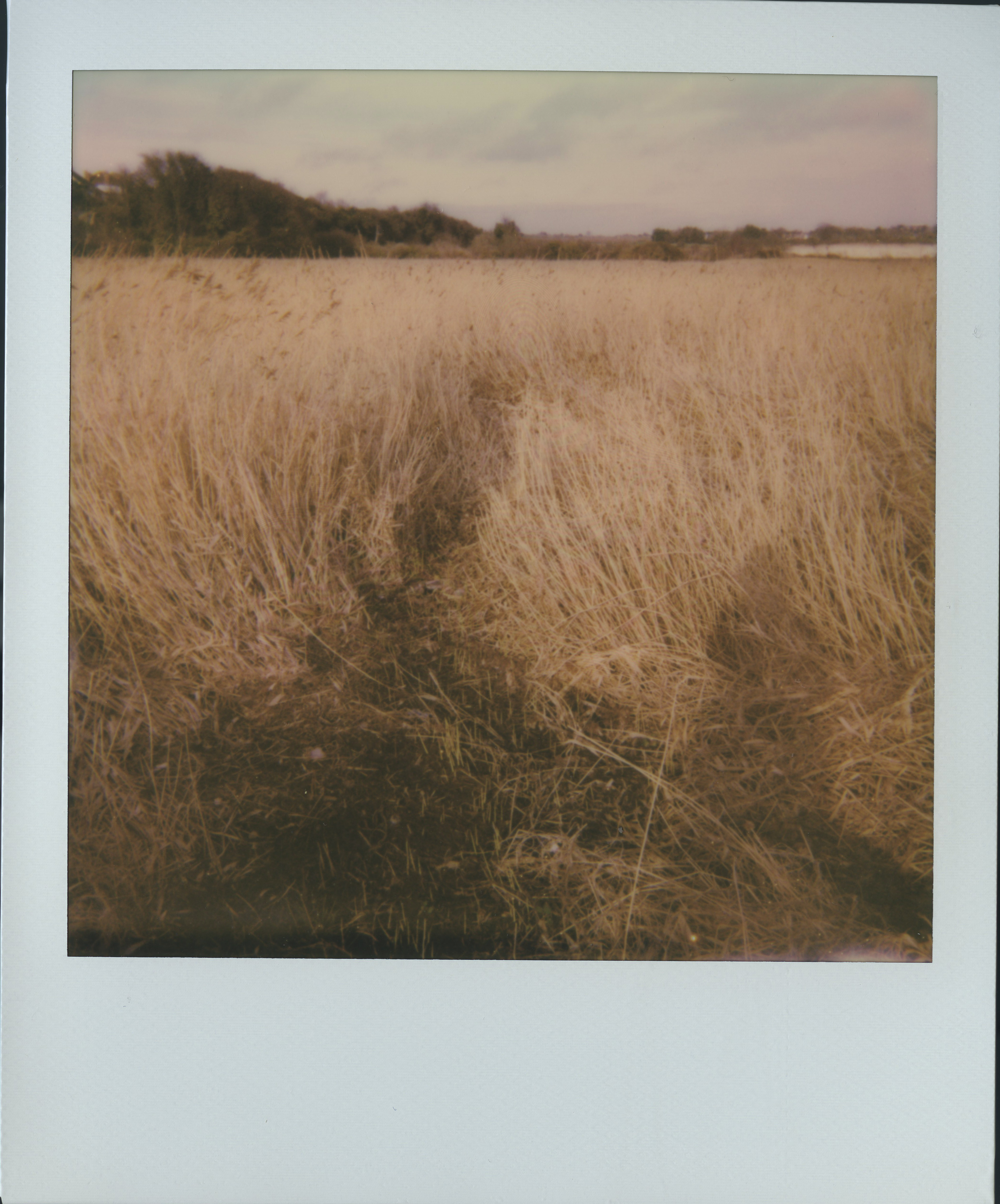
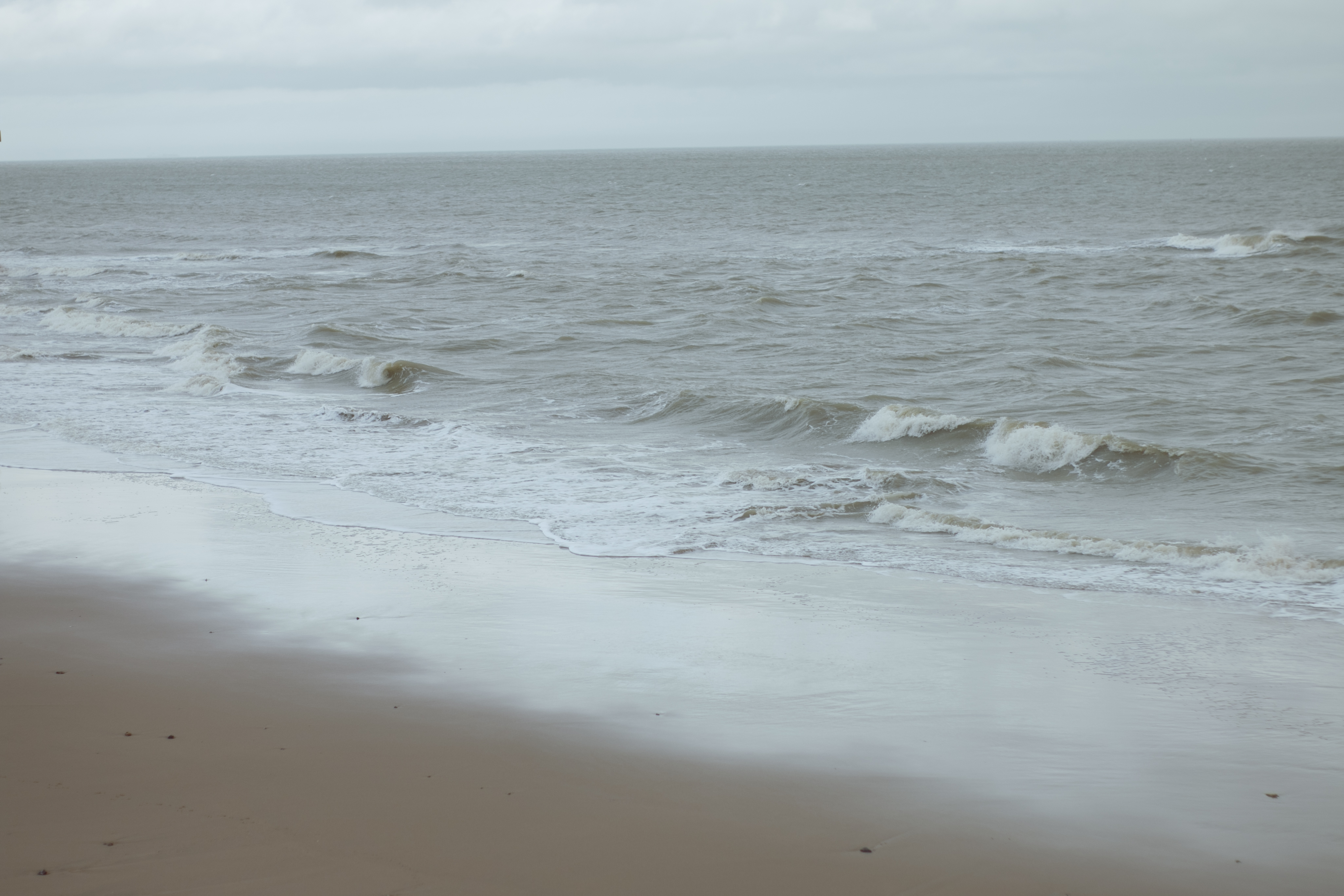
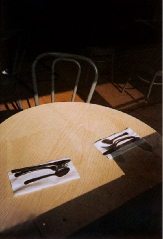
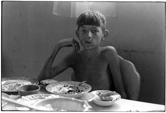
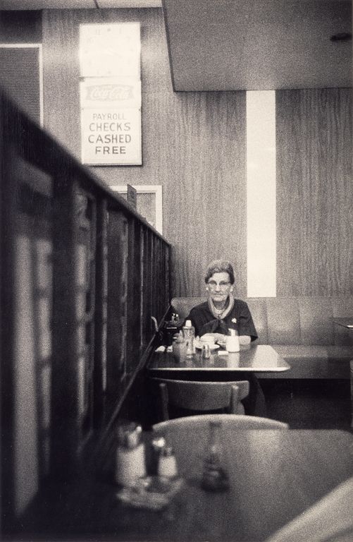
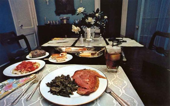
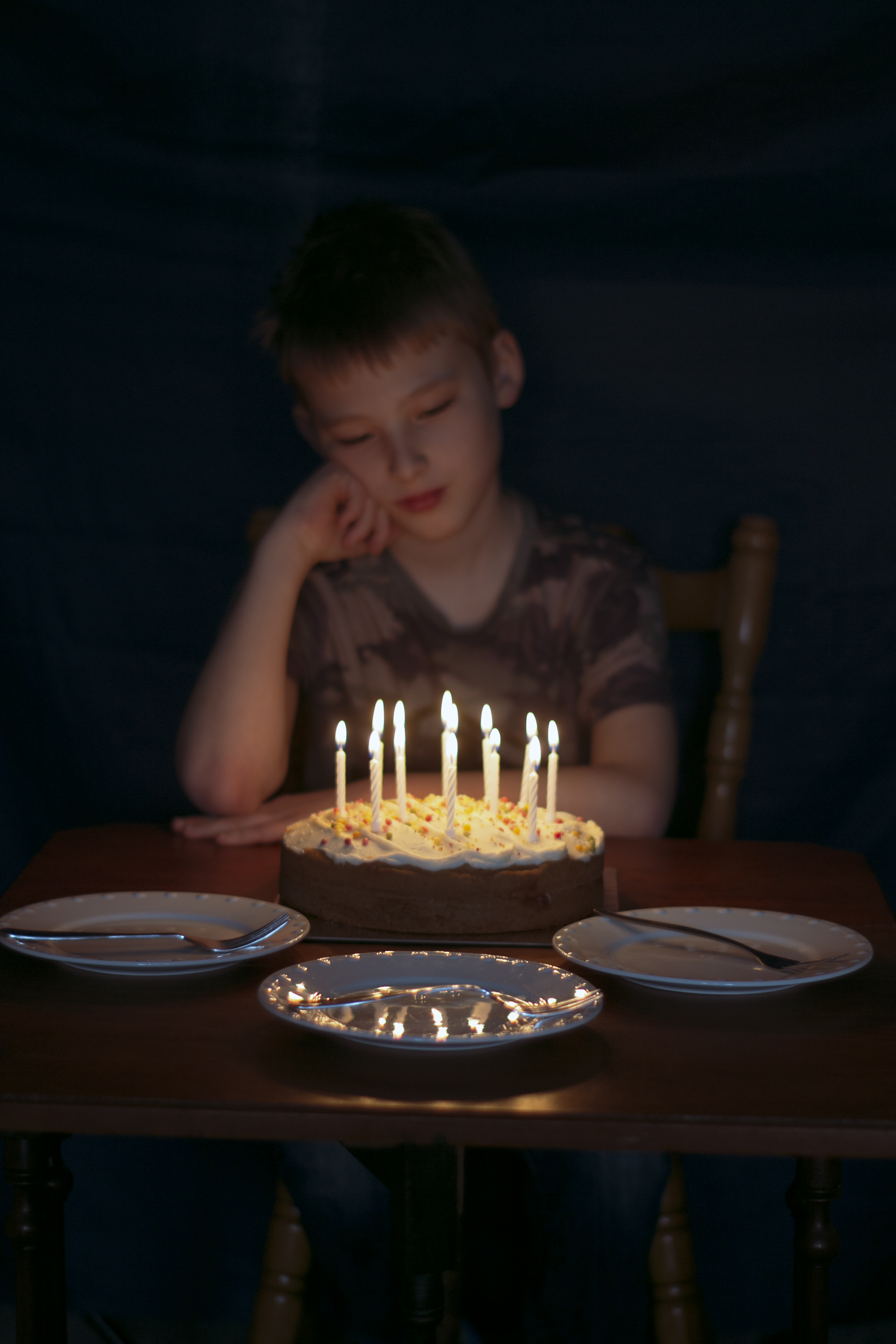
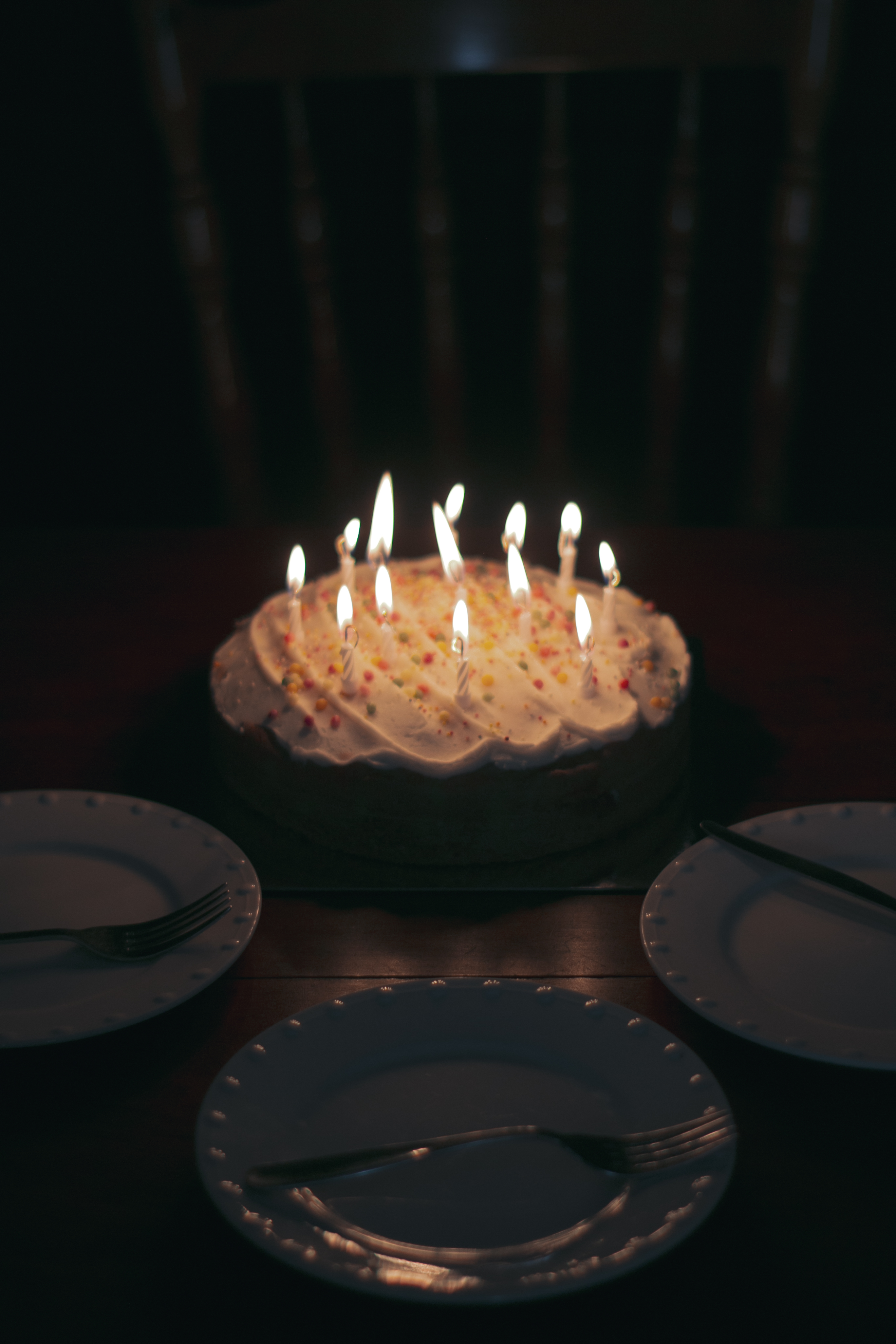
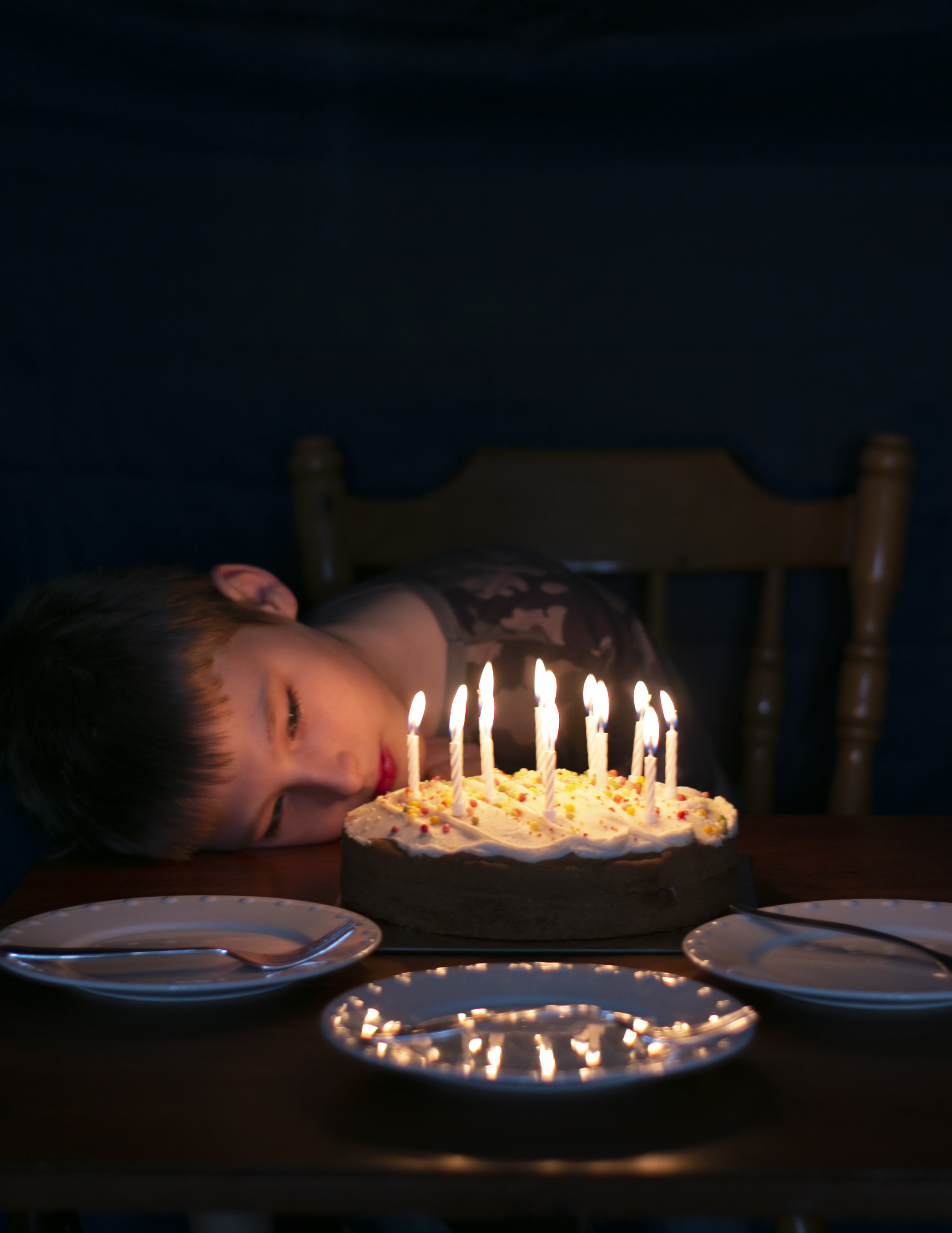
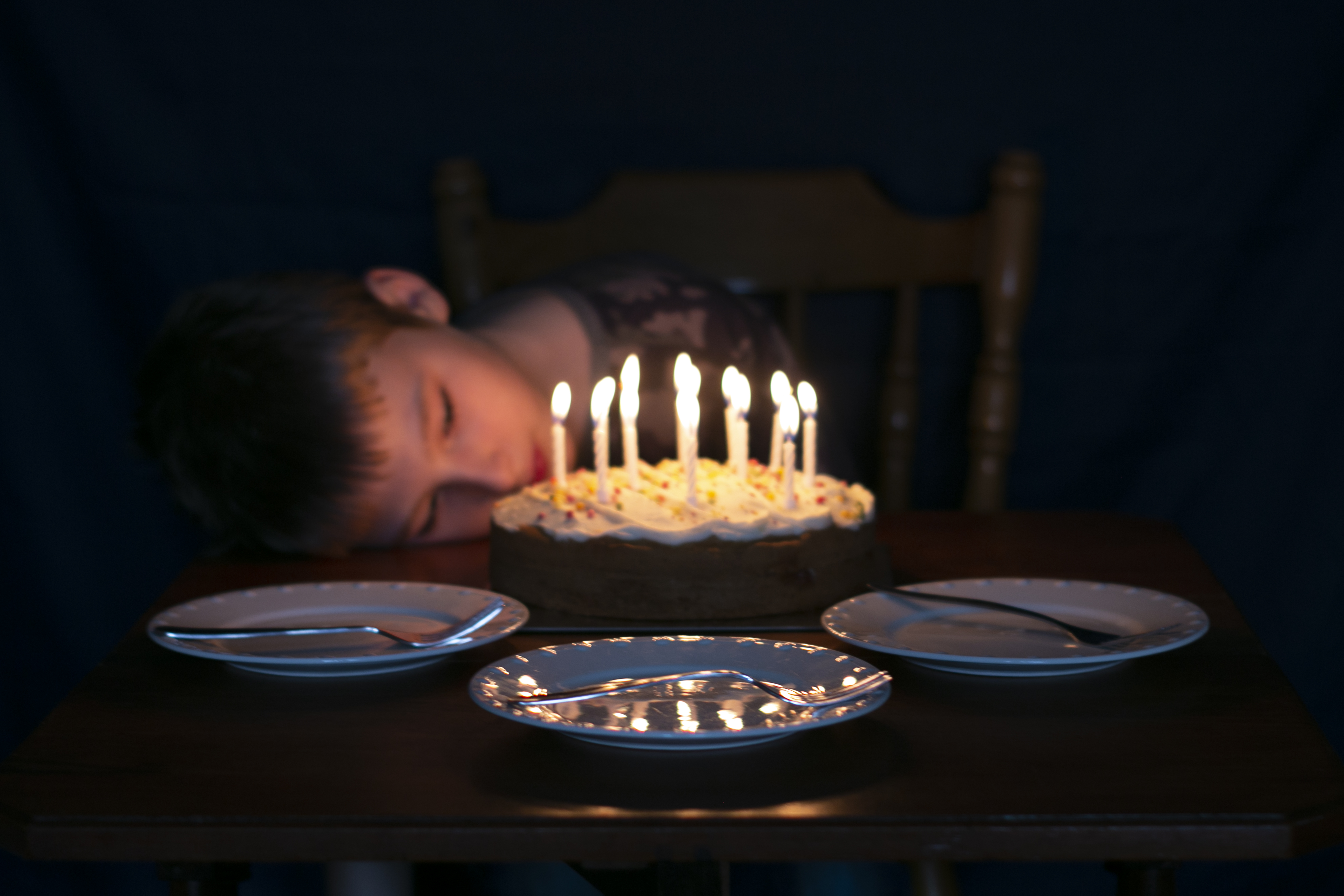
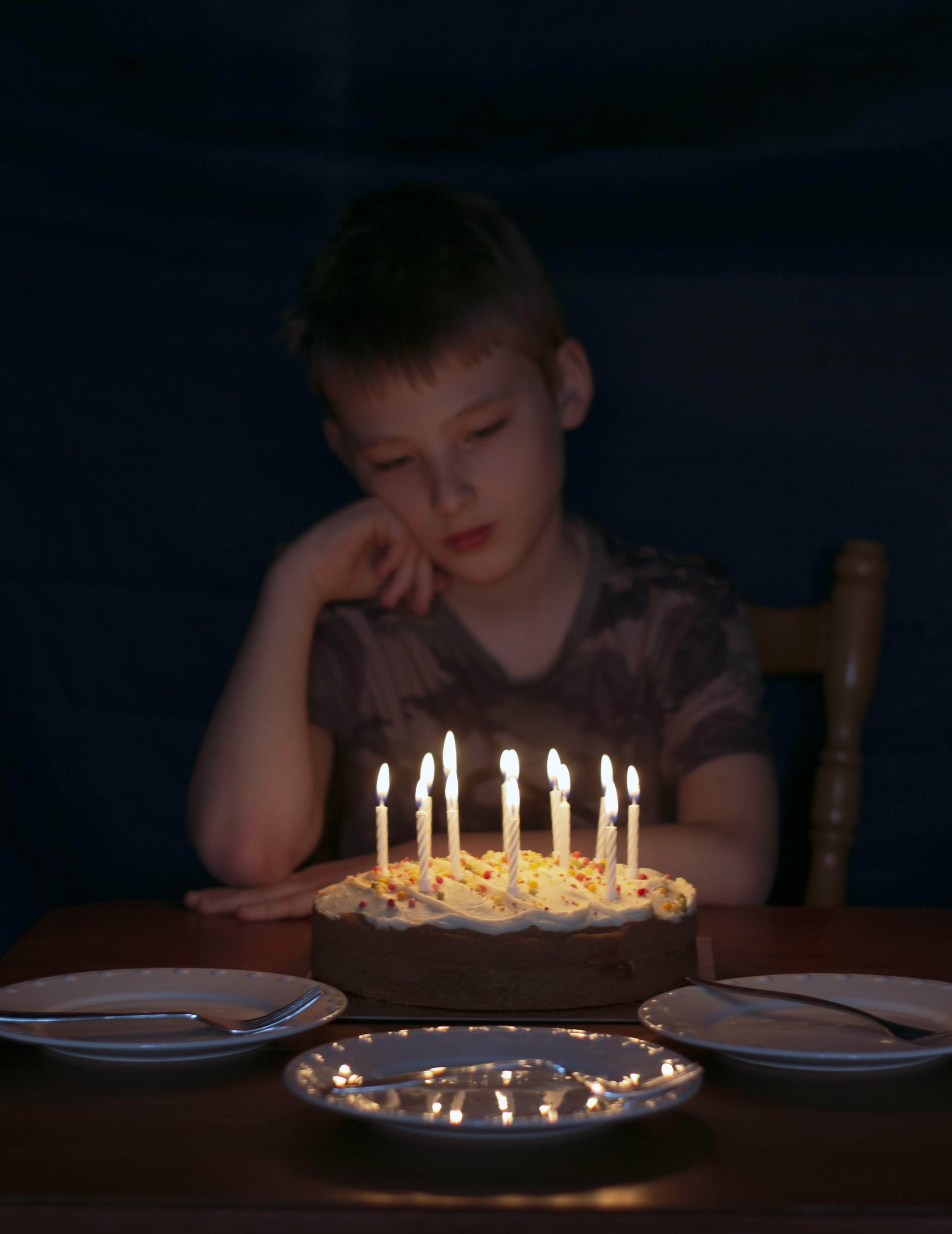
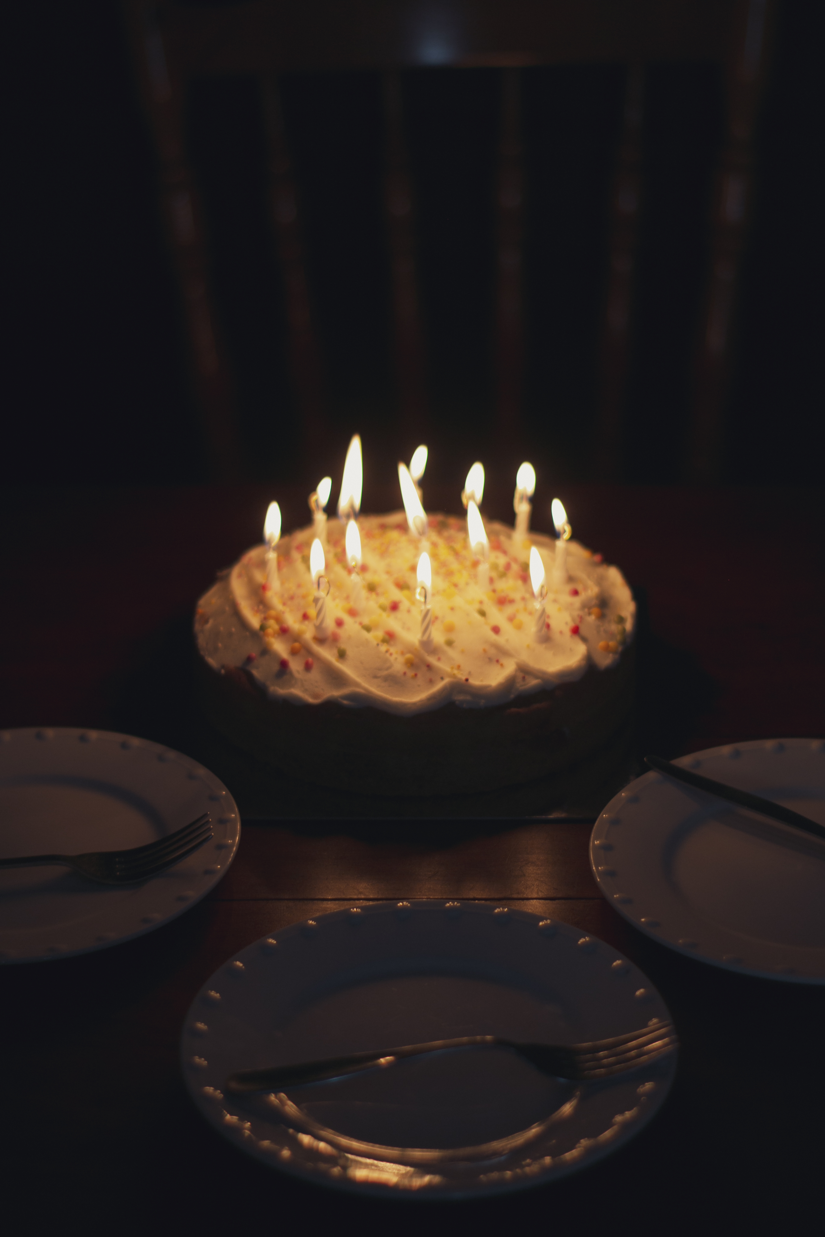
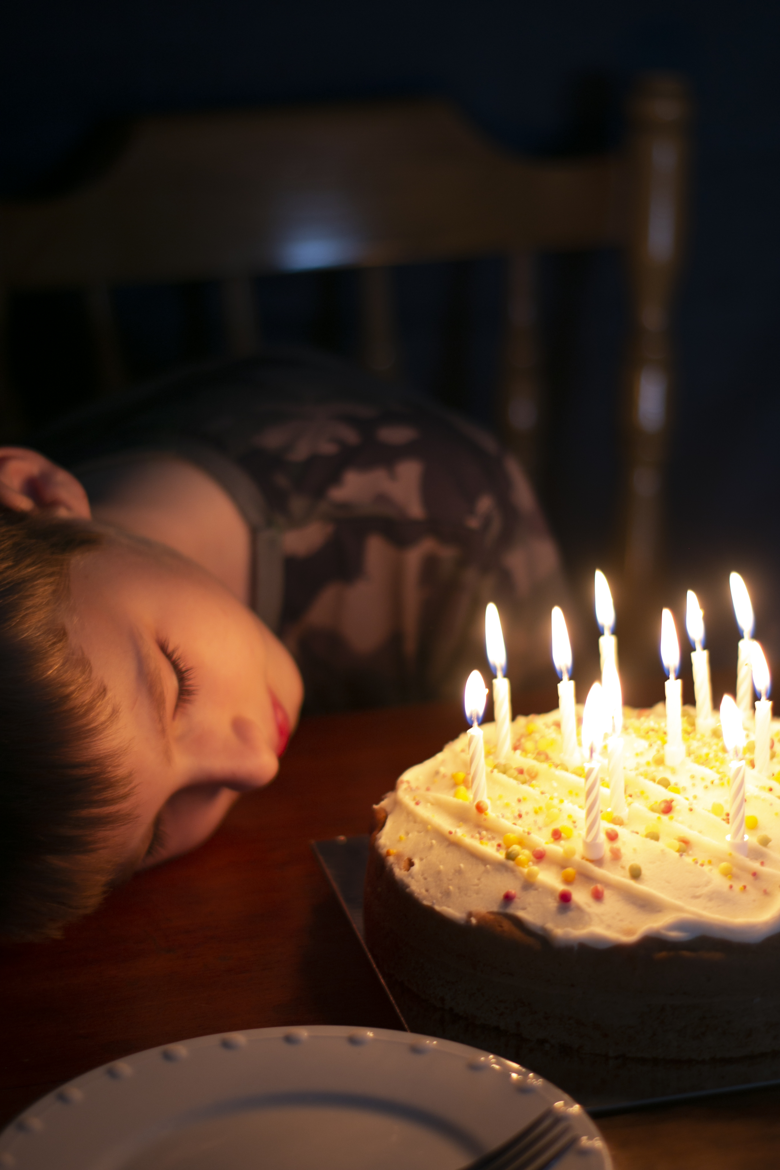
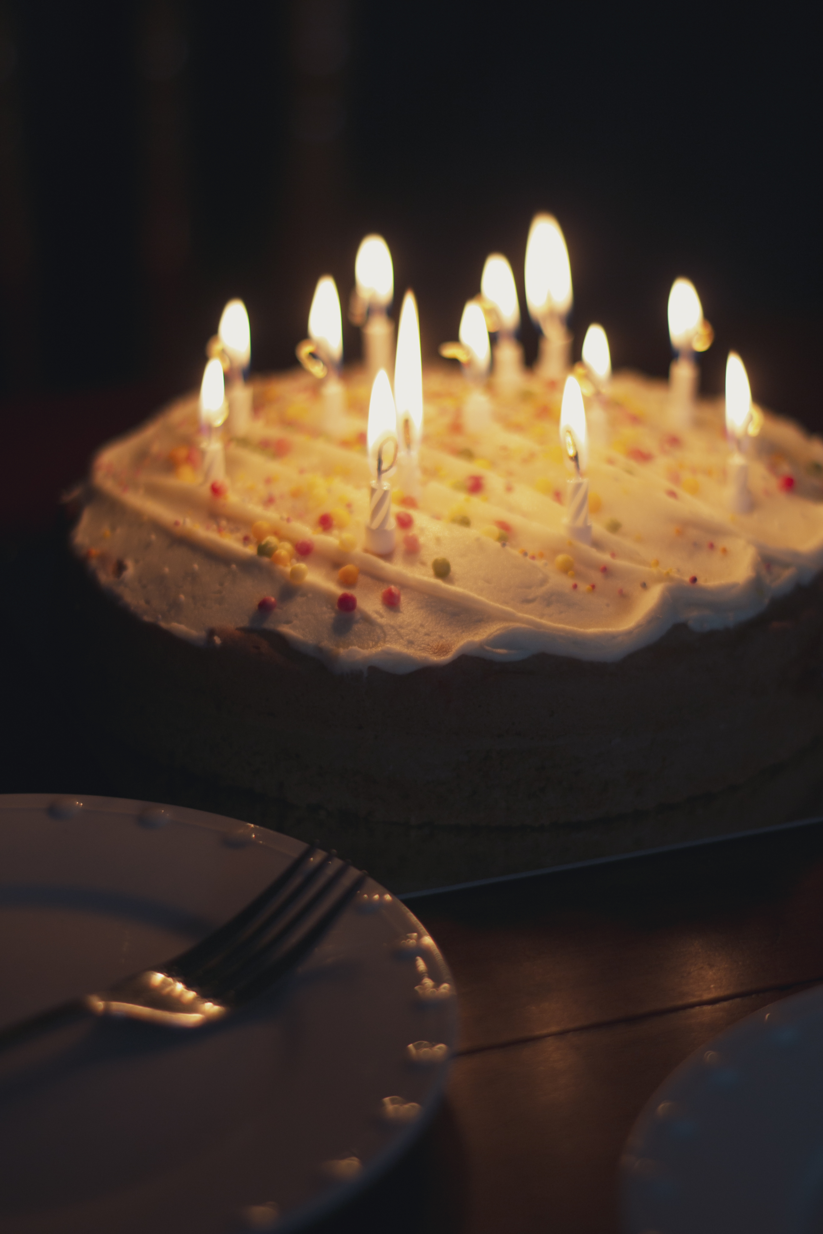
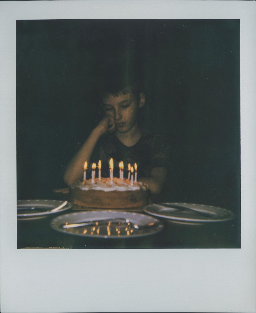
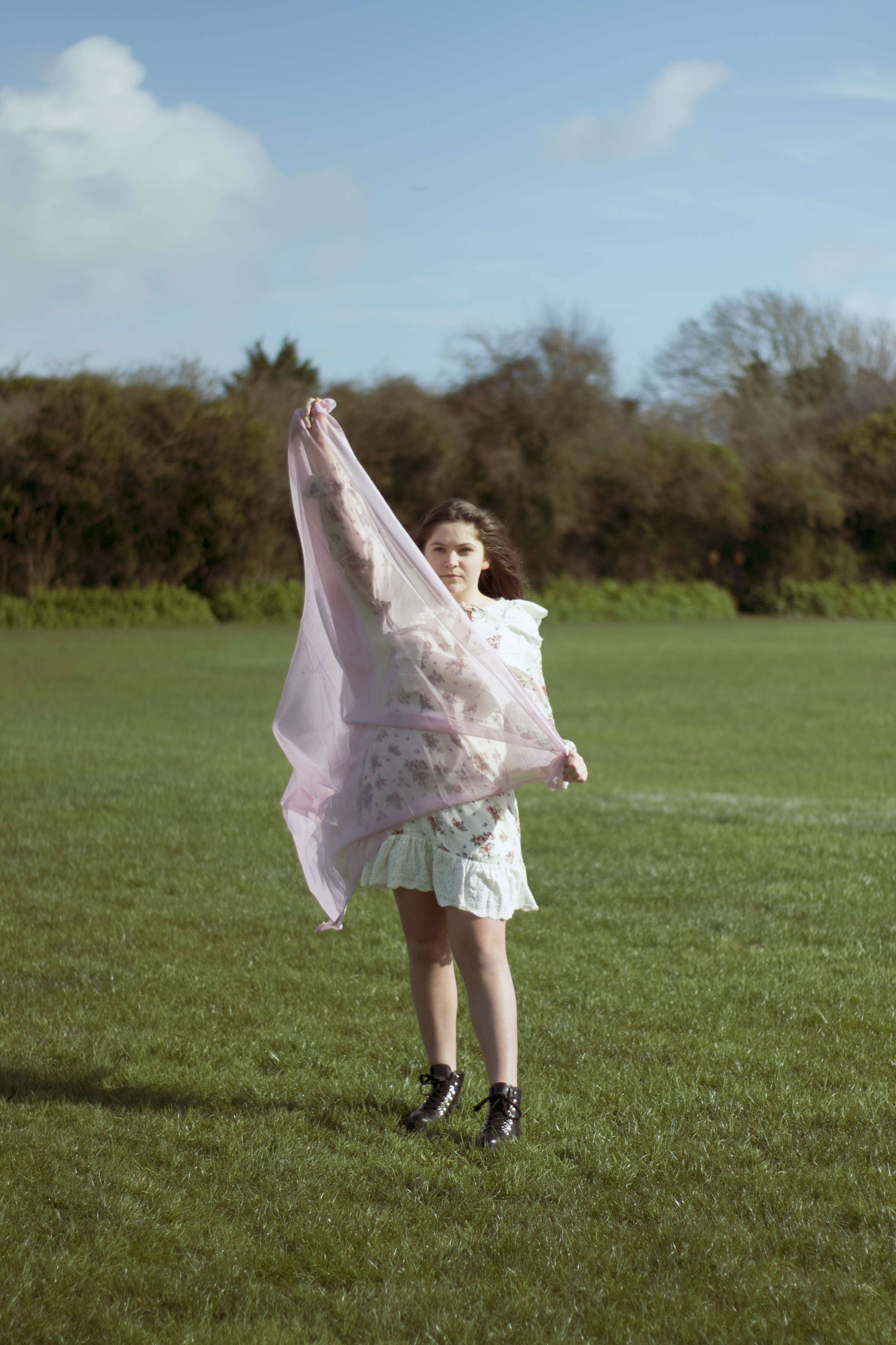
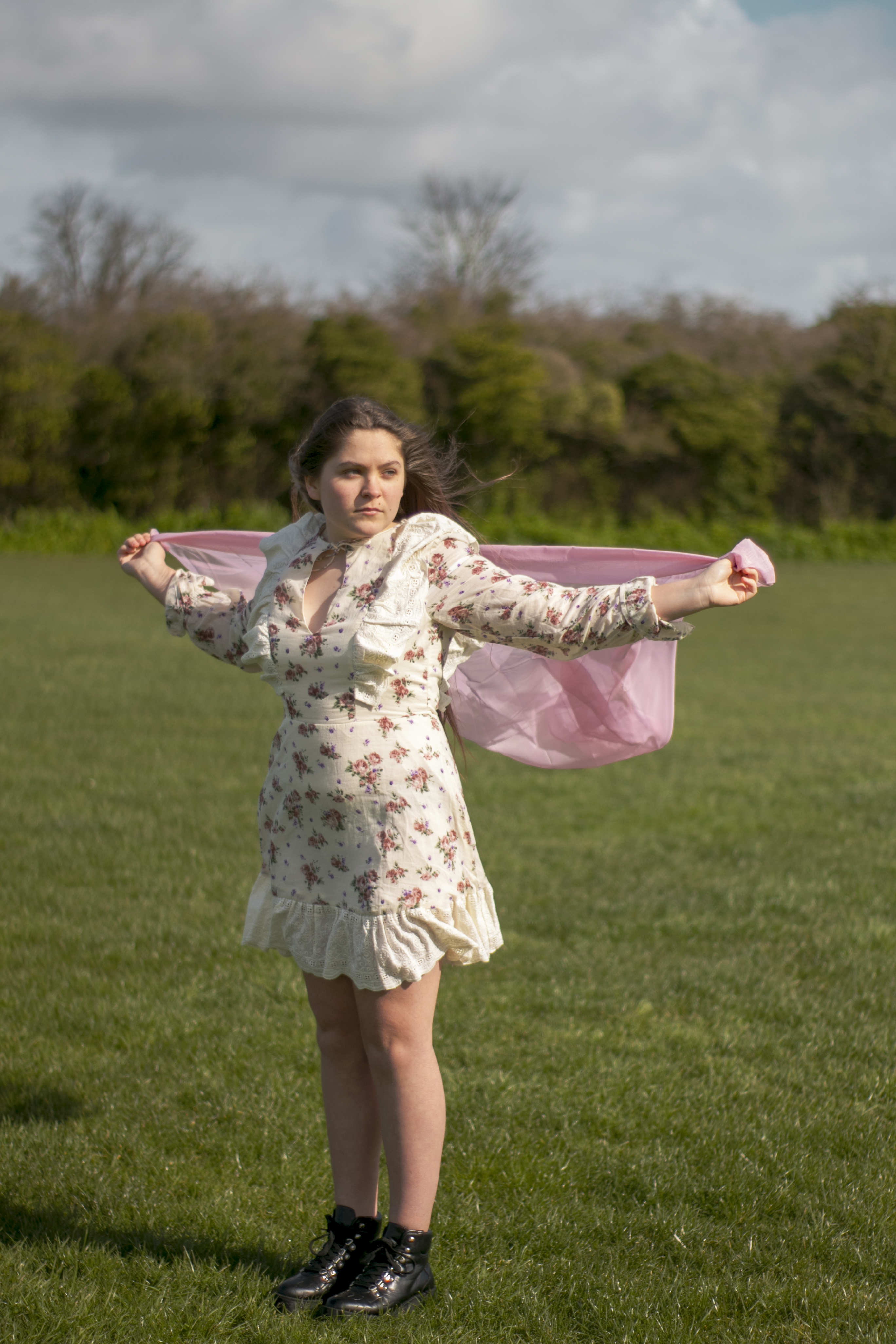
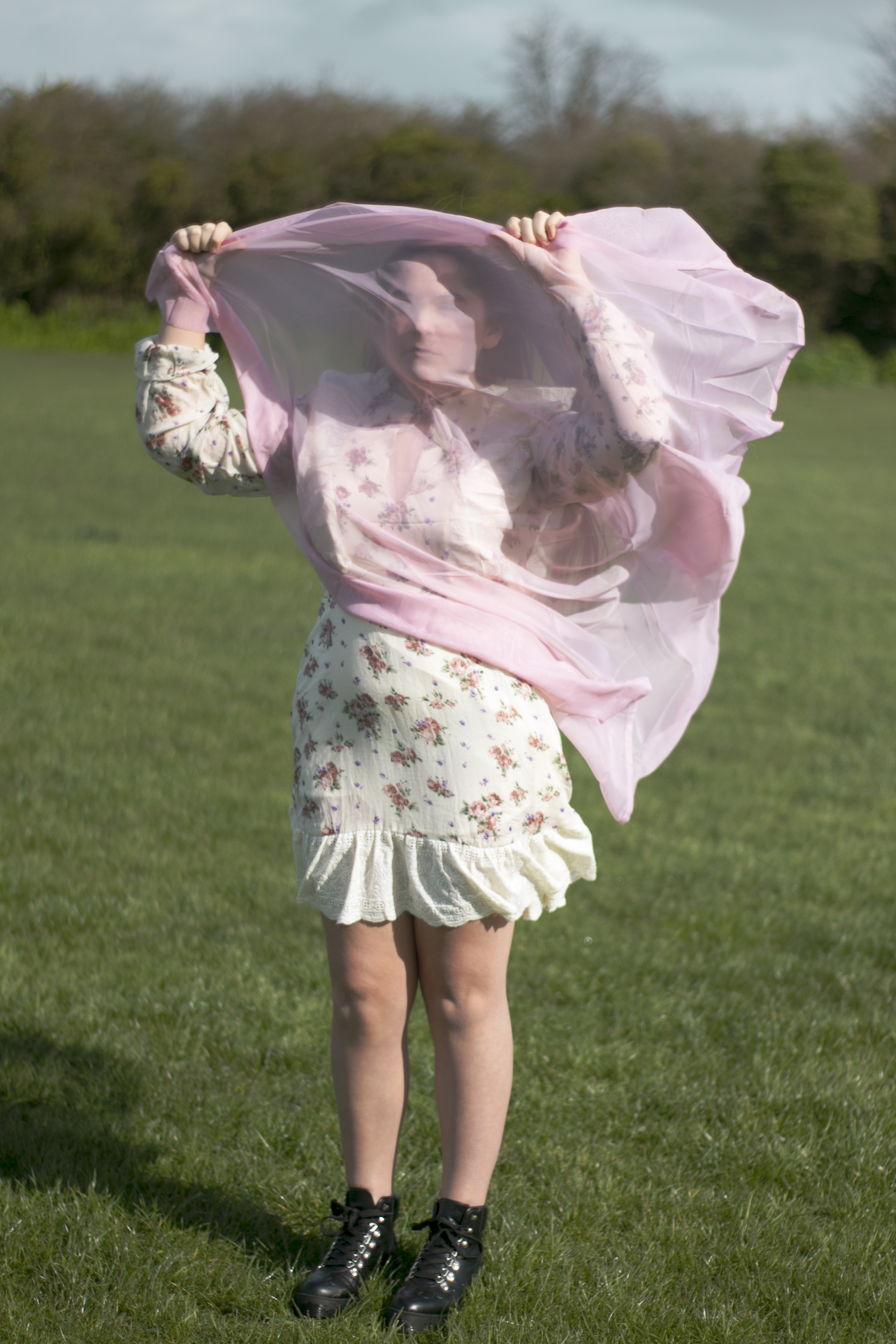
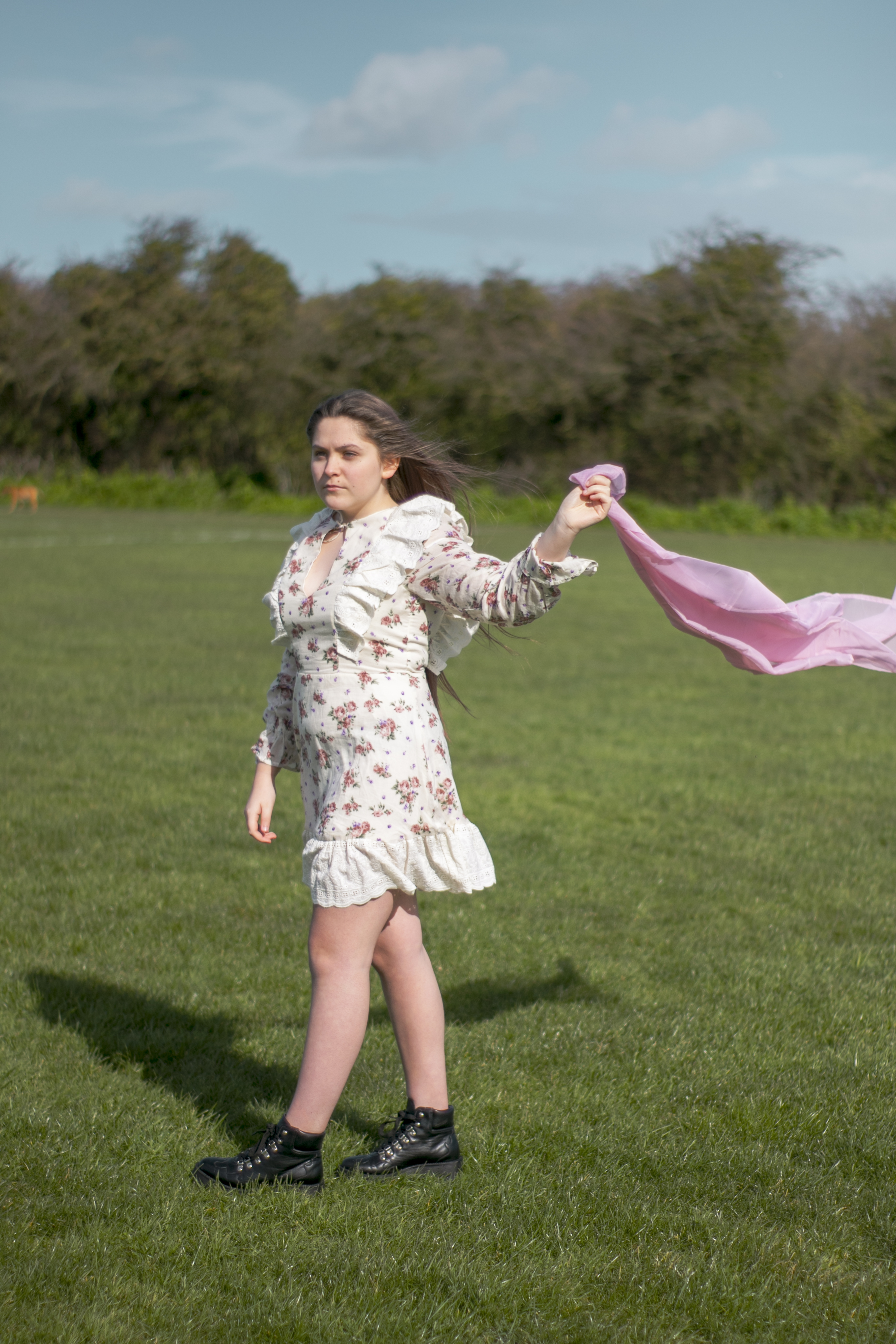
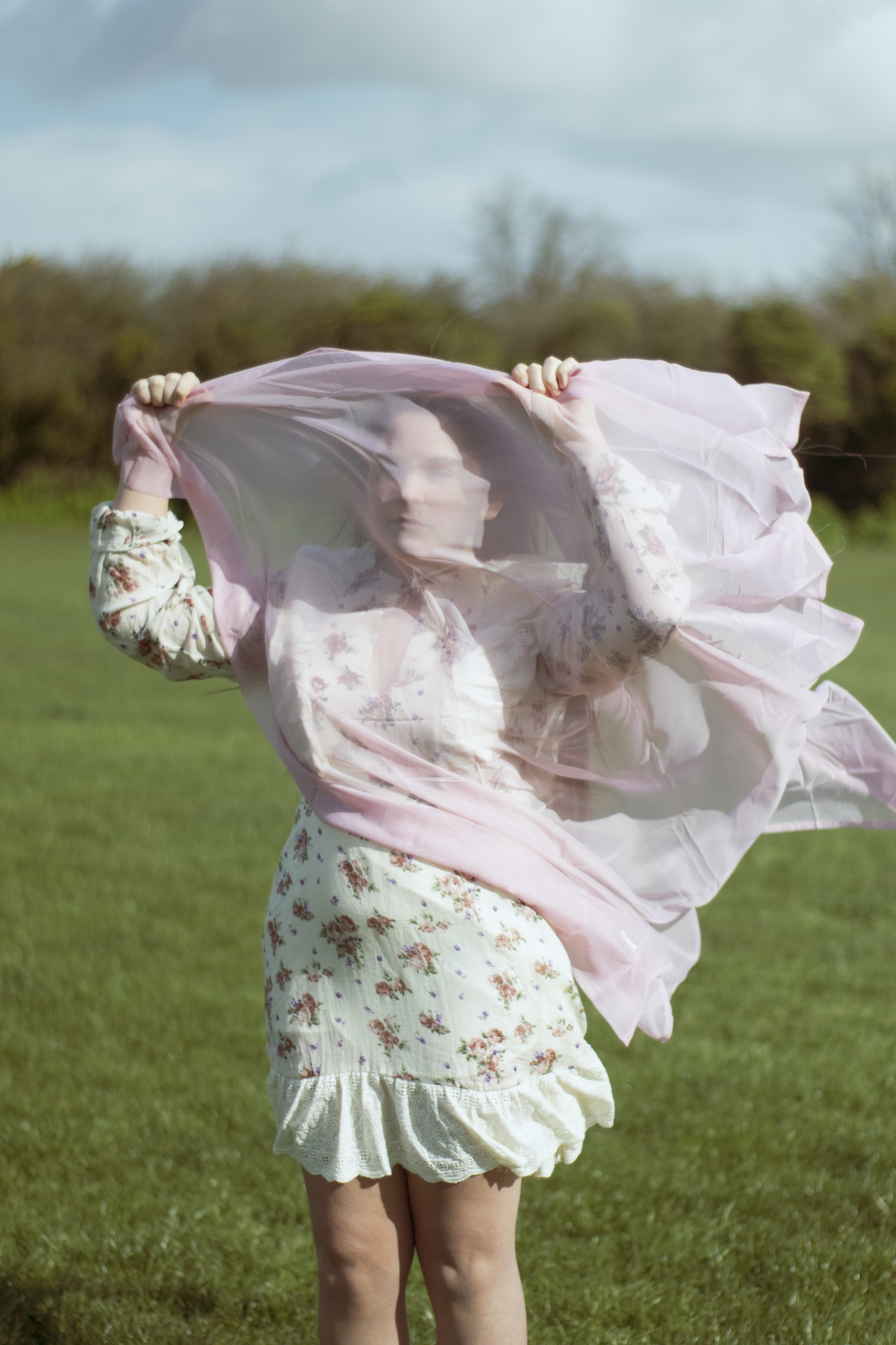
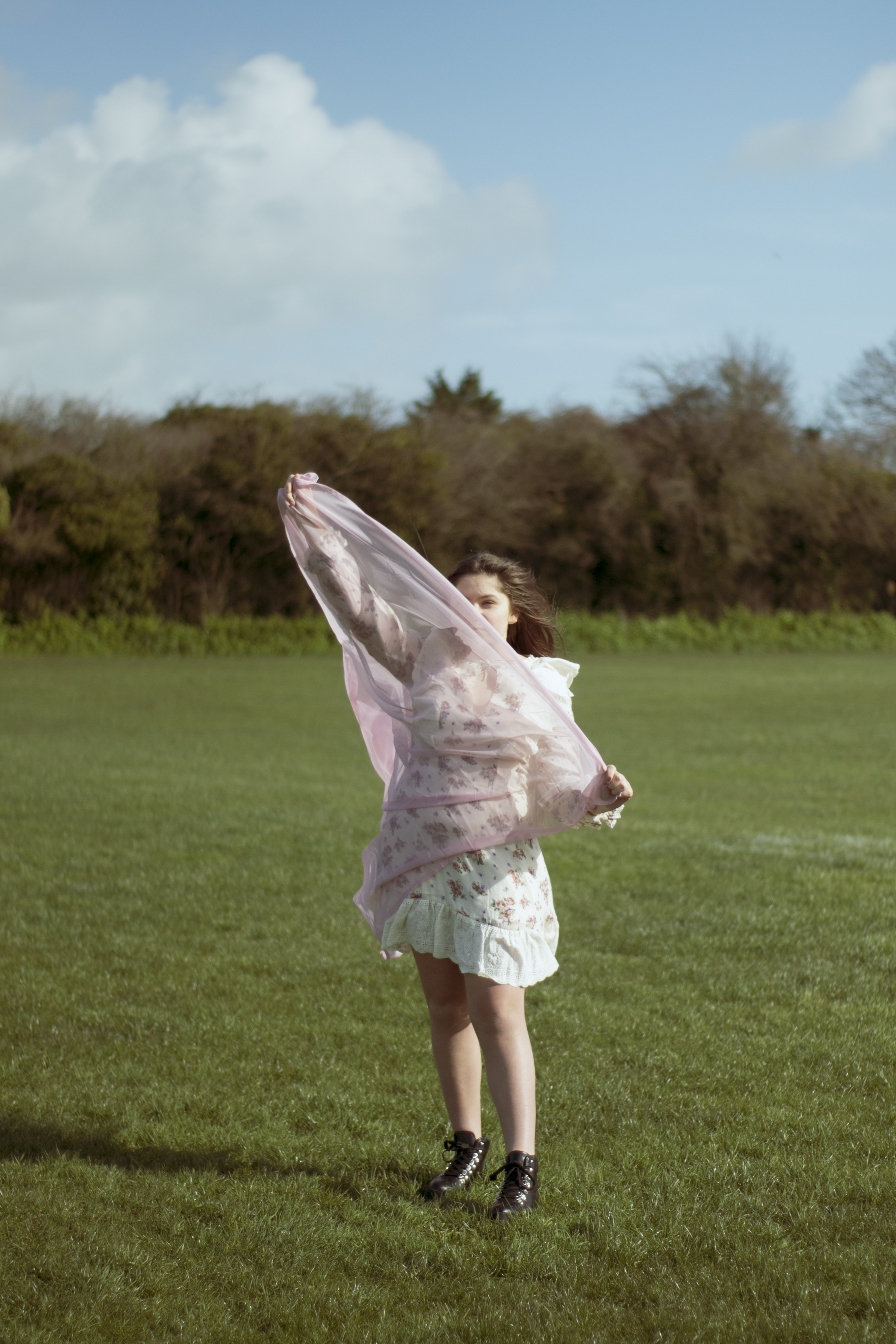
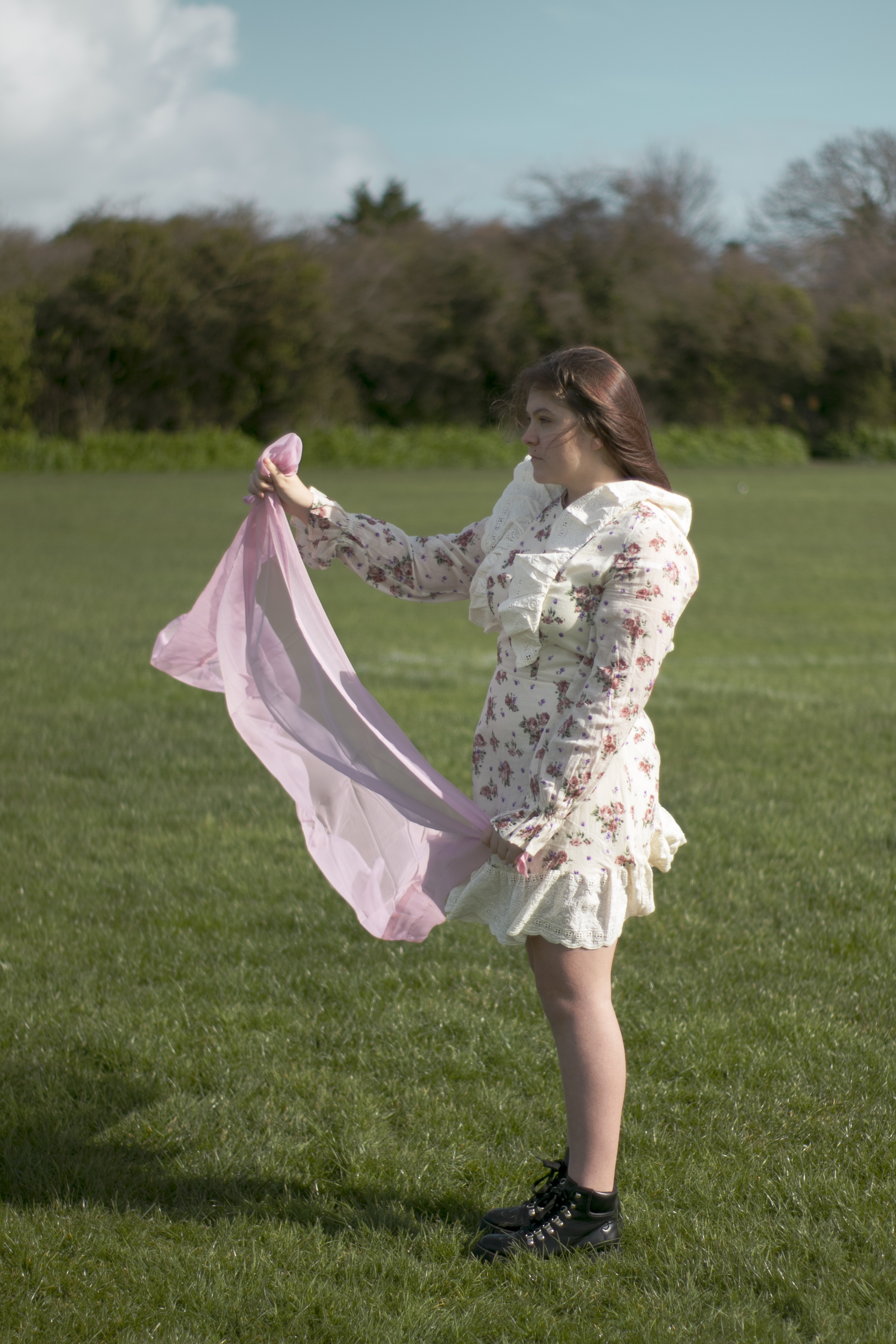
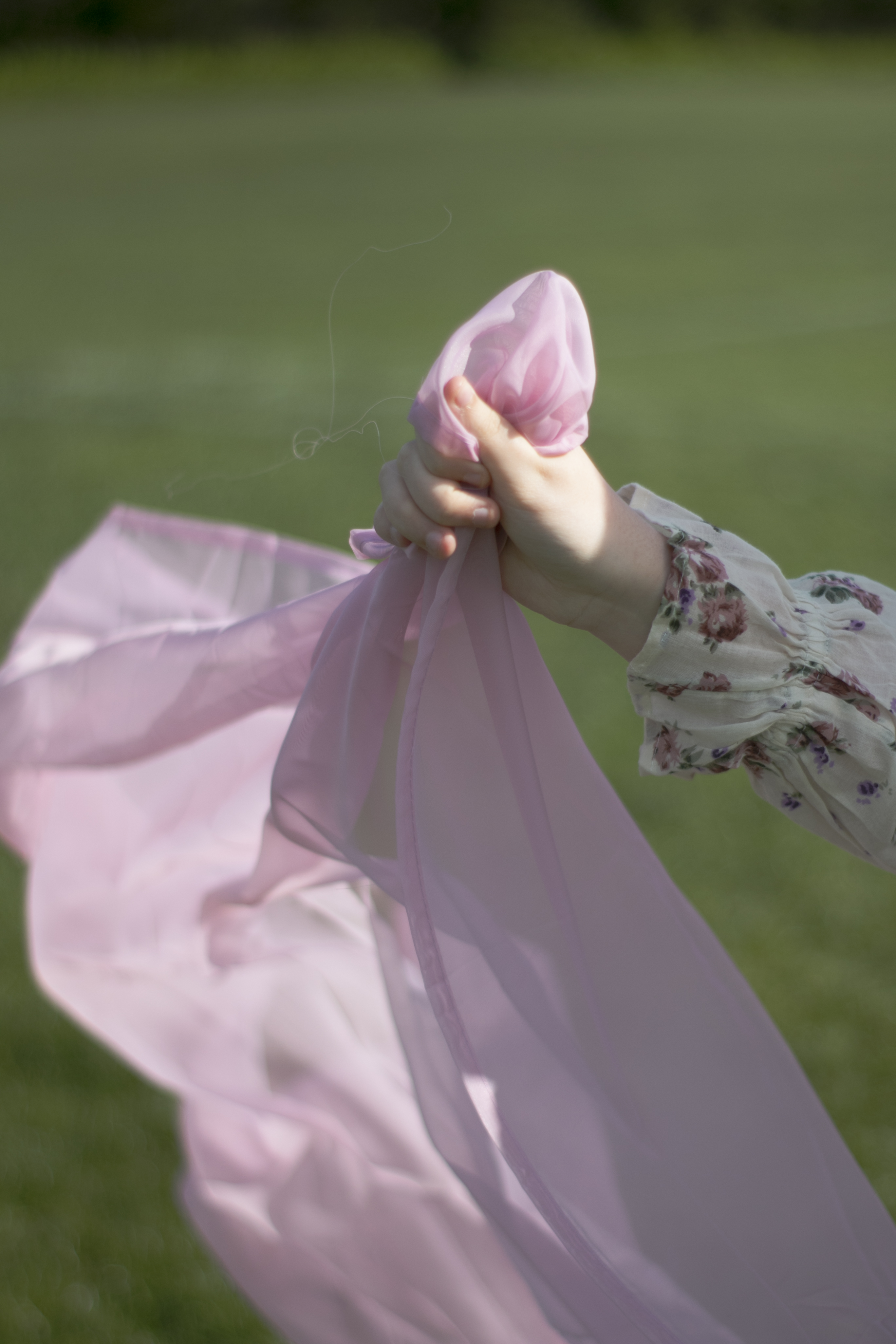
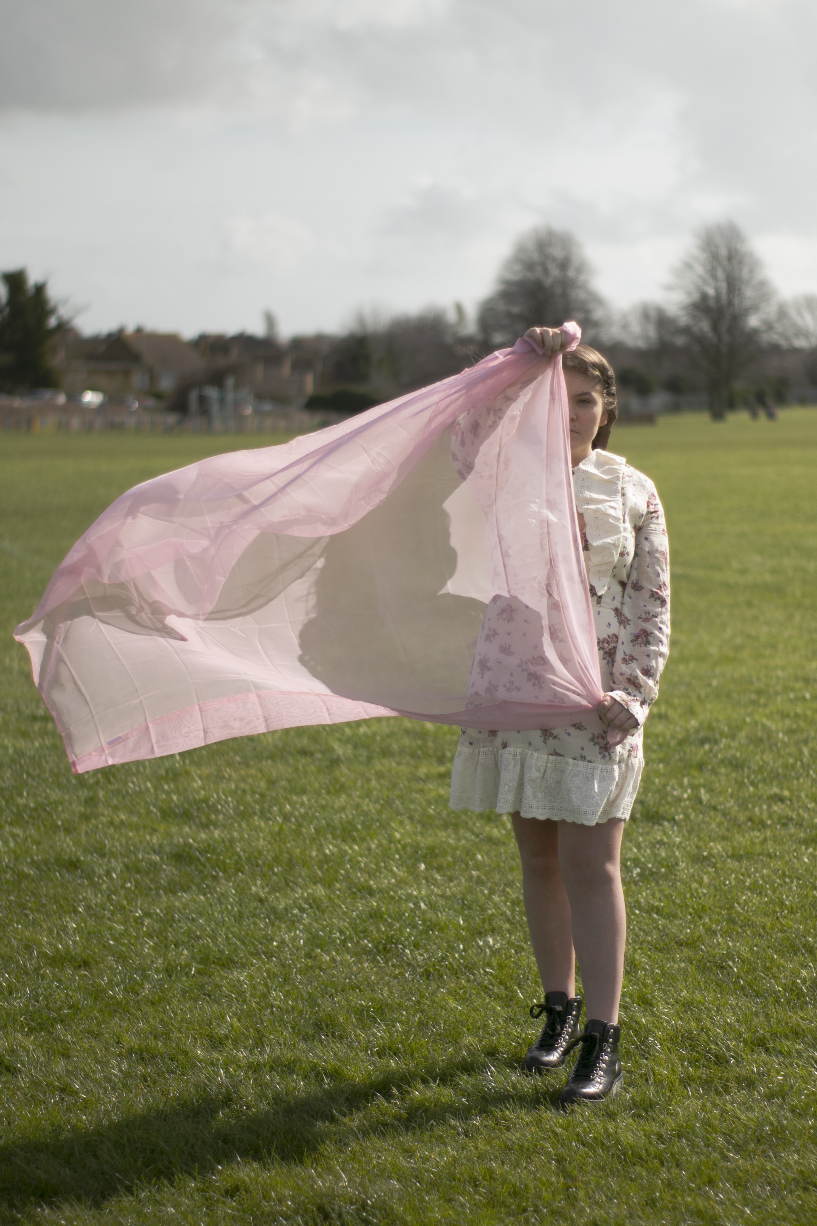
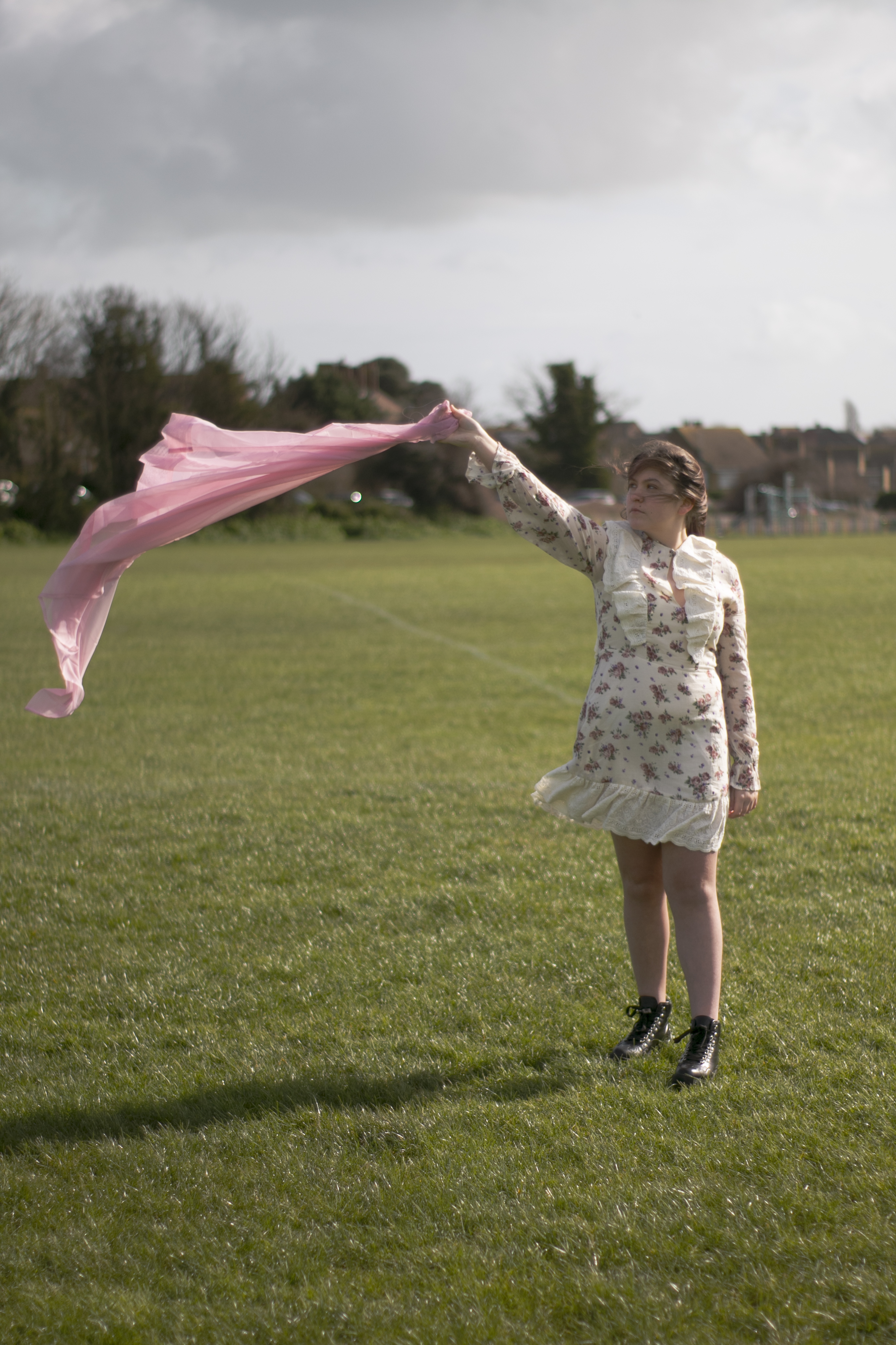
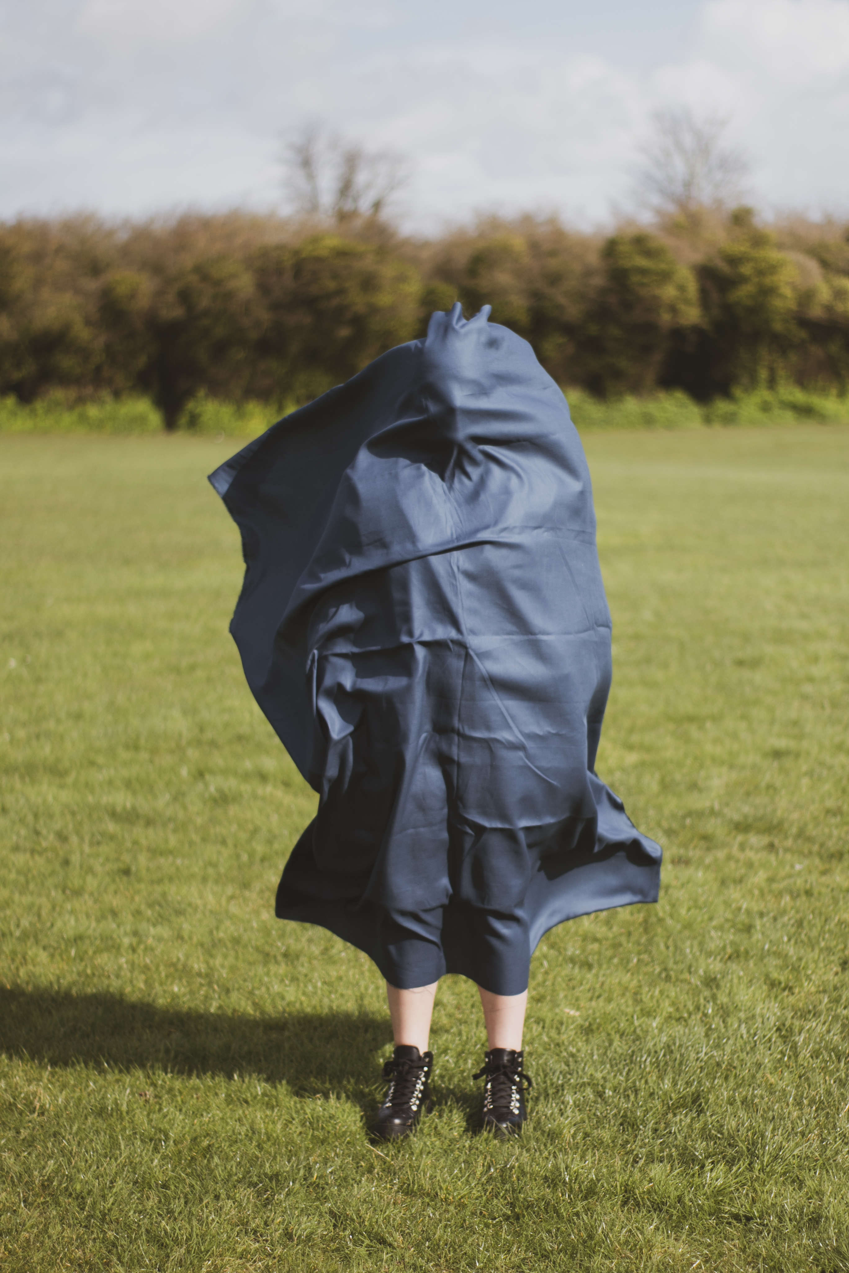
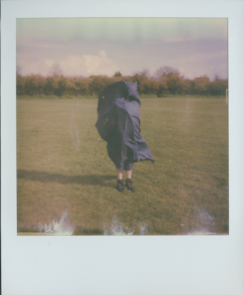
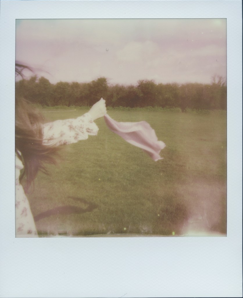
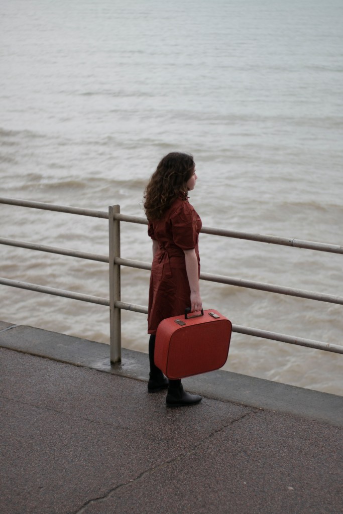
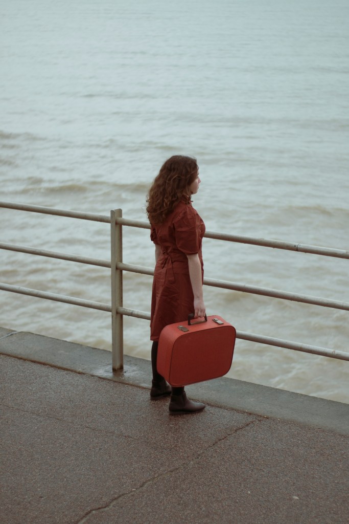
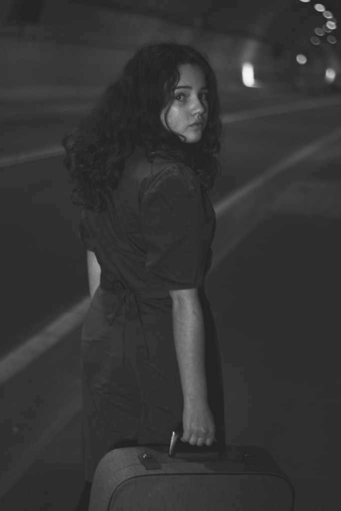
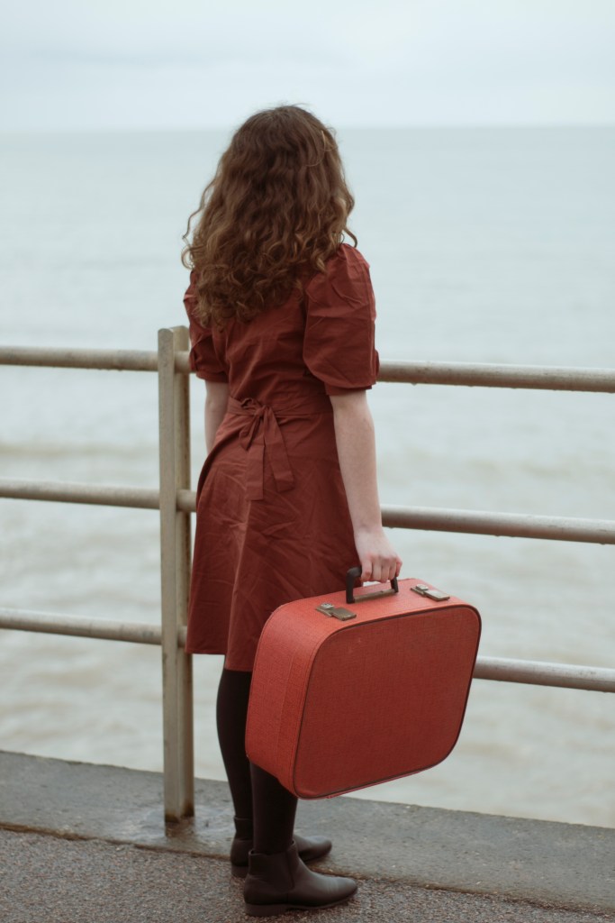
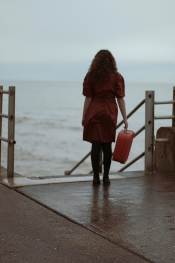
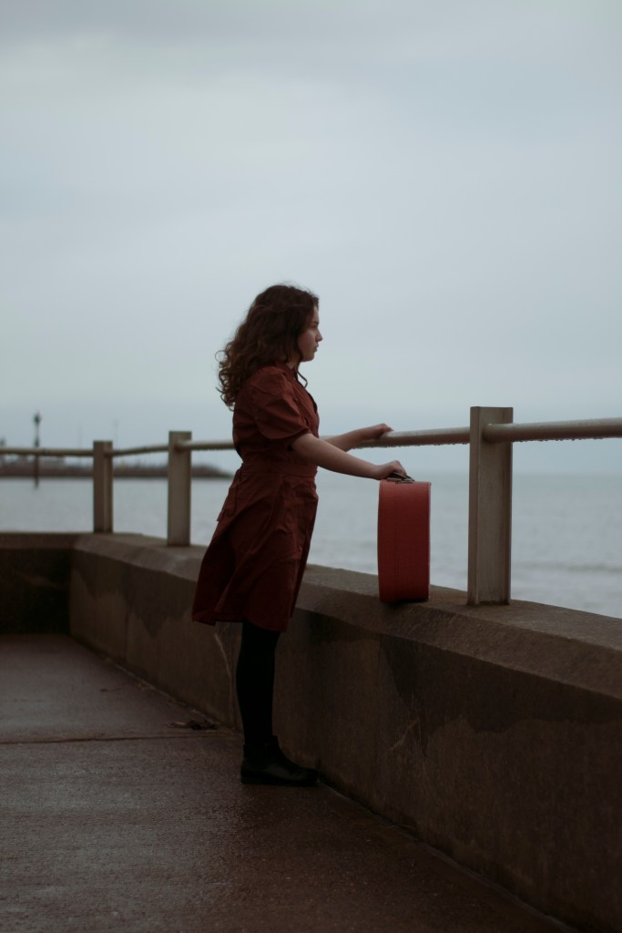
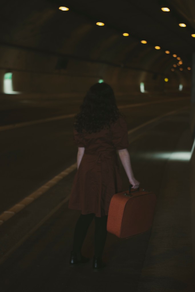
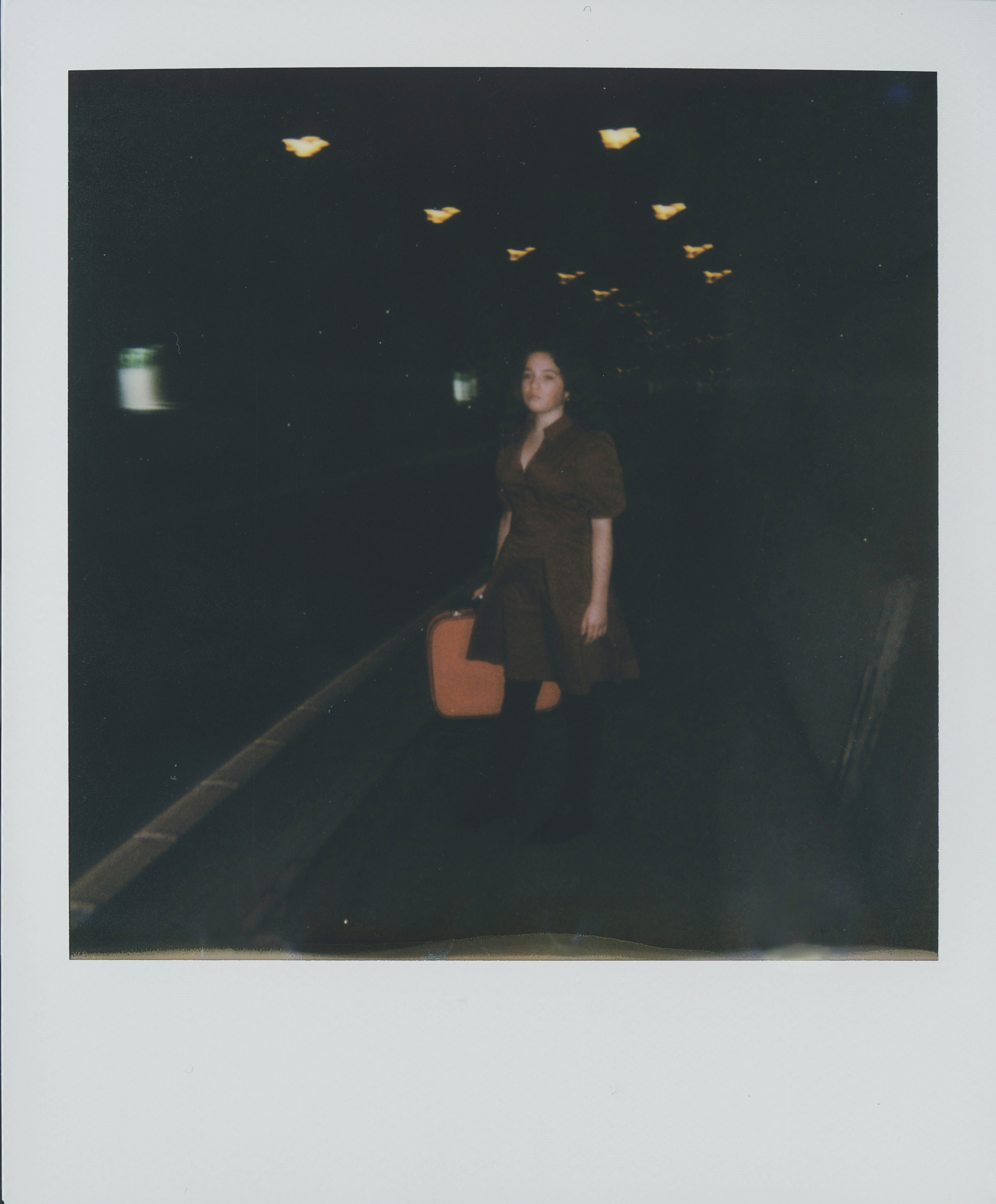
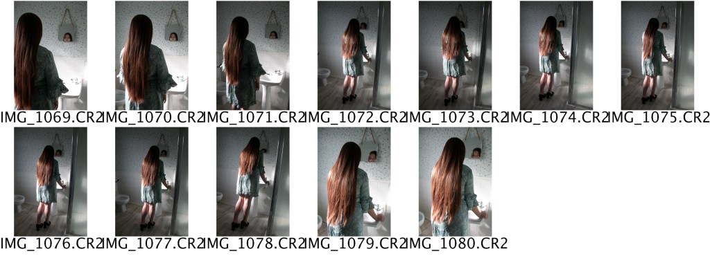
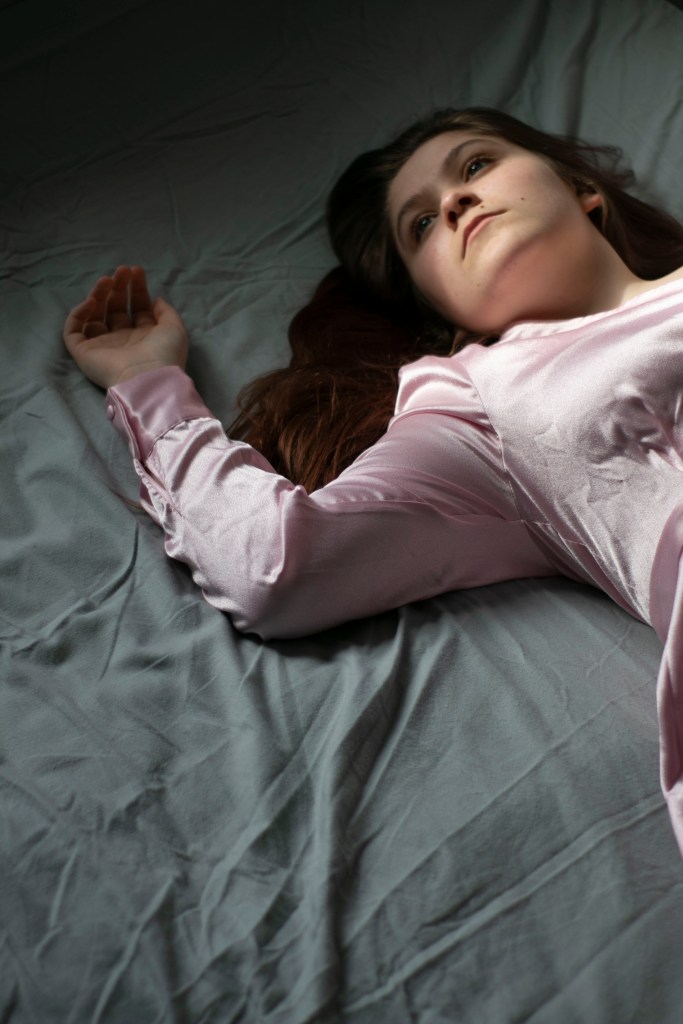
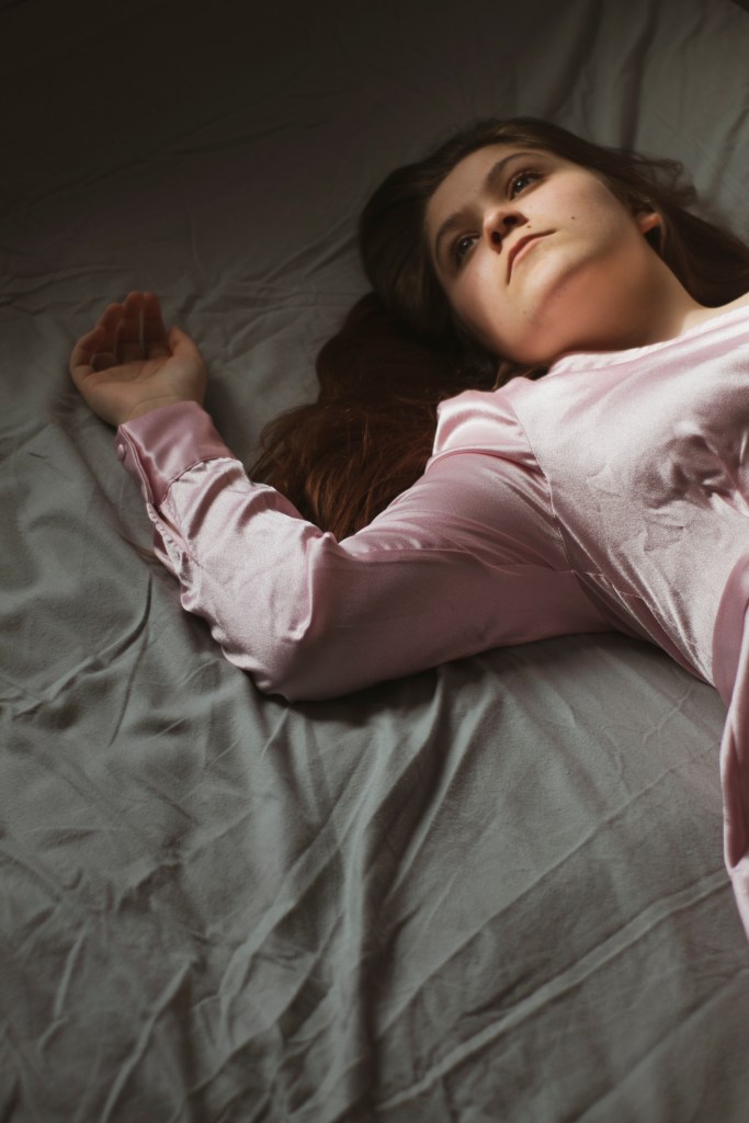
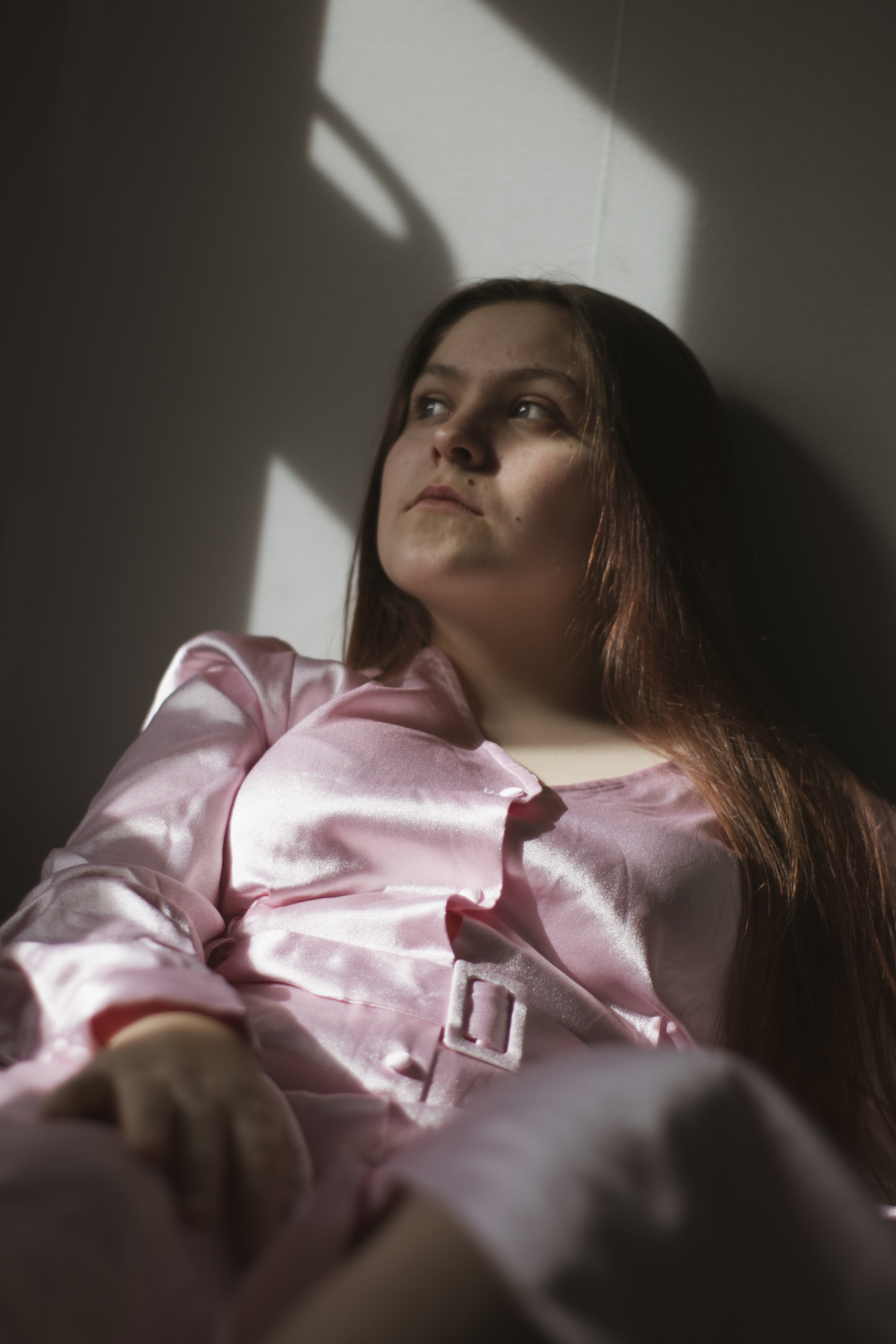
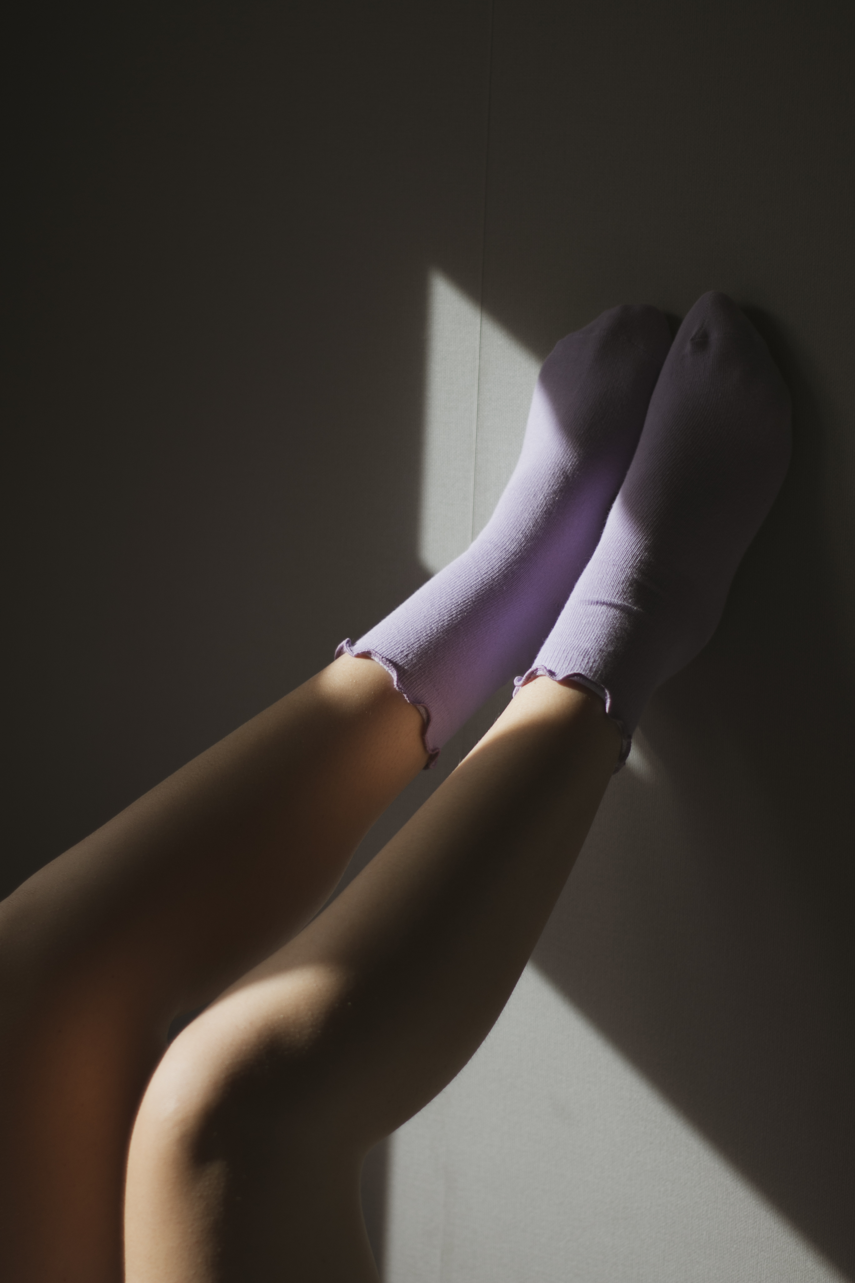
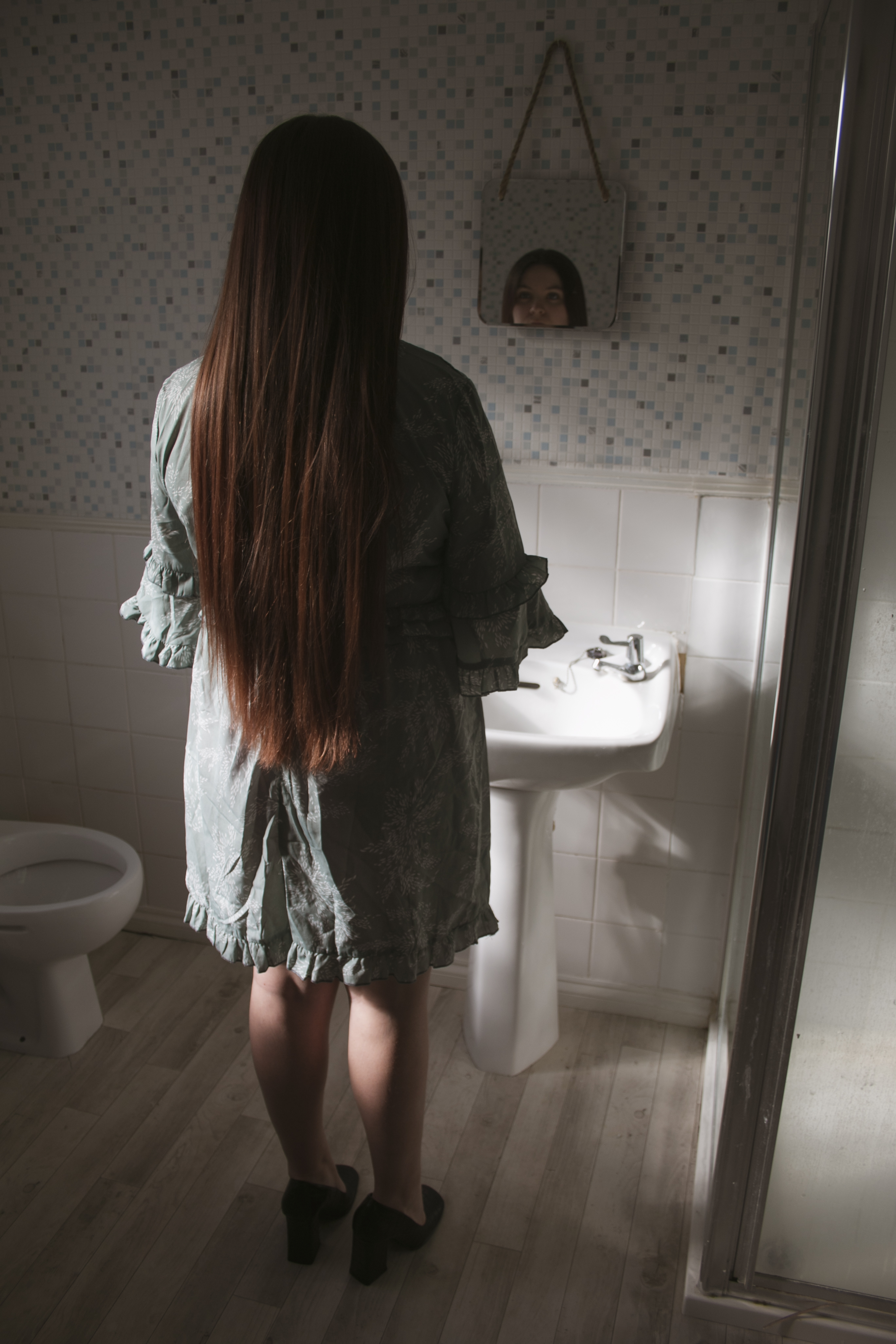
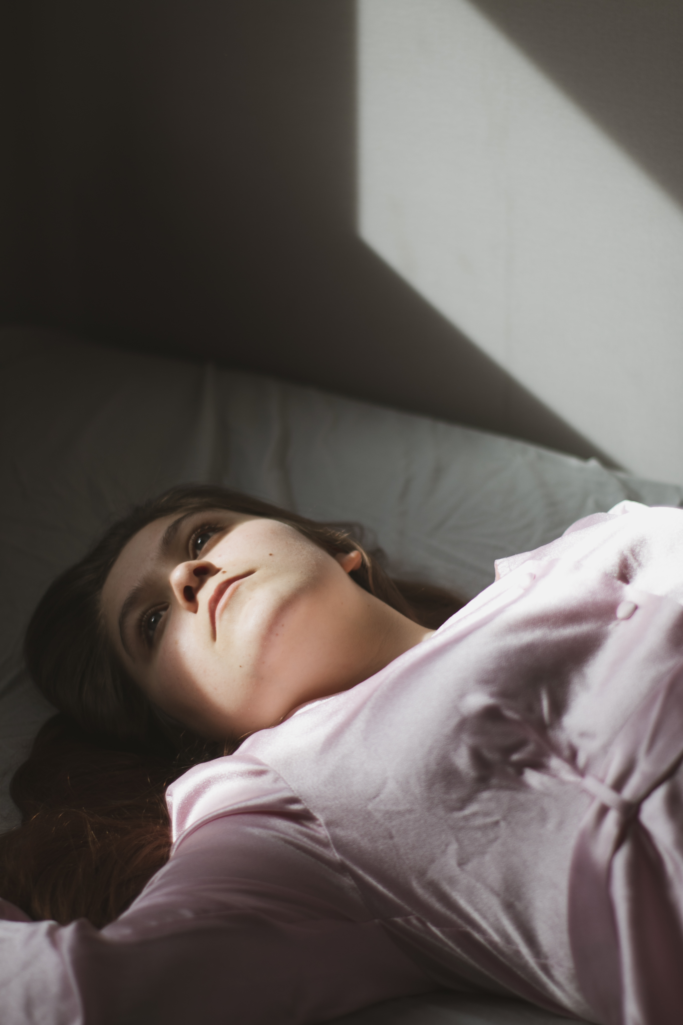
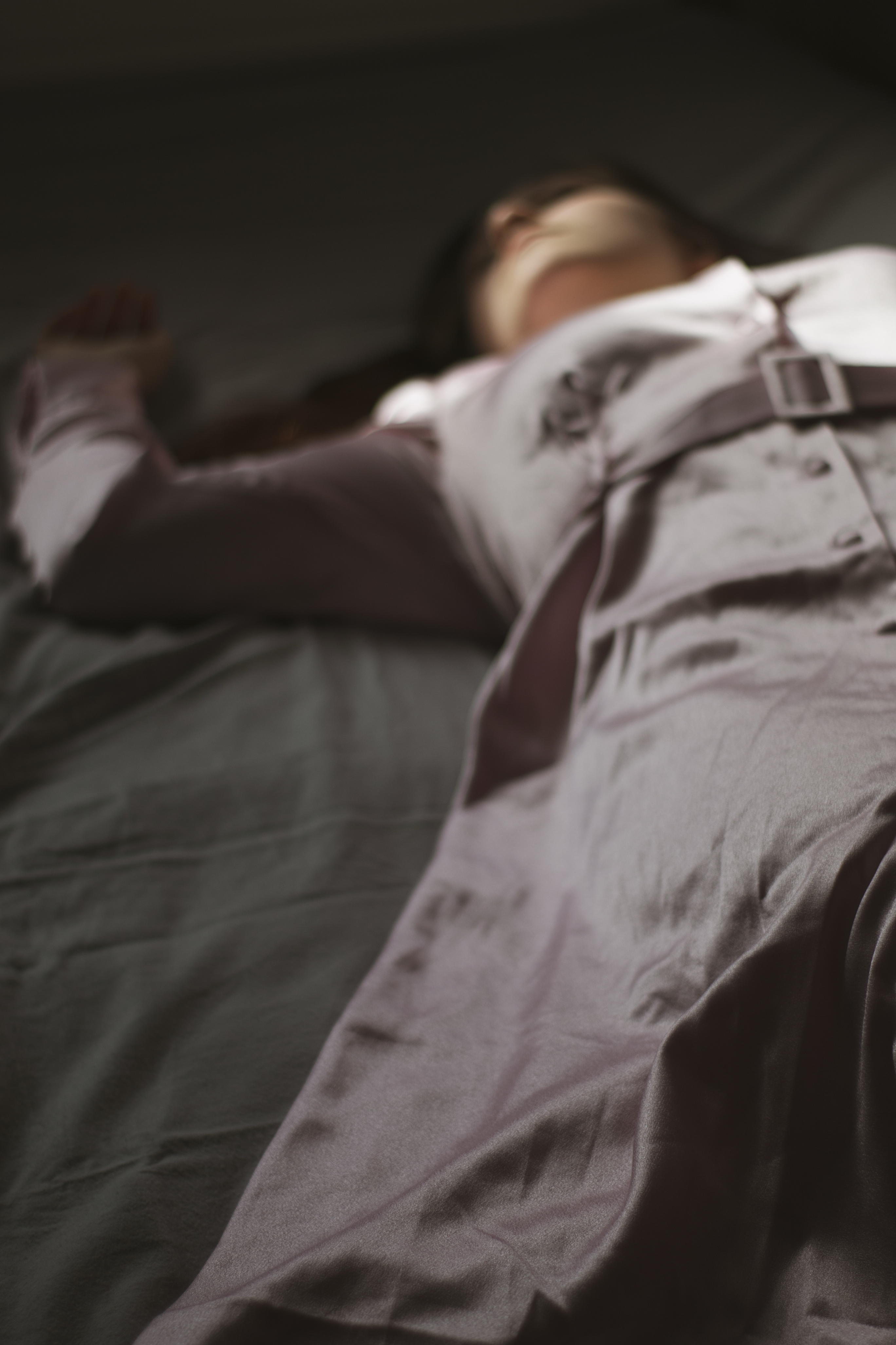
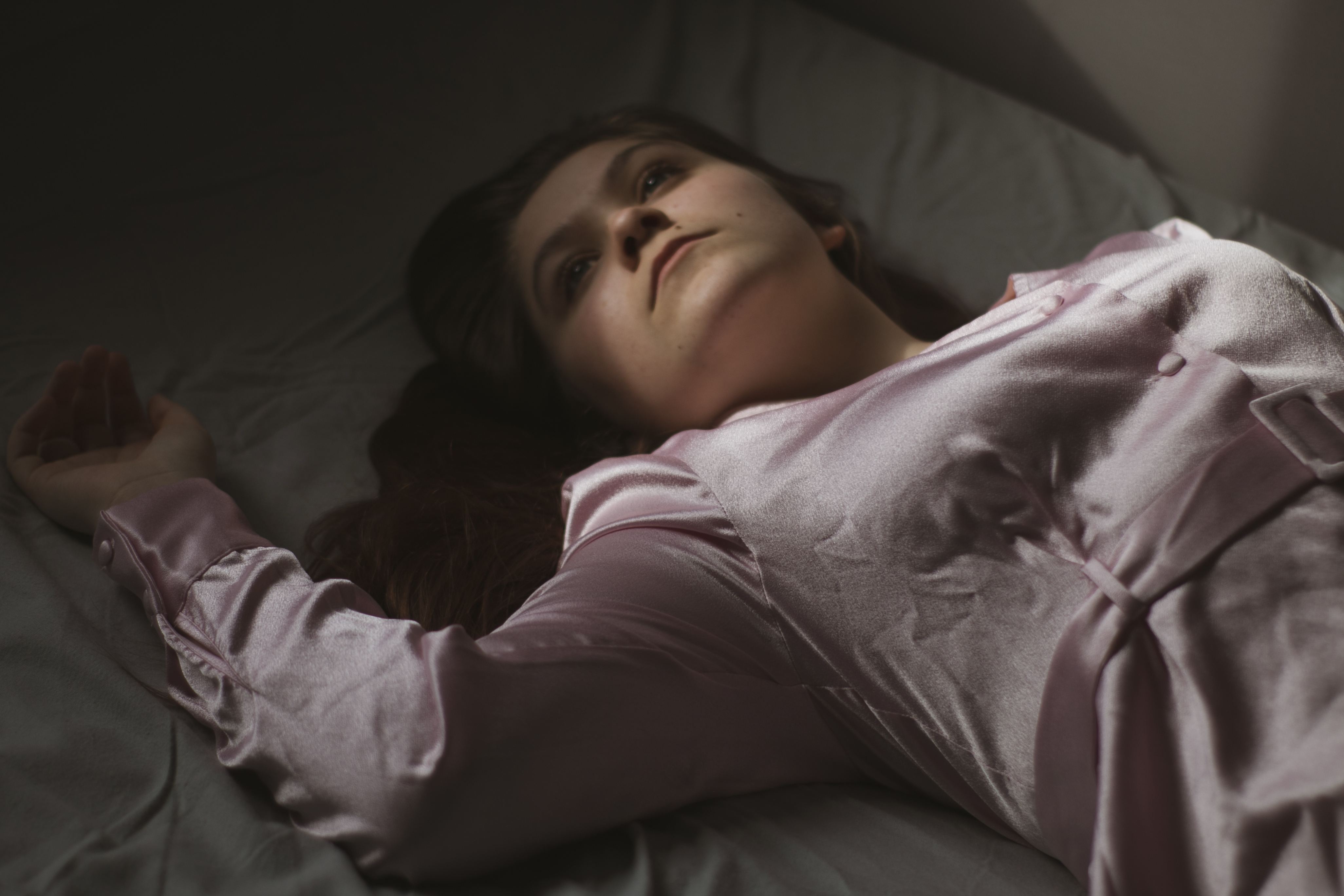
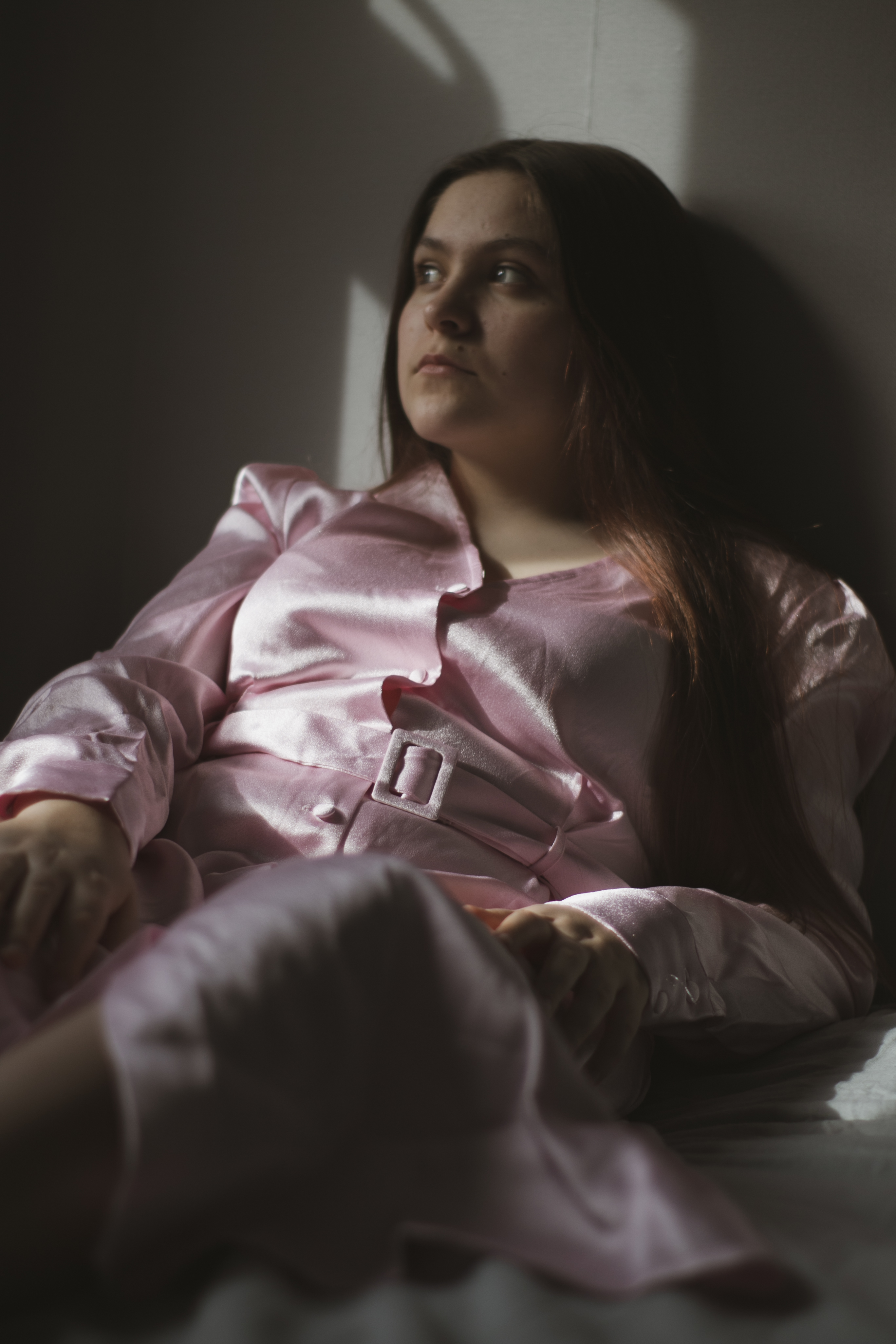
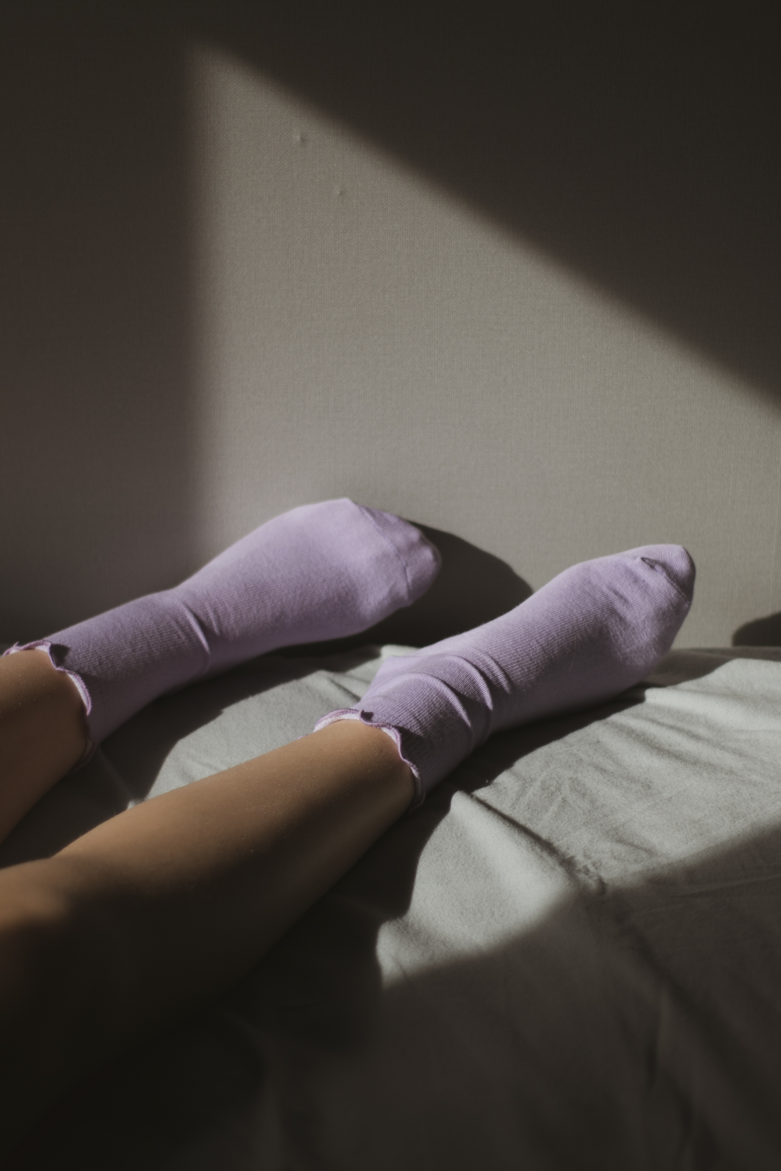
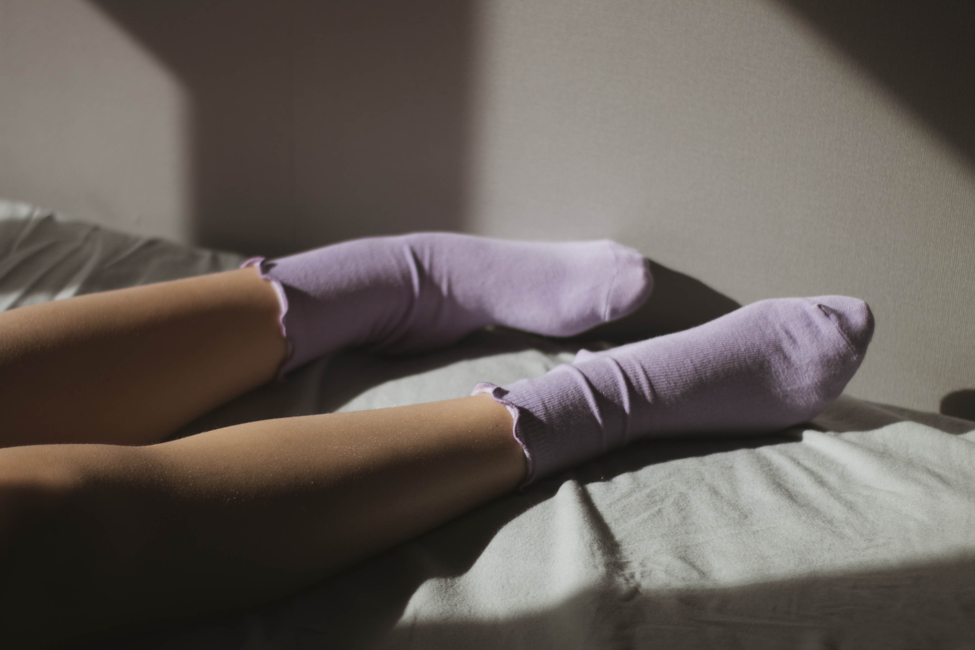
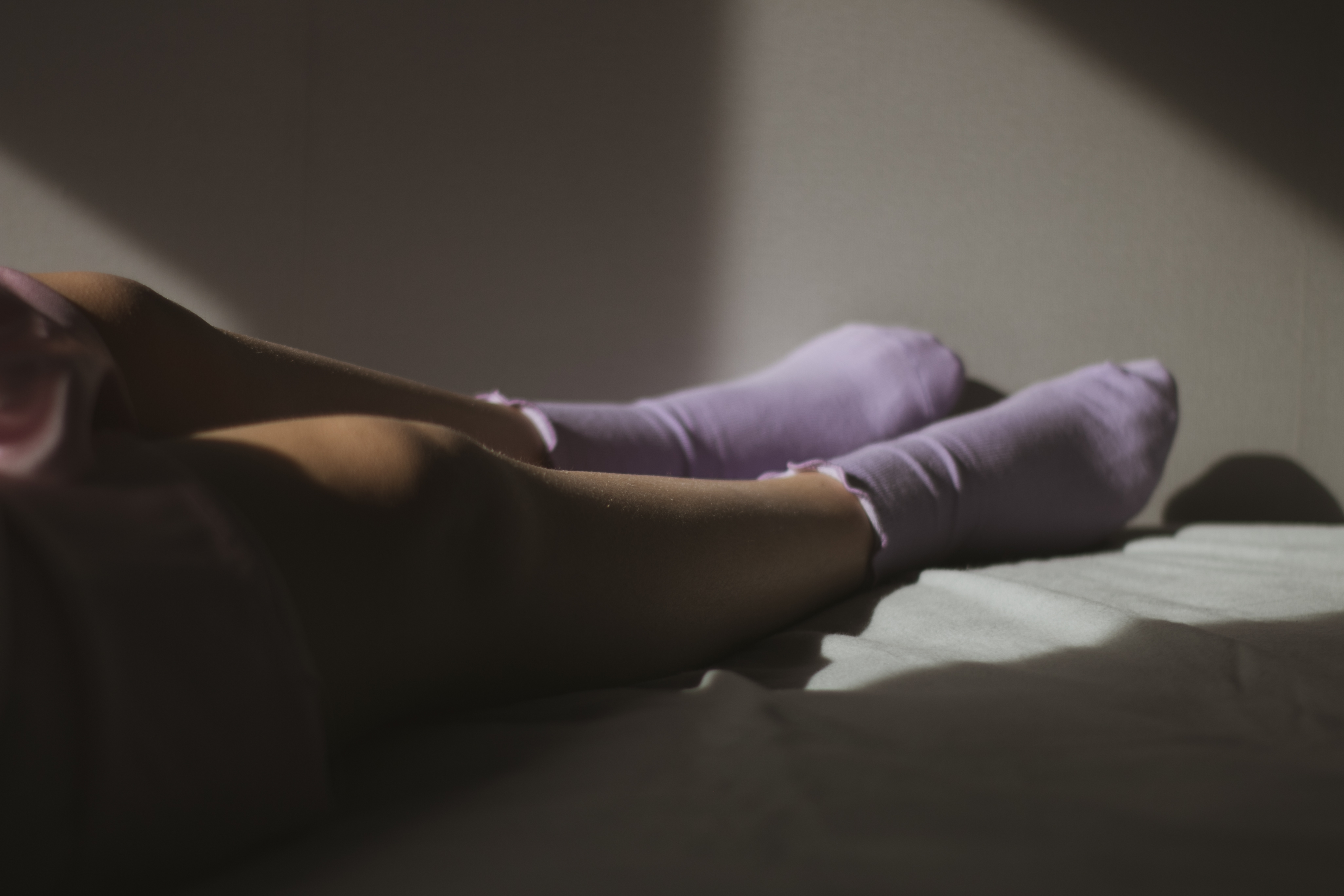
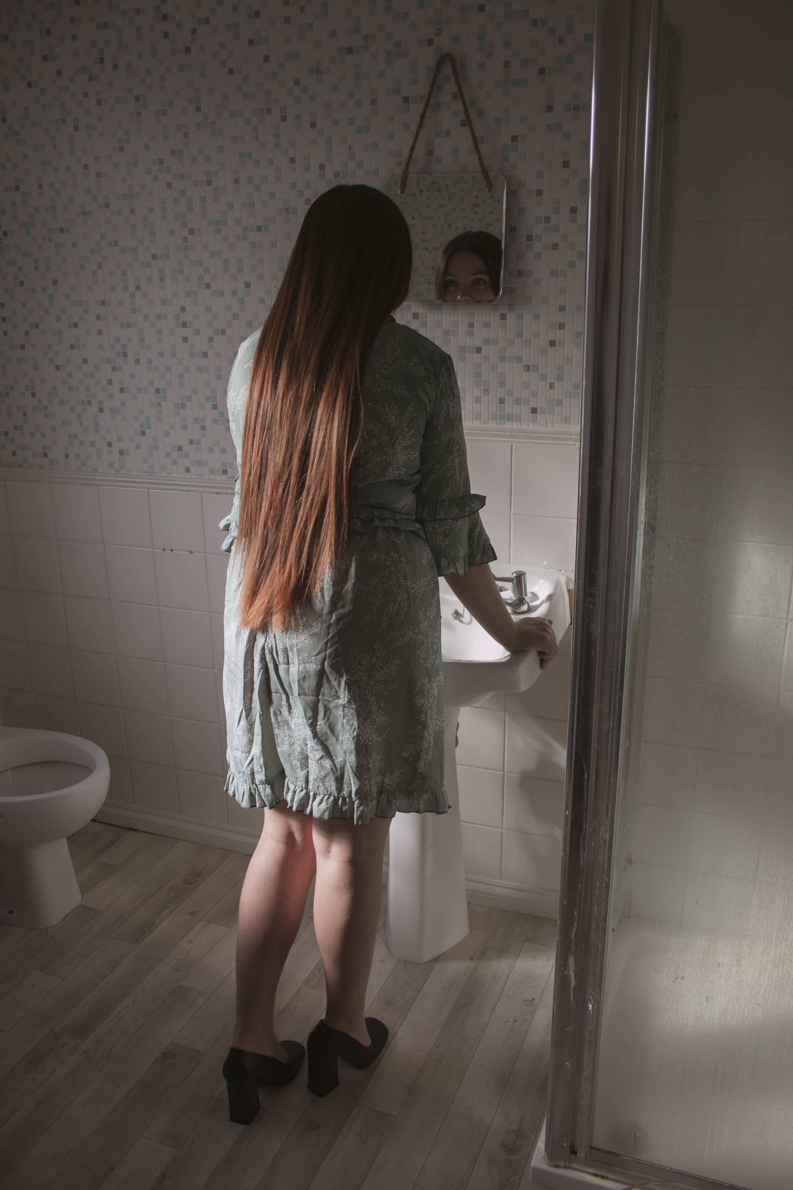
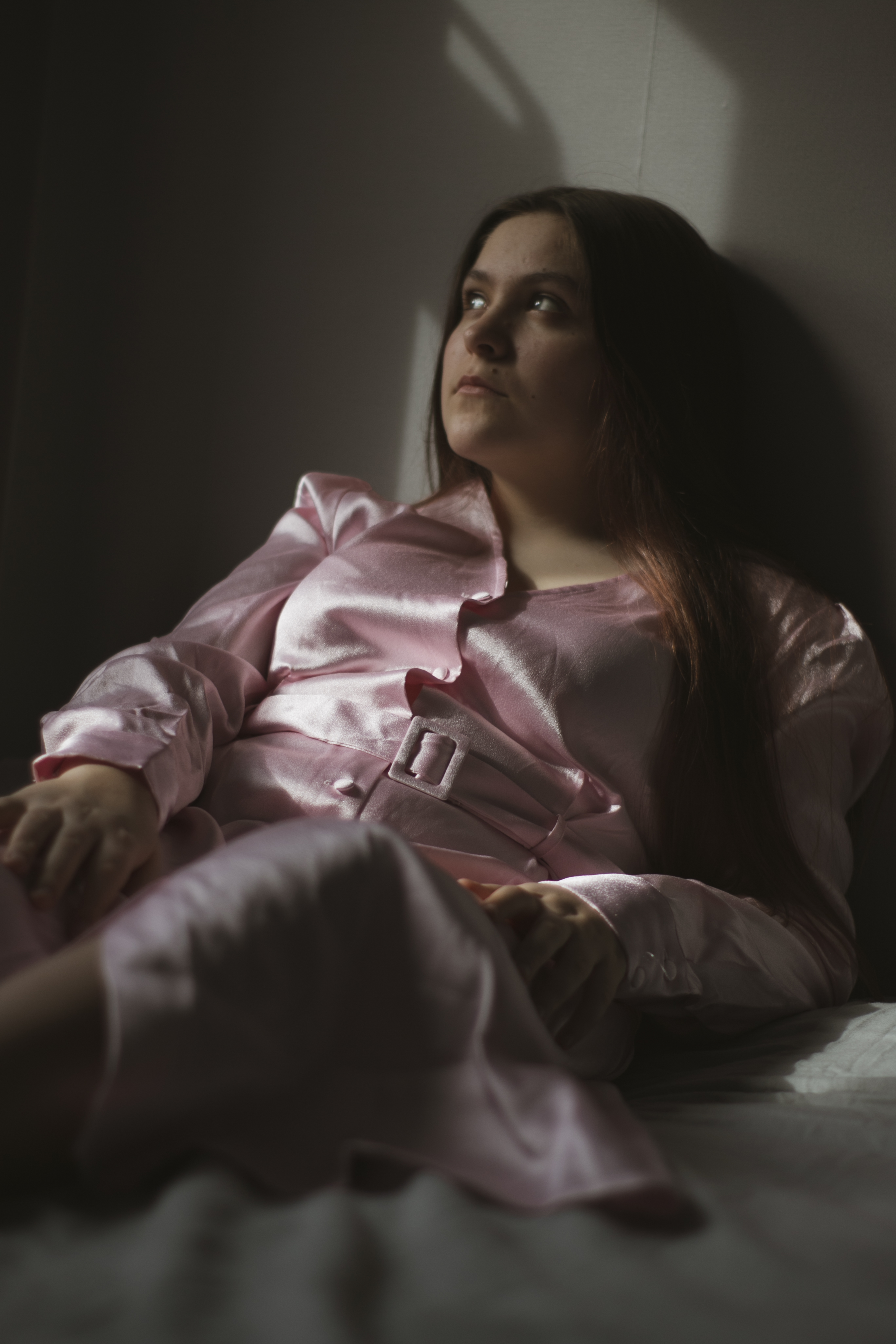
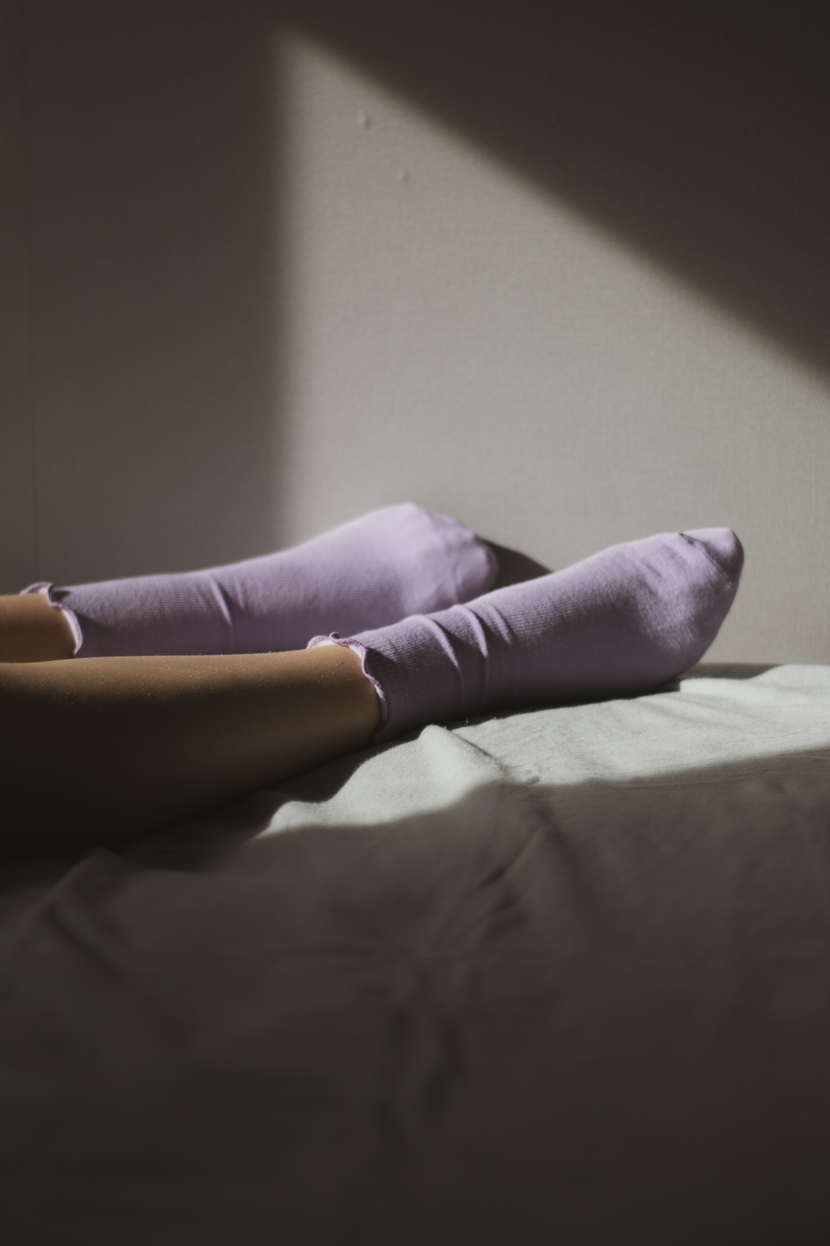
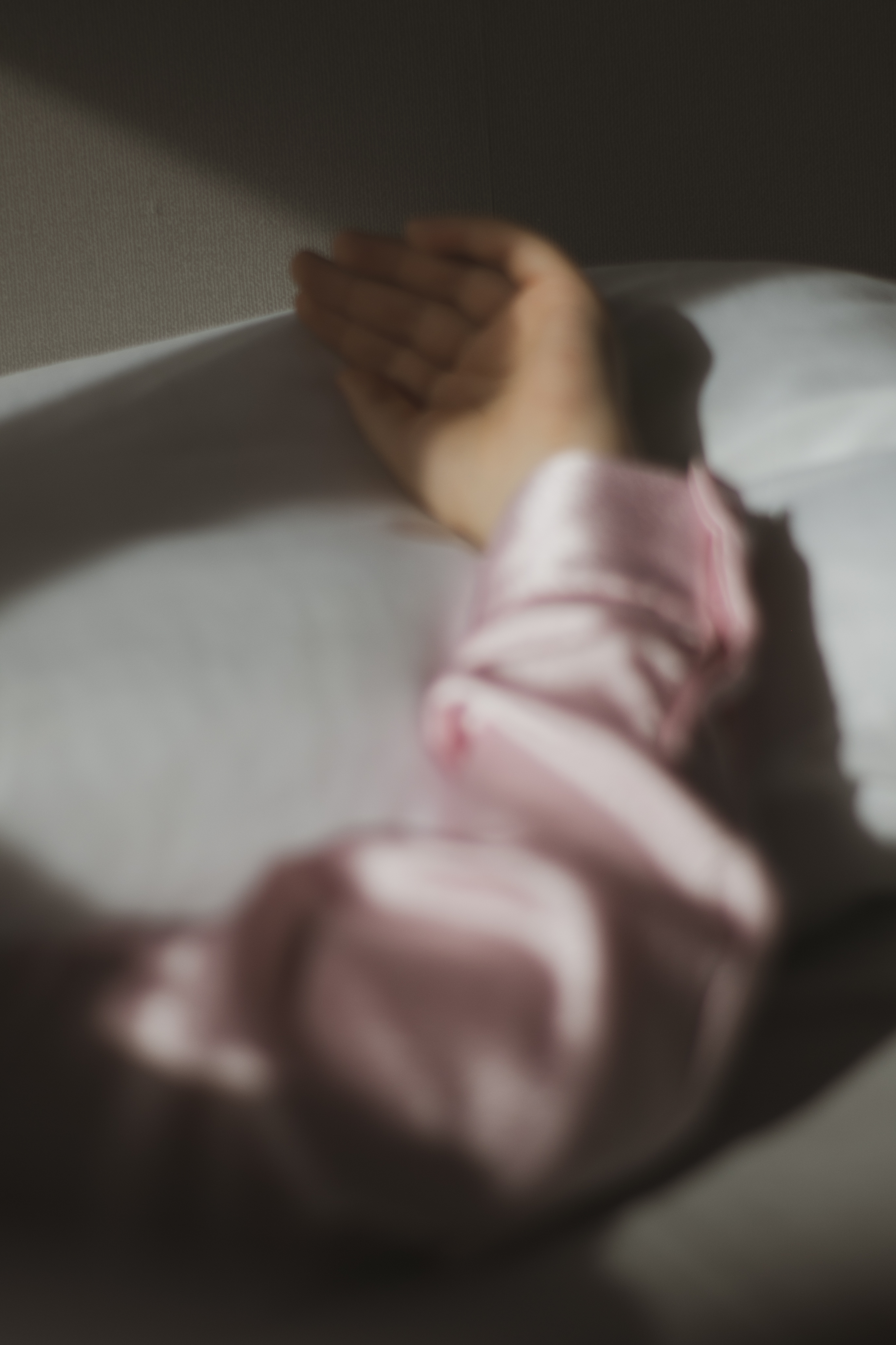
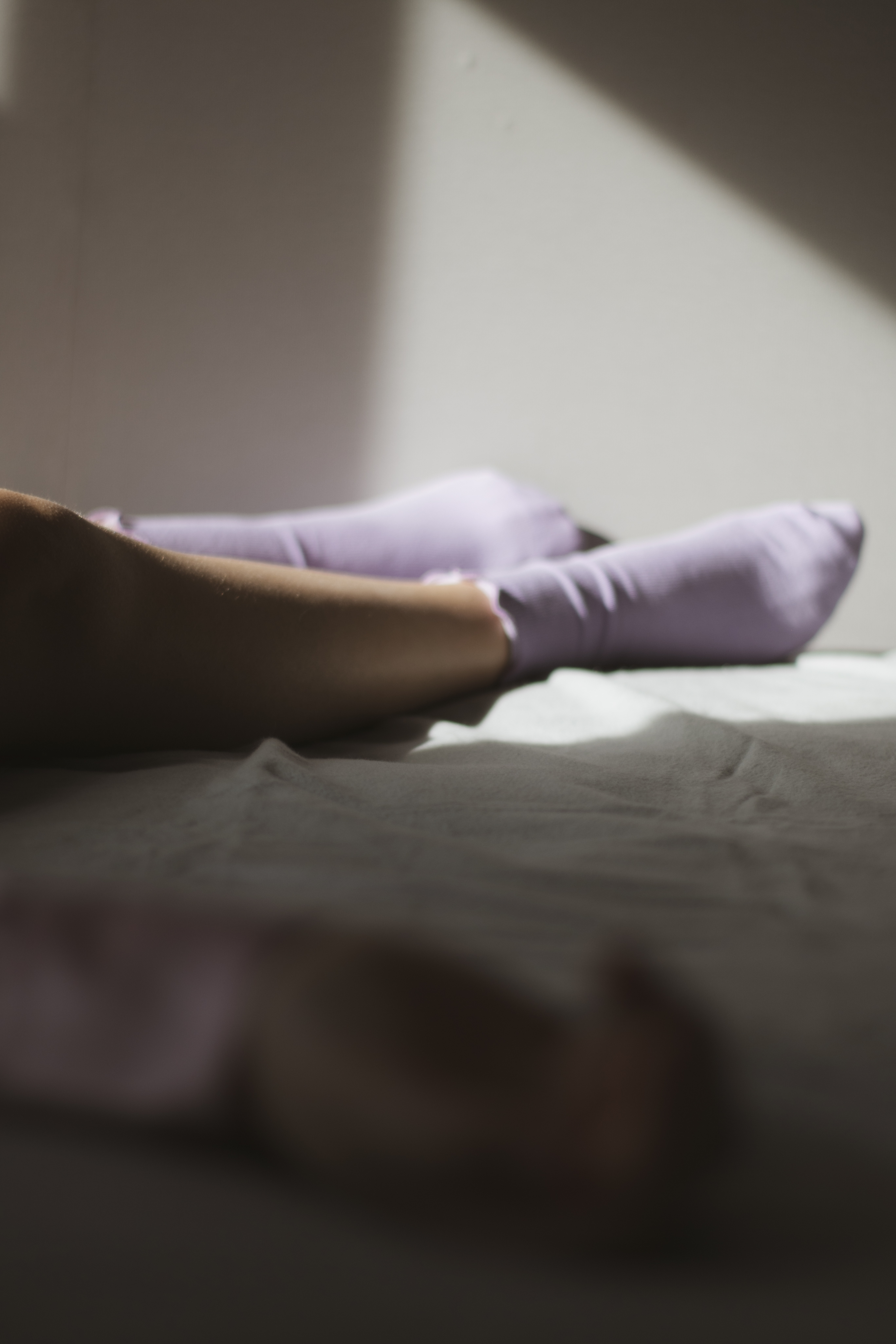
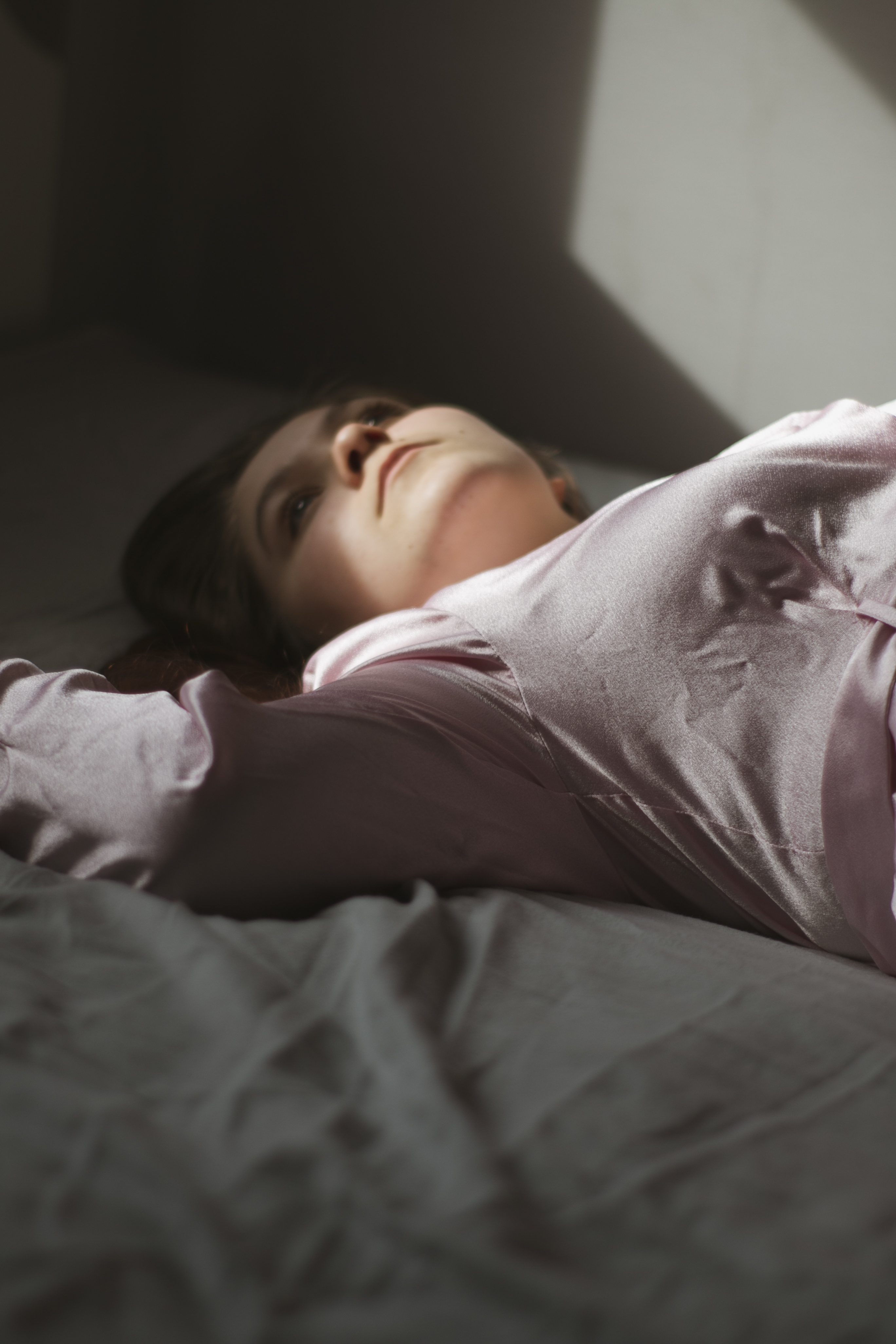
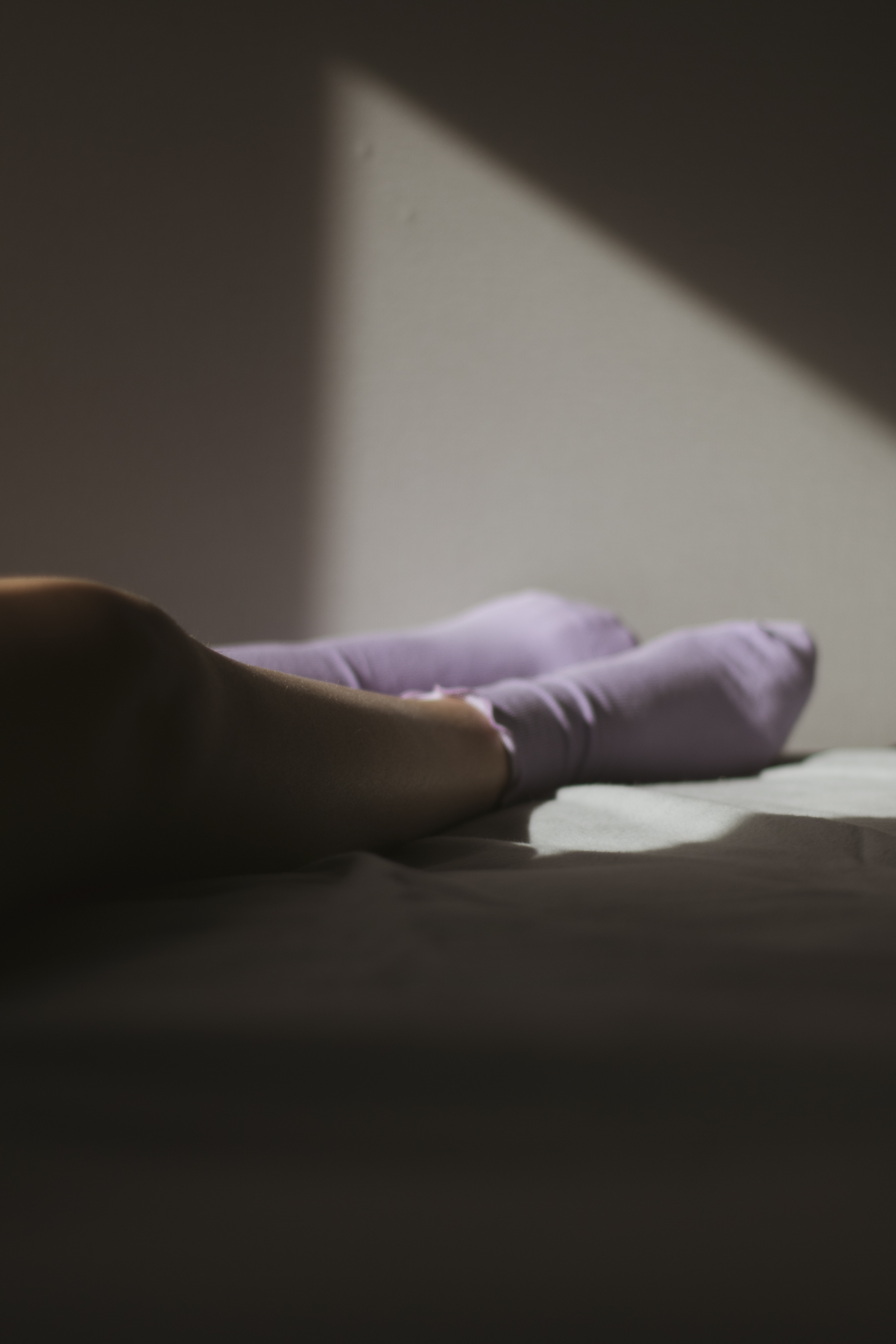
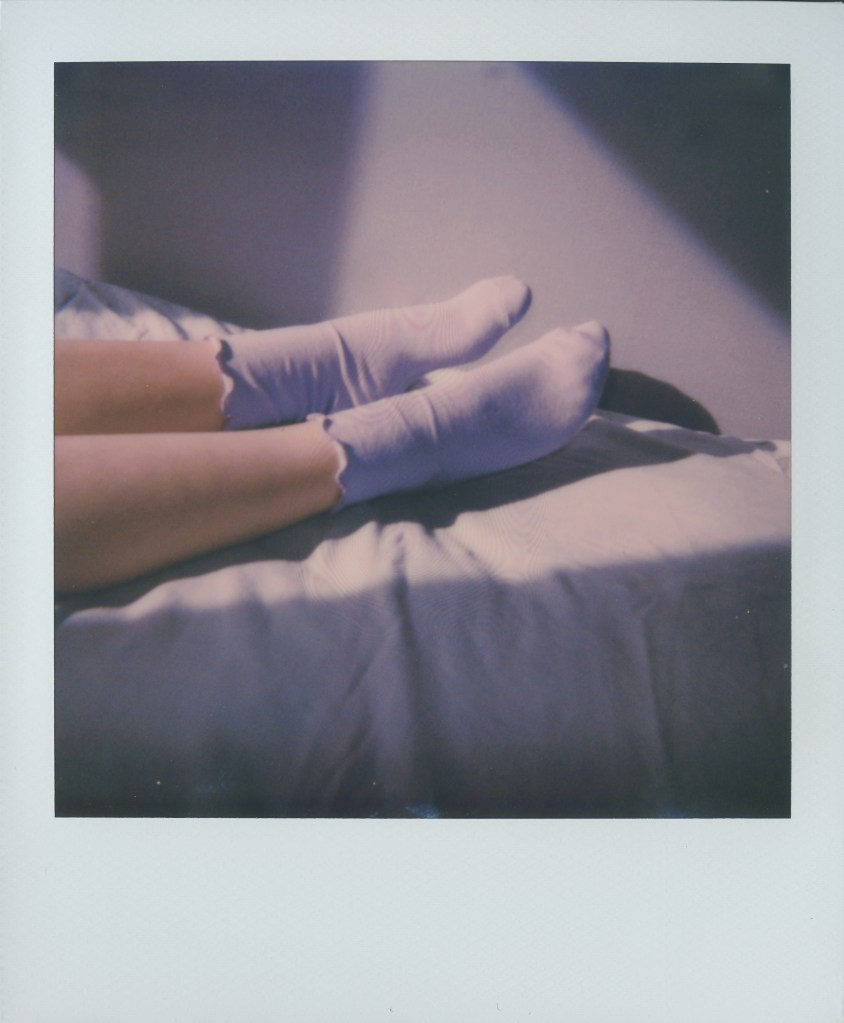
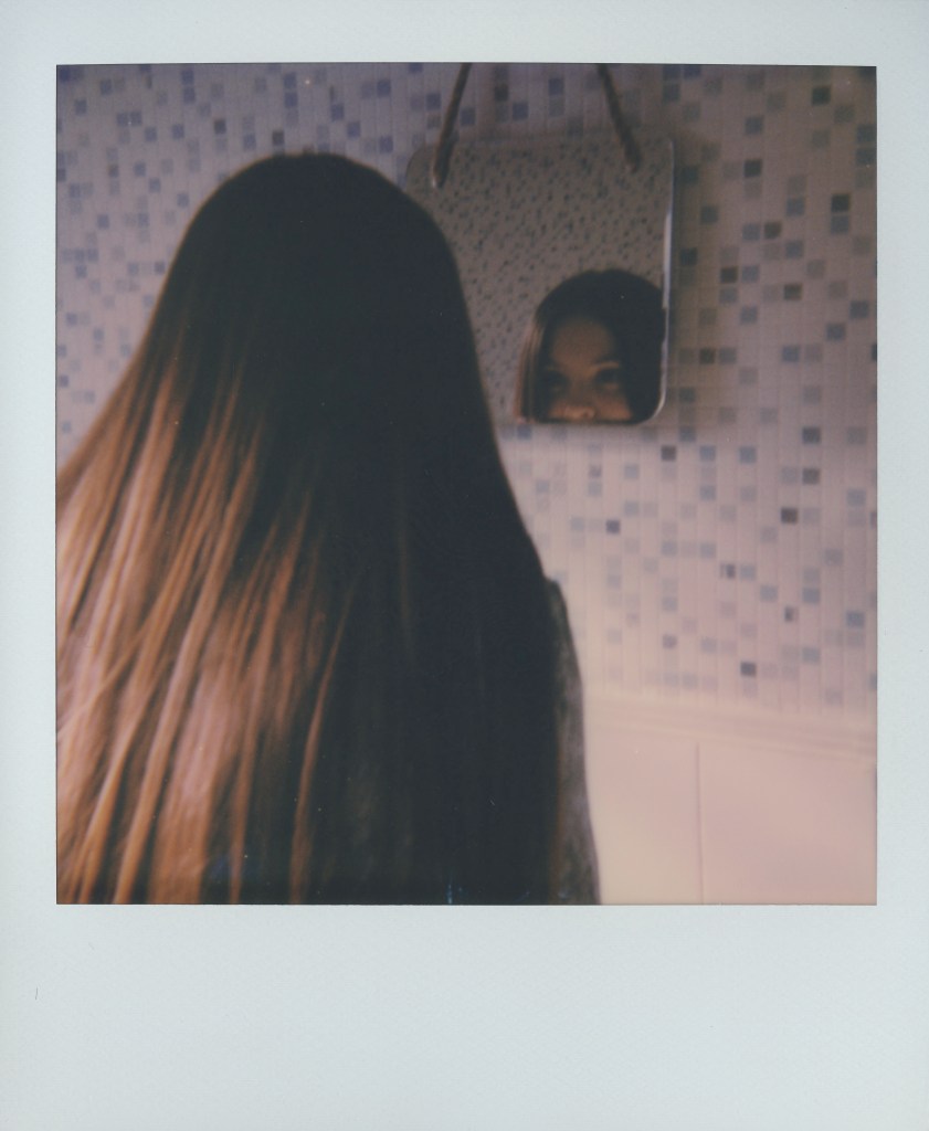
I knew I wanted to push myself and chose documentary fiction, but it was developing that idea. Even after researching, I had a couple of ideas, but I was not entirely sure for myself. So I later started to read short stories & poems and watch short films, to perhaps base my concept on, or to develop some ideas. This is how I got to my plan, I always like to shoot ‘things’ in my work in a simplistic way, and relating that to a poem I found was great. Because I based my concept off of the words loneliness, emptiness and isolation, this idea, along with the poem would be demonstrated through the various subject, differently, but all leading back to the poetry and words.

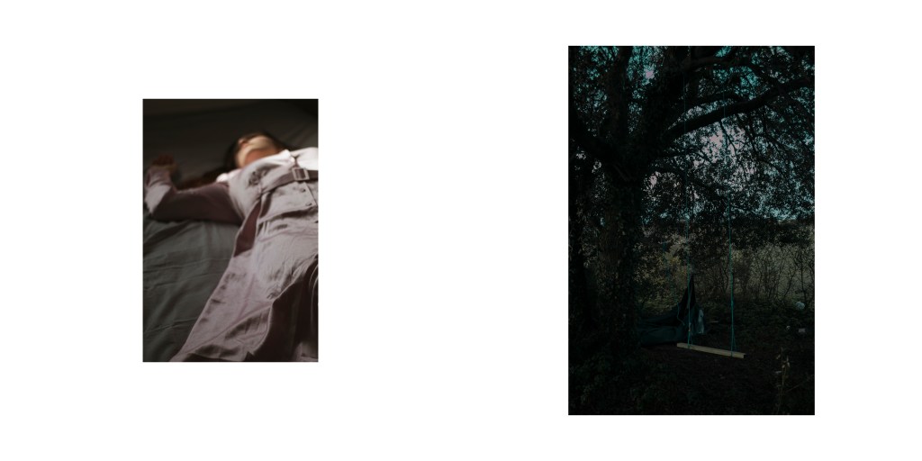
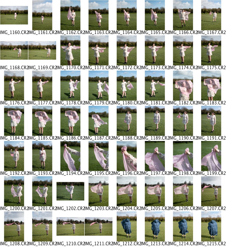
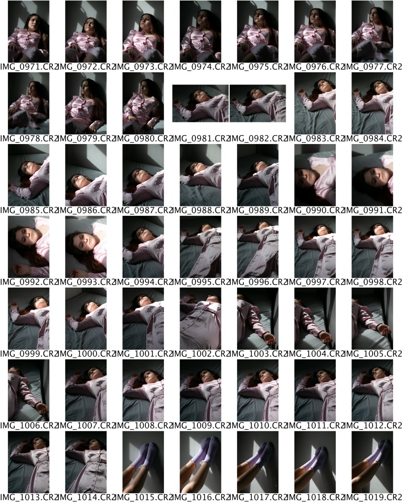
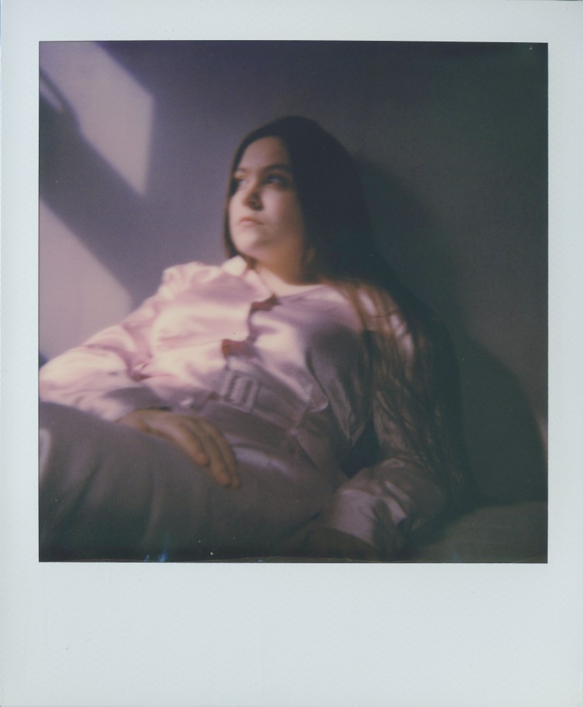
I believe through this process; I have improved my communication between me and my subject and the planning/production of the images. As I chose documentary fiction, I learnt that I had to think about every little detail. From the clothing, location, props, booking out equipment/subjects and also preparing for backups just in case. But this has taught me a different side of being a photographer, which has taught me valuable lesson/experiences.


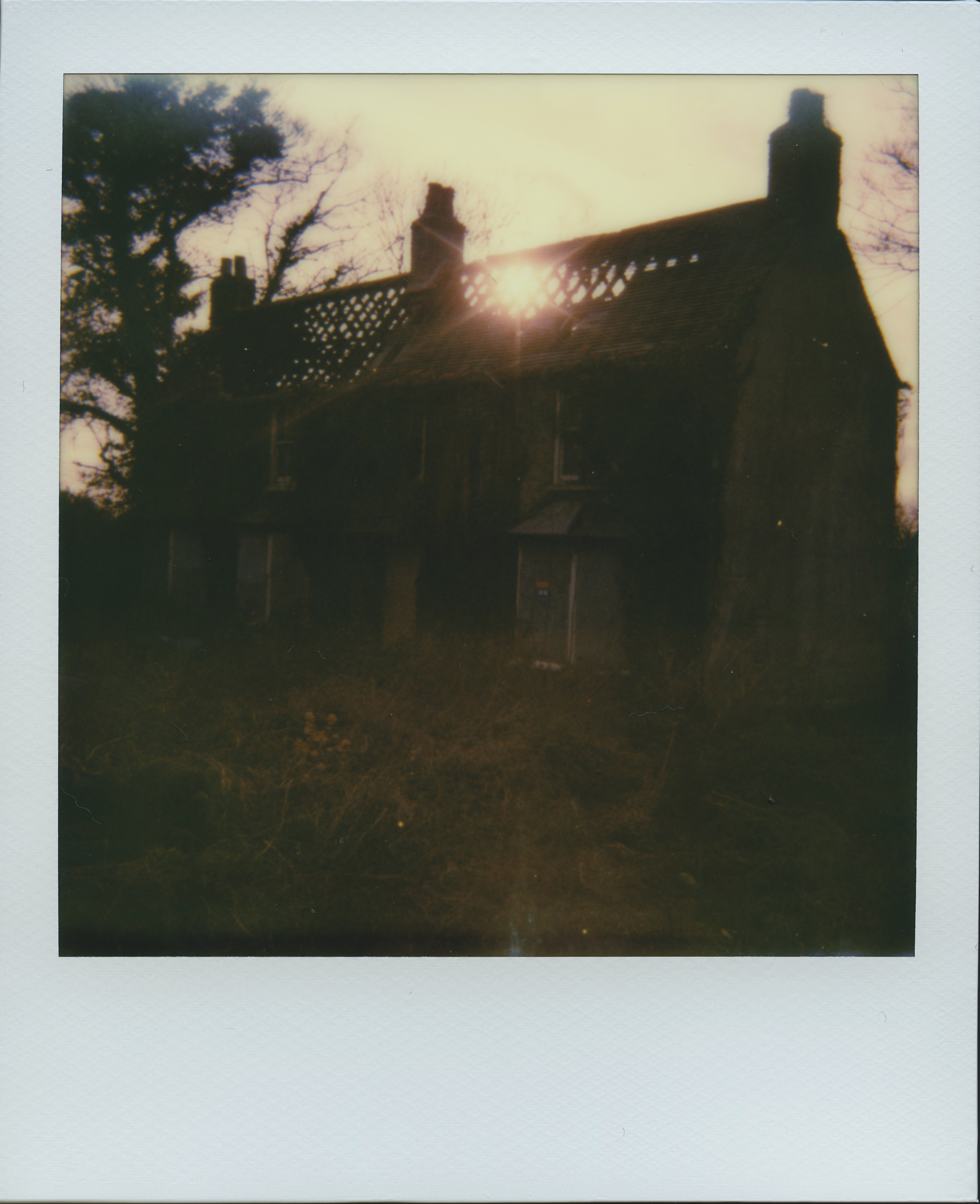
Some struggles with this unit were the British weather; I can expect this, at this time of year, but the constantly changing weather. Luckily the dark clouds in some of the images added to the moodiness of the photos. Another issue was a model quit the last minute, as I had the set and outfit ready. Luckily I had someone else to do it, and I feel that he was better suited for the image, but it was still stressful.


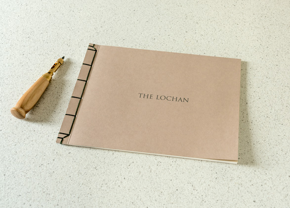
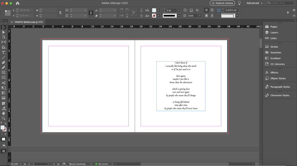
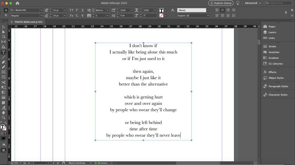
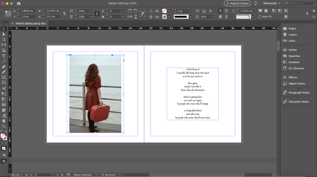
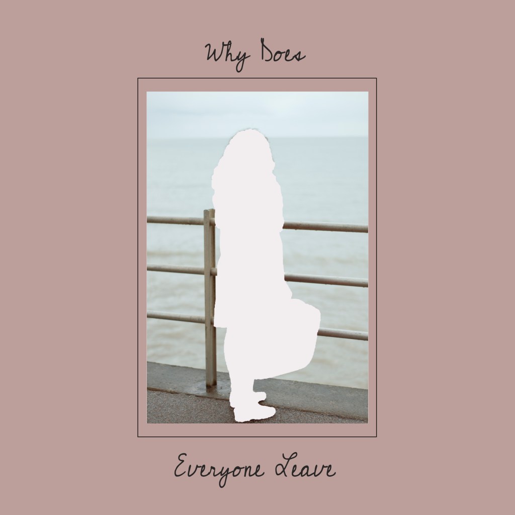
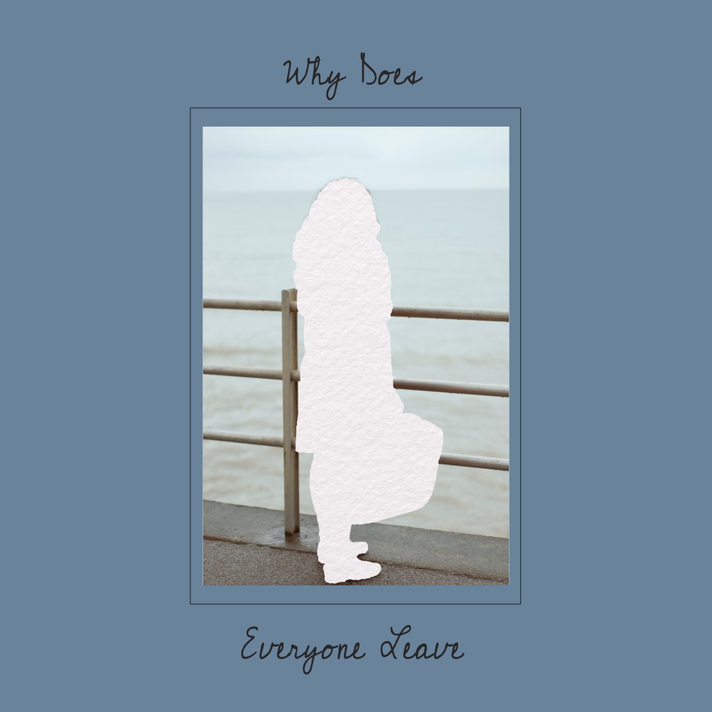
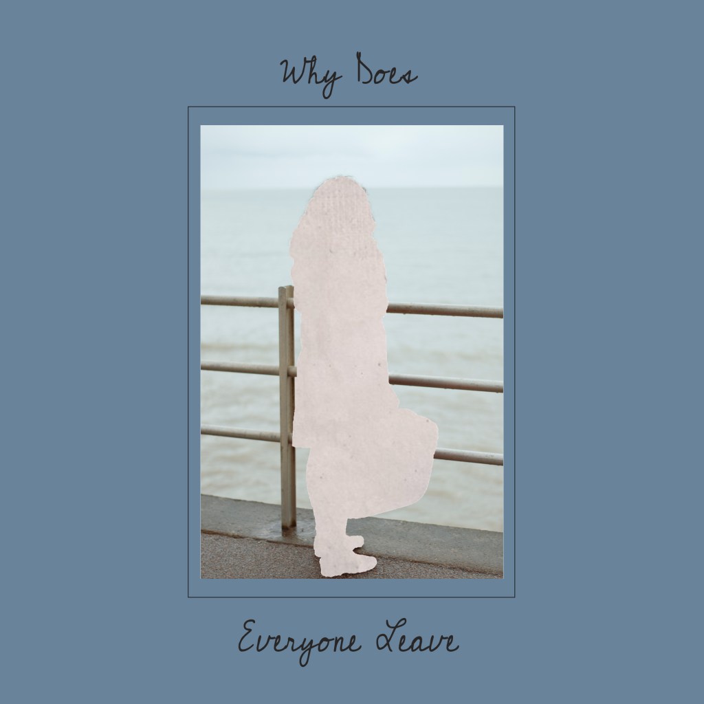
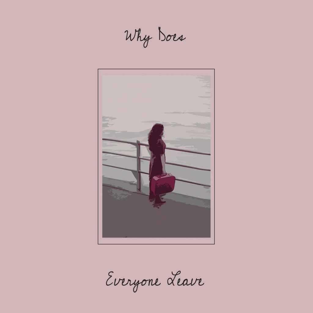
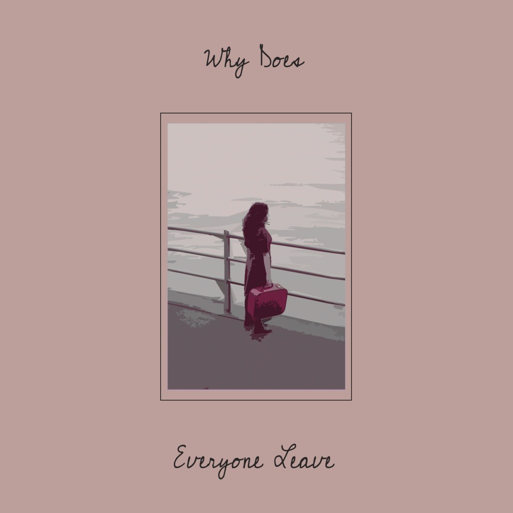
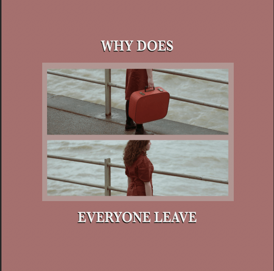
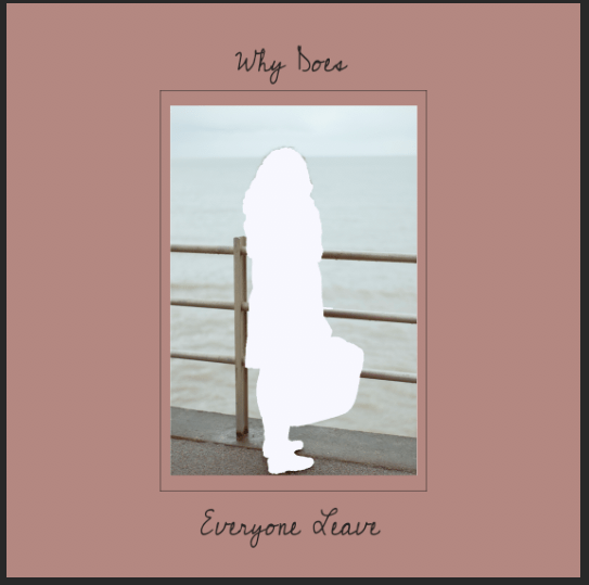
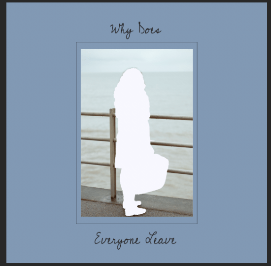
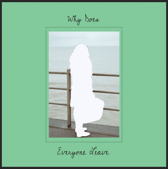
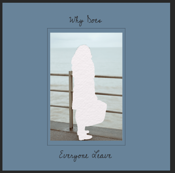
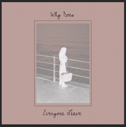
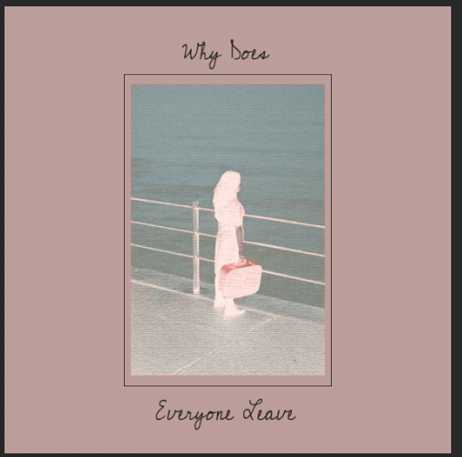
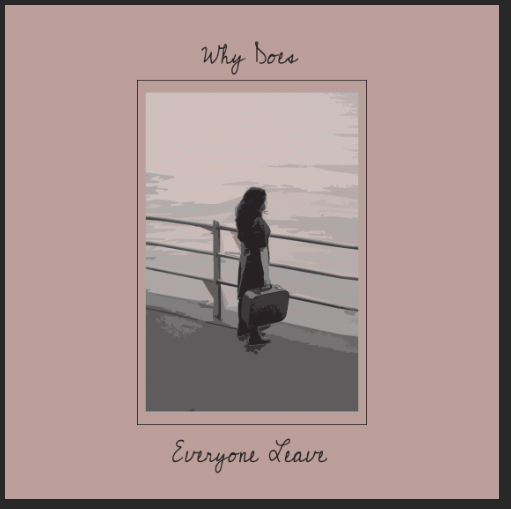
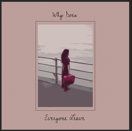
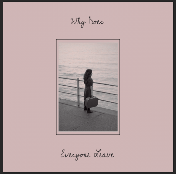
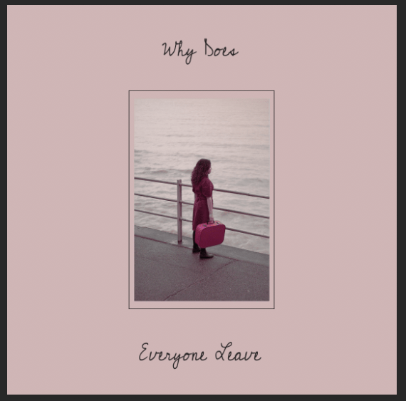
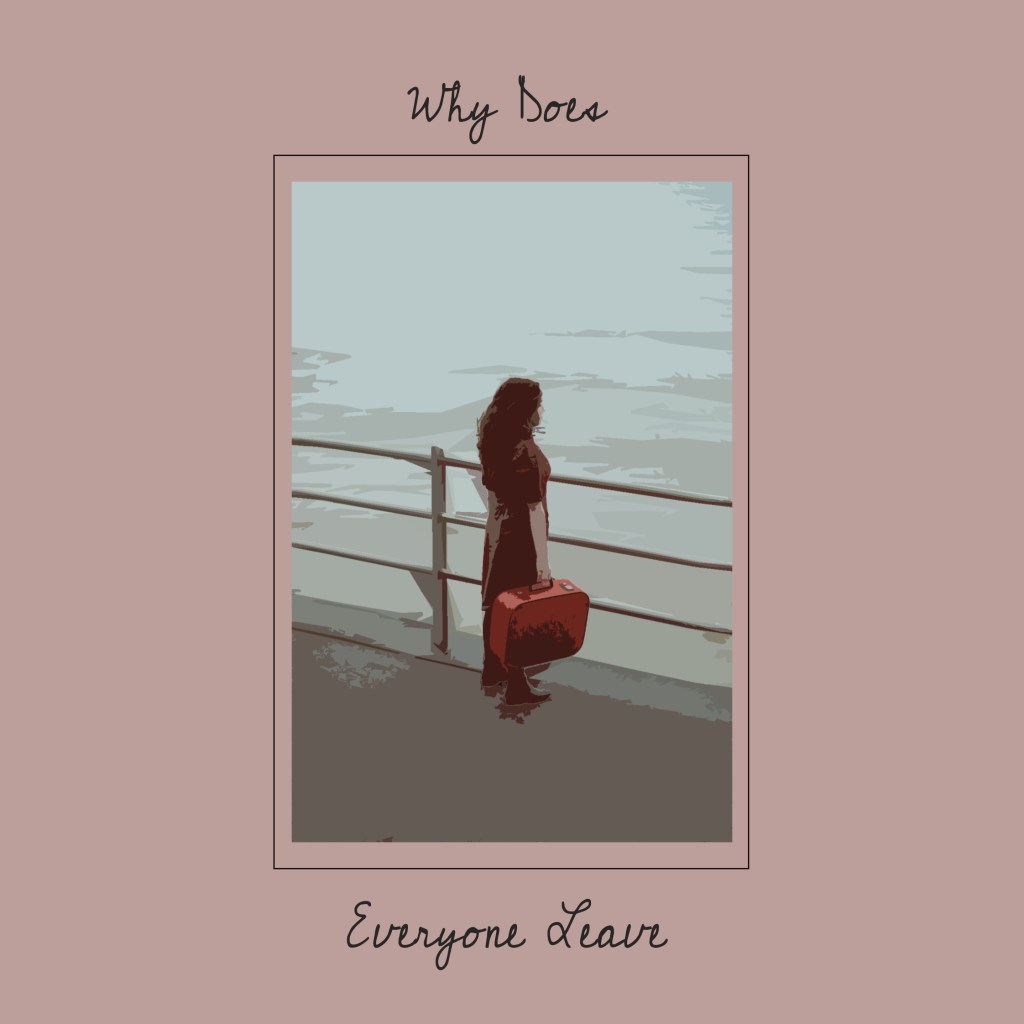
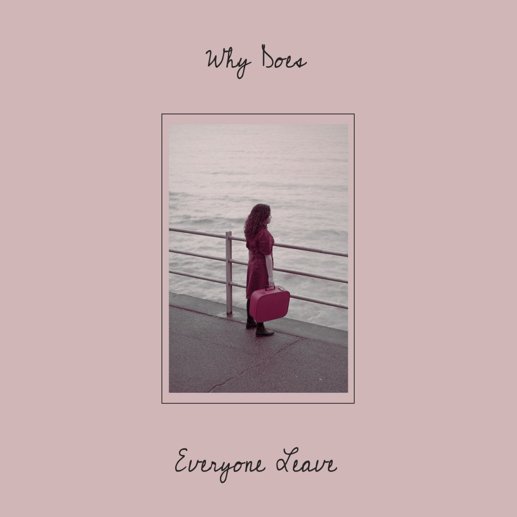
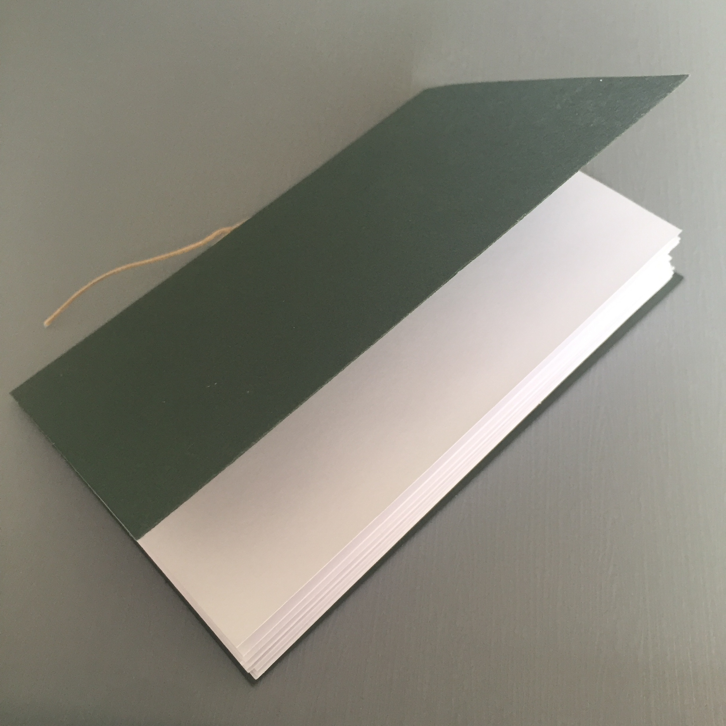
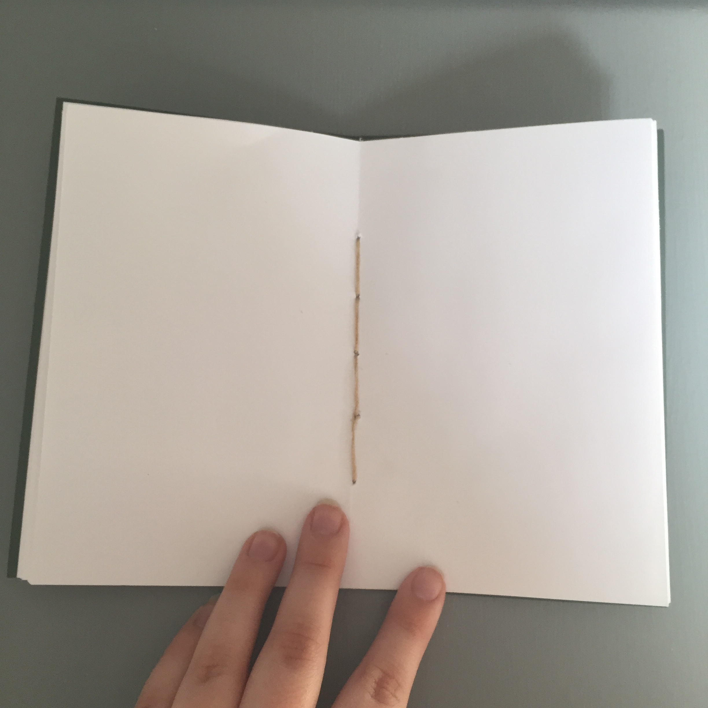
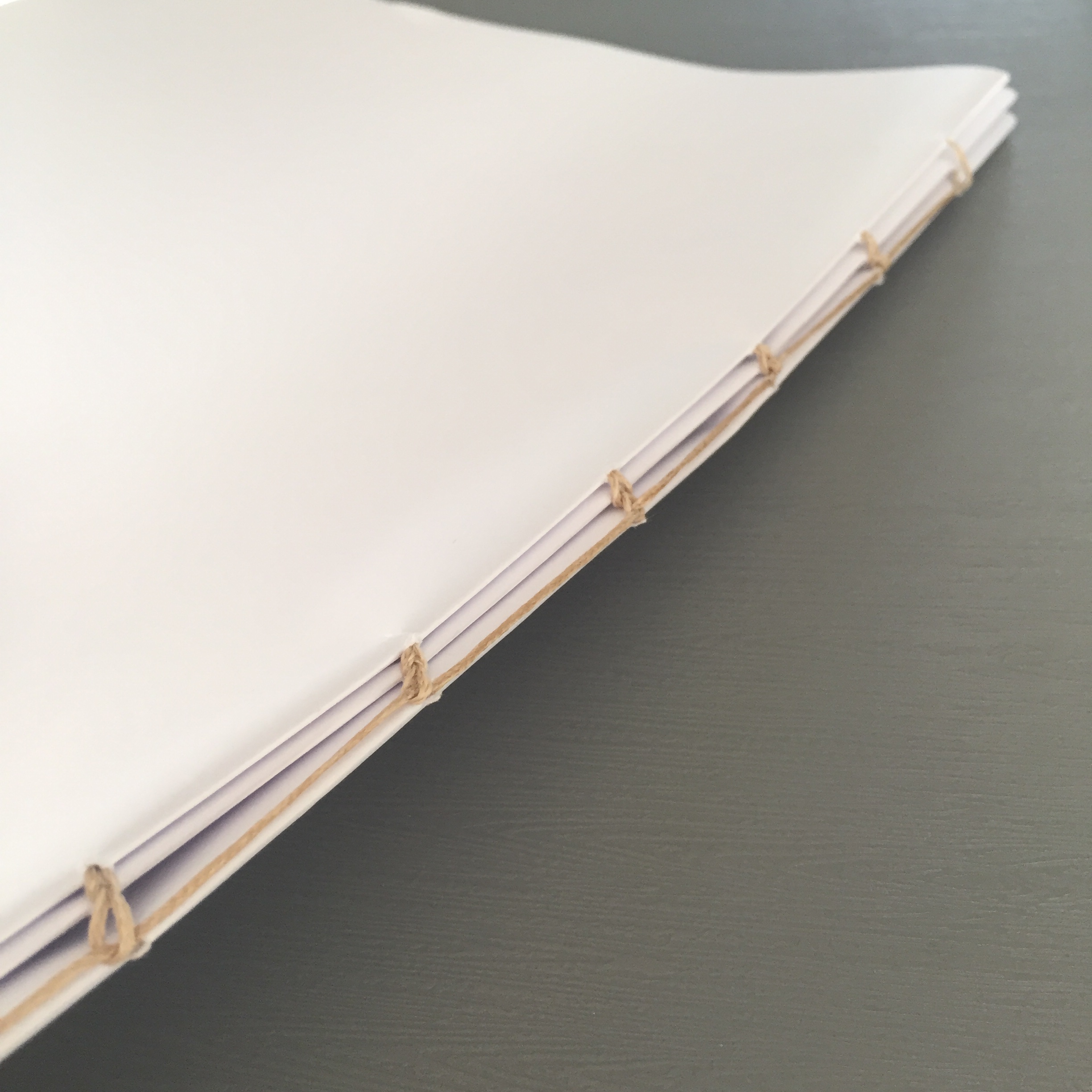
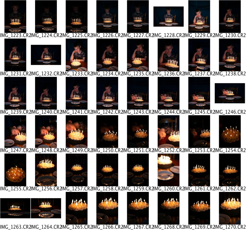
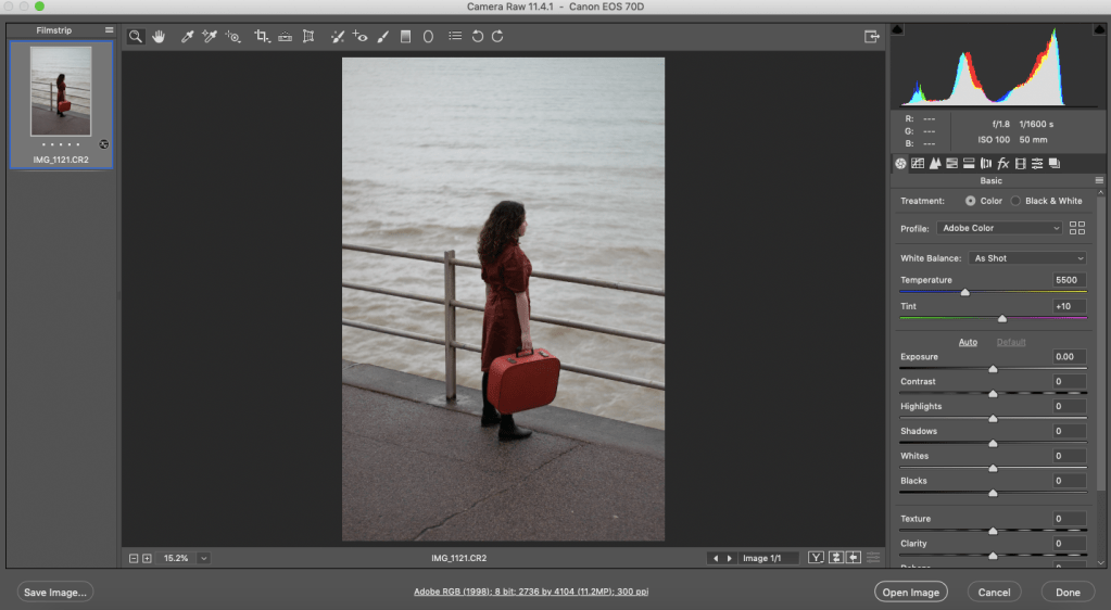
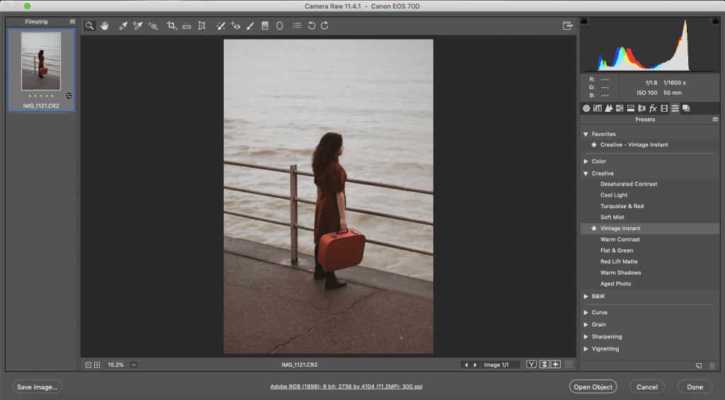
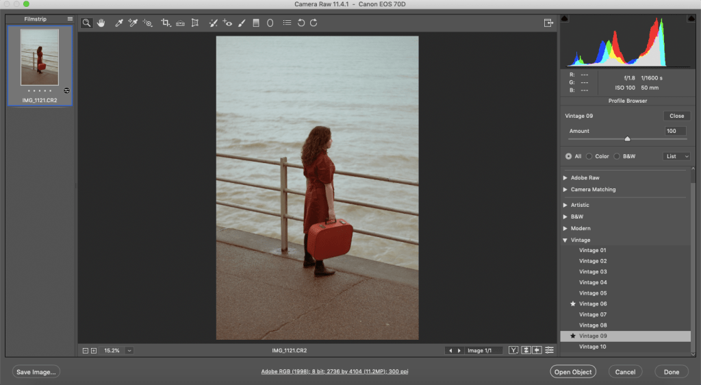
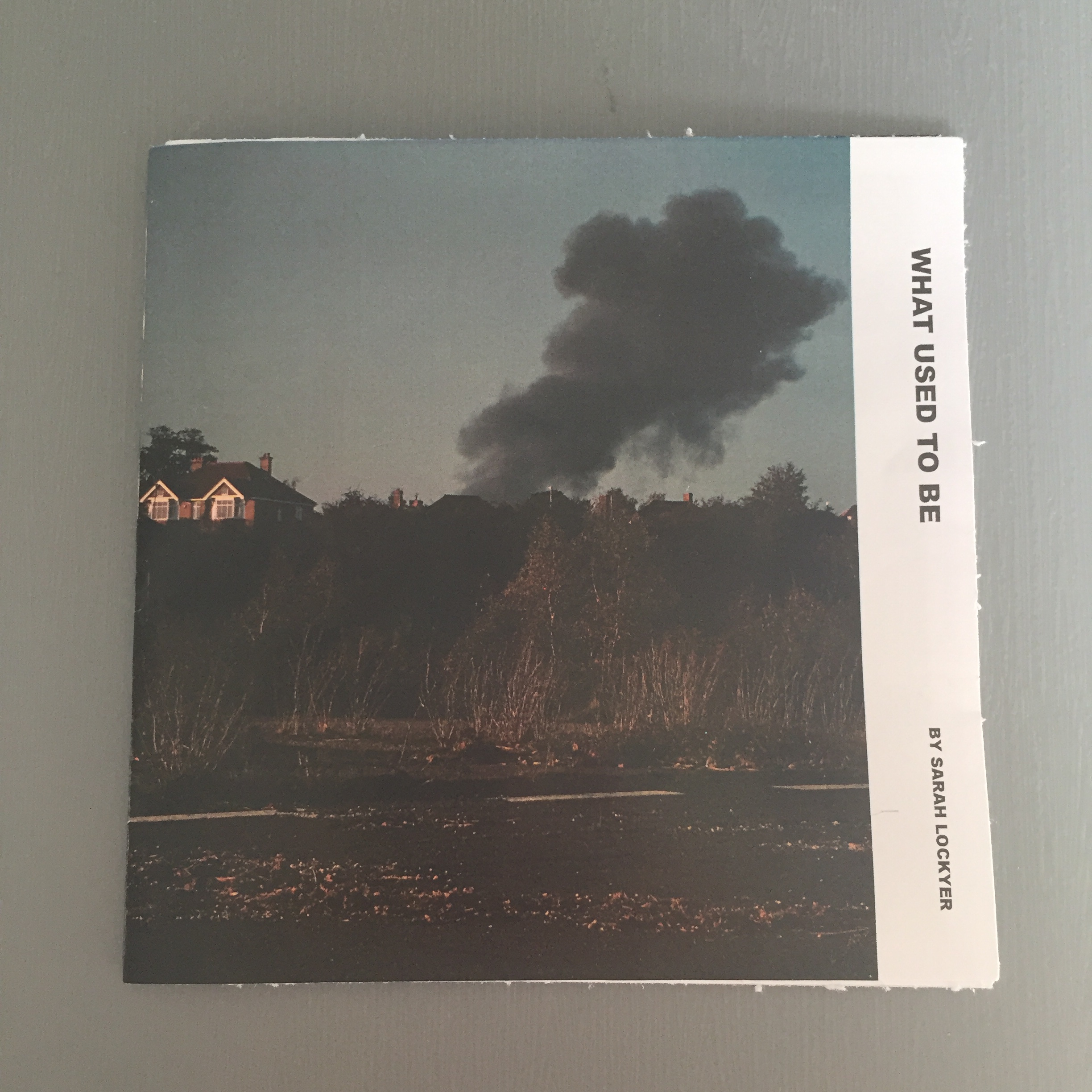
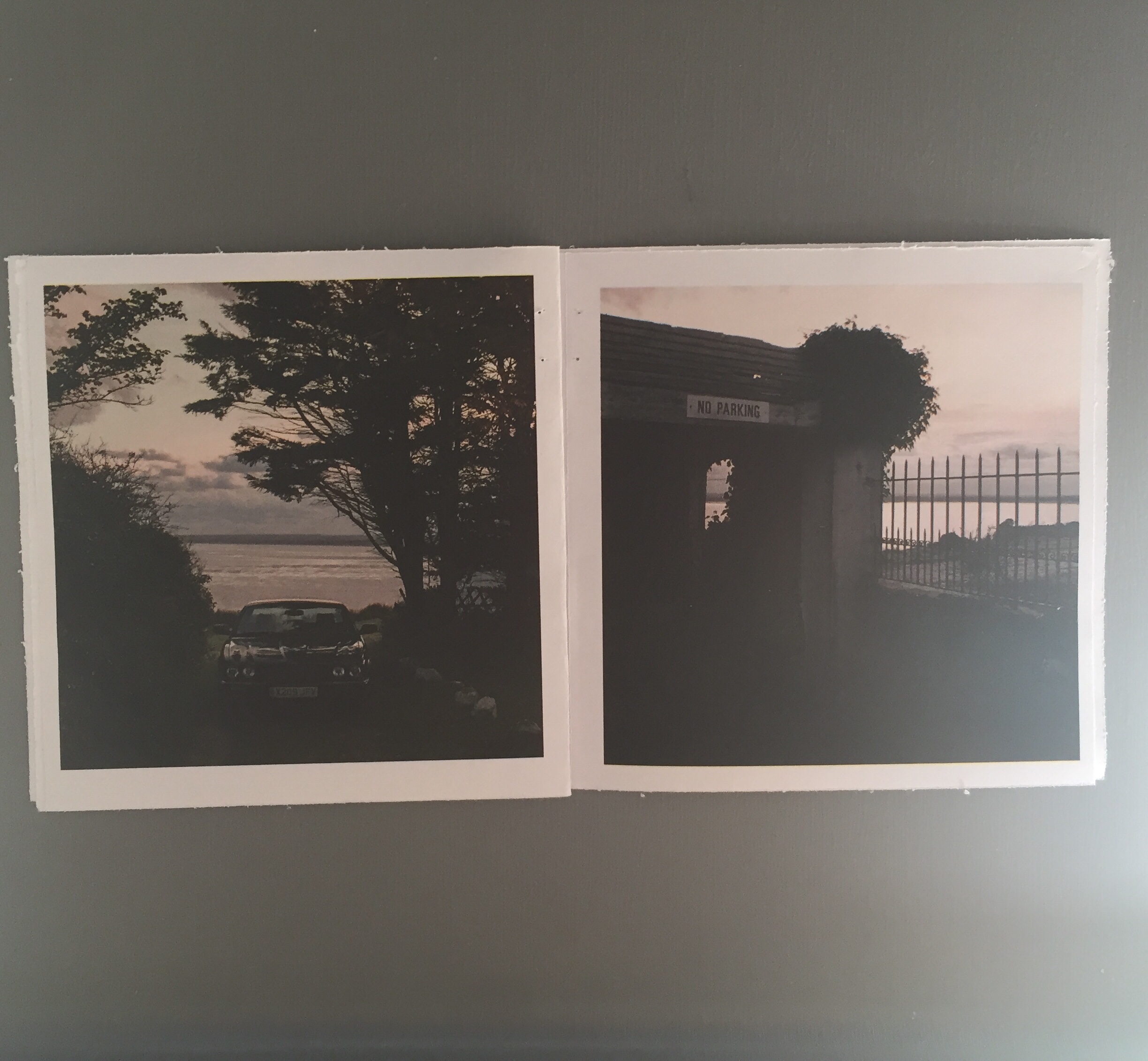
I went with SAAL Digital UK, to print my book with, as they were reasonably cheap for the quality standard. Throughout designing my book layout in InDesign, it took me days, sorting out which picture to put together etc. And thinking maybe I should have had done more shoots, however with the deadline nearing, I wanted to get this sent off, so I could have it back for hand in. I titled my book “Why Does Everyone Leave”, I wanted the title to depict all the different subjects within the book. When I received my book, I was thrilled with it, the printing was excellent quality, and for my first photo book, it wasn’t that bad.


Overall I am delighted with the outcome; I learnt new skills and this project expanded my ideas for the future. I enjoyed exploring new artist and techniques they used in their processes. Hopefully, the viewer can understand or interpret it to their understanding.

Below is the final outcome, in a Video format –

CREATING MY PHOTO BOOK

IMAGE MAKING, TEST SHOOTS

TEXT BLOCK

LAYOUT IDEAS & SIZES

There are many different ways to produce my photo book in various materials and sizes. This is why I’m looking into both handmade and company made. Comparing the differences as I need to make two books, in time for the hand in.

My images are both landscape, portrait and polaroid, so choosing the size of the book is essential. From looking at what different options I have, I’m going with a square format, in size 19x19cm or 28x28cm. Below you will see the difference between the two.

SCREENSHOTS
FINAL LAYOUT

Heres the final text block of my photo book, I wanted it to be clean and straightforward, but have a modern twist to the placement of the images etc. In the end, I went with the 19x19cm square format, I felt with going with the smaller option that it would make it more intimate and meaningful, which is what the book is about.


COVER

INSPIRATION FOR THE COVER

I want the cover to have a pop of colour, but be simplistic looking, to represent the book. Below is some inspiration for the cover.

DIFFERENT COVER MOCKUPS

Still thinking of the words loneliness, emptiness, etc., I wanted to incorporate that into the cover, thinking of ways I could potentially produce this in Photoshop. Below are many cover mockup attempts.

FINAL COVER

The colour I originally wanted it to be blue (as blue represents sadness, loneliness, etc.) but didn’t seem to like it, neither did my peers. In the end, after many different concepts, and with the help of feedback, I’m going with this design. The title is called “Why Does Everyone Leave”, as I have multiple models, I wanted the title to represent all of the images. Also wanting the typeface to almost look like someone just wrote that down.

I’m going to print with SAAL Digital UK, as all the books are excellent quality, all lay flat, and the prices are affordable. I wanted to make my still, so I might also have an attempt at that, and see how the book comes back.

SHOOT 5

IMAGE MAKING, TEST SHOOTS

PLAN

In the series I’m doing, even though all the different shoot has the same theme, they are different. So I wanted to photograph empty/abandon landscape, to space out the shoots in the photo book.

LOCATION

  • 1st – Beach
  • 2nd – Nature reserve
  • 3rd – Abandon house

EQUIPMENT

  • Canon 70D body
  • 50mm lens
  • 18-55mm lens
  • Polaroid camera/film

CONTACT SHEET

RESULTS

BOOK MAKING WORKSHOP WITH RIKARD OSTERLUND

IMAGE MAKING, TEST SHOOTS

WHAT DID WE DO

We had a workshop in book making, and had a guest lecturer Rikard Osterlund show us different was todo this and how. We learnt about signatures, different stitches etc.

WHAT WE USED

These were the tools we used, and Rikard gave use instructions about the sewing, that he made himself. We first made a small book with a cover, then next we made a bigger version, with more signatures. The results are below –

RESULTS

SHOOT 4

IMAGE MAKING, TEST SHOOTS

PLAN

My other shoots have been constructed as in location, clothing, but for shoot 3, I want to set the scene. The plan is to create an empty, lonely birthday table. The subject is going to be sitting alone in the dark, staring at the cake with the candles still lit. With empty plates surrounding the table. Below is some inspiration for this shoot –

EQUIPMENT

  • Canon 70D Body
  • 50mm lens
  • Reflector
  • Polaroid camera/film
  • Model (Owen)
  • Table
  • Table cloth?
  • Empty plates, glasses & cutlery
  • Cake
  • Candles
  • Background stand
  • Blue/Navy background fabric

CONTACT SHEET

RESULTS

RESULTS OF POLAROID

SHOOT 3

IMAGE MAKING, TEST SHOOTS

PLAN

For shoot 3, I wanted to do something a bit different. I’m not sure if it will work at all, but I feel it will be abstract. However, it will fit in with the theme. I’m planning to used different fabric and getting the model to pose/use the materials in various ways to disguise/hide.

LOCATION

Initially, I wanted to go to the beach; however, as I took some with my other model in shoot 2, I thought it would look too the same. So I decided to go to a location where it is windy and open. This is going to be in a field, there a couple of local areas around, but I think the one I have chosen will be the best option.

EQUIPMENT

  • Canon 70D body
  • 50mm lens
  • 18-55mm lens
  • Polaroid camera/film
  • Model (Ruby)
  • Frilled Dress
  • Material (Pink sheer & Navy blue)

CONTACT SHEET

RESULTS

RESULTS OF POLAROIDS

The shoot was a lot harder than I thought; the wind went in different directions, which made the timing/angles of the material hard to take. The weather was constantly changing, which made the condition harder, as well. When positioning the model and the fabric to how I wanted it, the wind moved it straight away, so I had to be quick enough and have communications between the model and me. The blue fabric happen by accident, I let go of it and few into her face, almost like the scene in movies when the newspaper lands in someones face. So I place it in position, and this is how it turned out.

WHY I PICKED THE BLUE FABRIC

The colour blue can represent loneliness, sadness, etc. Thats why I wanted to incorporate the colour mood into my work, for the viewer to interpret, thats why I chose the blue fabric!

SHOOT 2

IMAGE MAKING, TEST SHOOTS

PLAN

In shoot 2, i’m using my second female model on a location, with props. The idea for one image is for the model look likes she is lost/escaping. Hence the suitcase, in a isolated/empty area.

LOCATION

The location of shoot 2 is going to be around the Ramsgate port tunnel and sands. If safe, shooting inside the tunnel, as well as the beach/sea area.

EQUIPMENT

  • Canon 70D Body
  • 50mm lens
  • 18-55mm lens
  • Polaroid camera/film
  • Vintage suitcase
  • Black shoes
  • Red/orange dress
  • Model – (Leia)

CONTACT SHEET

SCREENSHOTS

RESULTS

RESULTS OF POLAROID

This shoot had a lot of change of plans; however, it worked out for the better in the end. The model, outfit and accessories were ready and prepared. But the weather was not on my side. Neither was the location, I originally wanted to go to. Anyhow, I made do with what I had and went to a couple other places and ideas. And I think it worked out a lot better than I intended.

The tunnel images were hard to get. I used my 50mm lens, so I could get a lower aperture, but still, because of the darkness, I had to turn up my ISO. I couldn’t turn it up too high because of the noise, so my shutter speed was low. That’s why the tunnel images are slightly blurred and not sharp. On the other hand, I feel that it adds to the realness of the scene, almost like the subject walk past you in real life.

With the sea images, I experimented with different angles and heights, trying to make the most of each shot. Again I feel that the outfit, model, suitcase, and location all came together nicely, and will go well with the other previous images.

SHOOT 1

IMAGE MAKING, TEST SHOOTS

PLAN

For shoot 1 I want to kill two birds with one stone, I will be doing the lying down on the bed image, the arm/feet close up & the bathroom mirror scene. For this shoot I want to use digital camera, but also a polaroid camera, and see how they turn out.

LOCATION

For shoot 1, i’m doing several images within one day of shoot. Luckily all the locations I can do within my home, so my bed/wall, and the bathroom.

EQUIPMENT

As i’m constructing these images need to prepare outfits, location, lighting etc. Heres a list below of what i’m using for the shoot –

  • Canon 70D
  • 50mm lens
  • Pink dress
  • Lilac socks
  • Green pattern dress
  • Standard lens
  • Model – (Ruby)
  • Bed/Pillows
  • Polaroid camera/film

CONTACT SHEET

SCREENSHOTS

RESULTS

RESULTS OF POLAROIDS

I’m genuinely pleased with how these images came out, initially, I wanted to block the natural light with boards to create this shadow effect. However, by picking a sunny day, the hard light created these patterns through the windows naturally. Which I feel adds depth to the images, making them more visually exciting.

The bathroom images turn out really well. It gave a cinematic feel to it and was exactly what I was going for. I wish I could have got more shots, (in the bathroom images), however because of the very little space, that was the best I could do. The outfit really complements and fits with the subject and themes well, as long with the model emotions and placement. Overall I want to carry on producing images that go with these, however, has the same style of the cinematic bathroom ones.