For this project, I have to produce four final images of the theme environment. After choosing the location Pegwell Bay Nature Reserve, I knew the concept of what my final four images were going to be. But I wanted to produce the four, so they link together and create a story. Before I chose Pegwell Bay as a location, I got feedback from a group critic, which help me shape my journey and choices through the project.
GROUP CRITIC – WHAT DID I SHOW?
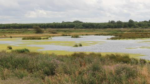
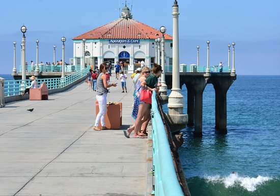
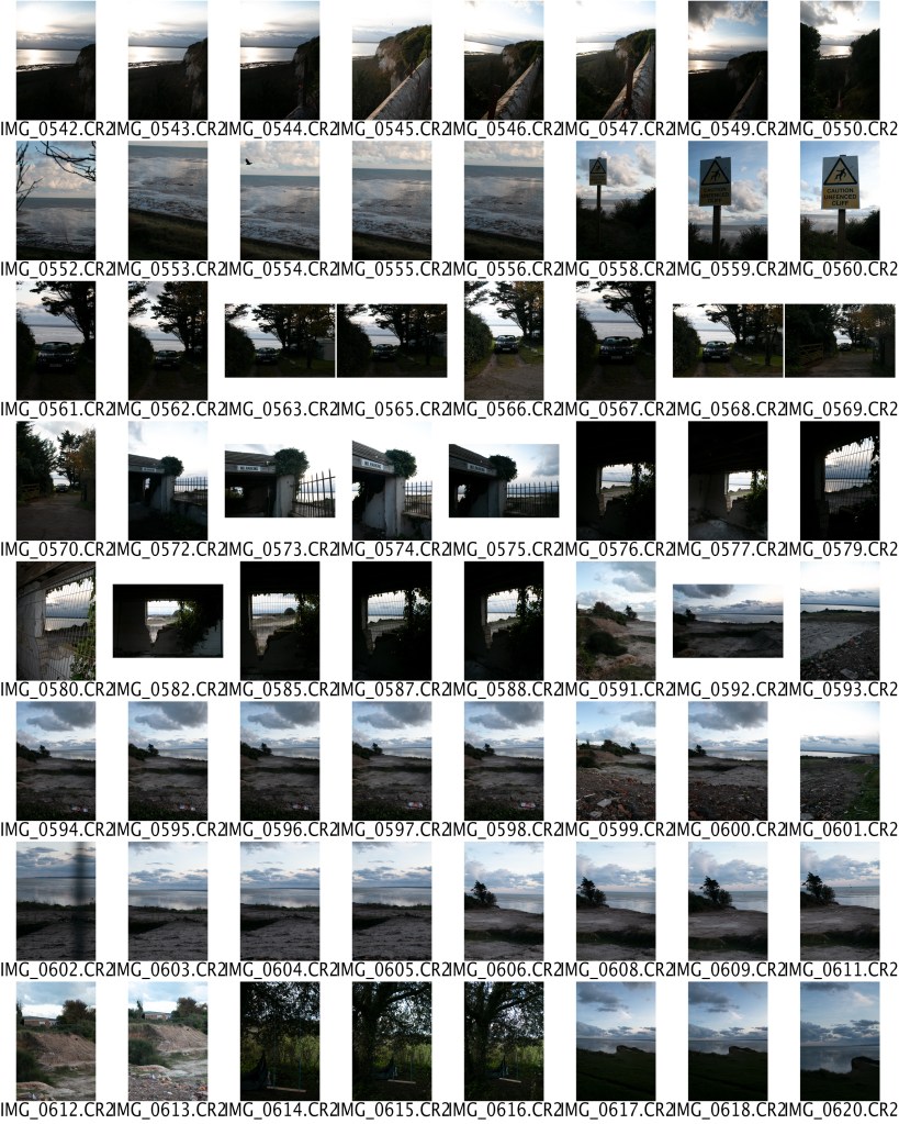
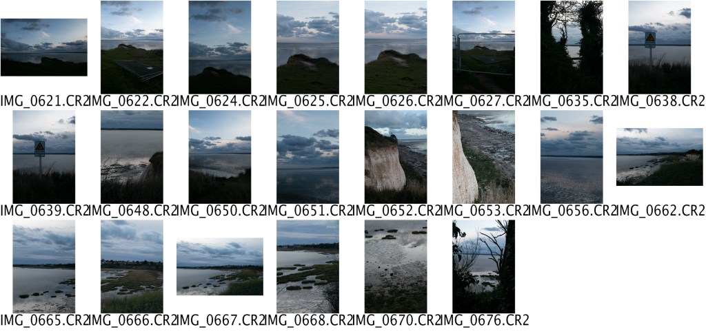
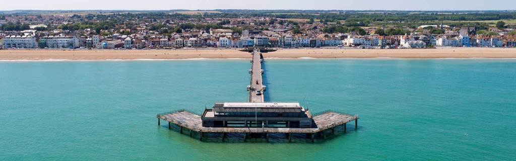
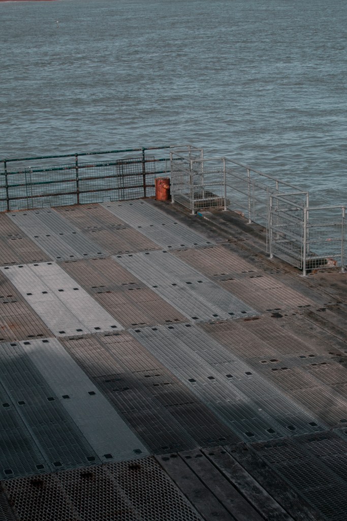
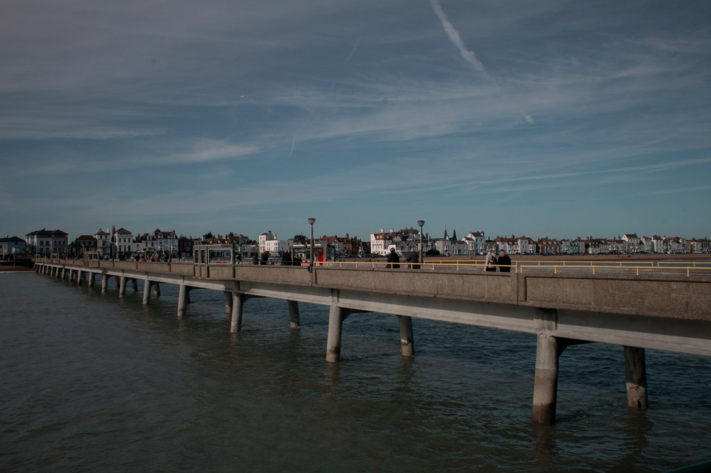
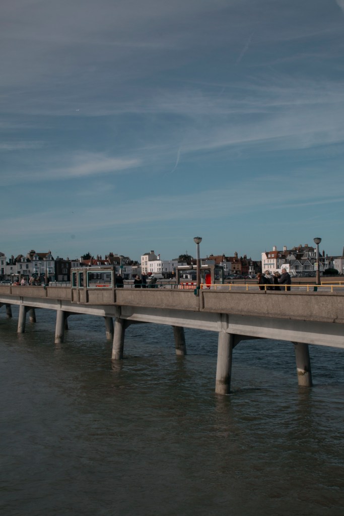
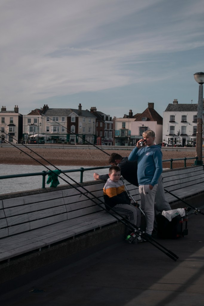
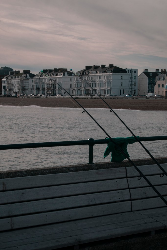
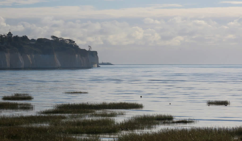
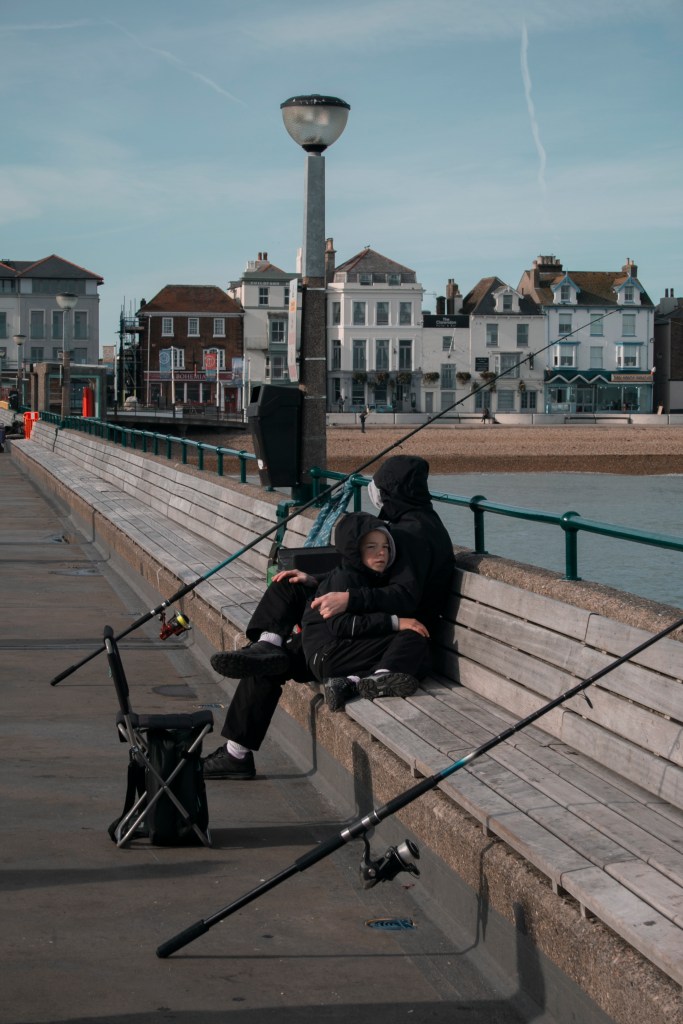
During the class crit, I took the opportunity to show my work and get a response/feedback. I showed photos from the two previous shoots (Shoot 1&2) – Pegwell Bay Nature Reserve and Deal pier. Even though these two shoot locations are very different, they sort of match because of the relation between the sea. The styles I took the images were changed as well, the Deal shoot was more street, and the Pegwell was very landscape. Even though I won’t be able to use these images together to create my four final photos, I wanted to do this shoot to find out what location and style I wanted to do and to see what the audience is leading more towards.
GROUP CRITIC – POSITIVES
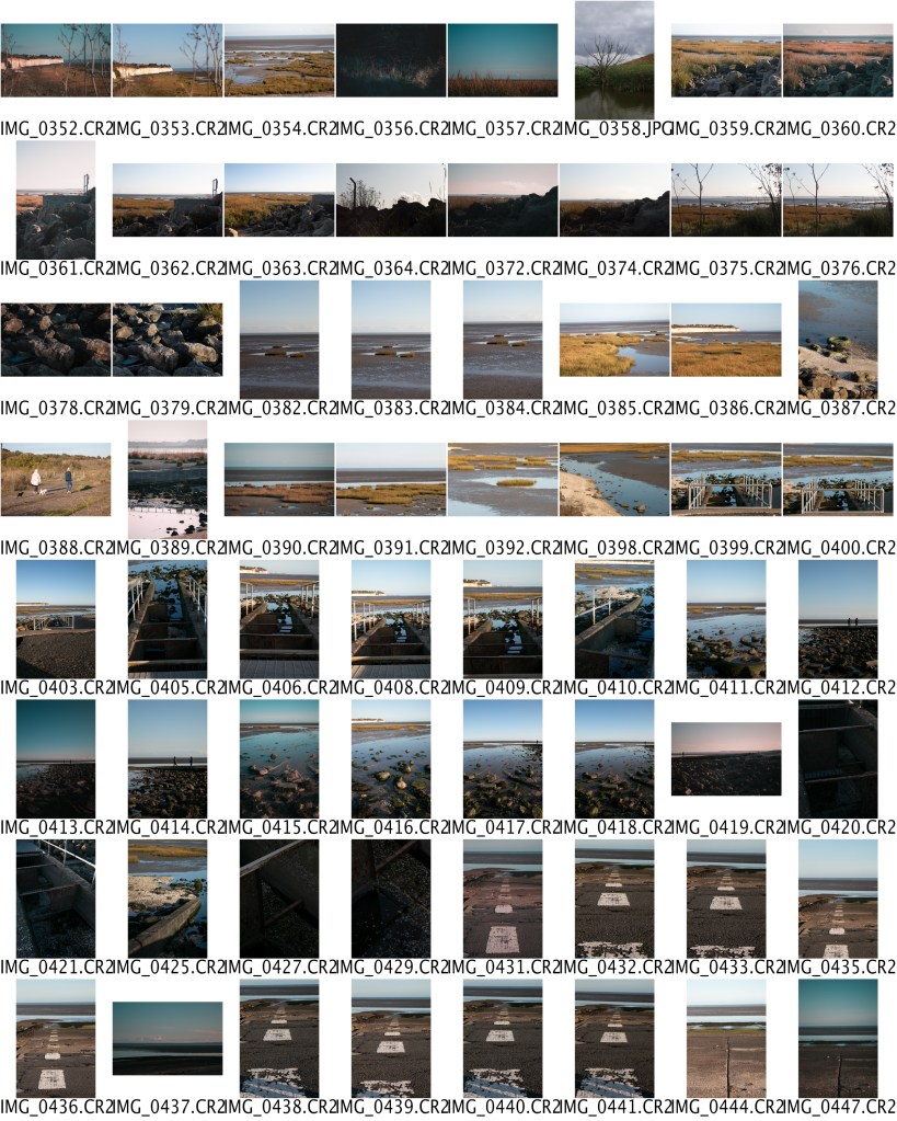
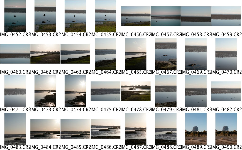
Overall I had an excellent response, saying that I have an eye for the vertical images, and looking for shapes, lines etc. As I had quite a lot to show, as a combined pile of the two shoots, the students raise their hand to in which images they like. Here are some of the most liked photos –


GROUP CRITIC – FEEDBACK
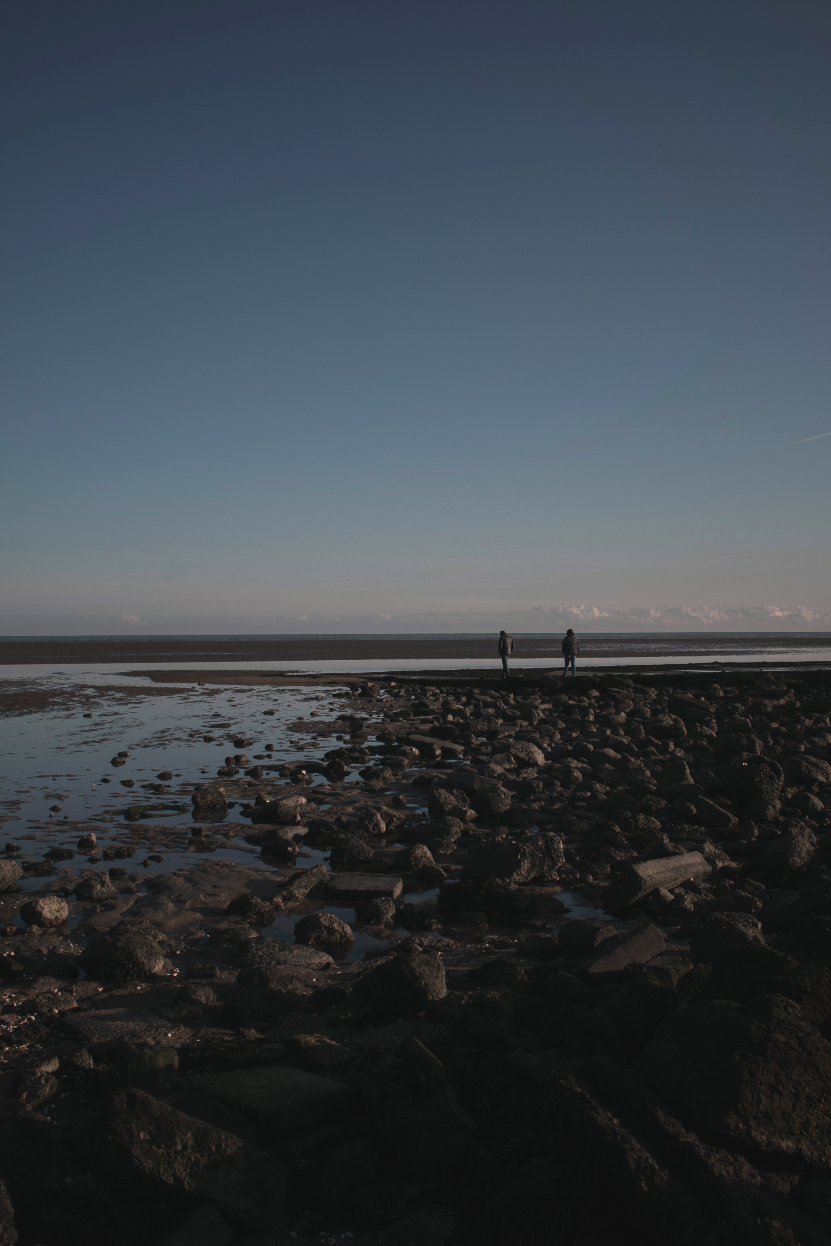
Overall I could have potential images above, but the group mention that I need to stick to one area. Ethier that being Deal or Pegwell Bay. As they dont really match each other. I wanted to go to two different locations, one of the people and one that does not, in a landscape theme. I wanted to see what differences I would get and how would they turn out. They both have strong images, but I think there is more potential in the Pegwell Bay area. Also, by the reactions of my peers, they seemed to like the Pegwell Bay images more.
They also mention that I seem to take better portrait images, down to the framing and etc. So maybe focus more on that for further shoots and making them blend together for the final four images.
GROUP CRITIC – WHAT AM I GOING TO DO NEXT?
As I didn’t get many images from the Deal Pier location, I would like to go again at the same time of day and weather conditions. Focusing on the people, as it was a significant favourite for some people. But also go and do another shoot at Pegwell, as I didn’t explore the whole nature reserve and know there is more to photograph. See which ones turn out better, and round down each location to four images, and ask fellow peers which one they prefer.
Again as I mentioned before I would want to go on a day close to the previous shoots (weather), so I can mix the two shoot together if I need to. I think these shoots are an excellent start to the theme environment, and by doing two locations + receiving feedback has made my mind clearer in the direction to go in. But as the two shoots dont really match up, I can’t use both together. So I would have to choose to go down one location.
PICKING POTENTIAL FINAL 4 IMAGES FROM SHOOT 1&3


From feedback and creating a story/link between the images, these are potential final images. I’ve now got to make it down to four final images. Down to the photos but the order they go in, you want to make an impact on the audience. Perhaps putting the more impactful images in the middle or last, as a build-up of tension. I’m going to make a template of different combinations of the images, which all have a link between them. Then showing my peers and getting there feedback to make a final decision. Making sure they get the relation between them.
FINAL IMAGES MOCKUP IDEAS
As I’m not sure which images to pick, I decided to come up with a PSD mockup concept. This way, I can visually see how they look together and do they link along with the theme. I will also ask for peoples opinions, as I have stared at these images for a while now, its made me even more confused and it would be nice to get other peoples opinions.
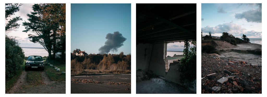
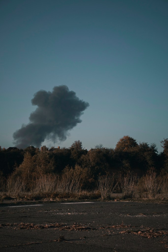
“I like mockup 1 because once you have gone from the car image then the smoke, your eyes are drawn through the building and leads out to the last image on the coast. The diagonal line then leads you back round to the beginning again.”
“As the set of images goes on they become more fascinating, overall this mockup is more impactful.”
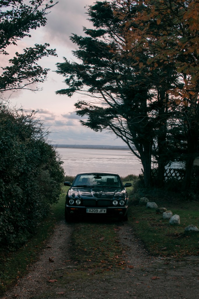
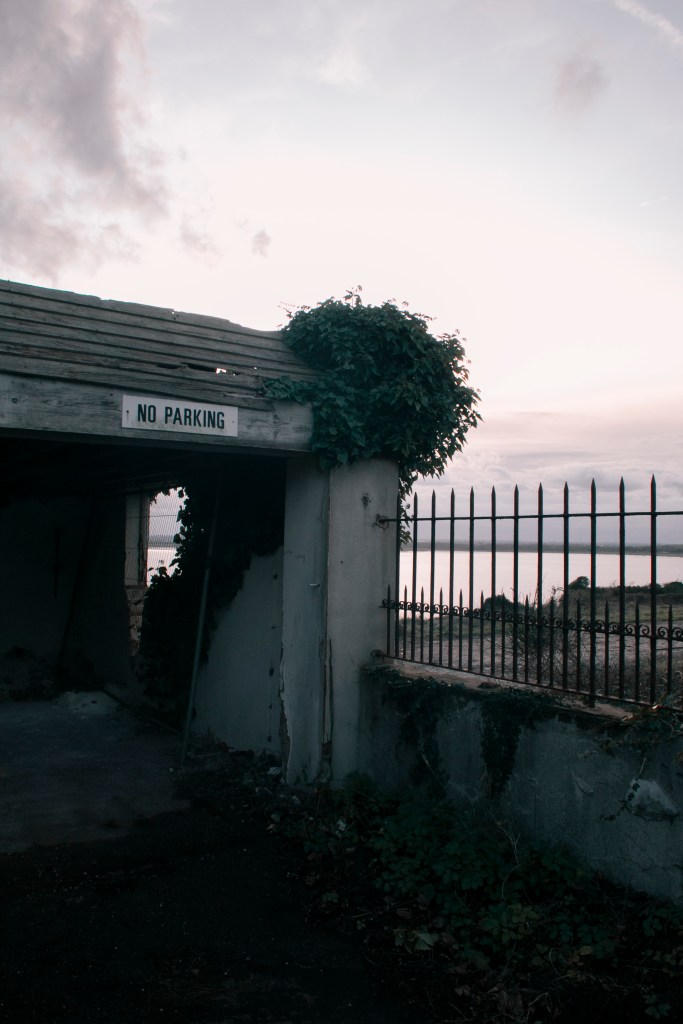
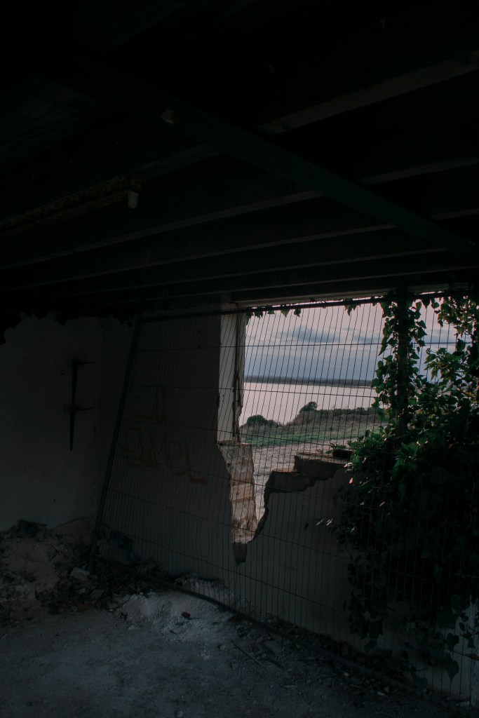
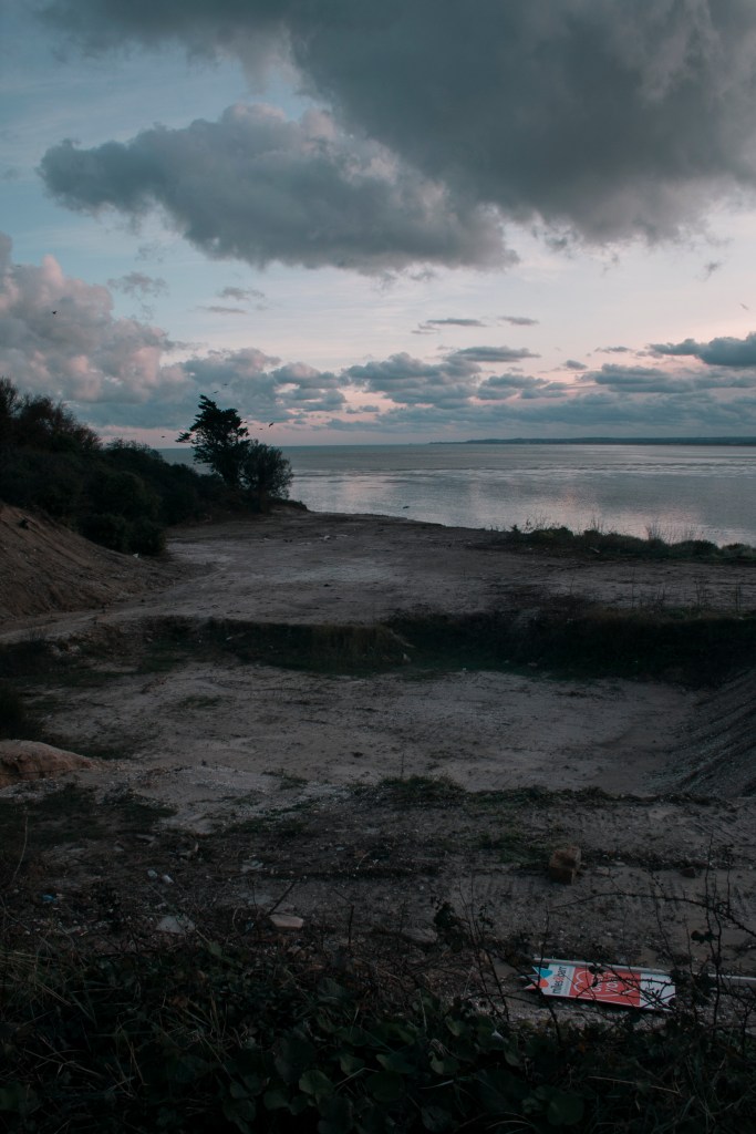
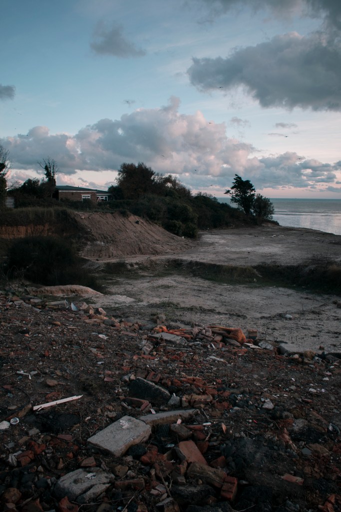
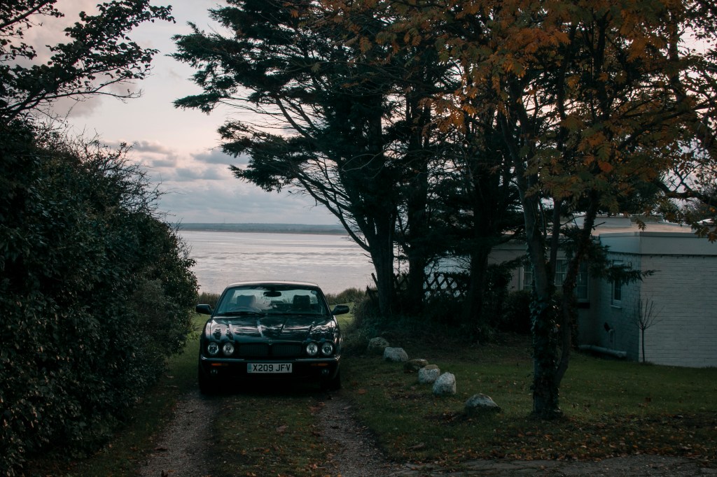
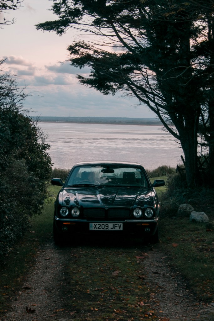
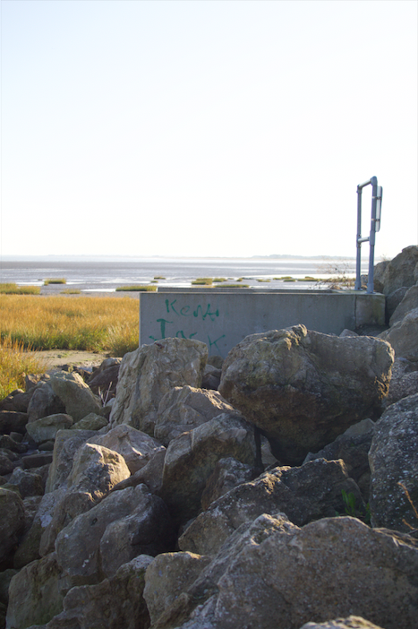
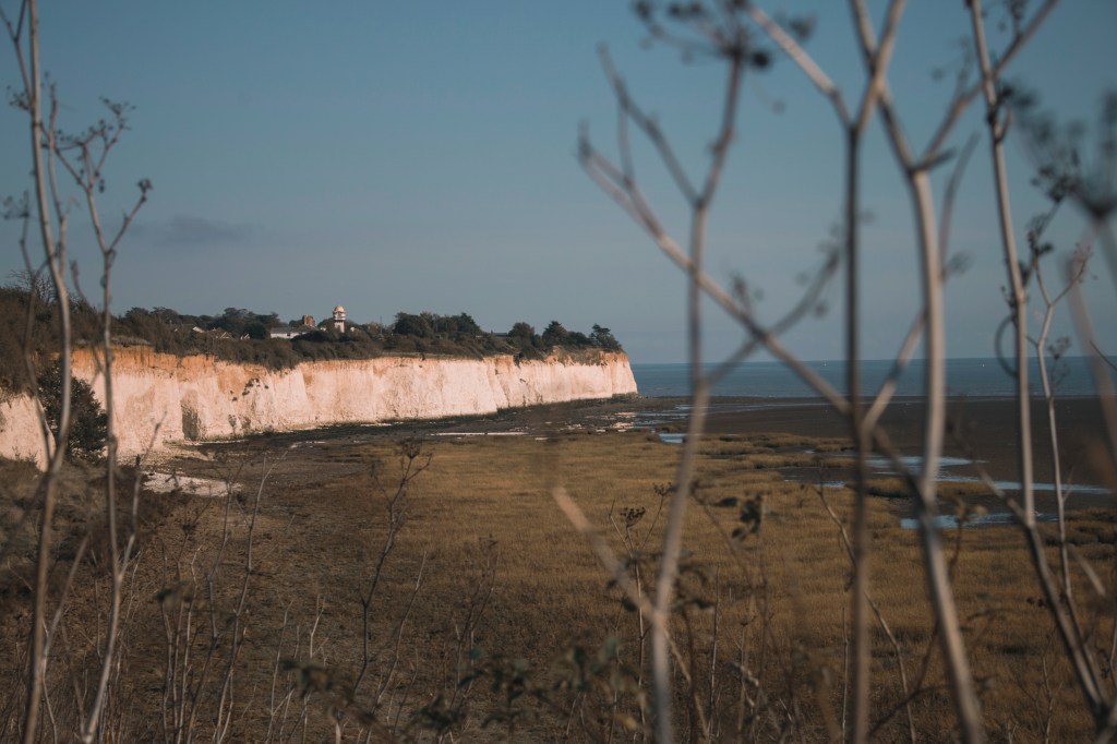
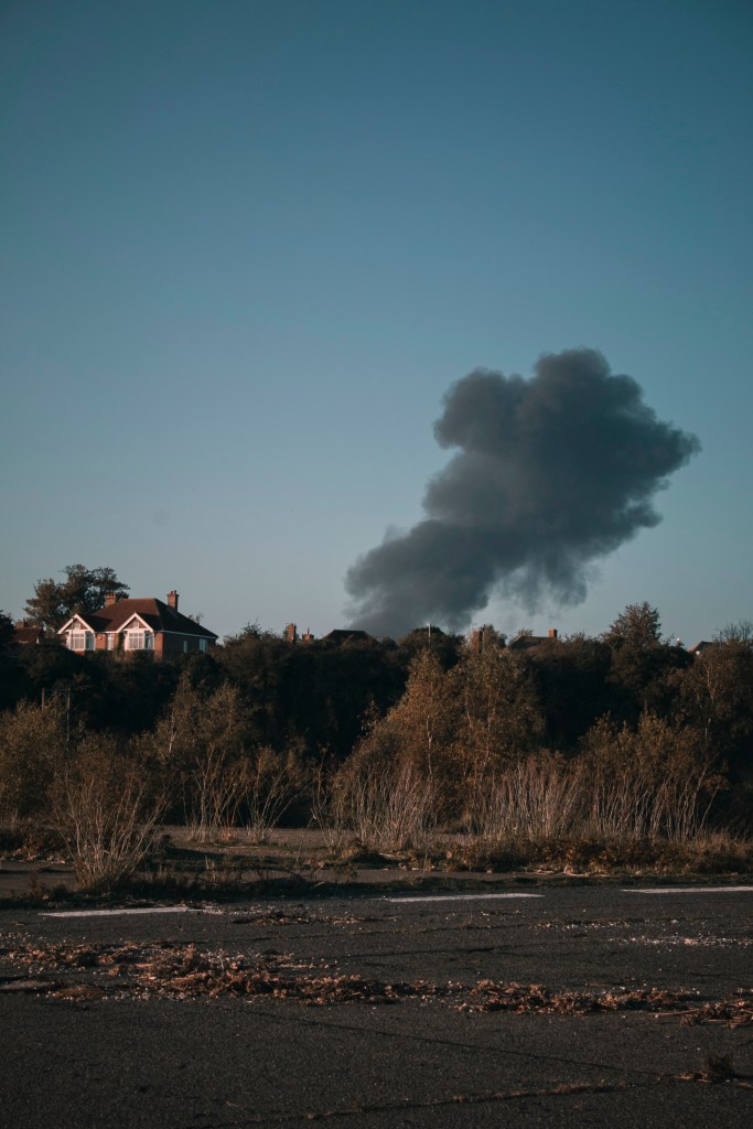
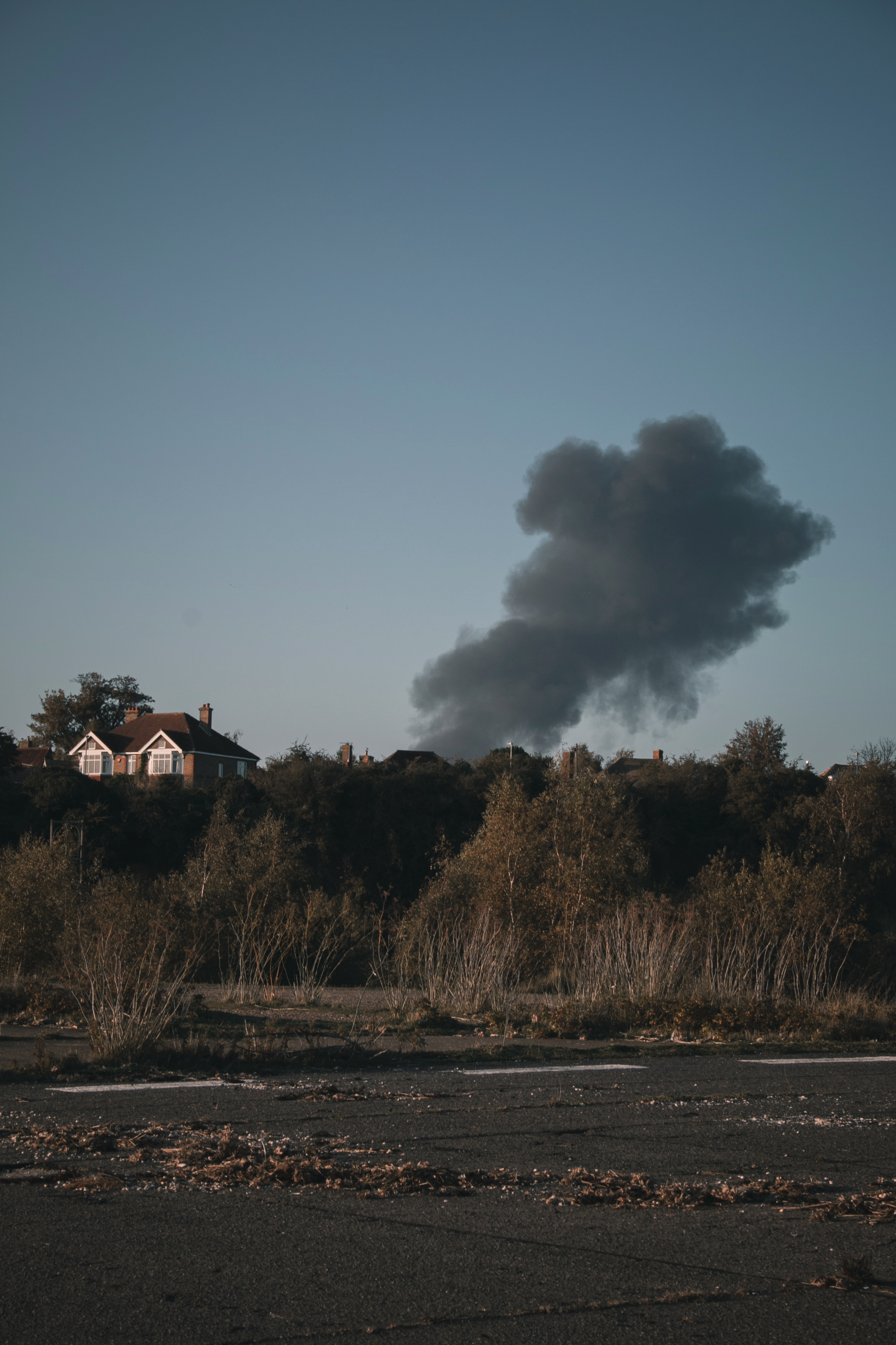
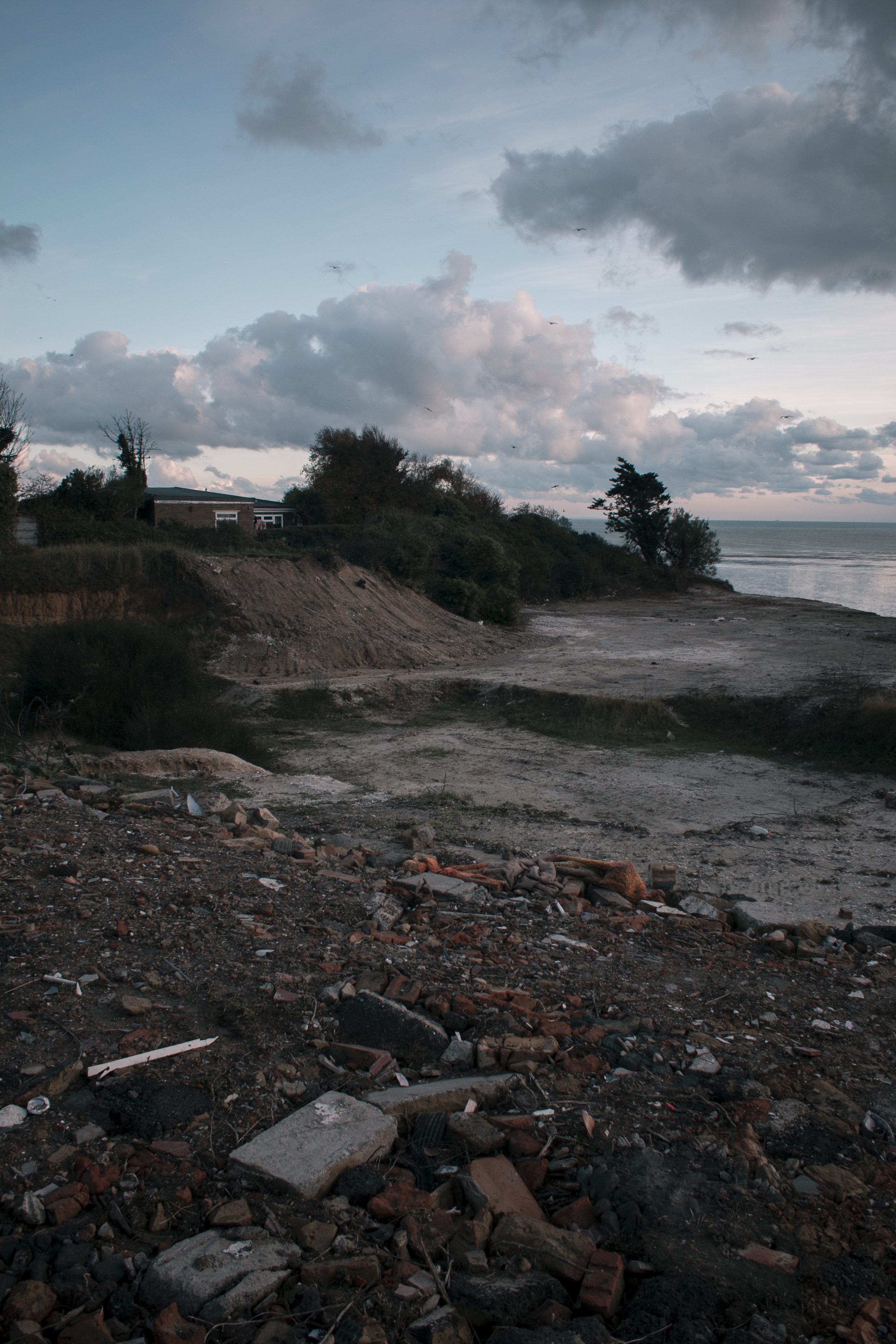
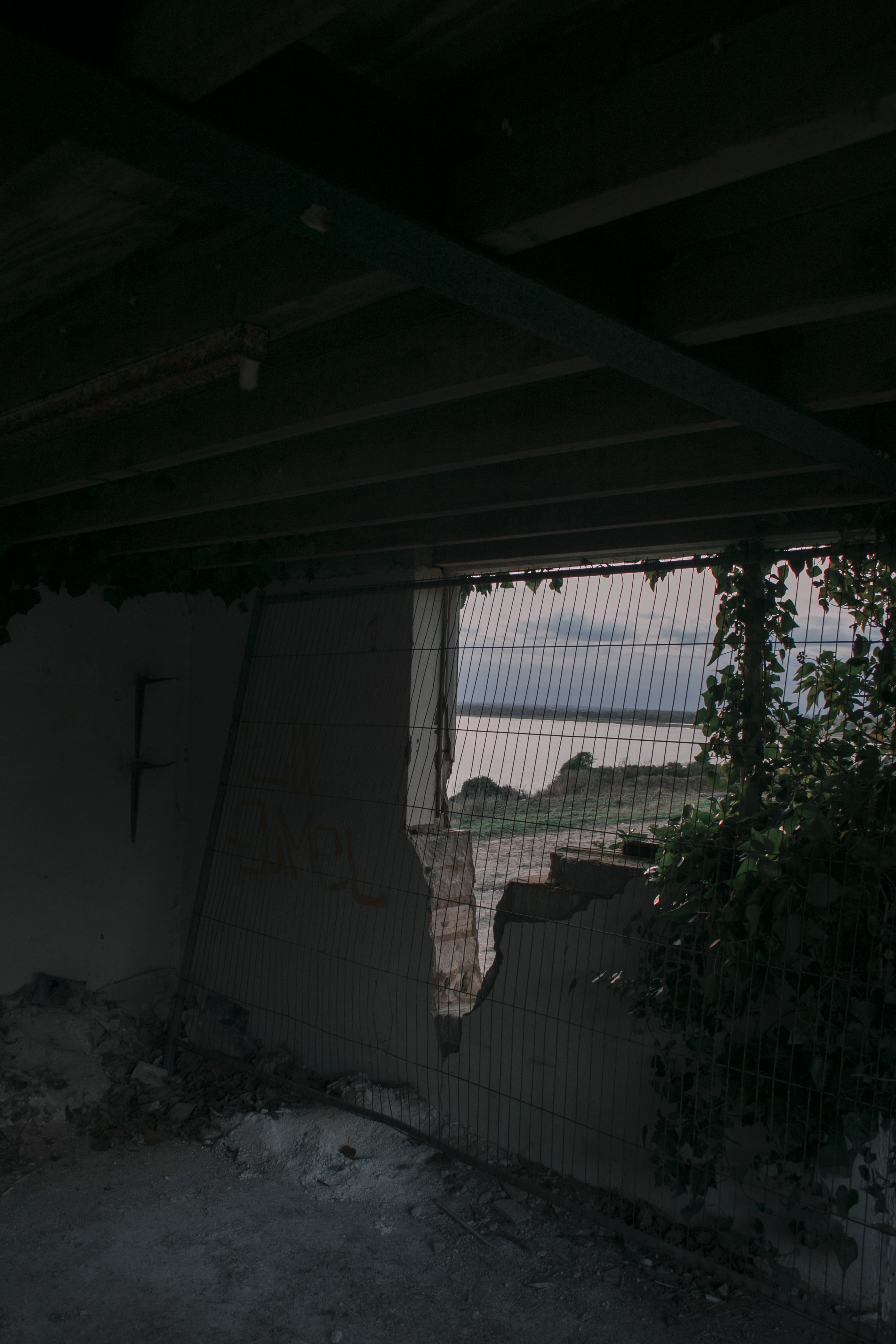
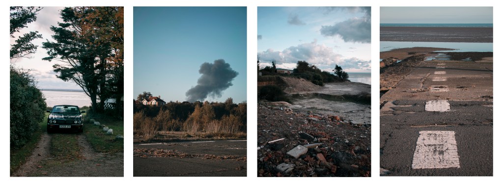
With this mockup, I’ve used one image from shoot 1 and the rest from shoot 3. To me, the fire and house image is one of the most potent images, so no matter what mockup I did, I would always have this image in the set. When picking out the photos, I wanted to create a story, but also a link between them. To me, the story shows a place where someone lives, then a fire happens, and the last two images shows the remains of what is left, in a landscape style. Showing how a landscape can change over time in different environments. But also could show a journey along with this environment, from one point to another.

“I like this one because I can see a story, but they are all different at the same time, which makes it interesting. I feel that mockup 1 has two photos that are the same thing, thats why I find this mockup more interesting”
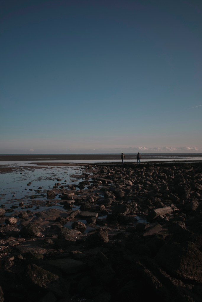
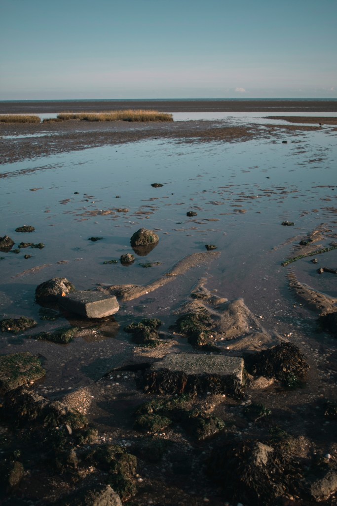
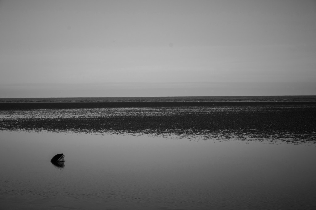
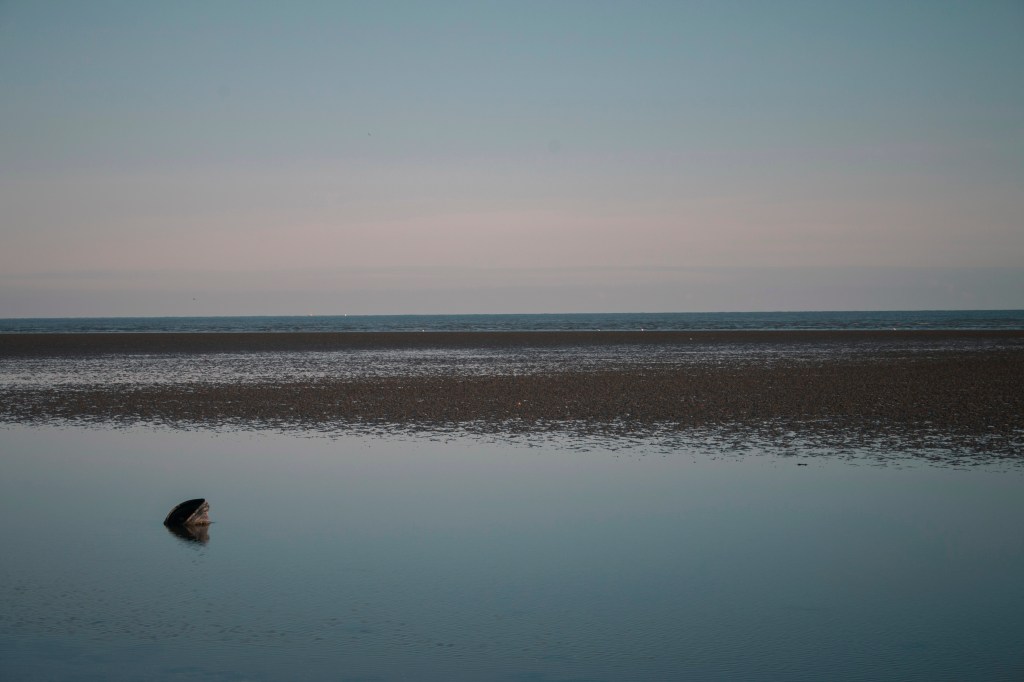
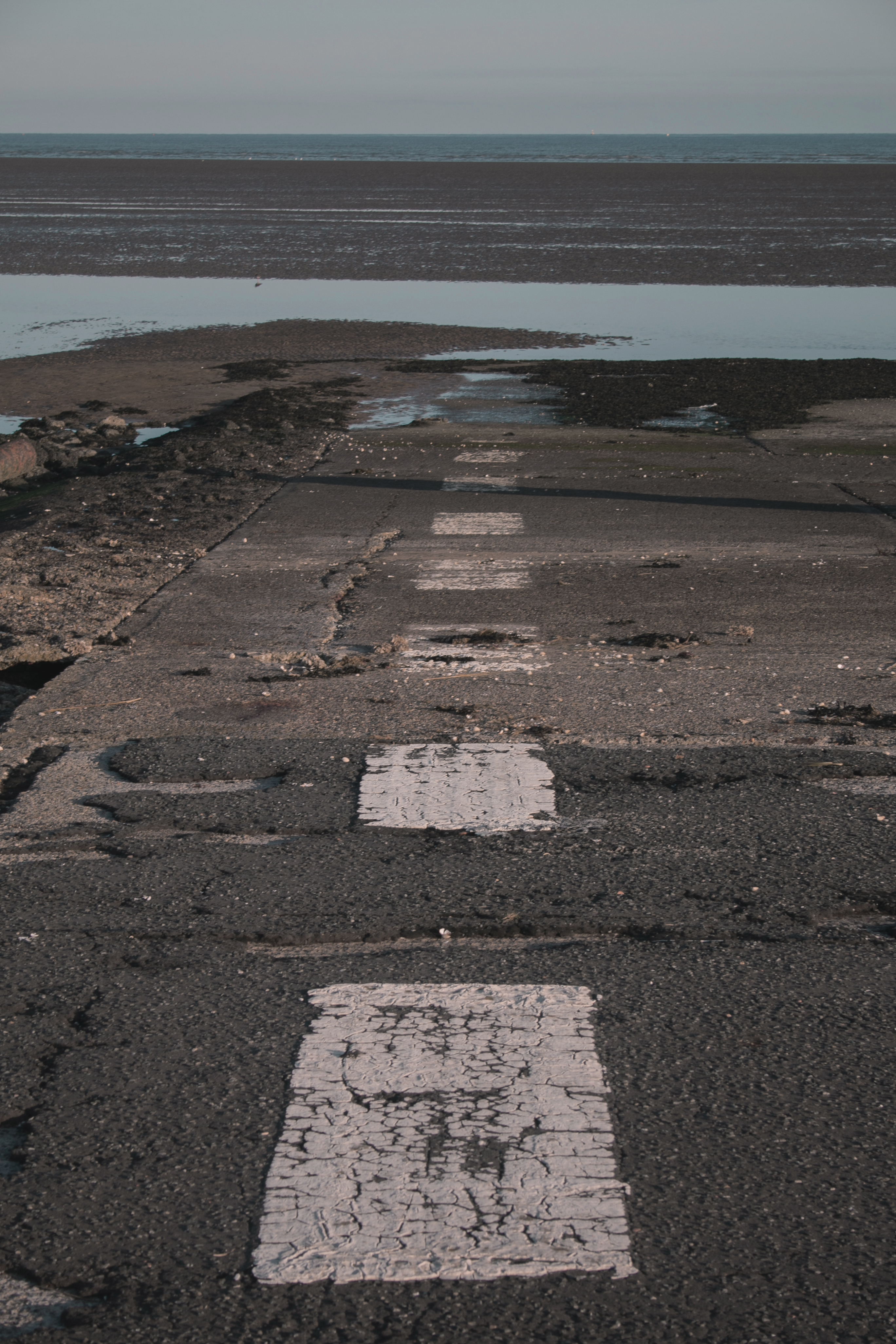
“The last image is interesting and cool, it’s like a road going out to the sea.”
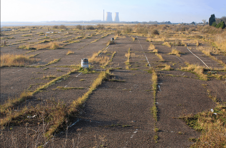
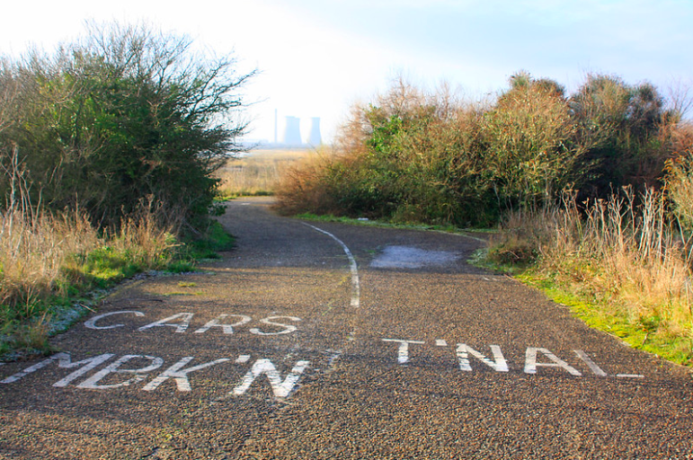
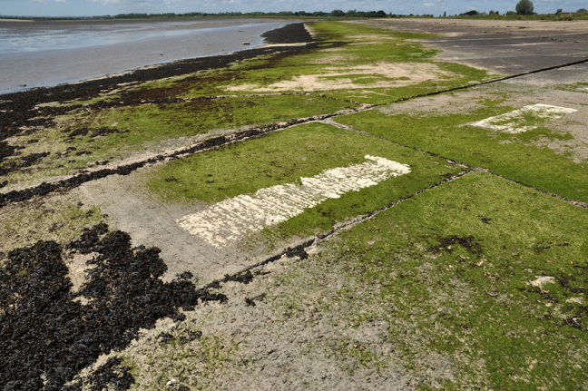
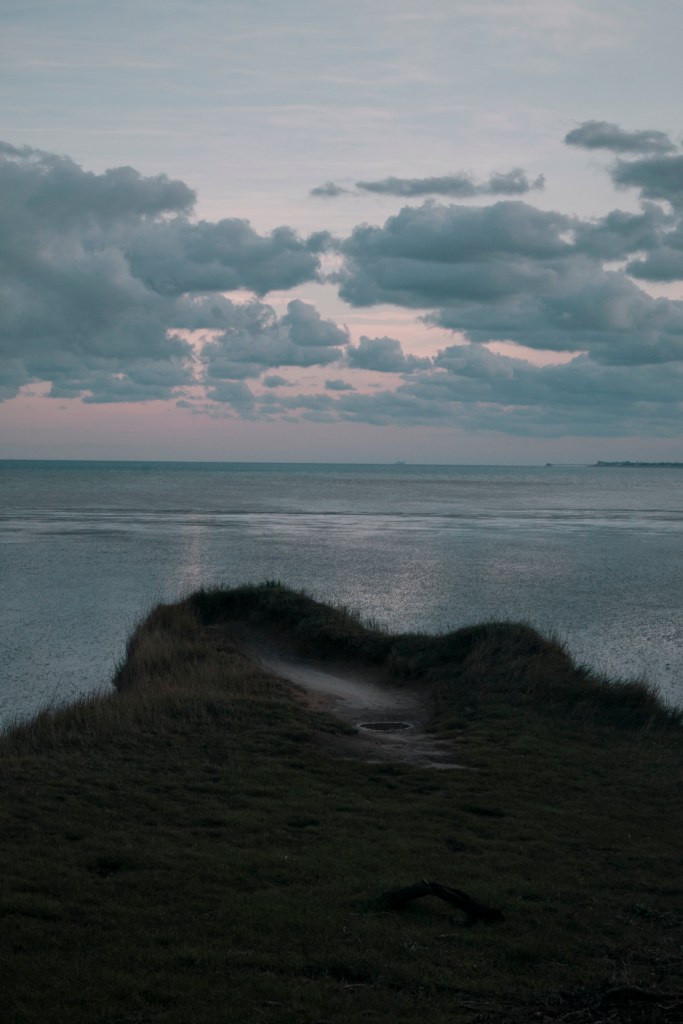
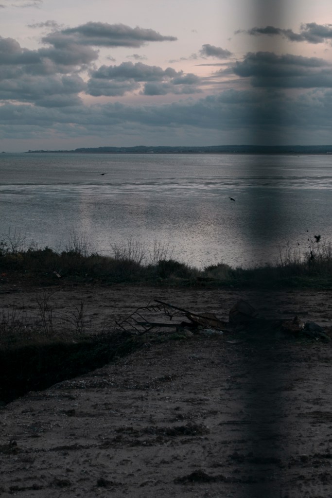
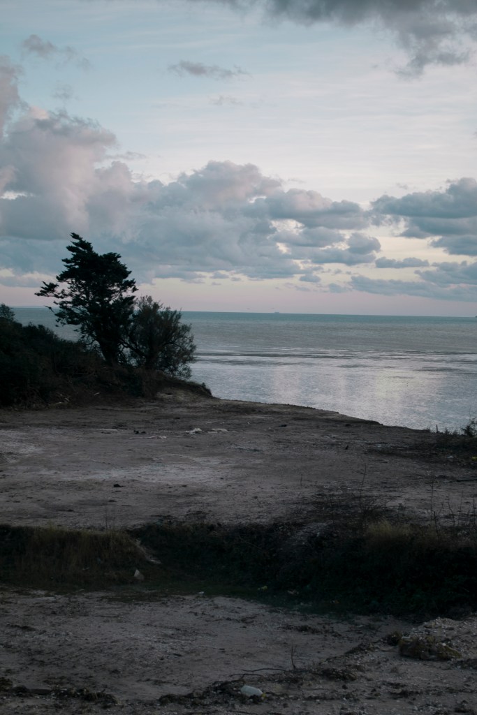
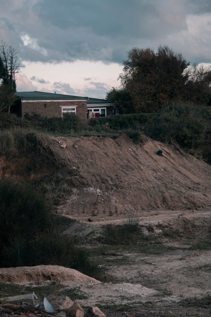
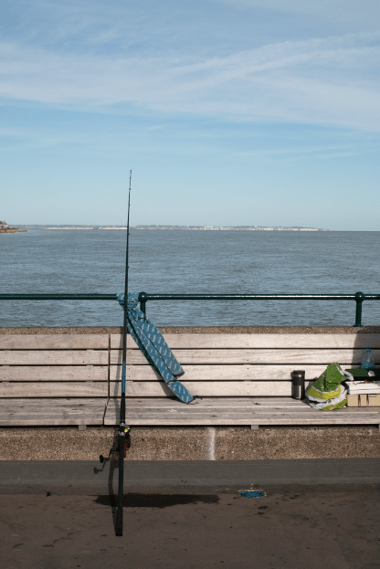
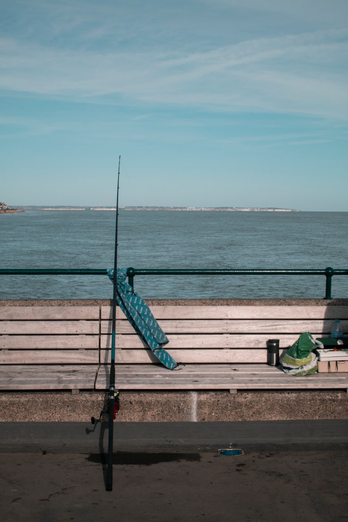
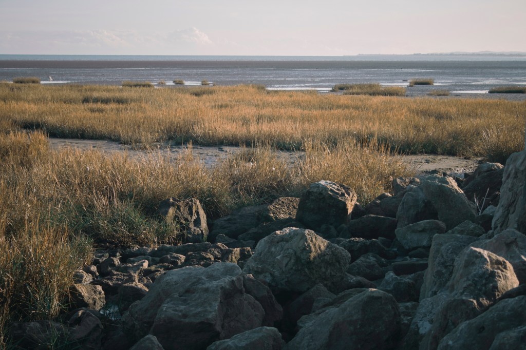
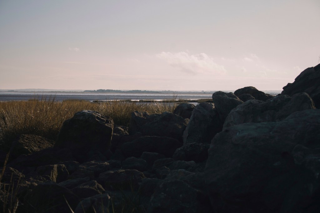
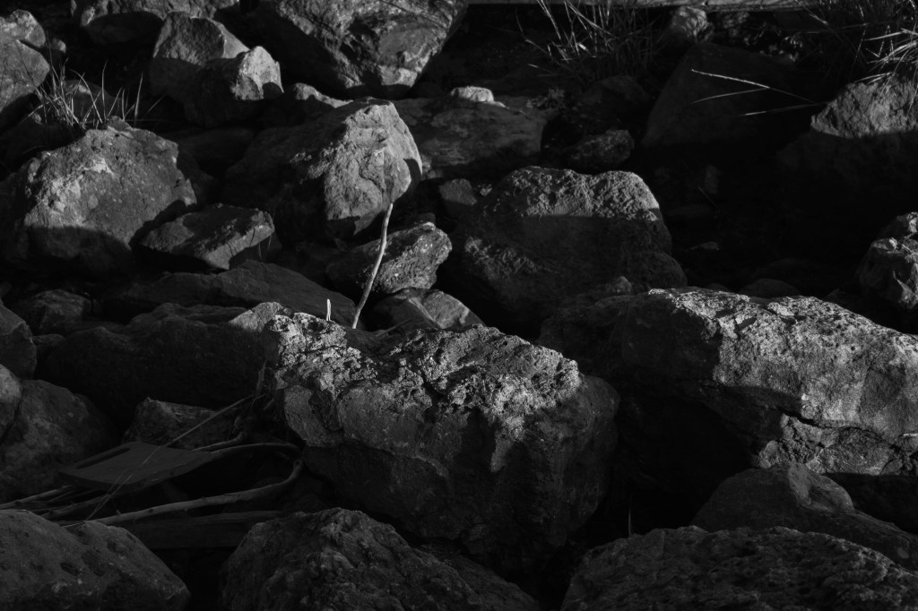
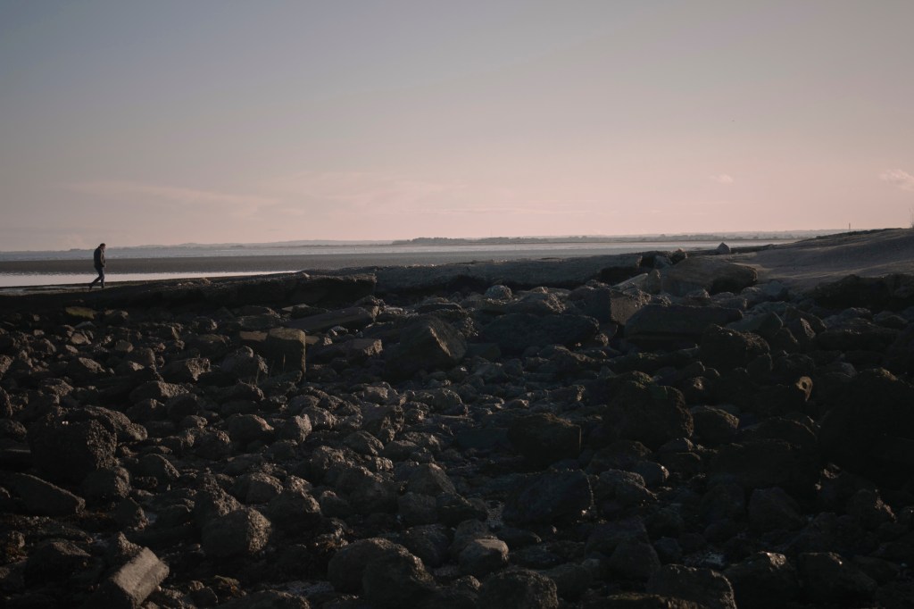
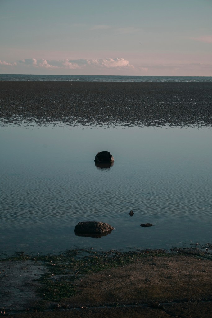
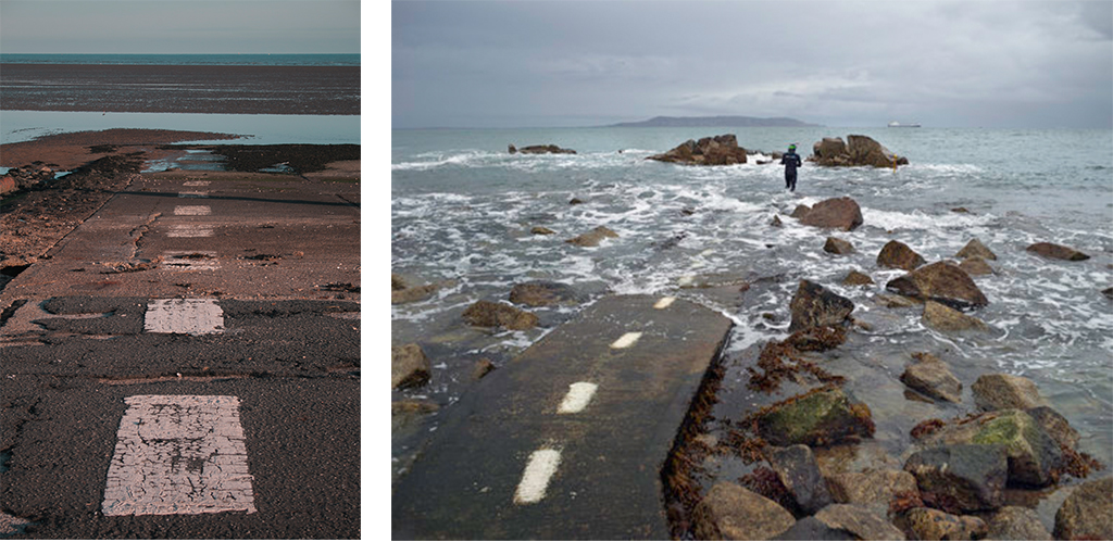
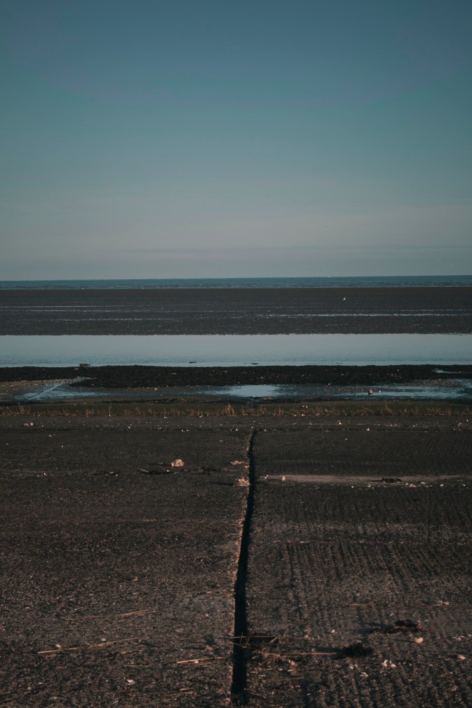
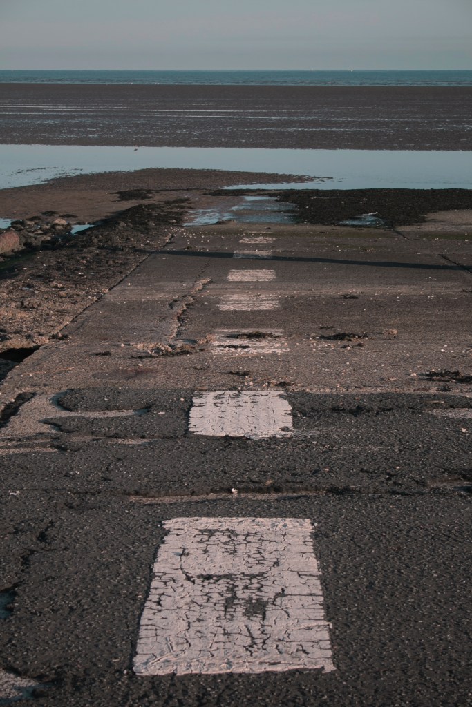
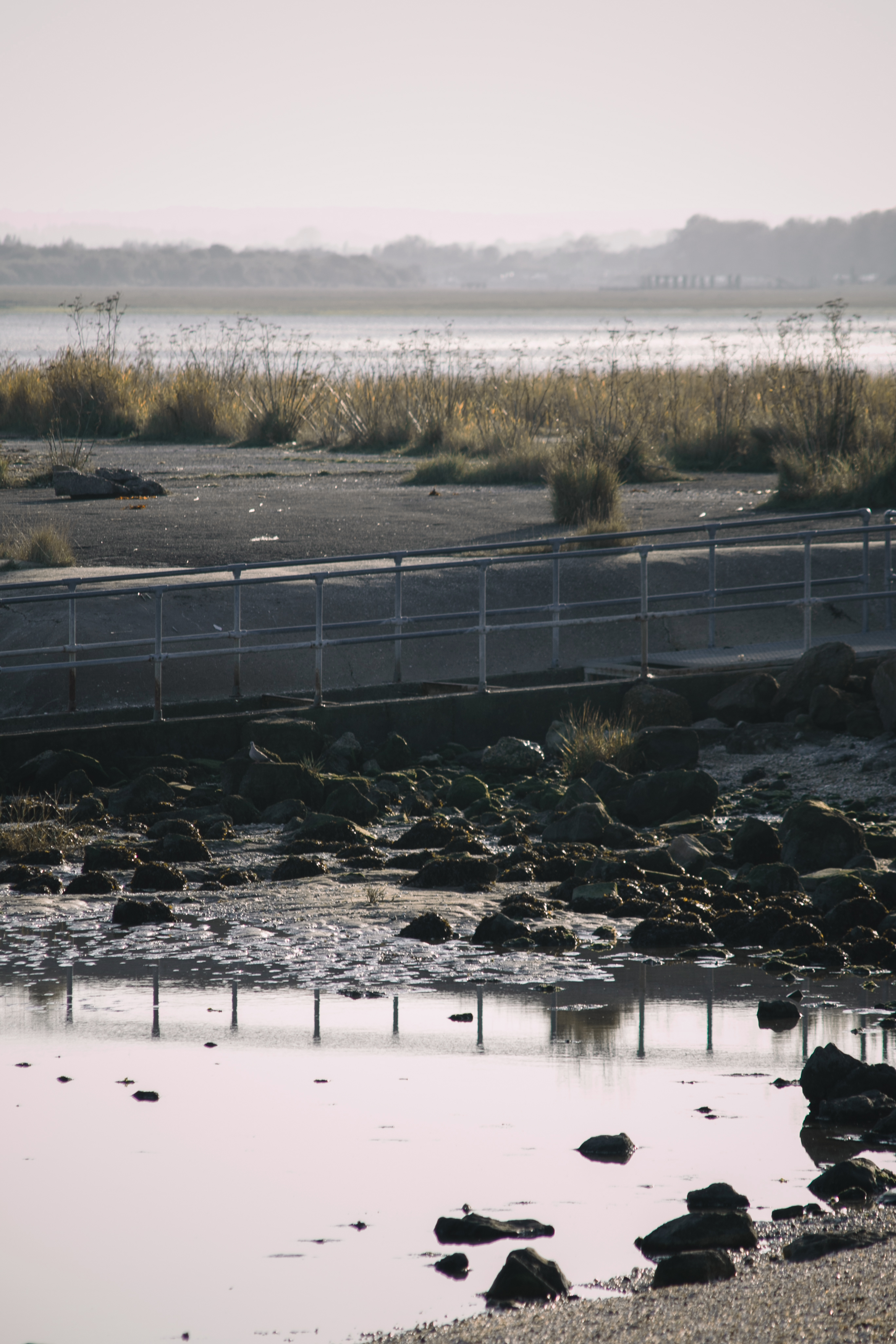
With this mockup, it doesn’t somewhat show a story of events like the previous mockup. However, all of the images link together because of the place. Image 1 and 3 links because of the sky and sea background. Image 2 and 4 links because of the line marking on the floor. But all four images do seem to fit together. From the location and the colours matching each other (blues and greens). A lot of people say they prefer this mockup because the 3rd image on mockup 1 is a bit darker than the rest.
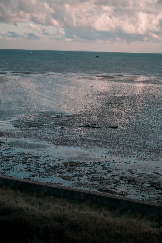
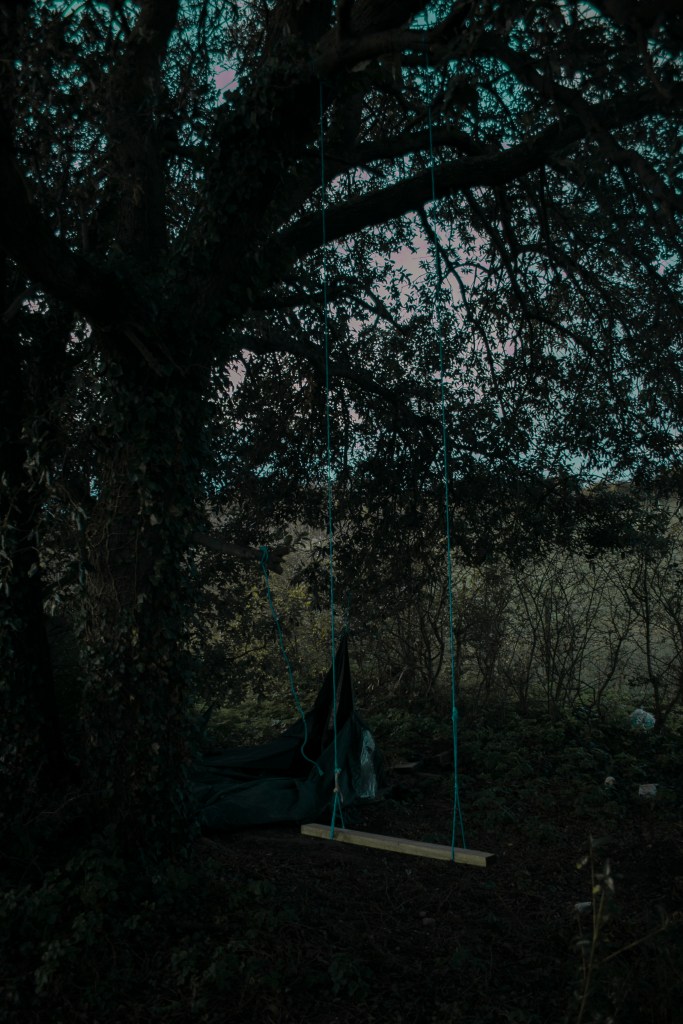
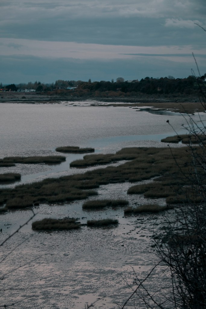
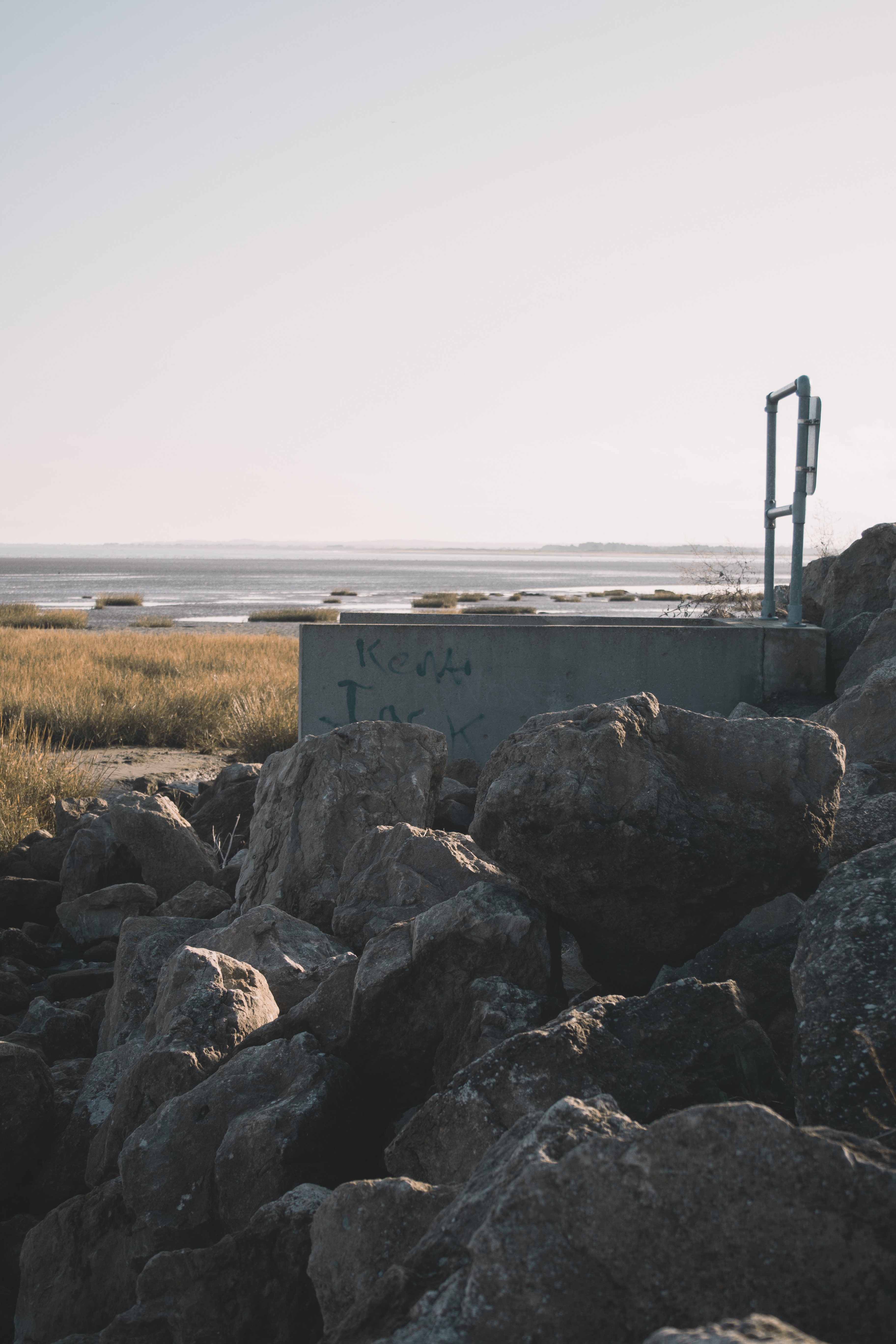
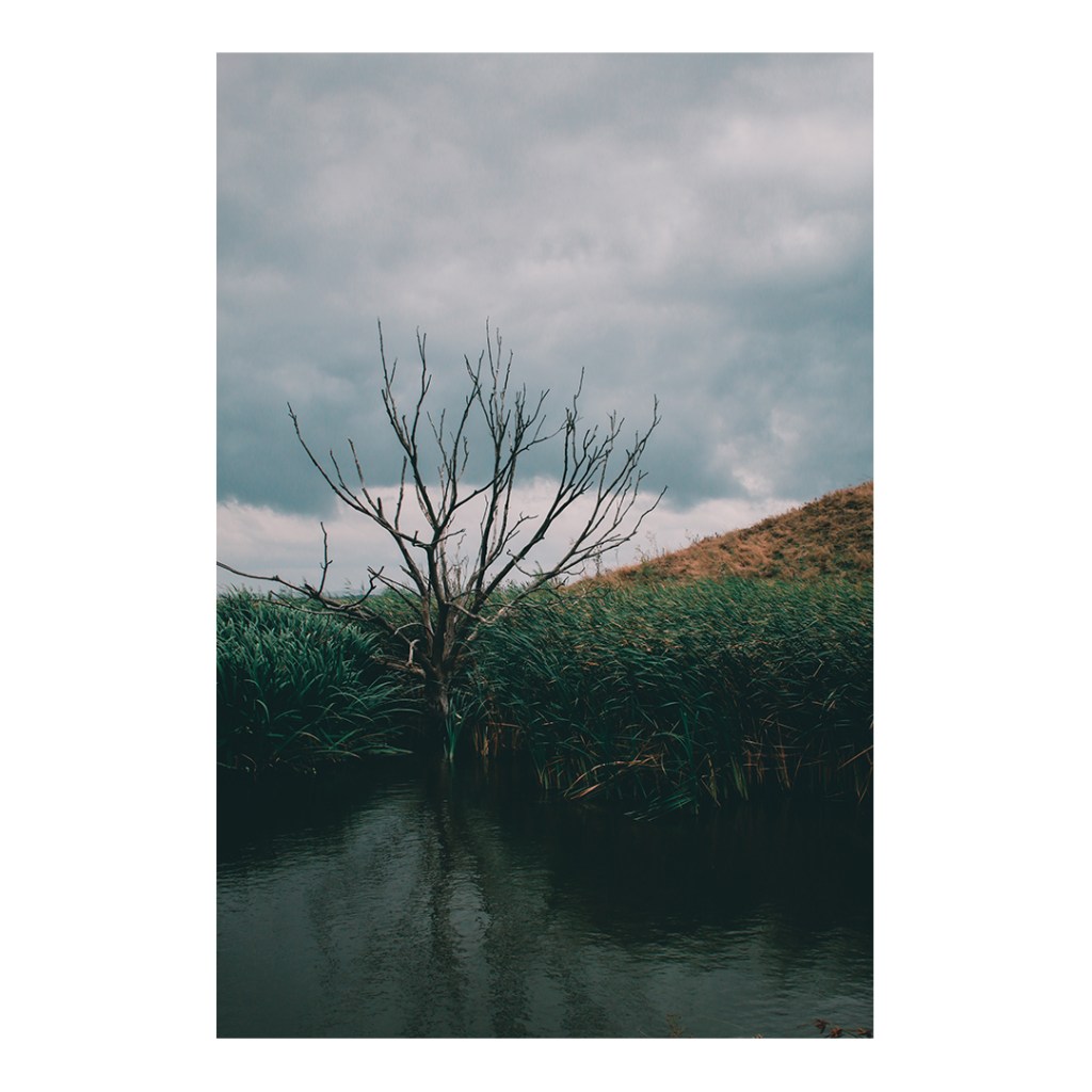
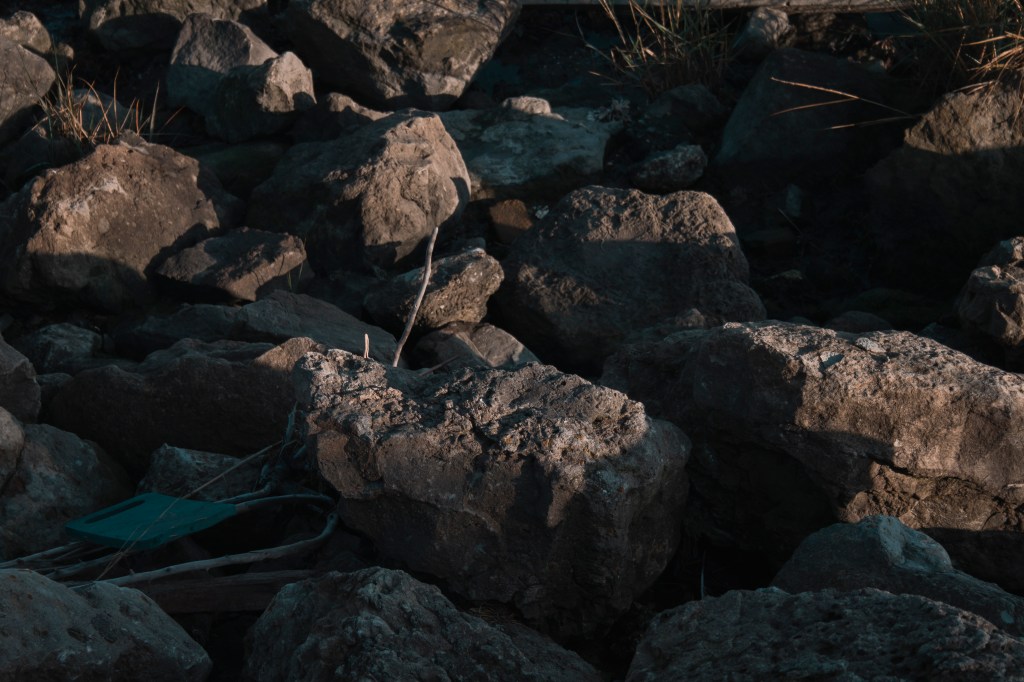
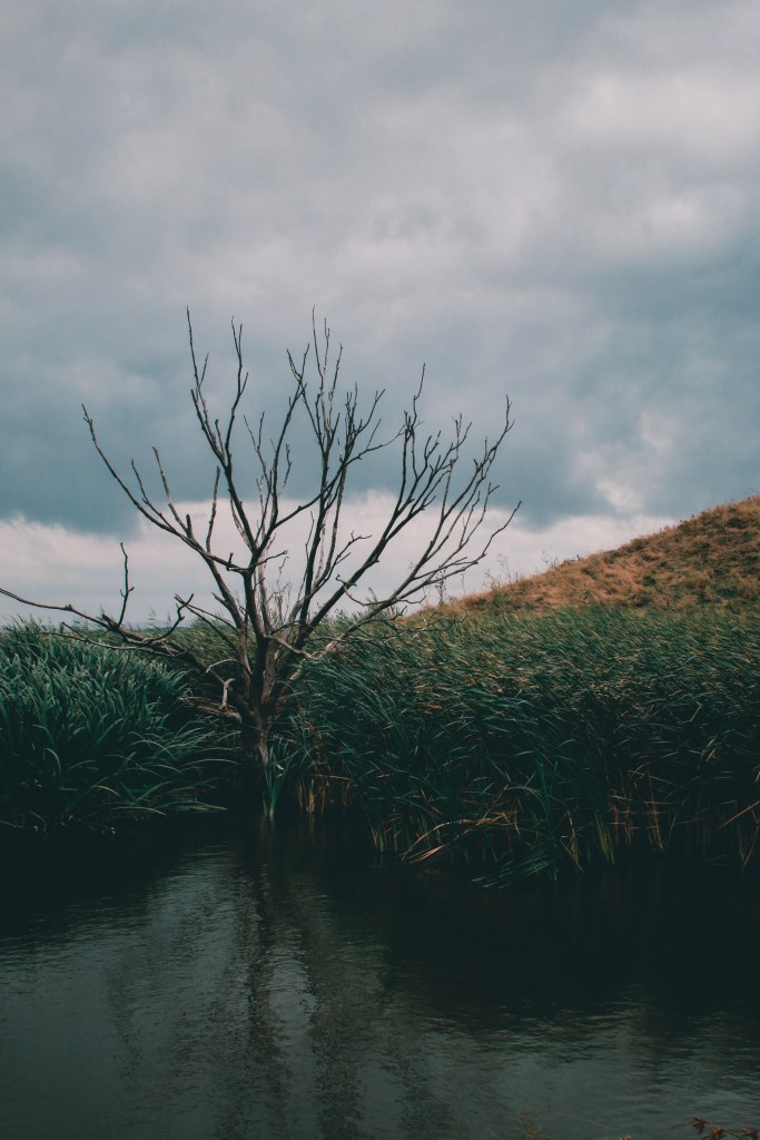
One other image that I wanted to use was the tree reflection image below. I feel that the composition of this image I have capture exciting, and the reflection produced in the water. The shapes and colours from the tree and grass mounds break the image up nice.
The reason I didn’t put this in my mockup designs, is because it didn’t really match the rest of the images. It does with the water, nature and some of the colours, but it doesn’t link together.
FINAL IMAGES
Overall the feedback and choices of my peers and friends have been 50/50, which doesn’t help, but I got useful information explaining why they like the one they chose, which has made my decision a little easier.
I have chosen to go with mockup 2 because I think this will best fit the theme of the environment project and the concept I was going for. The feedback did help shape my opinion, though both had a valid reason for why my peers like them. Which made it even harder to chose. I feel that this set of images and order is something different and they all link together.
I was going to pick mockup 1, because I like how they all flow, the sense of the inside/outside leading down to the beach, but I feel that the third image is too dark and similar to the rest.
While doing the mockup design, I quite liked the white border around the edge of each image, so with each image when printing they will have a white border around it; also I think it looks smarter. I have also chosen to go with size A4 paper and Lustre paper. I think the lustre paper (in between matte and glossy) will suit these images much better than glossy paper.
The title of the final four images series is called ‘What’s Left Behind’, I came up with this name through the environment I photographed. In all four photos, there’s an element of something thats been left behind. From what once used to be used by us, but now left behind for the environment to take over.